9 Best Multi Step Form Examples for Your Inspiration [By Industry]
In this post, we’re going to share some of our favorite multi step form examples for your inspiration — broken down by industry. Yes industry… so you ca...
In this post, we’re going to share some of our favorite multi step form examples for your inspiration — broken down by industry. Yes industry… so you can see what works best for each industry.
If you’ve ever considered building a multi step form and need some inspiration, then you’ve come to the right place.
After building thousands of multi step forms, I can tell you that it’s not easy…
From choosing the right questions to designing your form, there are quite a few things that you need to get right.
That’s why in this post, I’m going to share nine of my favorite multi step form examples that you can model right now.
If you’d like to get right to it by building your own multi step form, then I highly suggest signing up for an account with GetLeadForms. You can get started free here »
Otherwise, keep reading:
Contents:
- Not using multi step forms? It’s time to upgrade your forms.
- Why use multi step forms?
- Example 1: HomeAdvisor — Plumbing, HVAC, and Service Businesses
- Example 2: Pest Control Allentown Pa — Pest Control Companies
- Example 3: KlientBoost — Agencies
- Example 4: Home Loan Analyst —Financial & Mortgage Companies
- Example 5: Two Men And a Truck — Moving & Storage Companies
- Example 6: GEICO — Insurance Companies
- Example 7: GetLeadForms — B2B SaaS Companies
- Example 8: Legal Industry
- Example 9: ADT — Security Companies
- How to Build Your Own Multi Step Form
Not using multi step forms? It’s time to upgrade your forms.
For those of you still using basic contact forms to generate leads, it might be time to consider upgrading your forms.
It’s 2022 and technology has really advanced…
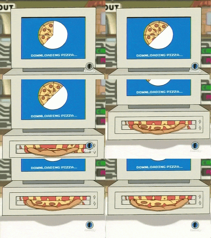
Okay, maybe technology isn’t advanced enough to print out pizza on demand.
That would be pretty great.
Maybe a pizza printer will be our next project at GetLeadForms.
In the meantime — we can at least use smarter, interactive forms.
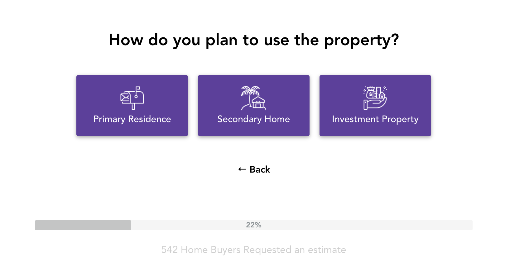
Like this:

This is a multi step form that I whipped up using the GetLeadForms.
It took me 10 minutes (I’m Pro though).
It might take you 30 minutes.
But hey, there’s no coding needed.
Anyway, if you’re curious about why you should be using multi step forms, then keep reading because we’re about to dive into some deep conversion rate optimization theory:
Why Use Multi-Step Forms?
One of my favorite reasons for using a multi step form is to increase conversion rates.
As marketers, we all like to think that we are conversion rate experts, right?

Image source
Well, I too like to think that I know my stuff about CRO.
But when it comes to anything CRO related, one of my go-to resources is the LIFT Model.
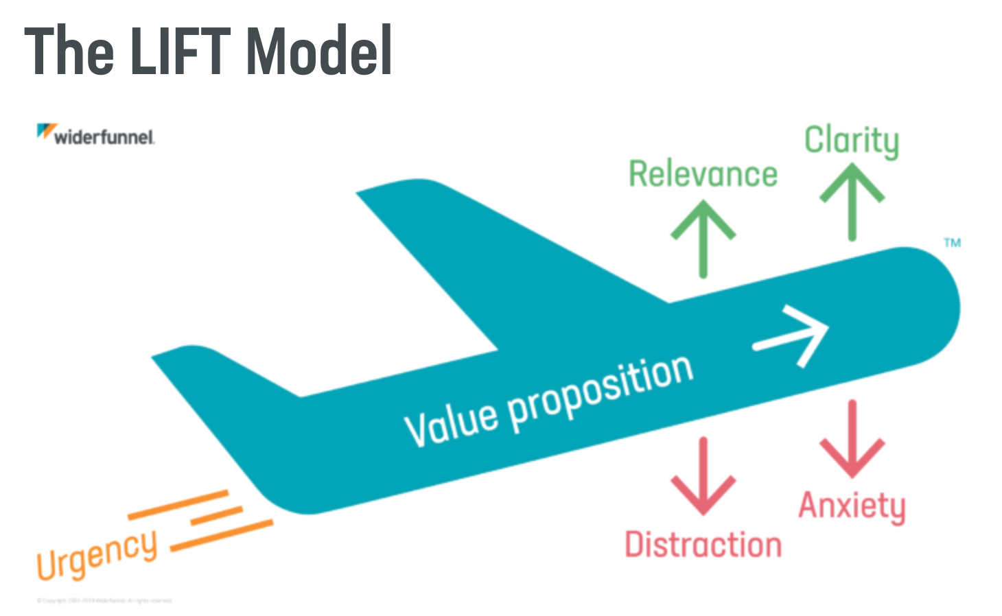
Image source
In 2009, Chris Goward from Wider Funnel introduced the LIFT Model®, a CRO framework for analyzing web and mobile experiences. The LIFT Model states that there are six factors that influence the conversion rates on a page.
- Value Proposition
- Relevance (conversion driver)
- Clarity (conversion driver)
- Urgency (conversion driver)
- Anxiety (conversion inhibitor)
- Distraction (conversion inhibitor)
Each of these factors are used within the LIFT Model to identify issues and opportunities within your online experiences.
You can read more about the LIFT Model here.
So, how in the world does this relate to forms? (One of the biggest conversion points on your website by the way)
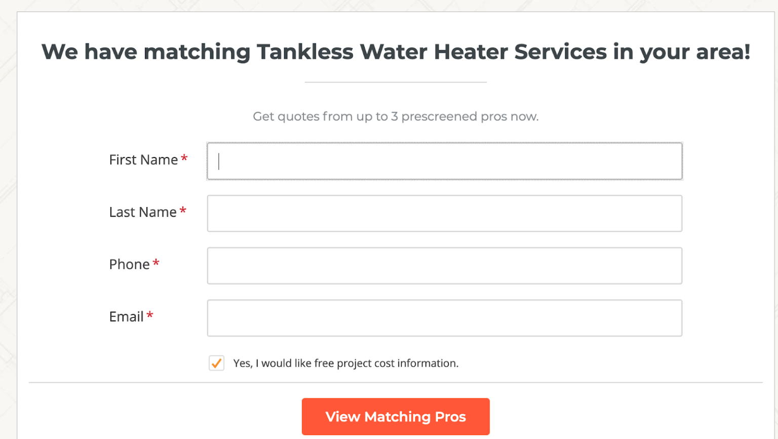
Well, imagine that you’re using a long form like this:
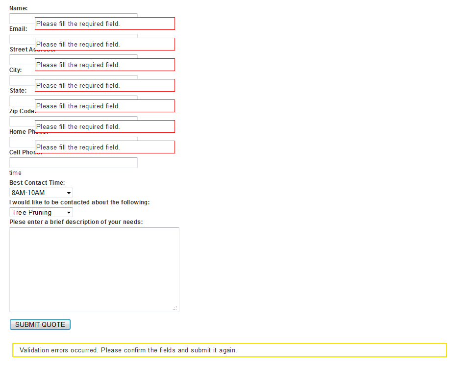
Not very appealing, right?
Let’s measure this form against the LIFT Model. Some issues include:
- Increased anxiety levels (conversion inhibitor)
- Unnecessary distraction (conversion inhibitor)
- Lacks clarity (notice all of the validation errors)
- And fails to clearly state the value proposition of why the prospect is providing their contact details in the first place.
Let’s imagine that you take the very same form, and turn it into a more friendly, interactive form like this form with multiple steps:
Instantly better.
You can view this multi step form template here.
Unlike that pretty bad single step form in our example, this new interactive form is aligned with the LIFT Model. This form is clear, less intimidating, and fits nicely into the page.
By Widerfunnels’ standards, the multi-step form is a clear winner when compared to the standard, single-step form in the example above.
Aside from that, multi step forms are known for improving a site’s overall user experience while also providing businesses with more qualified leads.
If you’re interested in taking your contact forms to the next level, check out our latest post on contact form best practices.
9 Multi Step Form Examples by Industry
Model These To Increase Form Conversion Rates
Now let’s dive into some my favorite multi-step form examples.
Quick Tip: if you’re looking to build a LeadForm like any of the examples below, here are 7 form building tools that can help.
1) Plumbing, HVAC, & Home Service: HomeAdvisor
One of my favorite multi-step form examples is brought to you by HomeAdvisor.com.
HomeAdvisor is what inspired me to build GetLeadForms in the first place.
When a visitor first lands on HomeAdvisor, there’s a zip code field that asks: “what is the location of your project?”
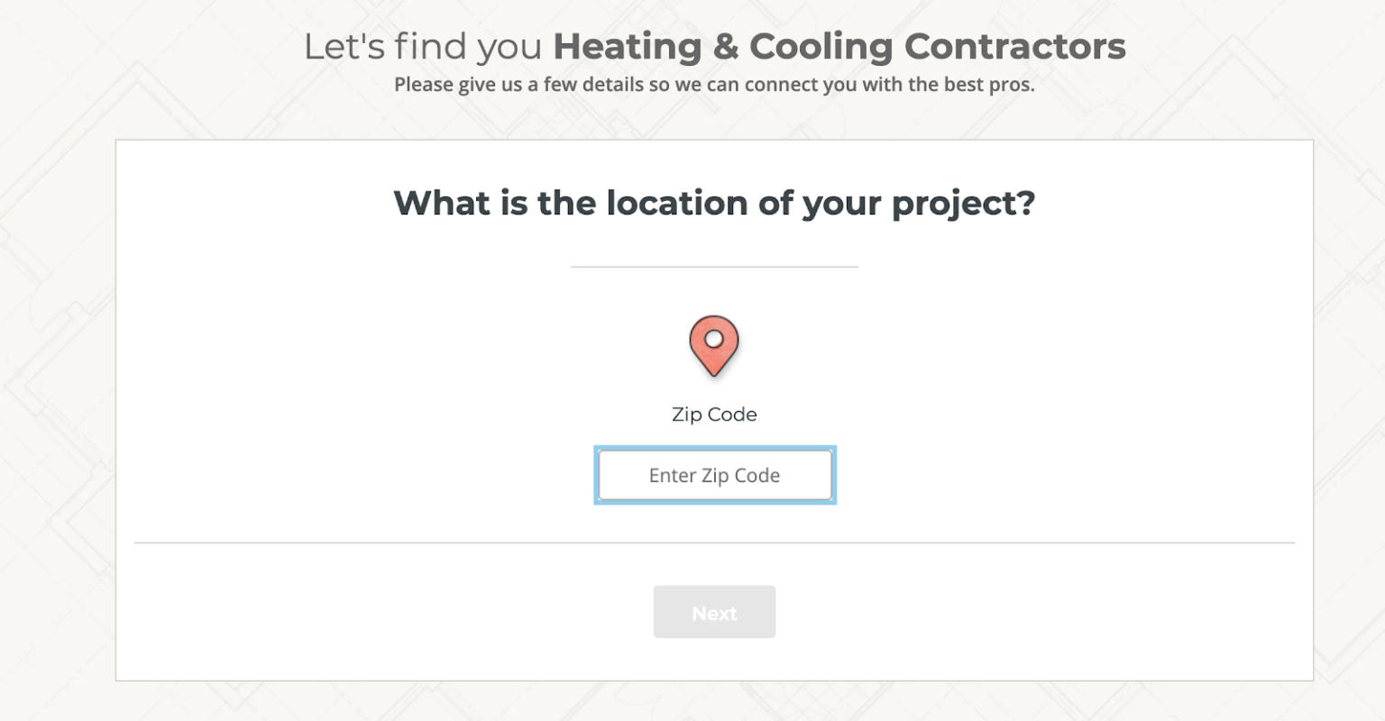
Asking the visitor to provide their zip code right out of the gate is a much smaller ask than requesting personal information like name and phone number. As a result, more visitors are likely to engage with this form.
After the prospect is engaged and drawn into the form, HomeAdvisor begins to ask for additional information about the project, giving their team the chance to get as much vital information as they can.
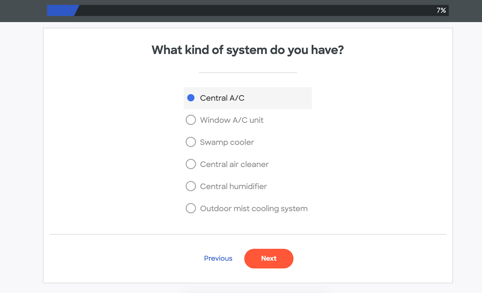
As you can see, HomeAdvisor hasn’t asked for an email address and name yet. That comes at the end.
Before submitting their contact information, the prospect has already supplied nine essential pieces of information about the project.
It turns out that building a form like the HomeAdvisor example is pretty complex, especially if you need to distribute leads to a sales team or push the info into a CRM.
That’s why I built GetLeadForms. One of my goals is to give marketers an easy way to build multi step forms without having to rely on a tech team to do all of the work. You can also do some pretty advanced stuff as as integrating with a webhook and even generating TCPA compliant leads with TrustedForm.
Our LeadForm Builder makes it easy to build multi step forms, like in this example:
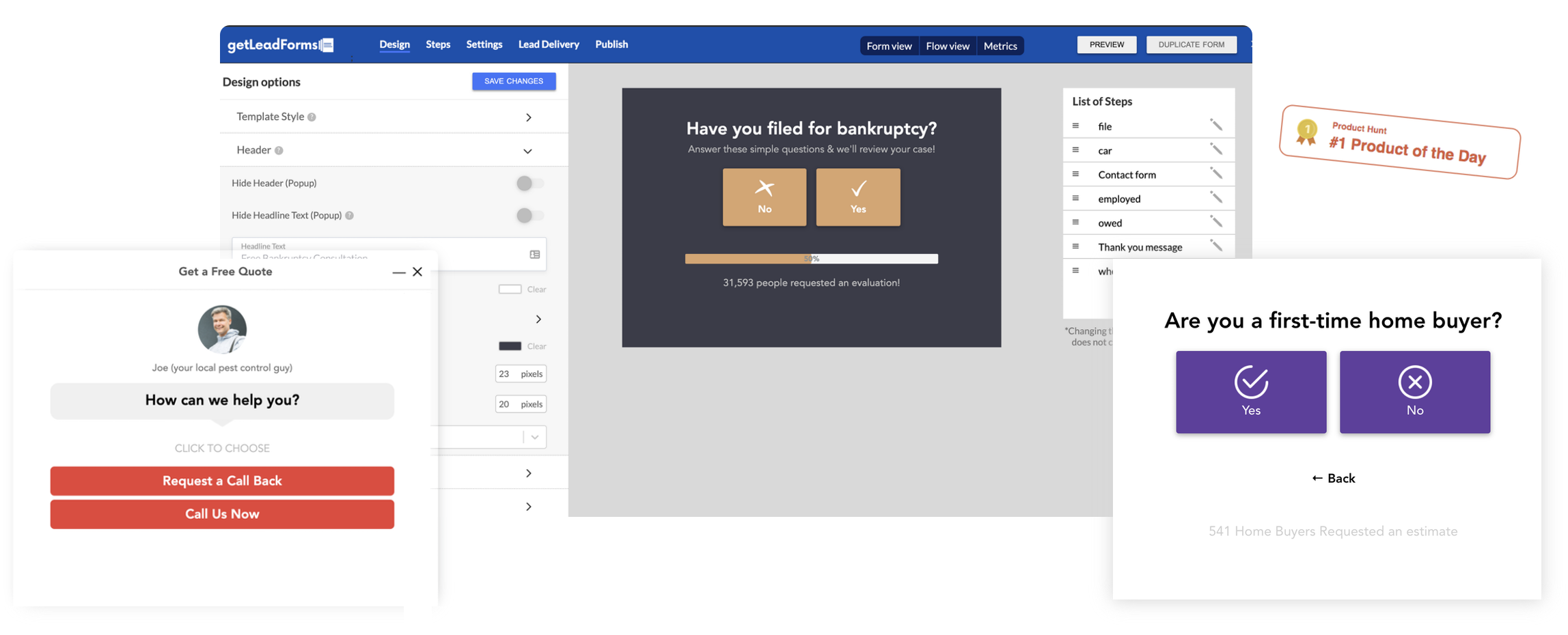
Simply pick a template, customize your form, and add it to your page. You can get started for free here.
2) Pest Control Company: Pest Control Allentown PA
For those of you generating leads for local service businesses, Pest Control Allentown PA is another smart multi-step form example.
The first thing you’ll notice on the homepage is a tiny welcome message in the lower right hand corner that lets open the form. Just by clicking on the “Get a Fast Free Quote**,”** the form will open.
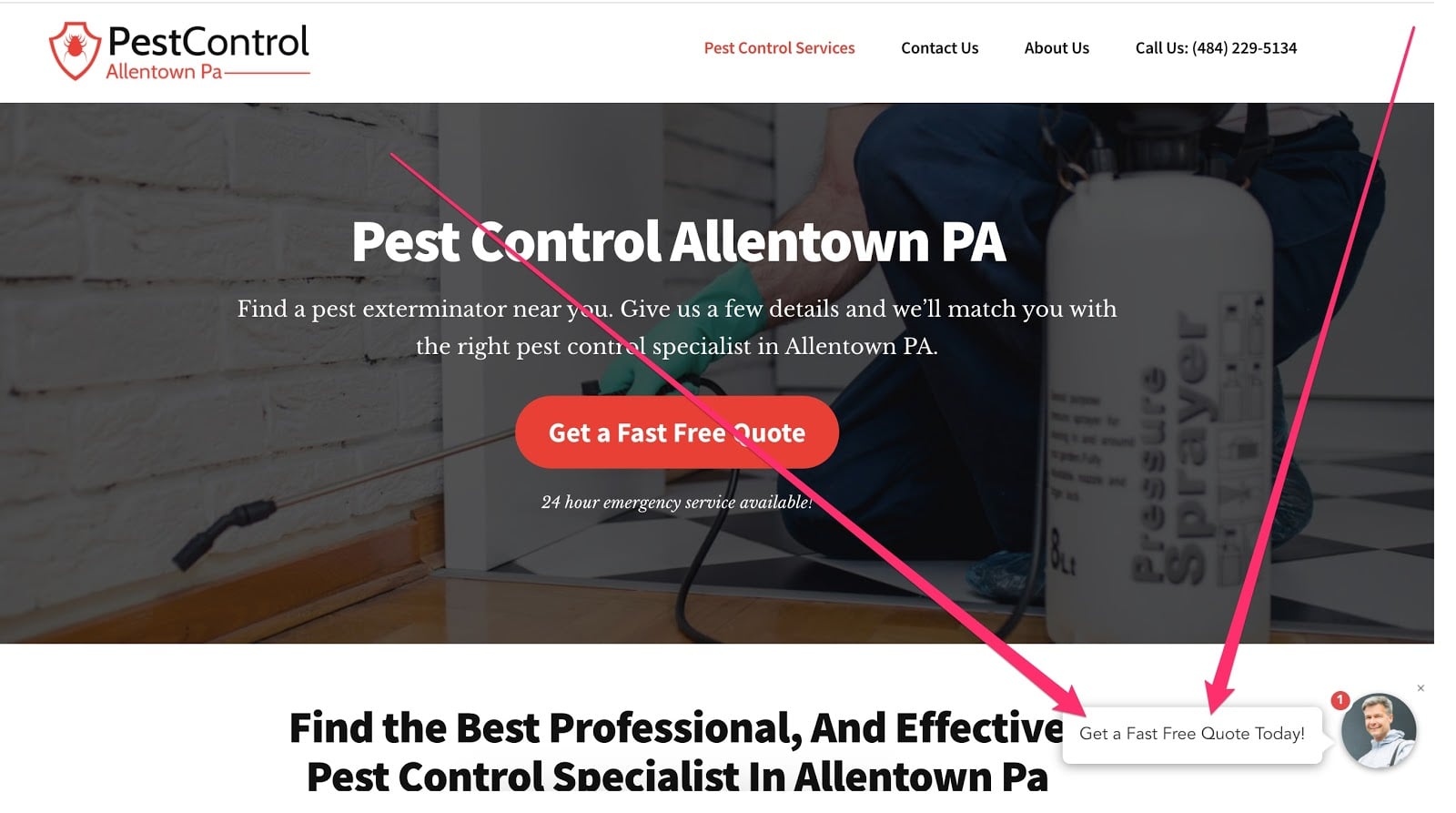
At GetLeadForms, we call this the “onsite message” and it can be used to make your forms more accessible across any page of your site by opening your multi step form up right on the prospect’s screen.
After the form opens on the screen, the visitor is asked a very simple question: “what type of service would you like a quote for?”
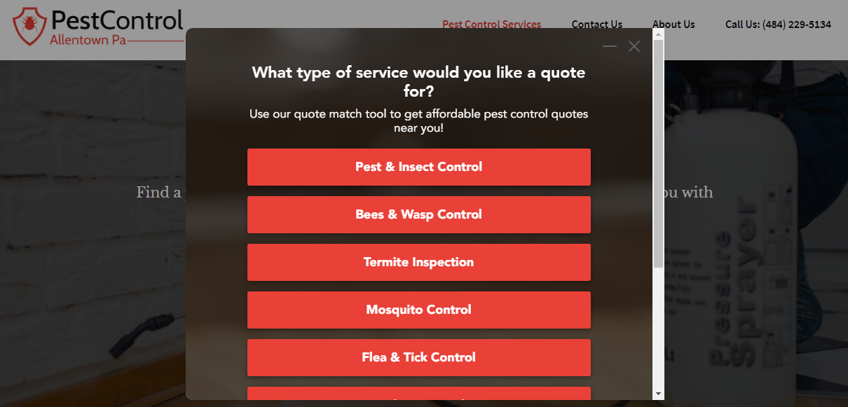
Check out this pest control multi step form example here:
The key thing here is to keep the question simple and to lead the prospect on the path of fulfilling their desired outcome — to get a pest control quote.
Another thing to notice is that the copy on the thank you step is SUPER personalized.
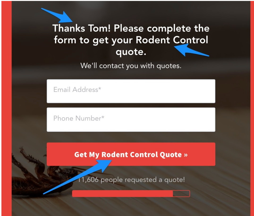
PestControlAllentownPa customized the CTA button with the exact service that the prospect is looking for, in this case it says, “Get My Rodent Control Quote.”
If the prospect had selected some other option such as Termite Inspection (on step #1), then the CTA would have said something like: “Get My Termite Inspection Quote.”
Personalizing your call-to-action buttons is a great way to boost conversions.
Here’s how to add personalization to your lead forms.
3) Agency: KlientBoost
If you run a marketing agency, then here’s a multi-step form example for you, coming by way of one of the leading PPC and CRO agencies out there — KlientBoost
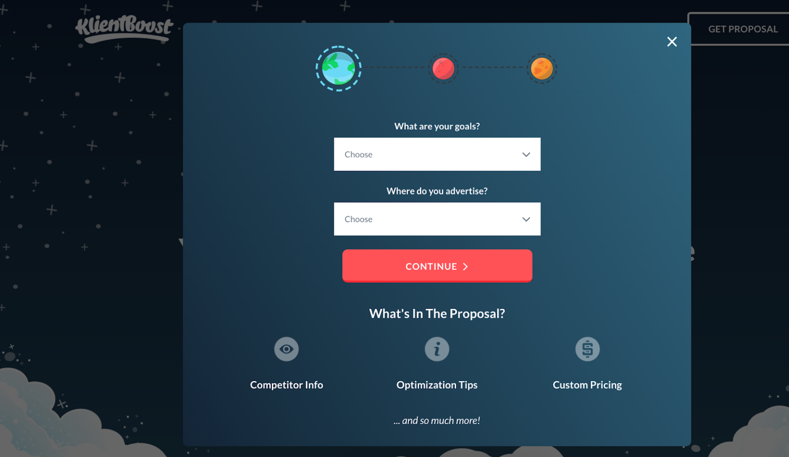
First, KlientBoost went out of their way to design a multi step form that matches their website’s branding.
By focusing on every pixel, it’s clear that KlientBoost cares about the details, which is so important for a PPC agency to highlight.
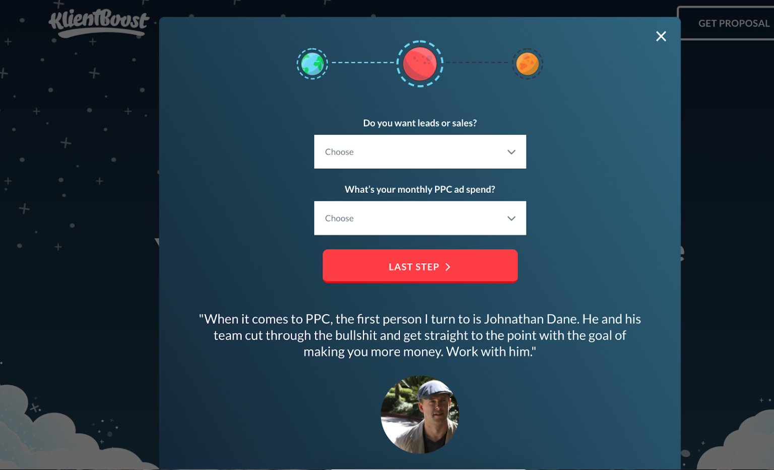
Second… notice the bottom of the form:

Remember the LIFT Model that we discussed in the first section of this post?
Well, KlientBoost has pretty much nailed the first part of the LIFT Model, the value proposition.
It couldn’t be more clear that by completing the form you’re going to get a custom proposal.
In addition to matching the branding of the form to their website, KlientBoost breaks each question into multiple steps, chunking the information so it’s less overwhelming to the prospect.
Nice job Klientboost!
4) Financial & Mortgage: Home Loan Analyst
If you’re in the financial industry, mortgage, or lending space then this multi step form example is for you, coming by way of Home Loan Analyst.

The thing that I really like about this form is the use of icons.
The icons really draw my eyes to the buttons.
As we start going through the form, we see that their team really optimized the UX of their multi step form design.
 I also love the slider in the screenshot above.
From a user experience perspective, it makes so much sense to use range sliders when asking for information related to currency and numbers.
You can design a similar multi-step form like the one above using LeadForms. Here’s a template to help you get started.
If you’re in the mortgage industry, here are some great mortgage landing pages examples to model.
5) Moving and Storage: Two Men and a Truck
If you’re in the moving industry, take note of this multi step form example coming by way of Two Men and a Truck.
With a $174K monthly Google Ads budget (it’s probably way higher), they really know what they are doing to drive leads.
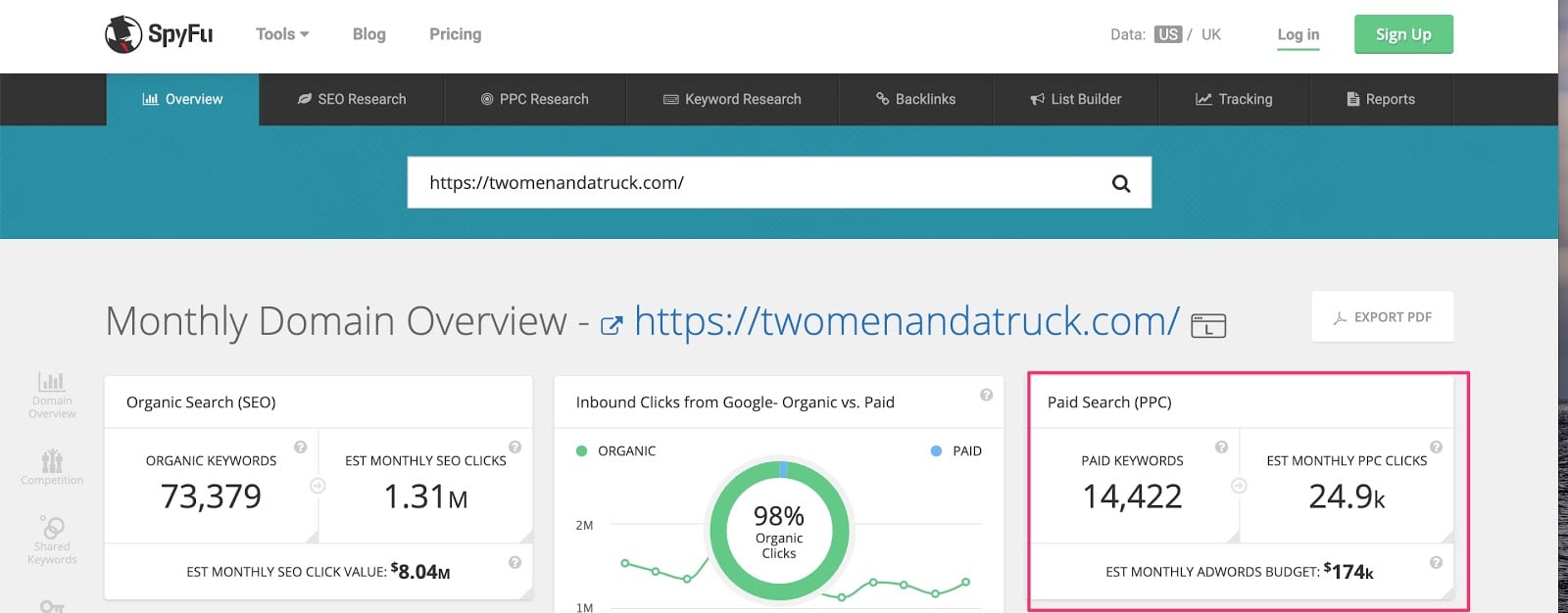
With so much traffic coming through to their site, the form can make or break the ROI from their PPC campaigns.
Here’s their multi step form:
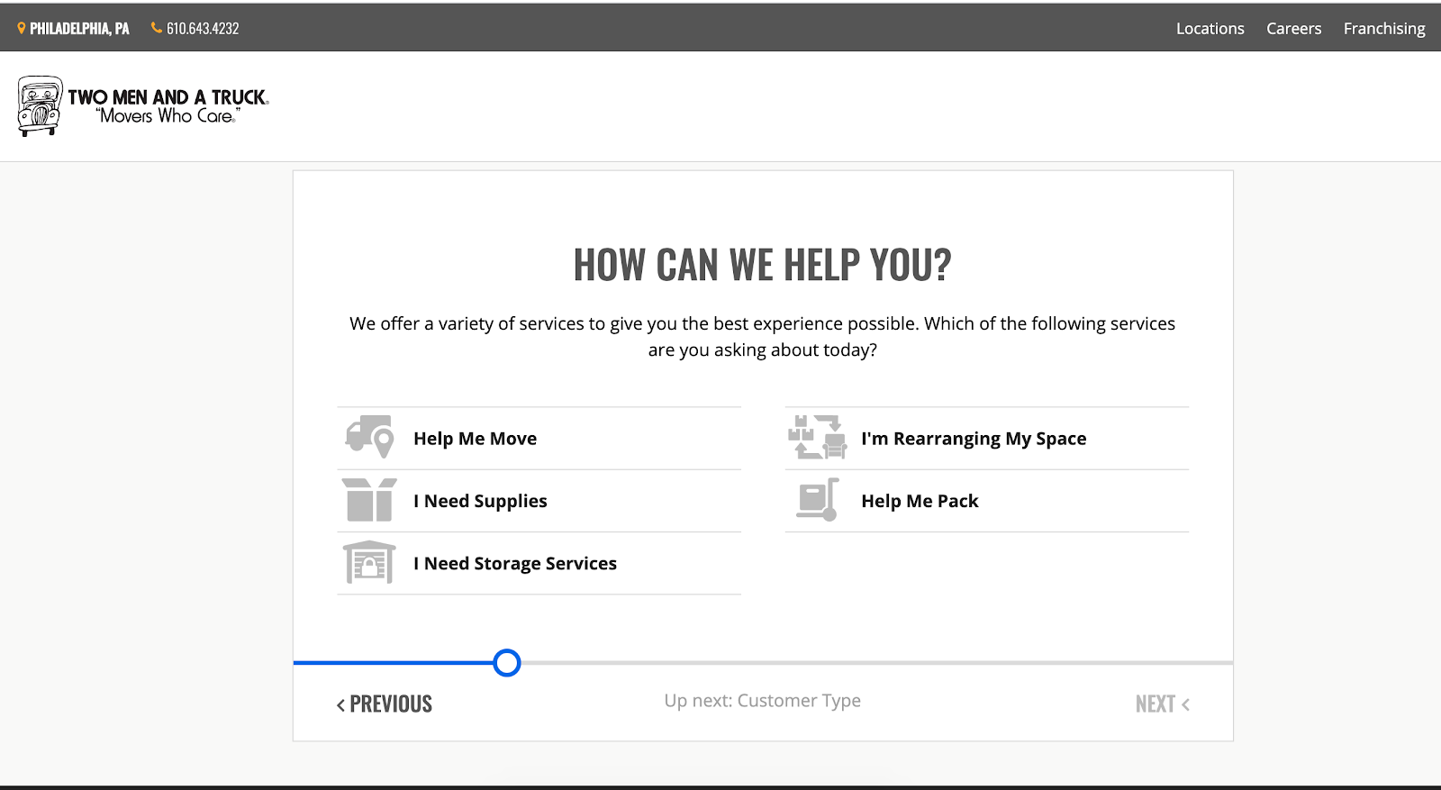
One thing that immediately stands out to me is that they asked for my favorite color.

Why did they ask this question?
I have no clue, but it did peak my curiosity.
My first thought was that the form design would change to use whatever color I entered into the ‘color field’, but after testing “purple” all of the accent colors remained blue. I’m not sure if this helps or hurts conversions, but it sure did act as a bit of a pattern interrupt.
Another thing that I like about this form is that they give the prospect an area to select their concerns.
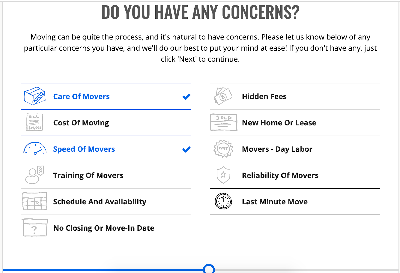
The data here can be used further down in the sales process to help ease any concerns that the prospect is having.
Another thing to note here is that Two Men and a Truck is not shy about using a long multi step form.
This form has a number of steps and asks for some very detailed information, such as my home address and the address that I’m moving to.
This is a great example of how using a multi step form isn’t always about boosting conversions. It’s also about helping sales and marketing teams get more data about their leads in a meaningful way.
At GetLeadForms, we have a similar moving form ready to go. You can Grab a template here and make it your own.
6) Insurance: GEICO
GEICO Insurance is popularly known for its great service…
And the GEICO Gecko who has probably sold more insurance than any human.

Image source
Rather than assuming what the prospect needs, the team at GEICO uses a multi-step form to have the prospect self-select, by starting with a very clear and logical first step: “What would you like to protect?”
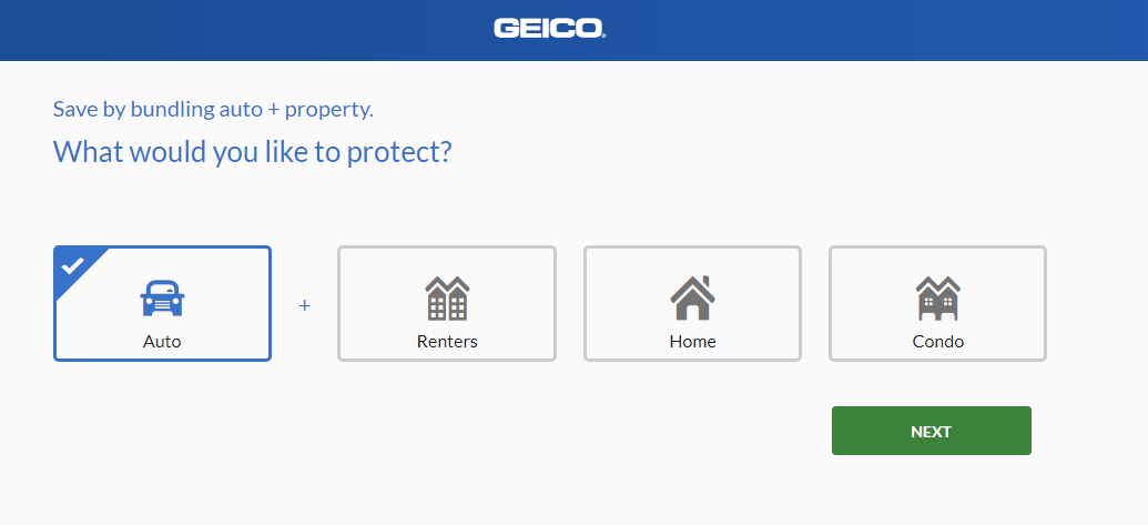
Next, the prospect is asked for his date of birth. However, there’s an incentive that gives them the chance to save an extra 15% on a 6-month auto policy.
What a brilliant way to encourage users to complete a step that’s probably met with a ton of friction and anxiety.
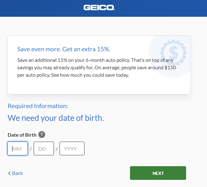
As you can see, this multi-step approach isn’t pushy at all. It’s quite subtle and very effective.
Up until this step, the prospect hasn’t submitted their email address. But they will at the final step.
Check an example of an insurance template here.
7) B2B SaaS: GetLeadForms
Multi step forms are a very powerful tool for SaaS companies. Especially when capturing leads for product demos and around pricing questions.
I could share a number of really good examples, but since we eat our own dog food at GetLeadForms so to speak, I just have to share an example of one area in our funnel where we use a multi step form — our pricing page.
GetLeadForms is mostly a self-serve product — meaning that the vast majority of our customers come to our site, see our pricing, and then sign-up and onboard themselves.
However, when evaluating conversions on our site with tools such as Google Analytics and Hotjar, I noticed that people come to our pricing page and usually have questions that I never anticipated answering on the pricing page.
In fact, I’ve noticed that if the average visitor can’t easily get an answer to their question, then they will typically abandon our site.
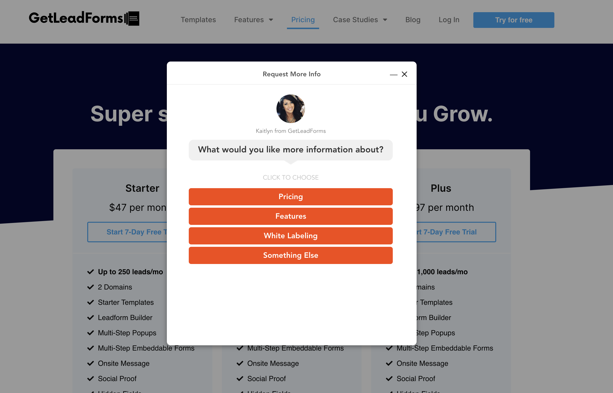
To give visitors an outlet to answer questions, I dropped one of our chat style multi step forms on our pricing page.
As you can see, it sits in the bottom right hand corner of the screen. Almost like a chatbot. This uses the “onsite message” feature of GetLeadForms.
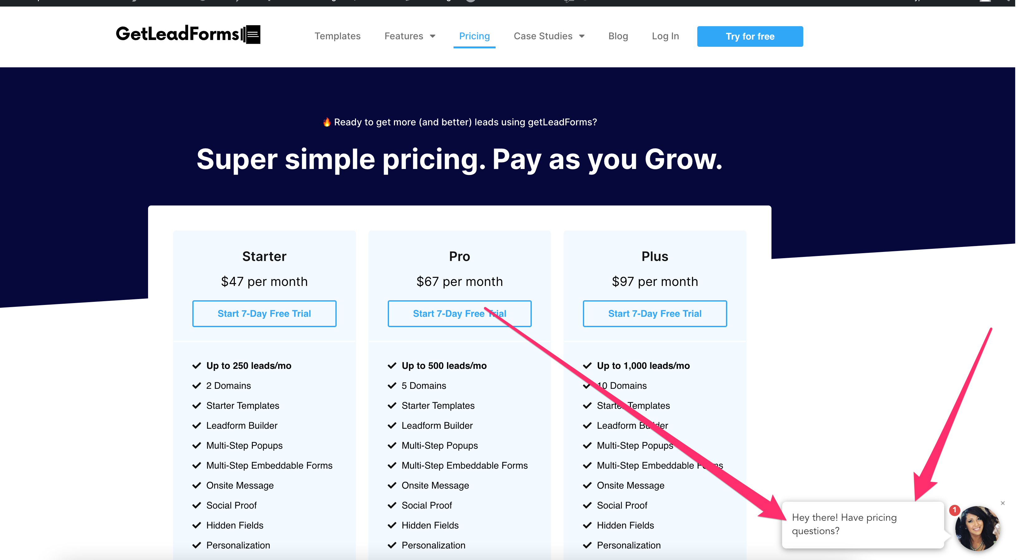
If someone has a question, then they simply click on the little message and the form opens on the screen:
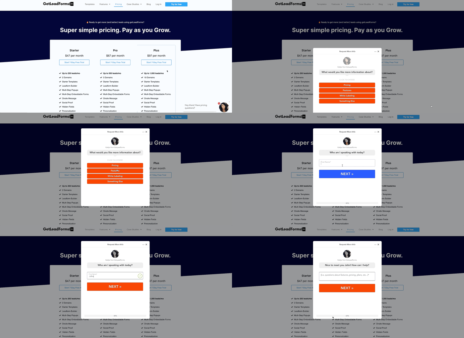
Our second, open-ended question really helps us understand what the prospect needs.
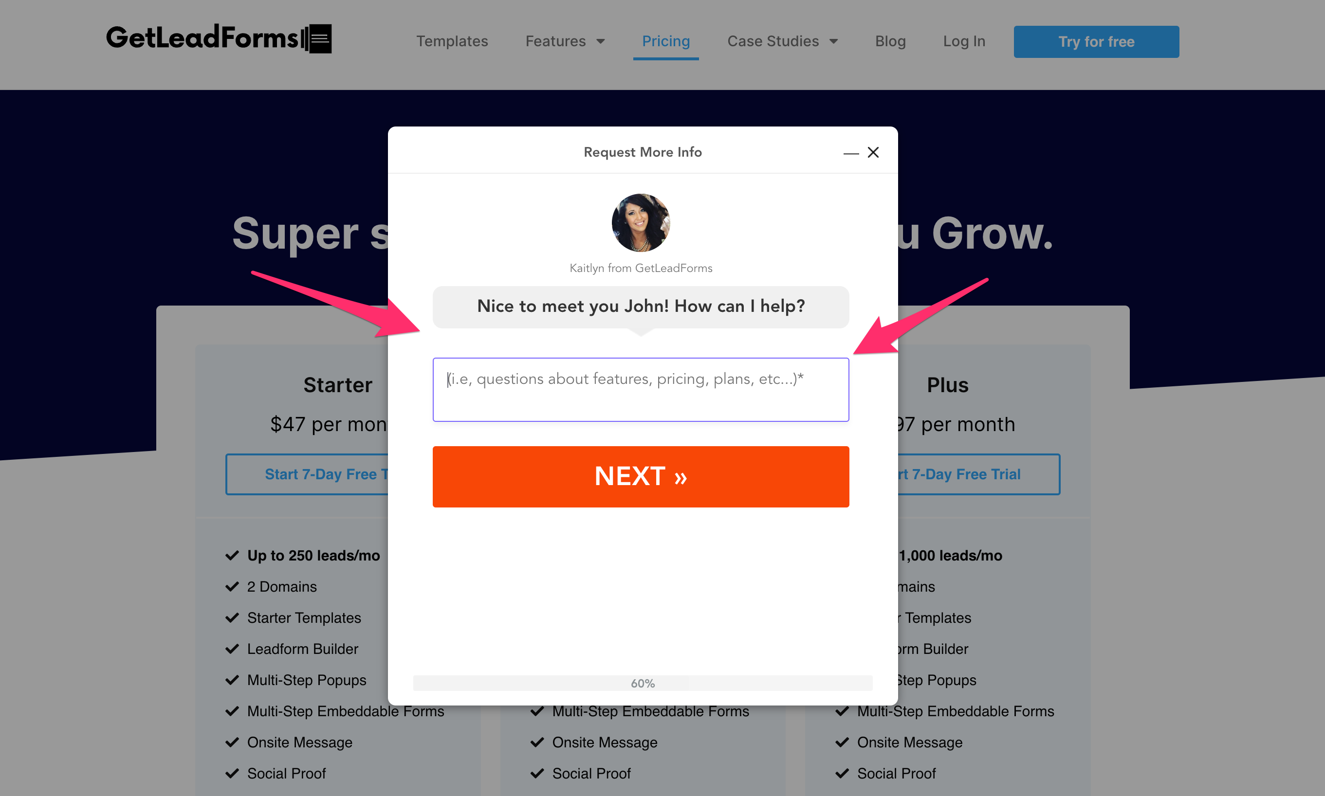
By asking the prospect to complete the form, we’re able to get additional information which usually saves us a step in the follow-up process.
So how is this performing? Check our our analytics for this form from a recent period of time.
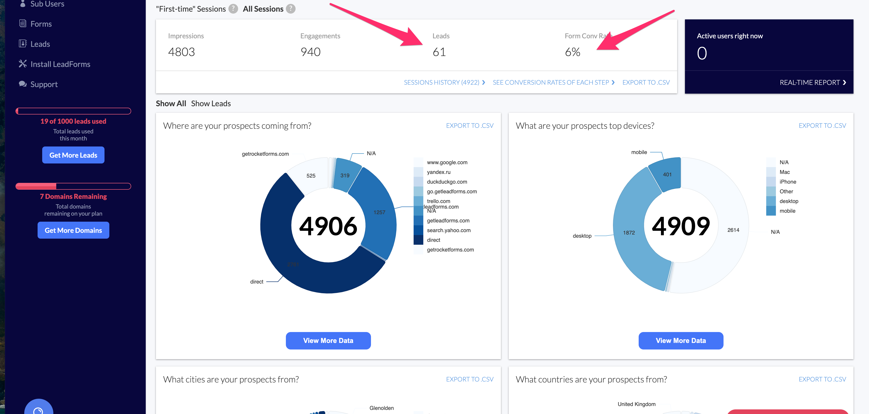
I pulled this data right out of the GetLeadForms platform. We provide pretty robust analytics around the performance of our customers’ multi step forms so they know what’s working and what’s not.
In just a short period of time, 61 leads and a 6% conversion rate.
Imagine if these people had questions and left because they couldn’t find a way to contact us.
In many cases, that would be lost revenue.
In addition, we field a number of great questions, which have helped us during the sales process and has been used in our marketing and support content.
To help capture the responses I always like to push my leads right into my HubSpot or ActiveCampaign accounts.
Bottom line: Add a form to your SaaS pricing page. I don’t even care if it’s a multi step form or a chat bot. Just put something there.
If you’re looking to drive more product demos and leads, then check out this template for B2B SaaS.
8) Legal Industry
If you’re generating leads for someone in the legal industry (personal injury, divorce lawyer, etc) then a multi step form is a great way to drive qualified leads.
Yes… Qualified leads is the keyword here.

Image source
If you’ve ever generated legal leads, then you know exactly what I’m talking about.
The last thing that any busy lawyer needs is to be wasting time with unqualified prospects.
And as marketers, it’s our job to get our clients the best leads possible.
That’s where multi step forms come into the picture. They not only boost leads, but these interactive forms also help with lead qualification.
Plus, arming attorneys with the information that they need makes them look super smart when they get on the phone with a client.
One of my favorite examples comes by way of a GetLeadForms customer and leading PPC agency, Ignite Visibility.
To respect their client’s privacy, I unfortunately can’t share too much about their exact landing page and form. But it’s somewhat similar to the example below.

The key thing that I can point out is that they use this friendly-looking chat style form to drive qualified leads for their client.
The nice thing about this form is that it comes across as super friendly, almost like a live chat. However, it doesn’t require their client to sit there and respond to every customer.
Ignite Visibility uses a similar form to the one in this example, and the results are impressive. You can read the case study here.
9) Home Security (ADT)
The year that my son was born I turned into a super paranoid father and went on a home security kick, despite having a ferocious Pomeranian…

Meet Mozzie, he’s sleeping on the job…
Isn’t he terrifying?
All jokes aside, I knew that my dog wouldn’t be enough to protect my family, so I jumped onto Google and started price shopping home security systems.
I was very impressed with the “get a quote” form by ADT Security Alarm Systems.
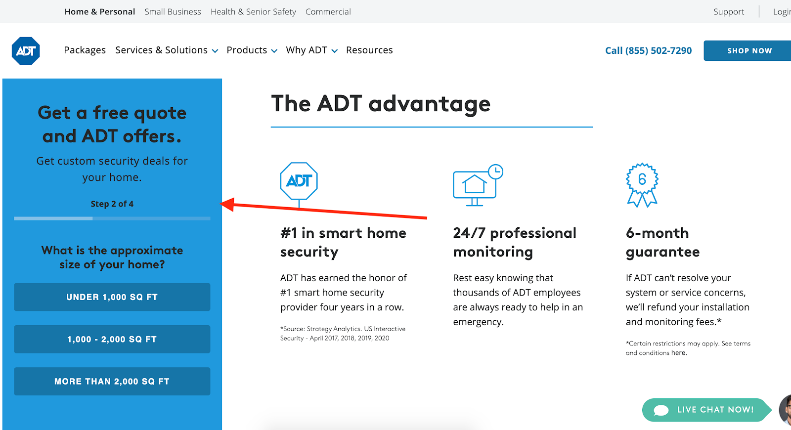
Being a 30 something millennial, the last thing that I wanted to do was pick up the phone and call someone.
So I completed their sleek multi-step form.
Minutes later, I received a follow-up call from a friendly sales rep.
Shortly after that, I was a new customer of ADT.
What I like most about their form is how ADT’s web team seamlessly integrated it right into the page.
Also notice how ADT asks for specific information such as, “What is the approximate size of your home?”
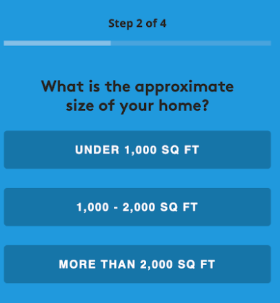
The question above seems basic, but it’s a key question to helping the sales team understand the opportunity size. This is because bigger homes tend to spend more money with ADT.
Oddly enough… out of all of the home security sites that I checked, ADT was the only company that made it super easy for me to request more information using a multi step form.
And their lead response time was AMAZING.
Now, as you were reading this article you may have found yourself wondering…
how can I build a multi step form just like these examples?
The solution…
Use A Multi Step Form Template To Help You Get Started
Here’s the thing…
To build a really good, high converting multi step form like some of the examples above, you don’t need to re-invent the wheel by going out and hiring a developer or coding a multi step form yourself.
In fact, we don’t recommend that. It can be very time consuming and costly to build your own multi step form. There’s backend coding, frontend, UX/UI, security considerations, email deliverability of lead magnets, then with every single change that you’d like to make, you need to do more dev.
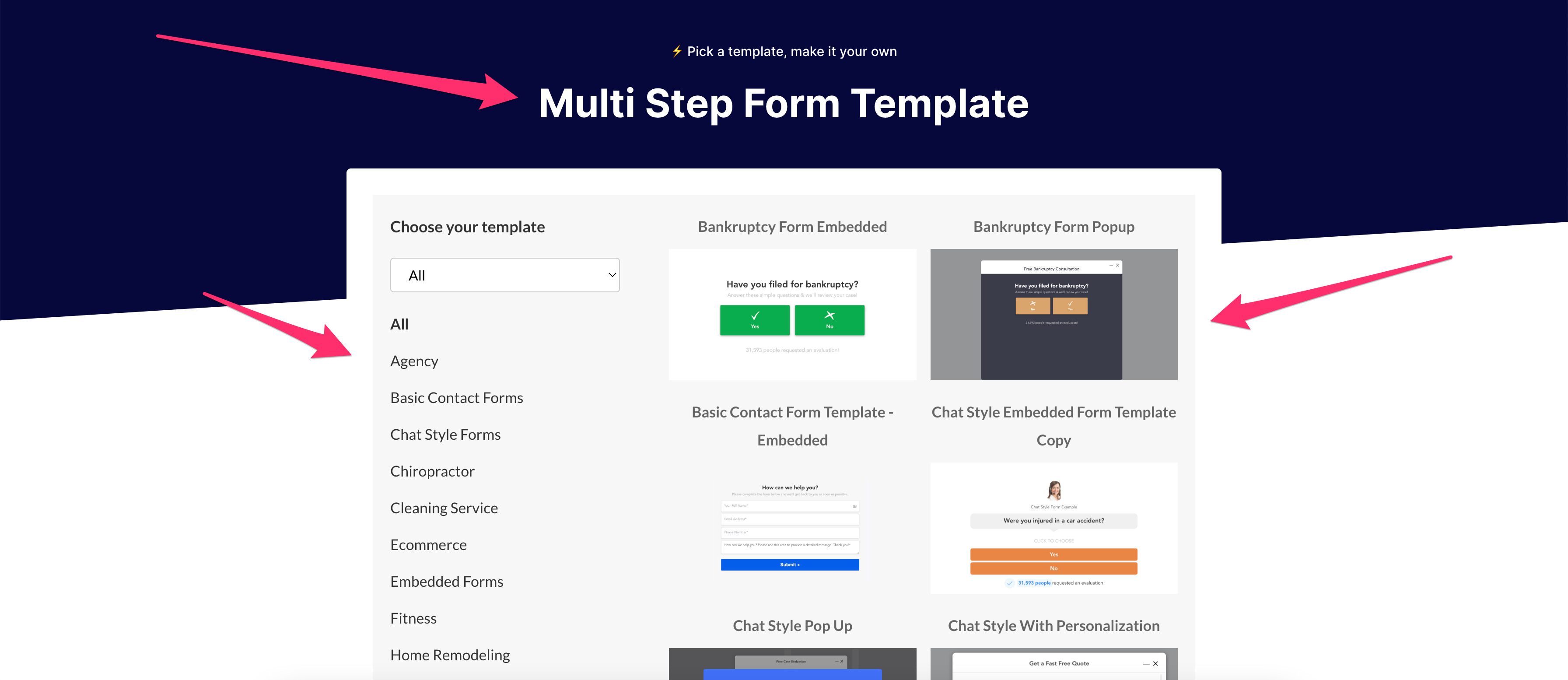
For this reason, we suggest starting with a multi step form template. Here are a bunch of templates, across dozens of different industries to help you get started.
Check out these multi step form templates
How to Build Your Own Multi Step Forms
As you can tell, a multi step form is a super effective lead generation tool.
But these smart, interactive forms aren’t always easy to build.
From question selection to form design, it can be quite a challenge to get it right.
Hopefully, the examples that I provided throughout this post gave you some inspiration.
If you need help along the way check out GetLeadForms’ multi step form builder. I built GetLeadForms to make it ridiculously easy to build your own multi step forms, without needing to code or hire a tech team to do it for you.
Simply pick a template, and make it your own.
Sign up for a GetLeadForms account. There’s no credit card required during sign up.
Need inspiration or want to see some more examples of multi step forms in-action? View our starter templates.
Ready to capture more leads?
Build and optimize high-converting lead funnels, quizzes, and forms with AI-powered lead capture software.
Start Free Trial