No-Fluff Advice: How to Build a Lead Generation Website That Converts
In this post, I’m going to provide some no-fluff, no-BS advice about how to build a lead generation site that actually converts.
In this post, I’m going to provide some no-fluff, no-BS advice about how to build a lead generation site that actually converts.
I’ll admit, there’s an overwhelming amount of information on this topic. Just Google “how to build a lead generation website” and you currently get 342 million results!
And while many of the posts look pretty good, from a high level, most are fairly generic, spouting “X ways to build a lead generation website,” or something similar.
What’s lacking, however, is practical nuts and bolts advice on what it truly takes to build a high-converting site.
That’s why in this post, I’m going to cut straight to the chase and give you actionable, no-fluff advice on how to build a lead generation website that actually converts your visitors into leads based on what I know has worked.
And if you’re looking for helpful tools to get your site set up, I’ll share those toward the end.
Why am I qualified to talk about this subject?
Well, when it comes to turning your website into a lead-generation machine, I definitely know a thing or two. I got my start in online marketing over 15 years ago and since then I’ve created my own lead capture software called GetLeadForms, which has helped marketers generate millions of leads. You can signup for a free trial here.
Let’s not waste any time and jump right in.
Building a high-converting lead generation site starts by understanding this one thing…
Your Website Exists to Generate Leads
When it comes to generating inbound leads, your website is everything.
If it’s not set up to convert, then leads will slip through the cracks. There’s no way around it.
One of the most common mistakes that I see is making the conversion flow an afterthought.
Many make great-looking sites, offering intuitive navigation, a smooth user experience, and plenty of helpful information.
But they fail to put a strong focus on lead generation and the subsequent conversion of those leads.
In turn, they fail to generate the number of leads that they want.
It’s essential to remember that the entire purpose of building a lead gen site is to generate leads.
That’s the sole reason your website exists.
It sounds like a no-brainer, but you’d be surprised how many people overlook this.
So right from the start, you should have this mentality baked into your thought process and approach, as it will help lay the foundation needed to thrive.
One other thing I’d like to point out is that too many businesses try to either get too creative with their branding or don’t put enough time and effort into it.
Here’s an example of a pest control company that falls short in this department.
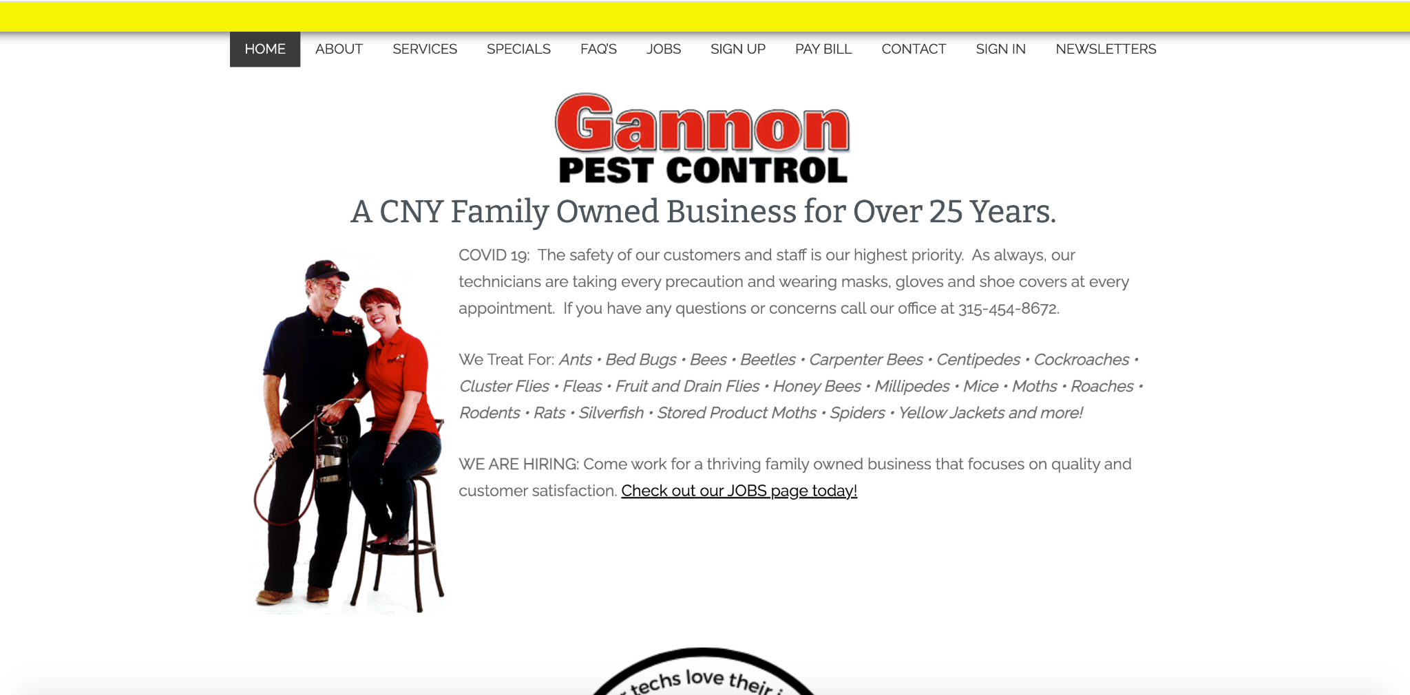
When I land on their site, I don’t know what’s going on. They’re telling me that it’s a family owned business and they are talking about COVID in the intro.
But there’s not much to differentiate them from competitors, and I don’t see a CTA above the fold to get in touch with them.
There’s a “Contact” option in the menu, but it gets lost in the shuffle, and I can only assume this is taking a toll on their conversions.
All that I went to do is click on the ‘back’ button to go back to my Google search.
On the other hand, here’s a lead gen site that I built, which does a great job establishing a strong brand identity and features a can’t-miss CTA, urging visitors to “Get a Fast Free Quote” above the fold.
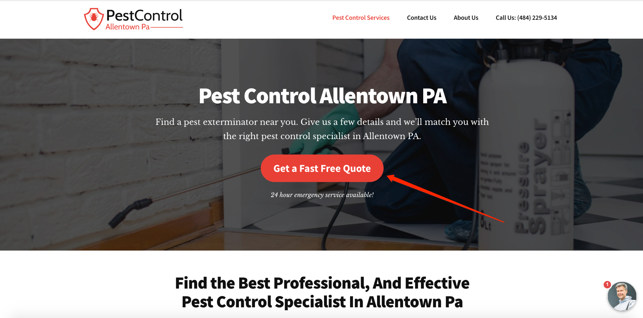
This site also includes a lead form in the lower right-hand corner which someone can click on at any time to get a free quote.
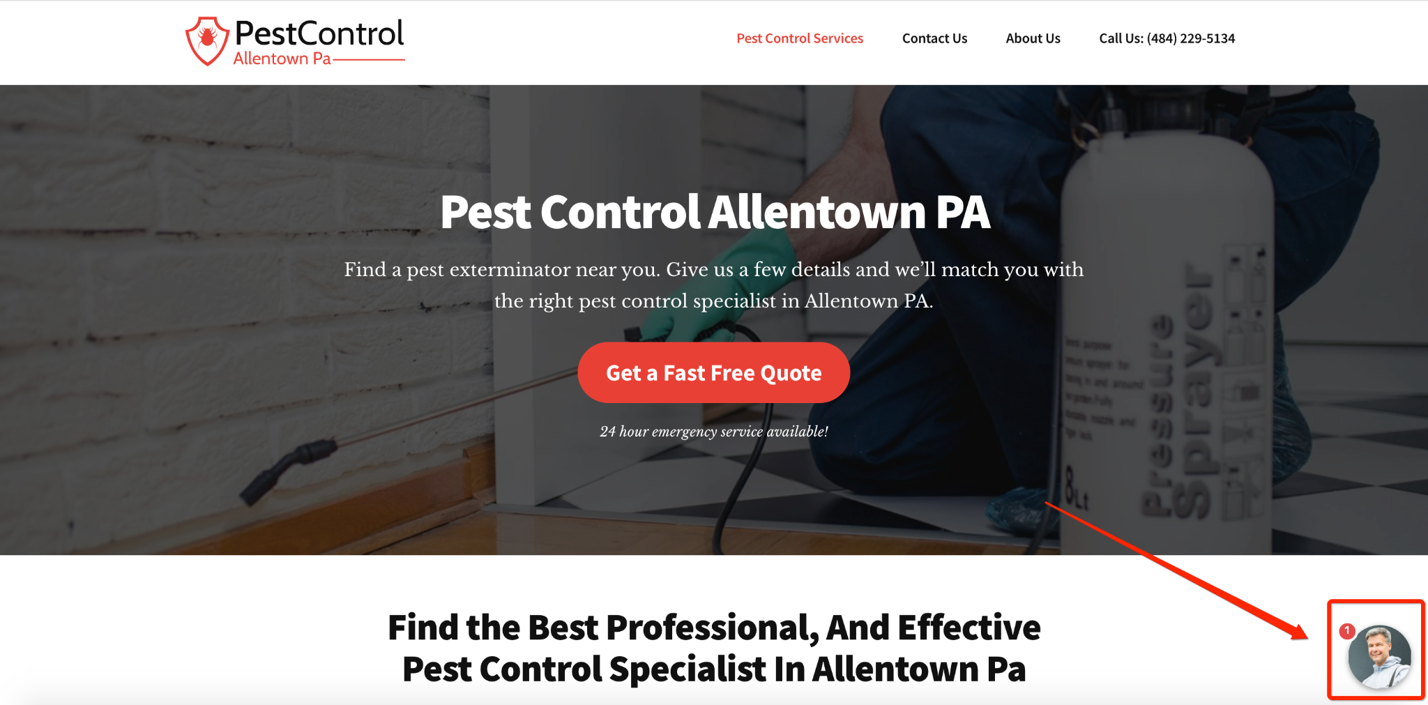
Once opened, it presents the prospect with a multi-step form that they can fill out to ensure that the prospect gets routed to a lead buyer, which in this case is a local pest control company.
There’s enough info to connect with the reader, rank for important keywords, and bring attention to the CTA.
But at the same time, it’s not obnoxious with forms popping up all over the place.

GIPHY
This makes it one of the best lead generation website examples to draw inspiration from.
Your Website Must Clearly Answer These 5 Questions at a Minimum
No matter what industry you’re in and the services you offer, there are five essential questions your website must answer to effectively convert leads.
- Who are you?
- What do you do?
- Who do you serve?
- What are the benefits of doing business with you
- Who else trusts you enough to do business with you
Fail to answer one of these questions and your conversion rate will drop.
Let’s dive into each below in more detail:
1) Who you are?
A visitor shouldn’t have to dig around your site to find out what you’re all about.
An effective lead generation site gets straight to the point so a visitor knows exactly who you are with just a glance.
Mr. Roofer of Atlanta is a great example of how to build a lead generation website for local services with their crystal clear header above the fold.

2) What do you do?
What specific services do you offer?
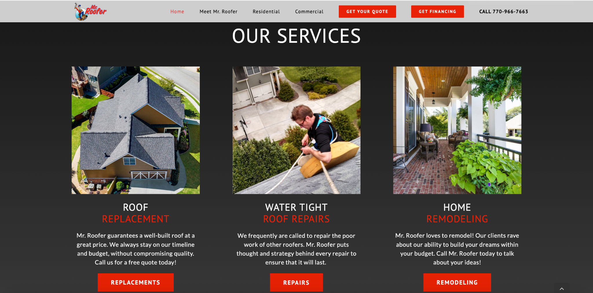
Mr. Roofer of Atlanta, for example, offers roof replacement, watertight roof repairs, and home remodeling.
If you want to go the extra mile, then I highly suggest weaving your services into your Lead Form like in this example:

By showing your services in your lead form you’ll boost conversion rates and lead quality too! You can grab this template here.
3) Who do you serve?
Who’s your audience/demographic? What specific areas do you serve?
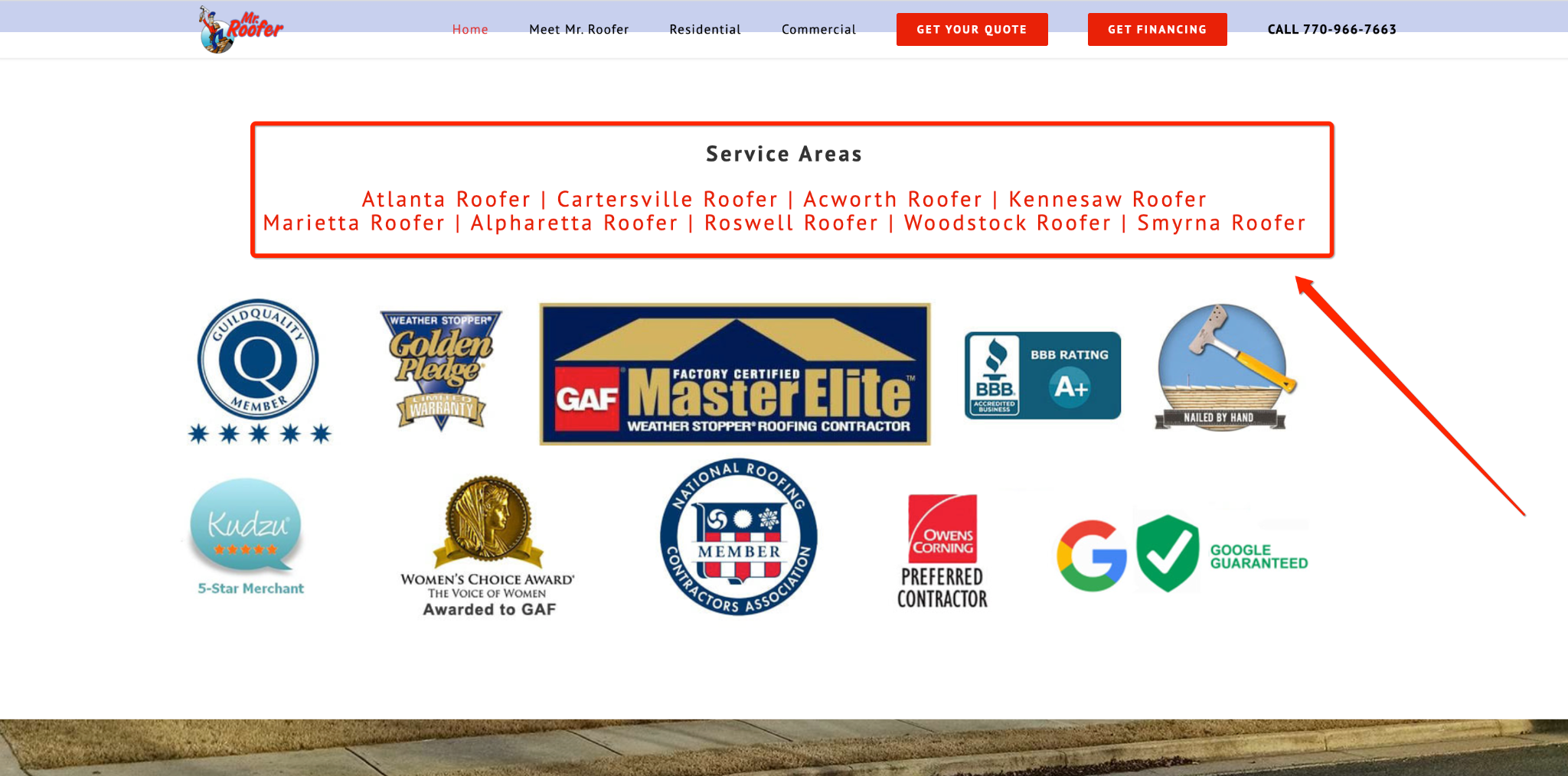
Highlighting your key service areas is also really useful for SEO reasons.
4) What are the benefits of doing business with you?
What’s your unique value proposition (UVP)?
What do you bring to the table that the competition isn’t?
Why should a potential customer choose you over the competition?
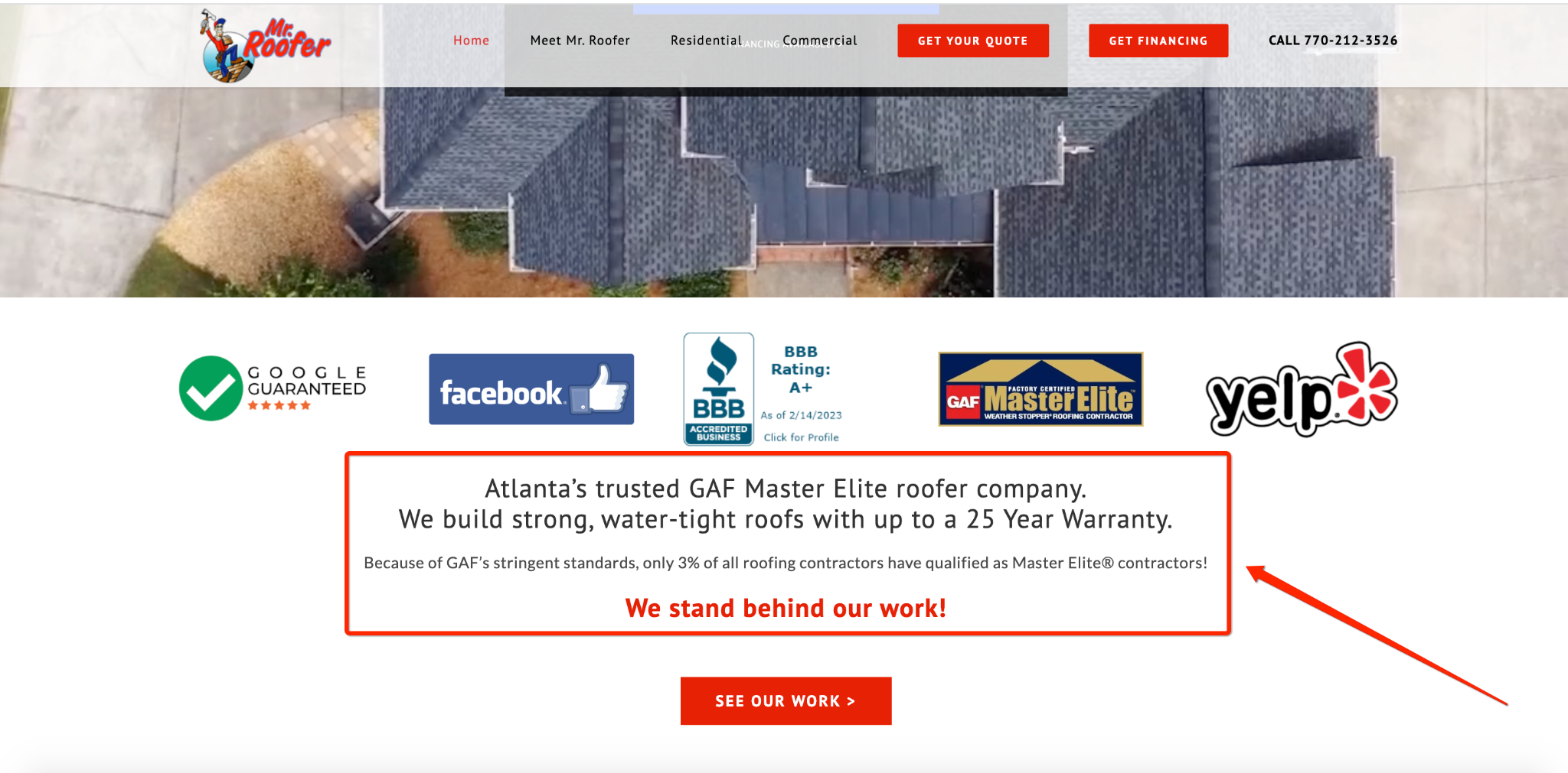
Again, Mr. Roofer of Atlanta addresses this head-on in their homepage above the fold.

They also dive into other unique benefits as a visitor scrolls down the page.
5) Who else trusts you enough to do business with you?
Today’s consumers are more skeptical than ever, so you need some form of social proof to validate your business.
This can include:
- Testimonials
- Case studies
- Business Credentials
- Industry accolades
Mr. Roofer uses testimonials here…
… and industry accolades here.

Pro tip: if you’re using a tool like GetLeadForms, then you can even add real-time social proof to the bottom of your forms to boost conversions.
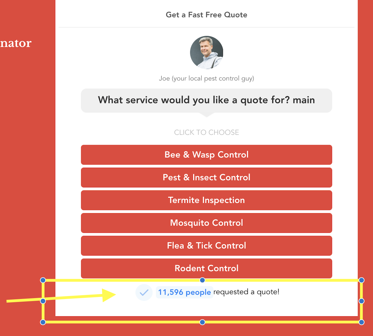
Grab this LeadForm with built-in social proof here.
Moving on to some more no-bs advice…
Give Value to Get More Leads
Put yourself in a visitor’s shoes for a second.
There’s absolutely no commitment to choose your business, and your competitors are just a Google search away.
So why should they fill out your contact form and submit their precious contact information?
A big part of generating qualified leads that ultimately convert is to think of it as a value exchange.
What sort of value can you give someone early on to motivate them to contact you and enter into your sales funnel?
Examples include:
- A free consultation
- A free quote or estimate
- A website audit
Active Pest Control offers value by giving visitors $50 off their PestFree365+ residential package.
A visitor simply provides their contact information and can claim the offer.
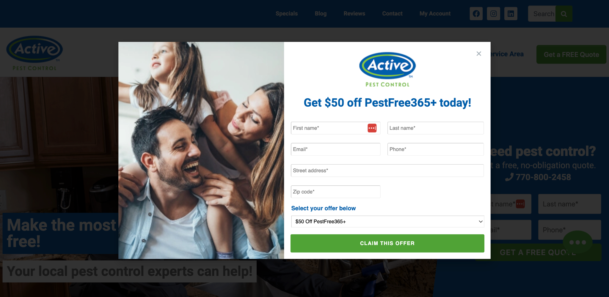
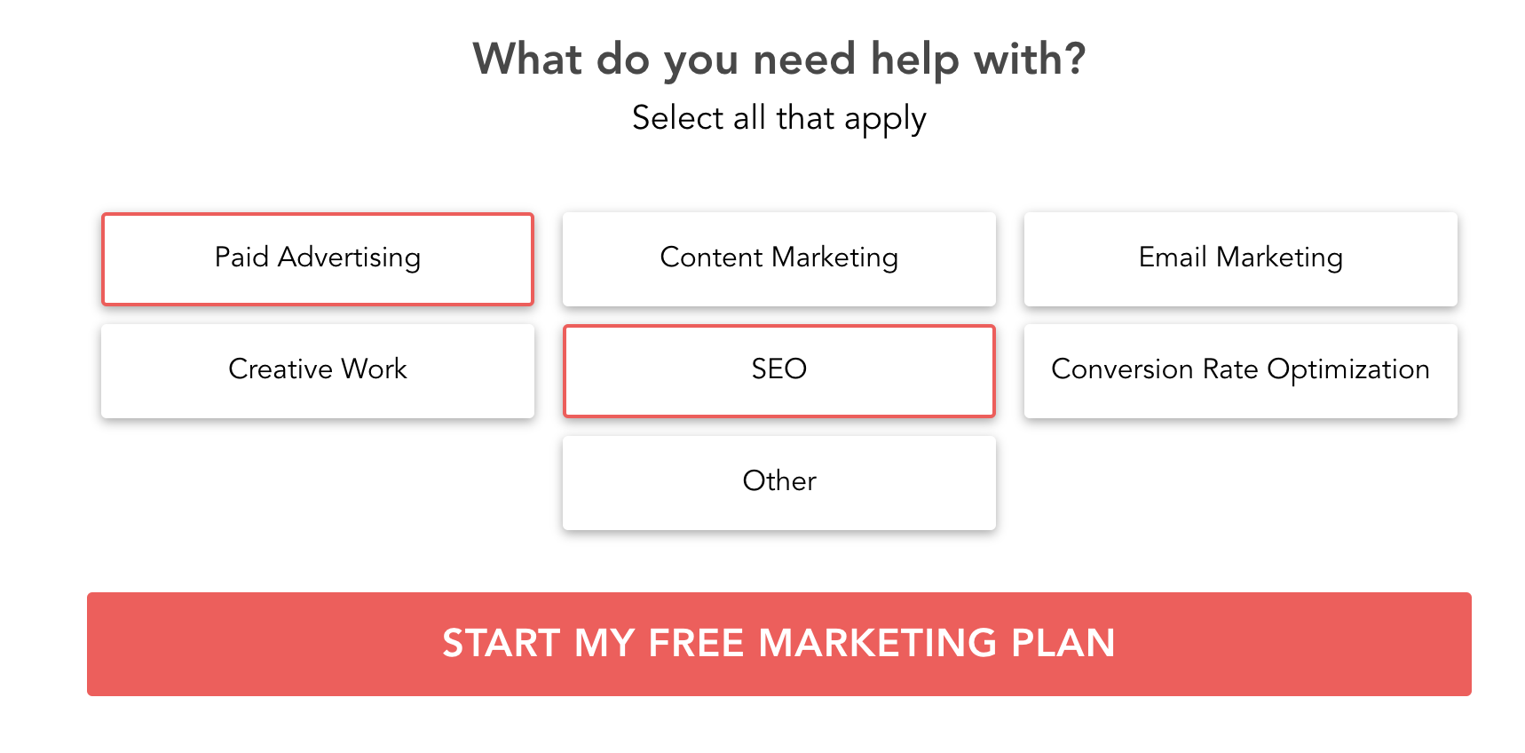
By providing value early on, you can significantly increase the number of visitors who take action, thus maximizing your qualified leads.
For example, with this agency form, we recommend offering a consultation or marketing plan based on the prospect’s response.
This brings me to my next point.
Use Multi-Step Forms to Increase Conversions and Improve User Experience
Whether you’re offering a free consultation, quote, or any other type of incentive, you need to get a lead to fill out a form.
But that’s easier said than done, especially if it’s a long single-step form that looks like this.
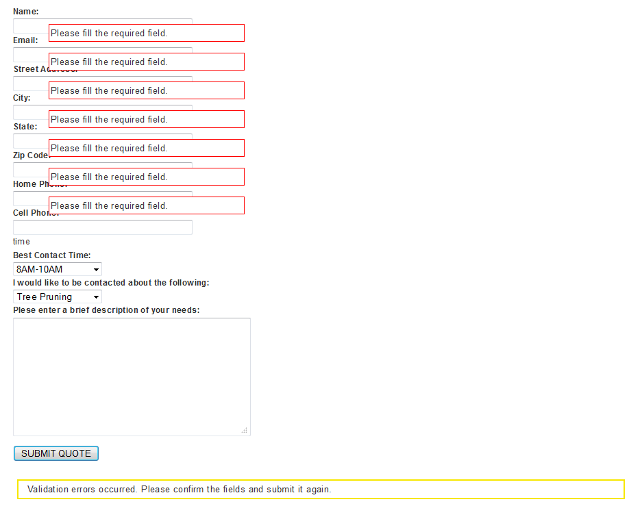
Not only does it look ugly, but it can also feel overwhelming to many visitors, resulting in cognitive overload.

Source: GIPHY
When visitors get confused, you get higher bounce rates and fewer leads.
But by switching the outdated single-step form with a multi-step form, you can instantly improve the user experience and, in turn, increase conversions.
Rocket Mortgage is one of the best mortgage lead generation website examples I’ve seen and flawlessly uses a multi-step form to gather lead information and direct them to the right place.
First, Rocket Mortgage has two simple, straightforward CTAs above the fold on their homepage, showing visitors where to apply for a home purchase or apply for refinance.
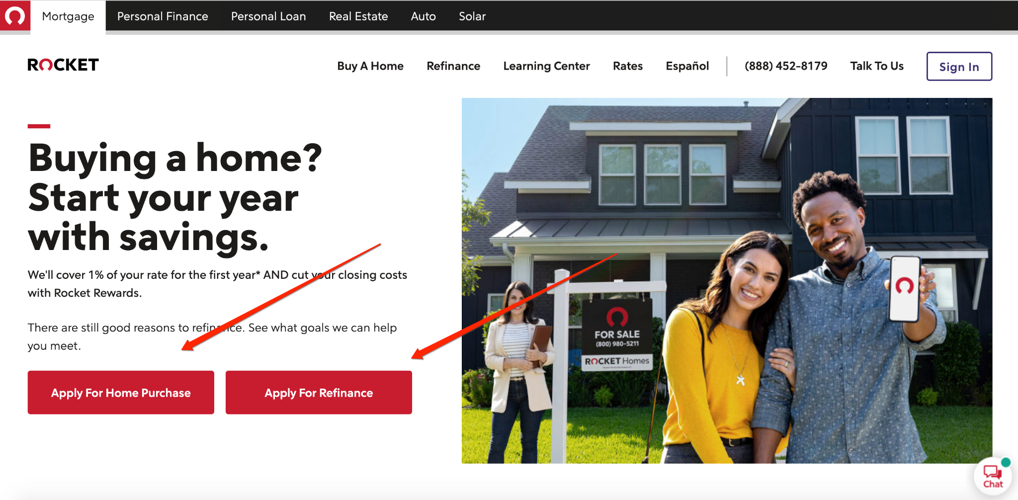
Let’s say someone is interested in applying for a home purchase.
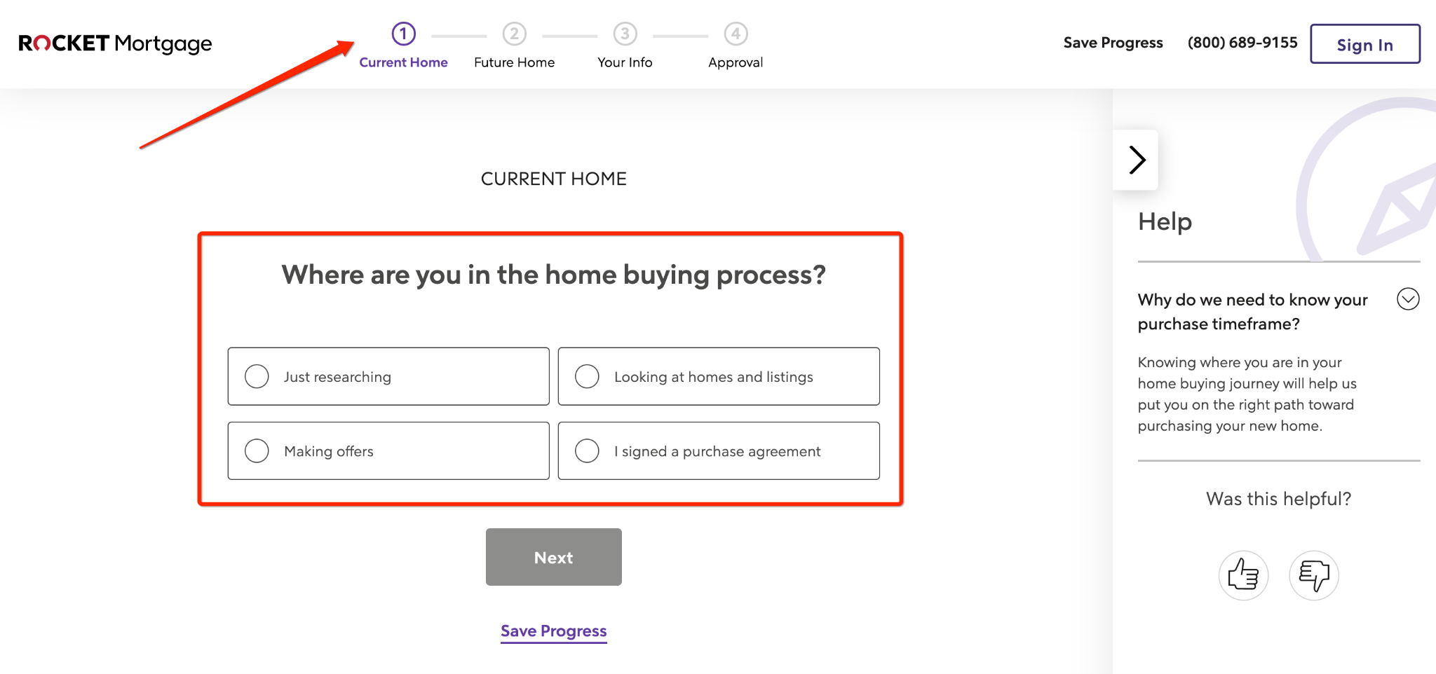
After clicking the link, they’re taken to this multi-step form which starts by asking them where they’re currently at in the home-buying process.
Also, notice at the top, Rocket Mortgage shows which stage they’re at in the form for quick reference, which is a nice touch.
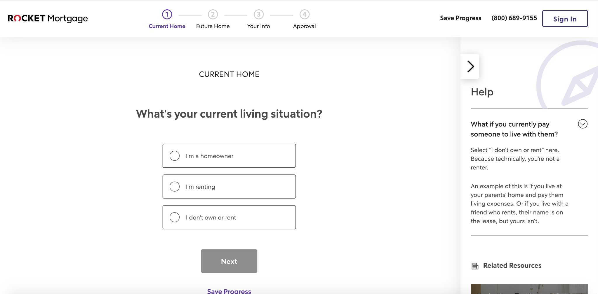
After answering the first question, the visitor moves on to the next question which asks what their current living situation is.
This continues until Rocket Mortgage has the necessary information needed to point a lead to the right team member.
With our Rocket Mortgage Example template, for instance, you can ask a sequence of customized questions just like Rocket Mortgage does to seamlessly move a visitor through a form while creating an A+ user experience.
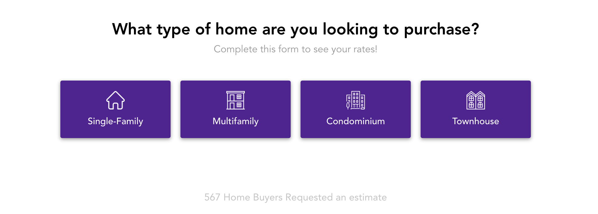
If you’d like more multi-step form examples, you can find nine of my favorites here.
These multi-step forms also work great for the insurance industry. If you’re looking to build an insurance lead generation website then check out this post.
Don’t Just Create a Lead Gen Site That Captures Leads. Qualify Leads Too.
Capturing leads is obviously important and an essential first step in the process. But it’s not the ultimate goal.
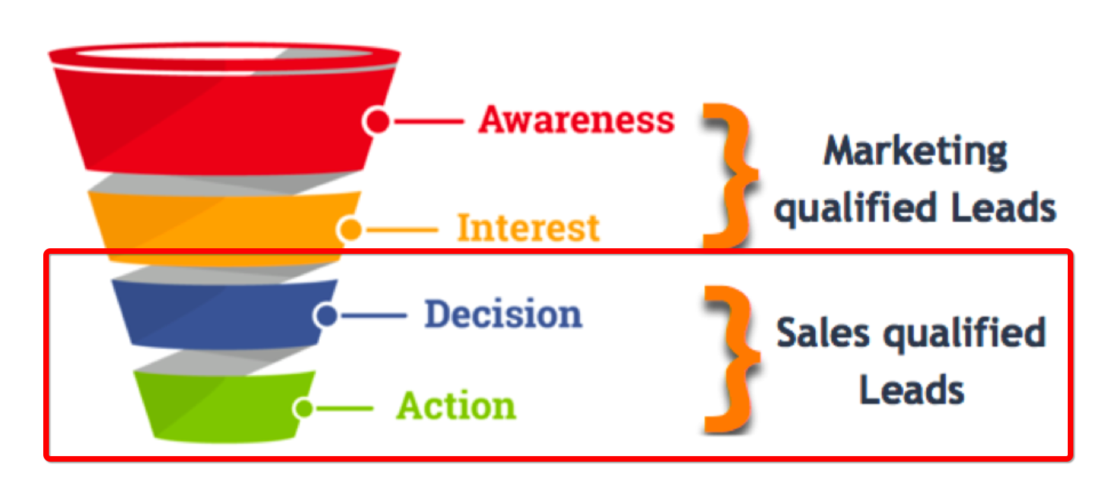
The ultimate goal is to qualify leads to ensure you’re only reaching out to sales-qualified leads who are at the decision or action stage of the sales process.
As for marketing qualified leads that aren’t yet ready for the sales conversation, you’ll want to spend time nurturing them until they are ready.
One of the best ways to do this is with a multi-step form.
Here’s an example of how a personal injury lawyer could do this with a lead generation website template.
First, they would start with a basic question like “Were you injured in a car accident?”

If the visitor answers yes, a relevant next question like “Did you go to the doctor?” pops up.

This continues until the attorney has the necessary information to qualify a lead.
From there, they can begin outreach with sales qualified leads and nurture marketing qualified leads to drastically raise conversions.
For more great examples of top lawyer landing pages, check these out.
Don’t Overwhelm Website Visitors
One way many businesses shoot themselves in the foot when they build a lead generation website is by getting too aggressive.
They take it too far where they treat their website like a lead generation machine to the point that it becomes obnoxious with annoying chatbots and popups beating visitors over the head the moment they land on a page.
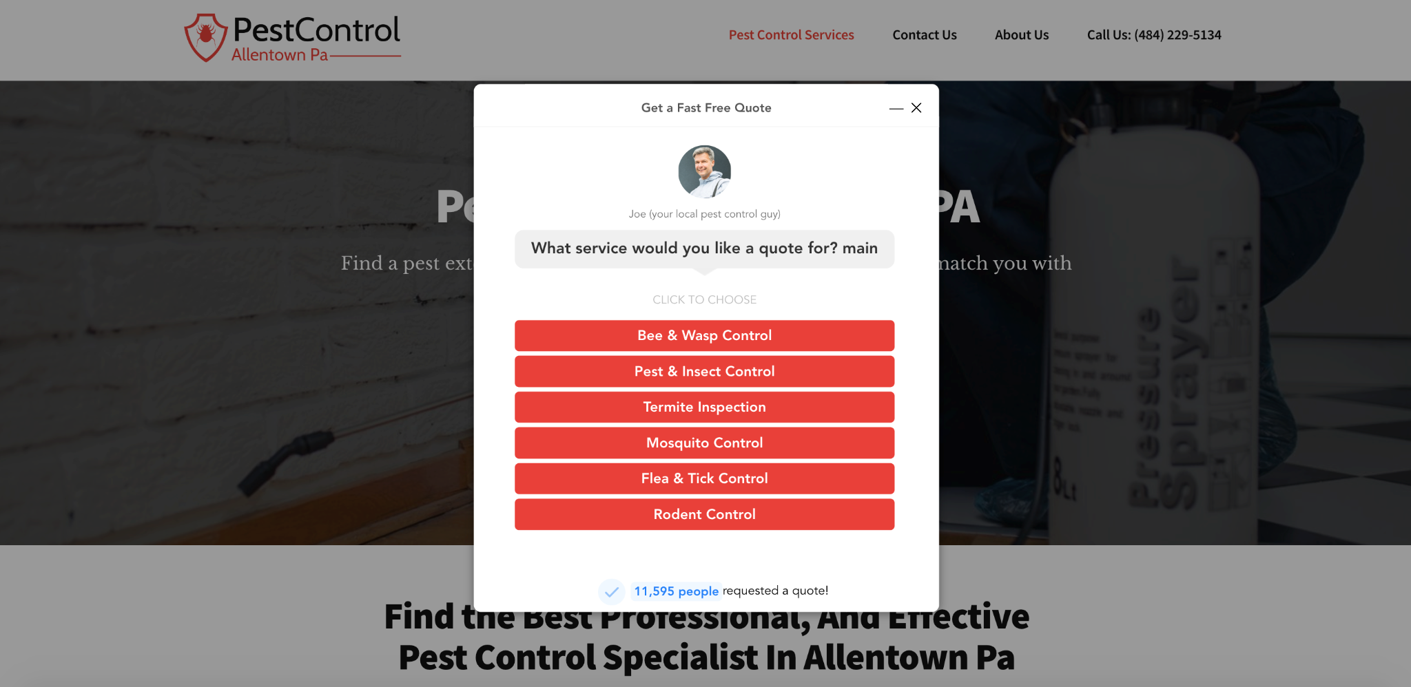
For instance, as soon as visitors land on this pest control company’s website, they get hit with this popup that doesn’t even apply to a large portion of the audience.
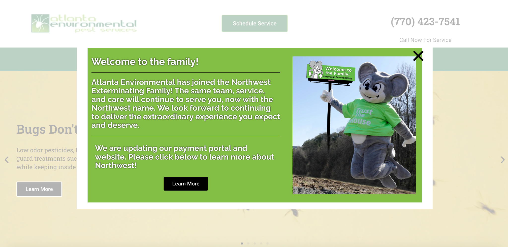
And to make matters worse, it just looks ugly and has an unprofessional feel to it.
While popups can be incredibly helpful for increasing conversions when used responsibly (you can find an entire post I wrote about this here), you should be mindful of how long someone is on your page before you hit them with popups.
Be sure to give them time to consume your content before presenting them with an offer, with most experts suggesting waiting 15 to 60 seconds.
Always Be Testing Your Lead Generation Site to Maximize Results
Conversion rate optimization isn’t a one-off type of deal.
Just like with web design and marketing, it’s an ongoing process that goes something like this:
- Form a hypothesis
- Test it
- Look at the data
- Implement your findings to make key improvements
- Repeat
Having this mindset where you’re continually testing your lead generation site and making the necessary adjustments as you accumulate more data should ensure you’re always moving in the right direction and is the foundation of incremental progress.
Over time, your lead generation website can’t help but increase conversions, and at the same time, you’ll learn a lot about your audience.
Note that it’s not just about top of the funnel and immediate conversions. It’s also about optimizing the middle of the funnel so the entire process is airtight.
Recommended Website Lead Generation Tools and Software
Finally, a good lead gen site really comes down to having fast hosting, a great theme, and optimized lead capture forms.
To ensure you check all the boxes, you’ll need to have the right combination of website lead generation tools in your tech stack.
Here’s the tech stack that I personally use to build high-converting lead gen sites like Pest Control Allentown, PA.
Lead Capture Software & Multi-Step Forms: GetLeadForms
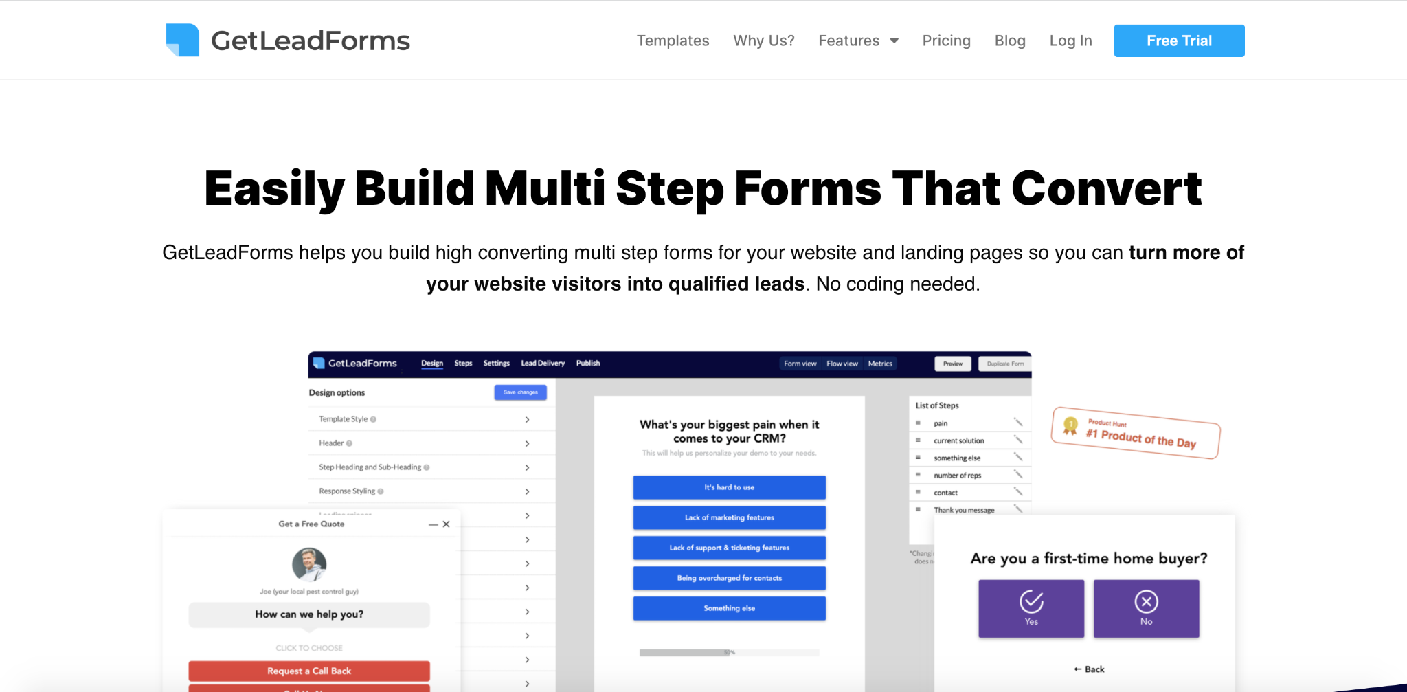
GetLeadForms has all the features you need to attract qualified leads, and more importantly, convert them.
Some of our top features for doing this include:
- A multi-step form builder
- Multi step form builder
- Form personalization
- Lead verification features
- Design customization
- Timed popups
- Built-in social proof
You can find a full overview of our features here.
CMS: WordPress
There’s certainly no lack of CMS options out there, but WordPress is one of the most popular for good reason.
It’s a simple, user-friendly lead generation website builder that allows you to create a beautiful-looking site without any development knowledge.
And it’s what I personally use in my tech stack.
Theme: Elementor
If you want to know how to build a lead generation WordPress site fast and easy with epic results, I suggest using Elementor.
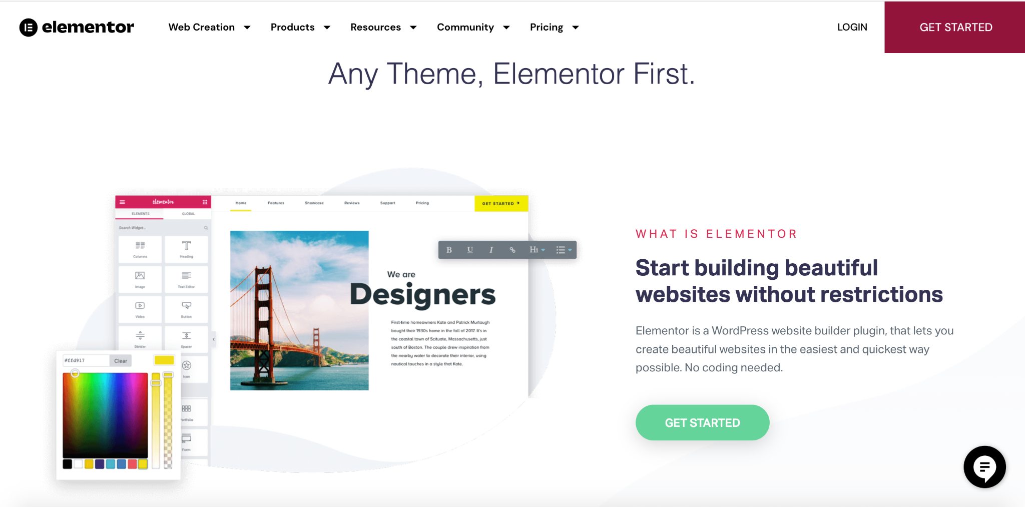
It’s a one-stop shop with over 150 professional templates, an in-depth design system, and much more.
Website Hosting: WPEngine
When it comes to hosting, WPEngine is my favorite because it’s fast and reliable, with multiple pricing options to accommodate businesses of all sizes.
Landing Page Tools: Unbounce
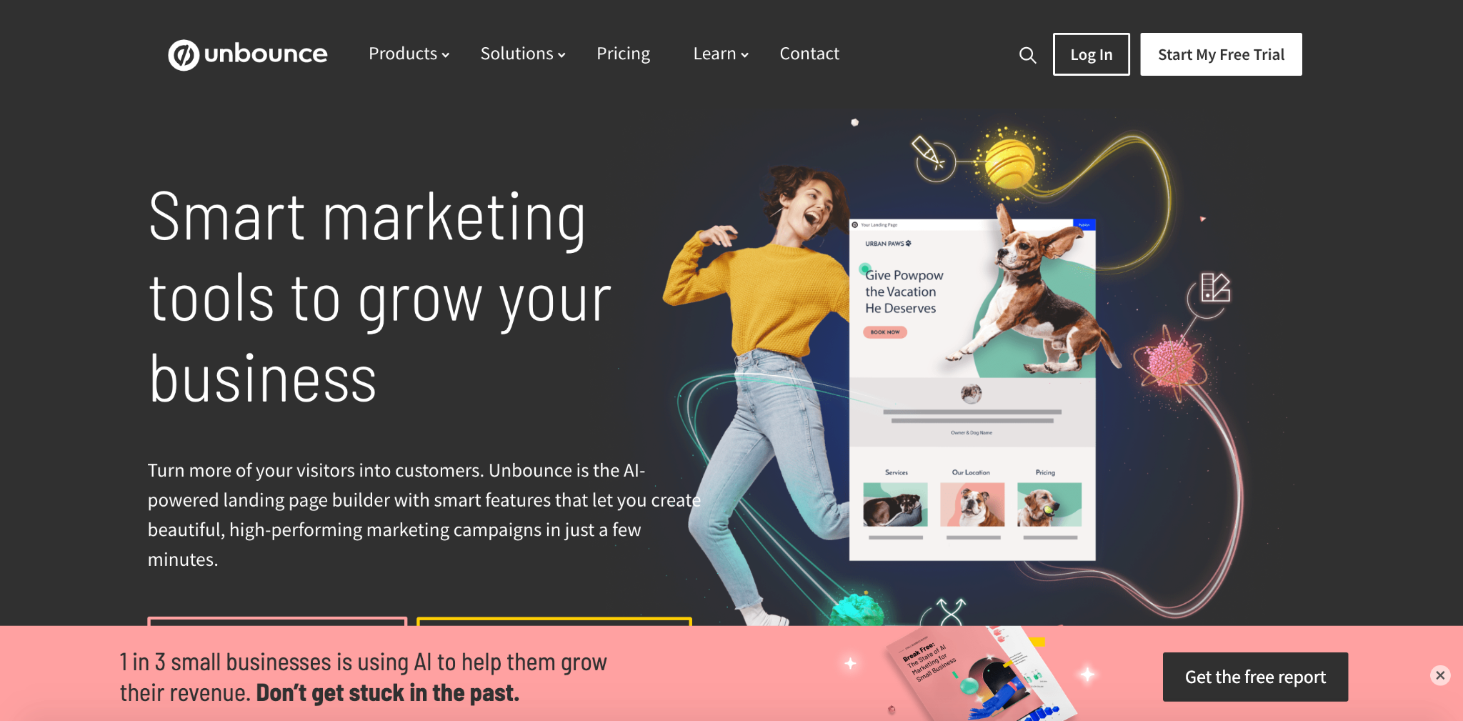
It goes without saying that creating great landing pages is vital to successful lead generation and conversion.
While there are a lot of solid products on the market, Unbounce is my favorite because of the robust solutions (it works for PPC, social media, email, and more), industry versatility, and customizable pricing to ensure you get exactly what you need and nothing more with simple scaling.
Call Tracking: Callrail
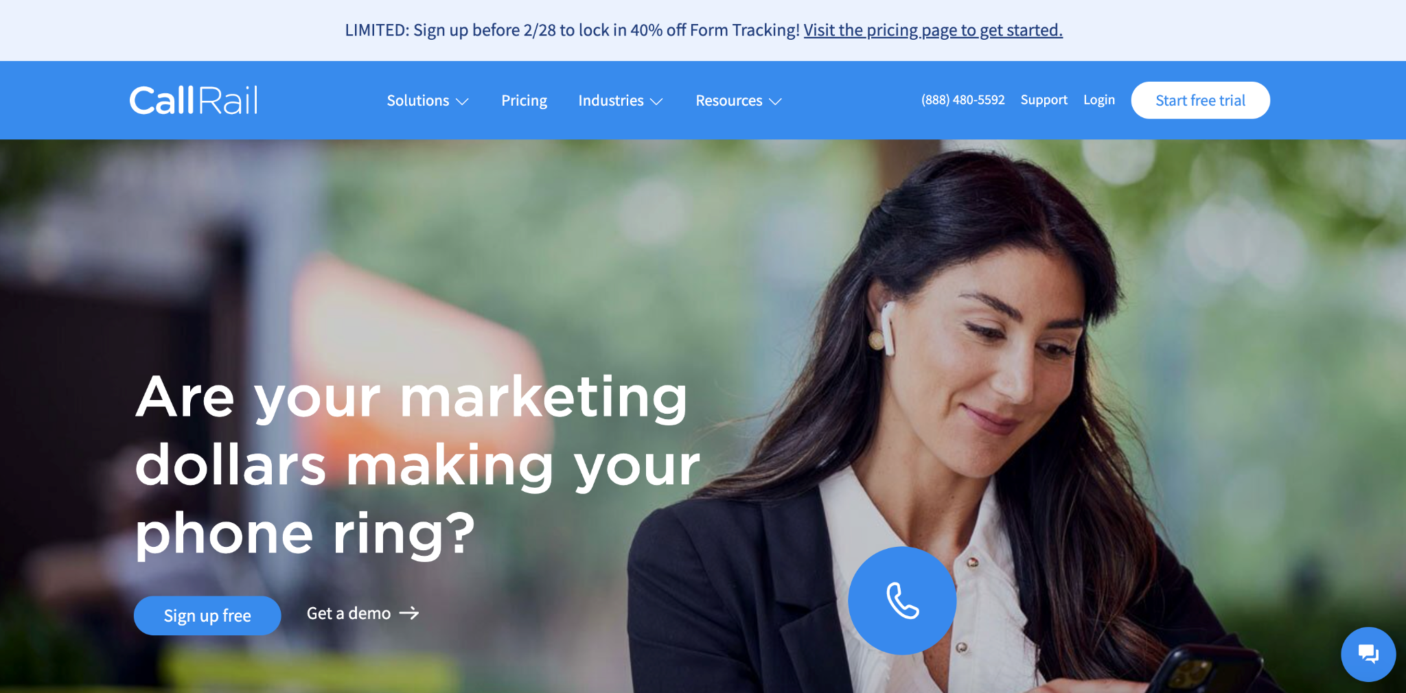
CallRail is a call tracking and marketing analytics software that offers lead scoring, automatic conversion analysis, and other great features to help you better understand your leads and bring in high-value customers.
Lead Tracking and Attribution: Attributer
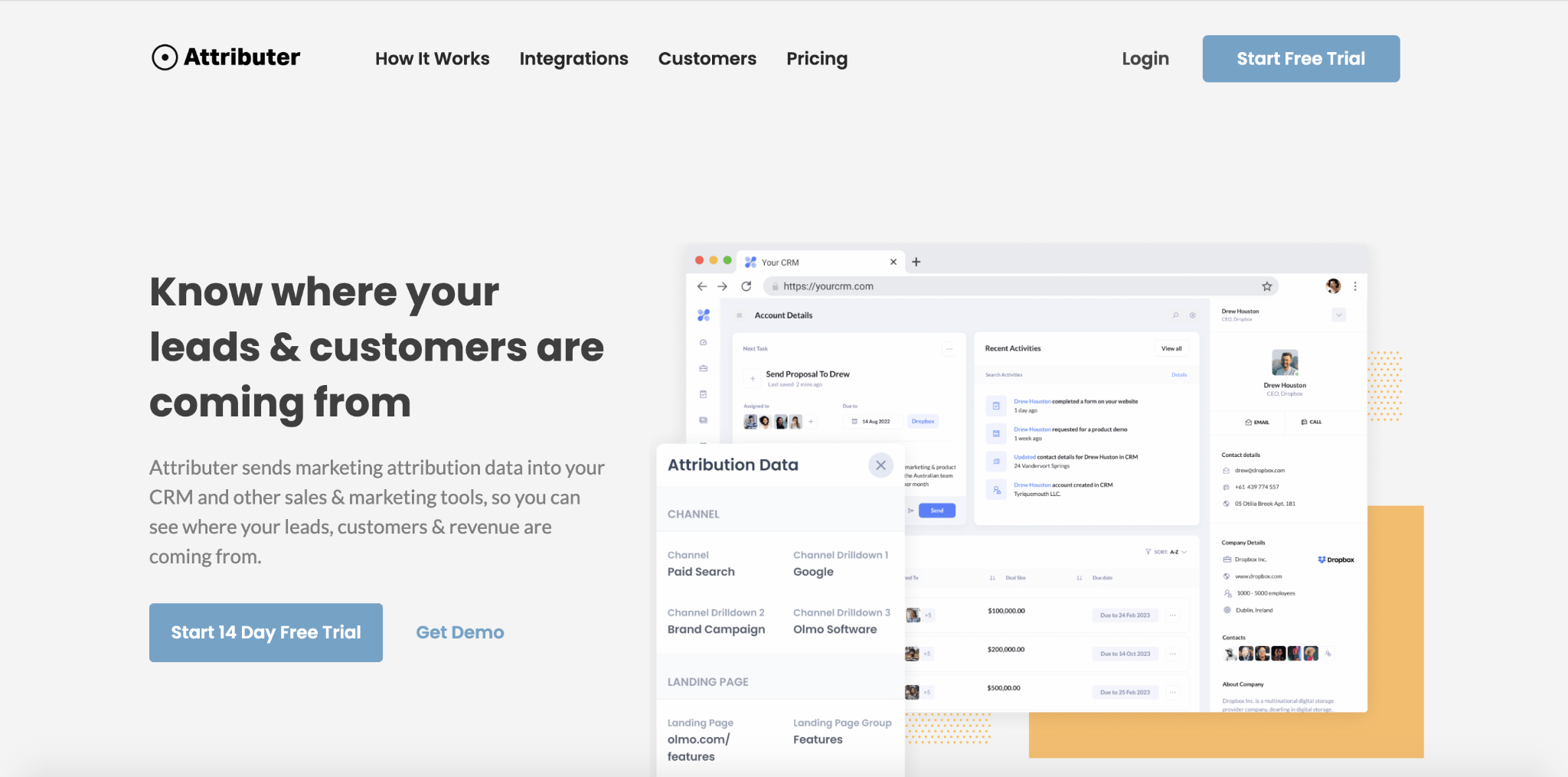
Attributer is sends attribution data to your existing tools to help you identify where leads and customers are coming from. That way you can figure out what’s working so you can rinse and repeat. We even use it here at GetLeadForms.
If you need something more advanced, then I highly recommend also checking out ActiveProspect’s suite of products. Mainly ActiveProspect Trusted Form for generating TCPA-compliant leads and LeadConduit to help customize lead flow and deliver leads to your CRM.
Closing Thoughts on How to Make a Lead Generation Website That Converts
Hopefully by now, you have a clear idea of what it takes to generate qualified leads on your website so fewer leads slip through the cracks.
This starts with first understanding that the purpose of creating a lead generation website is to generate leads and then ensuring that you’re making it extremely clear what your business does and why someone should do business with you.
And just in case you skimmed to the end, here are our six no-fluff strategies to help you turn your website into a lead-generation machine:
- Provide value in exchange for your visitor’s contact details
- Use multi-step rather than single-step forms
- Ensure you’re qualifying leads and sending them to the right place
- Don’t overwhelm visitors with annoying popups and CTAs
- Always be testing!
- Use the right tech stack to optimize page load speed, themes, and lead capture forms
To browse lead forms across a wide variety of industries, check out our template list.
Ready to capture more leads?
Build and optimize high-converting lead funnels, quizzes, and forms with AI-powered lead capture software.
Start Free Trial