Lawyer Landing Pages: 11 Tips For More Qualified Leads (With Examples)
If you’re struggling to generate quality leads from your lawyer landing pages, or if you simply want to optimize your pages to get even more leads, then...
If you’re struggling to generate quality leads from your lawyer landing pages, or if you simply want to optimize your pages to get even more leads, then you’ve come to the right place.
In this post, we’ll provide actionable insights on how to create lawyer landing pages that convert while also featuring real-life examples of some of the best lawyer landing pages, so you can see what a winning legal landing page looks like firsthand.
Let’s get right into it!
1) Lead quality is greater than quantity
When it comes to generating legal leads, it’s about getting qualified leads that have high intent to become clients.
Lawyers are busy.
And they don’t have time to waste with tire kickers and bad leads.
Therefore, if you’re on the agency side then the last thing that you’re client wants is to get bad leads that will end up wasting their time.
In fact, if you’re buying and selling legal leads then generating quality, data-rich leads is mandatory.
And if you’re working in-house at a firm (maybe you’re a lawyer reading this yourself) the last thing that you need is to waste your own time with bad leads.
That’s why at the end of the day, it’s not just about generating a high volume of leads. It’s about generating quality leads too.
So how exactly can you ensure consistently high-quality leads from your legal landing pages?
This is where you’re landing page form comes into the picture.
Many savvy legal marketers who really know what they’re doing ask a couple of key qualifying questions about a lead’s case directly in the form.
Example: This personal injury firm (that will remain anonymous to protect their campaigns) asks a number of qualifying questions when filling out a form to receive a free evaluation on their personal injury landing page.
This particular example, which was built with GetLeadForms is from one of the customer’s personal injury landing pages where the form asks a number of qualifying questions like “Were you injured in a motor vehicle accident?”
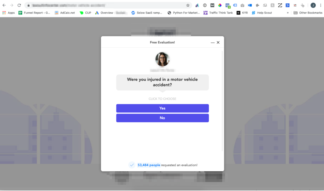
By gathering critical information like this on the landing page through the form, the agency can efficiently qualify more leads to ensure the ones they send to the actual lawyer meet the right criteria, thus significantly raising overall lead quality.
Want to implement an interactive form like in this example? You can grab this similar template here for free.
2) Optimize your form on your legal landing page
Your form is one of the most important elements of your landing page.
That’s why we like to think of the form as the bridge between the landing page and the sales team.
And that’s precisely why a form is one of the best places to optimize on a landing page.
Making adjustments to the layout, headline, CTAs, and even button colors of a form not only can increase the number of leads you generate but also the overall lead quality.
With time and testing, you can gradually optimize all elements of landing page forms until they fire on all cylinders and start generating more qualified legal leads.
Here are 10 examples of different areas that you can optimize in your form alone:
- Form style: Embedded vs Popup vs Click Popup
- Engagement settings: Timed popup, vs exit popup, etc
- Layout
- Button colors and button size
- Icons in buttons vs no icons
- Multi-step vs Single Step
- Adding social proof directly to your forms
- Offers
- Number of questions in your forms
- Type of questions (i.e, removing specific high friction fields)
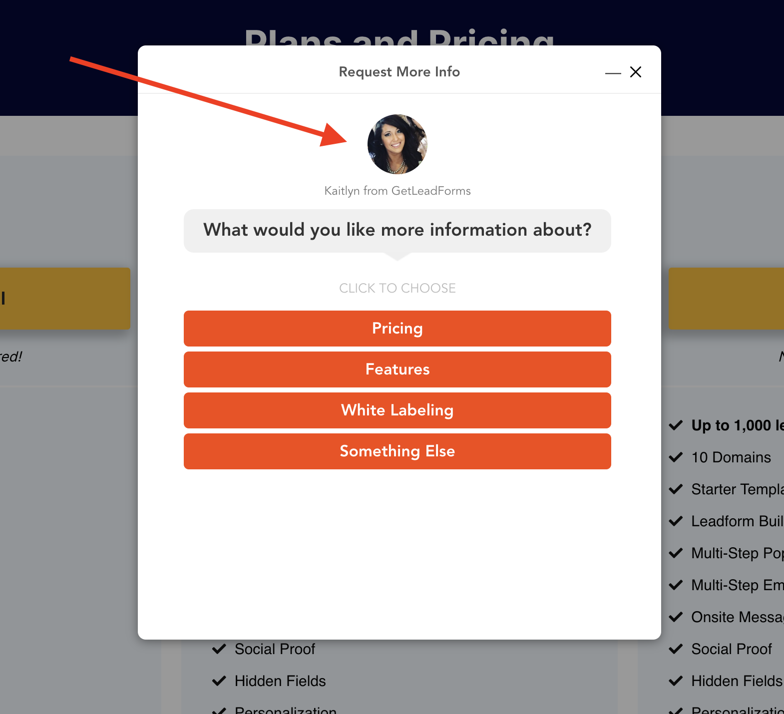
Example: When we simply dropped an image into our form we saw a 33% conversion lift in our lead form compared to the form that didn’t have an image of a person in the form.
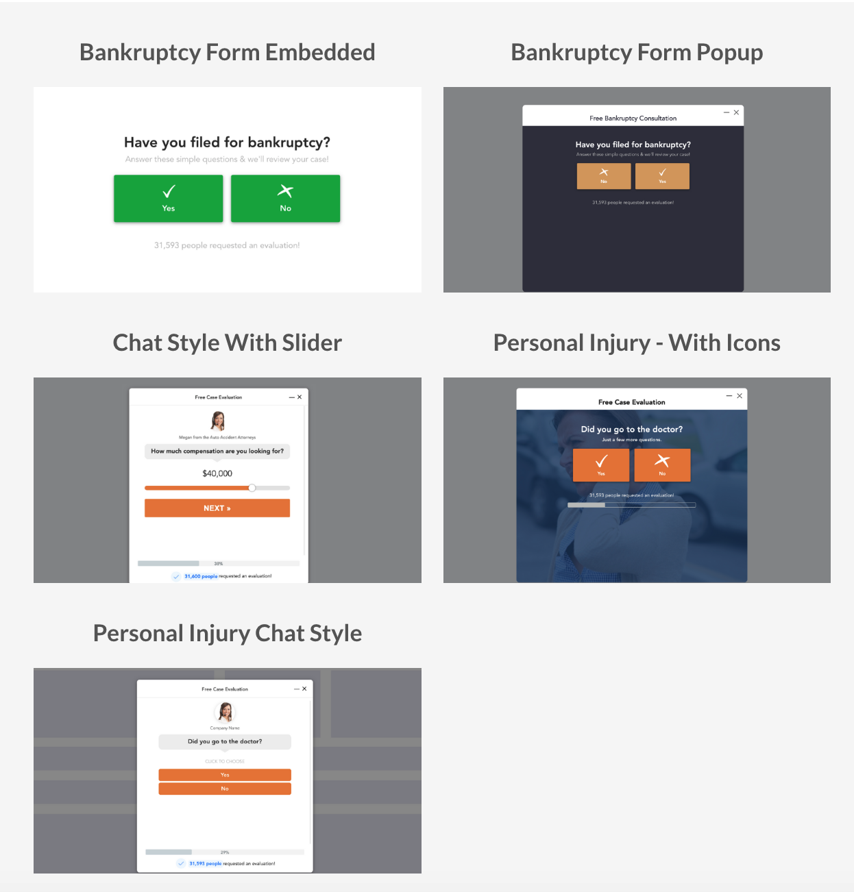
Here are some highly customizable templates that work great right out of the box and can easily be optimized and tested on the fly.
3) Make a compelling offer near your form
Even the best lawyer landing pages can fall flat if they use a run-of-the-mill offer without an adequate incentive.
Therefore, you don’t want to use some arbitrary, generic offer that no one will be receptive to.
We find three particular types of offers that tend to work well across the board in the legal space.
- Free case evaluation
- Free consultation with a lawyer
- Find out how much your case is worth
Example: Personal injury professionals Cohen & Marzban put an offer for a free case consultation front and center on this landing page.
Notice how they use “Free Case Consultation” as the headline for their form and “Review My Case” as the CTA.
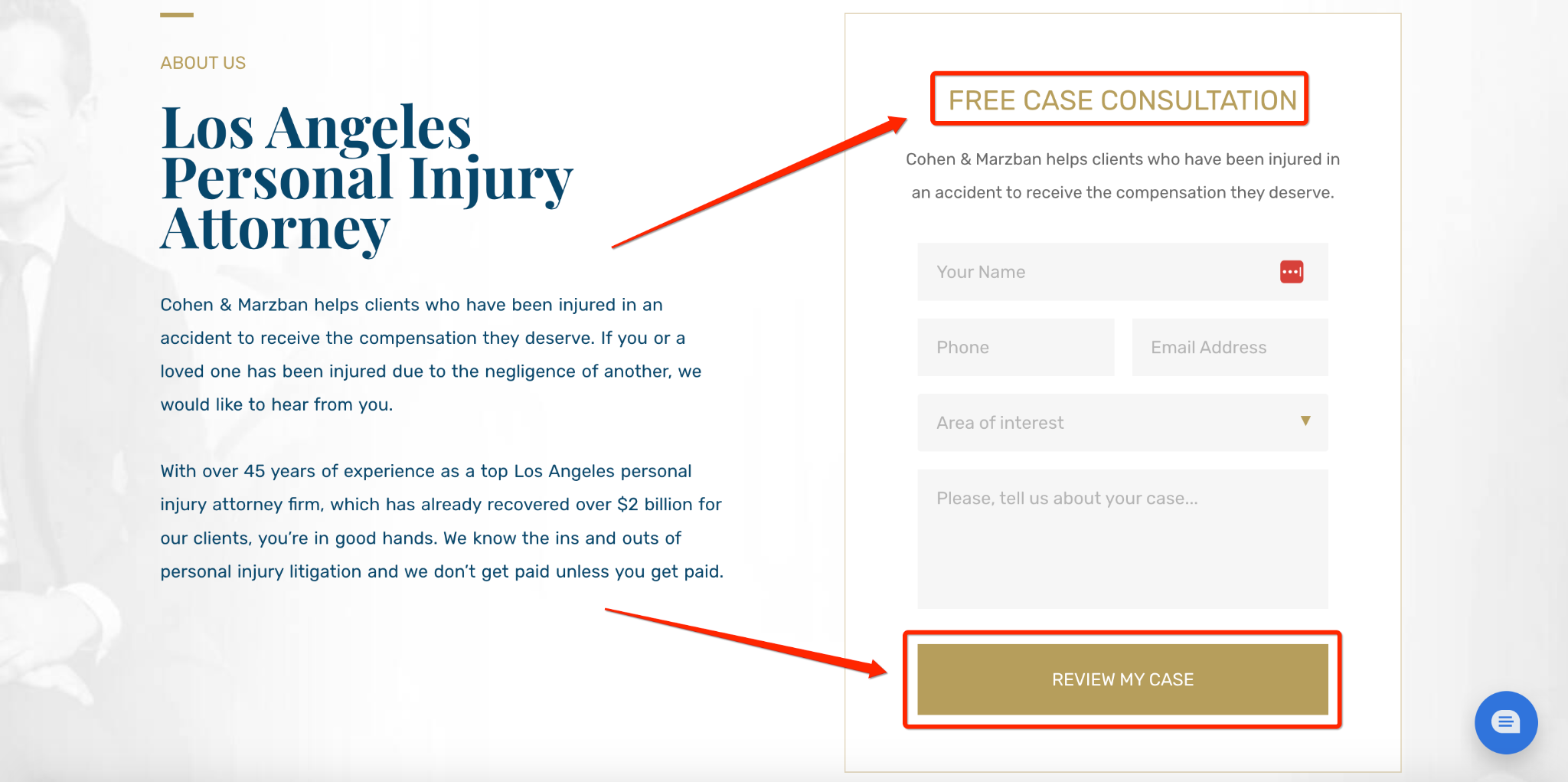
Instead of asking visitors to simply contact them, they provide a strong incentive while making the process simple and intuitive.
You could even consider using a lead quiz where you ask key questions to gather critical information while keeping it fun and engaging, which is another type of customizable lead form you can create with GetLeadForms.
4) Get your prospects to make micro-commitments to drive engagement and conversions
Getting someone to commit to a large request (converting) isn’t always easy.
But if you can break it down into micro-commitments where you get them to say yes to a smaller request first, this can often get your foot in the door.
From there, you can work your way up to get them to commit to the large request.
This is a concept that uses what’s called the breadcrumb technique which you can learn all about here.
The bottom line is that focusing on micro-commitments on lawyer landing pages is an excellent way to pull in more qualified leads without overwhelming them.
One of the best ways to do this is with multi-step forms, which are built on the idea of micro-commitments.
Instead of requiring leads to fill out an entire form in one go, multi-step forms break it down into easily digestible chunks.
Example: Find My Perfect Lawyer provides visitors with a multi-step form that first asks how they were hurt.
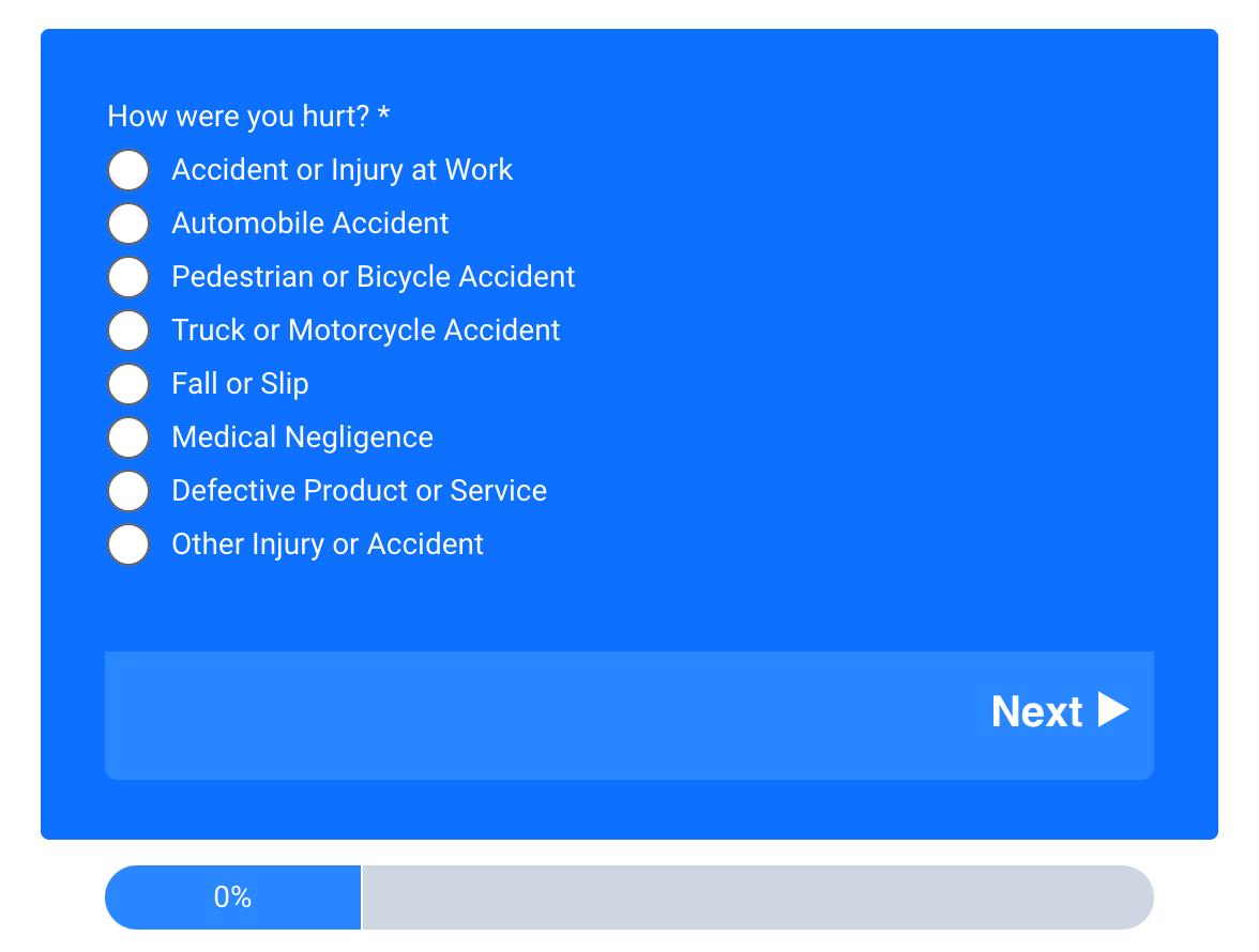
This is followed by asking whether or not the prospect had to go to the doctor and how many lawyers they talked to about the incident.
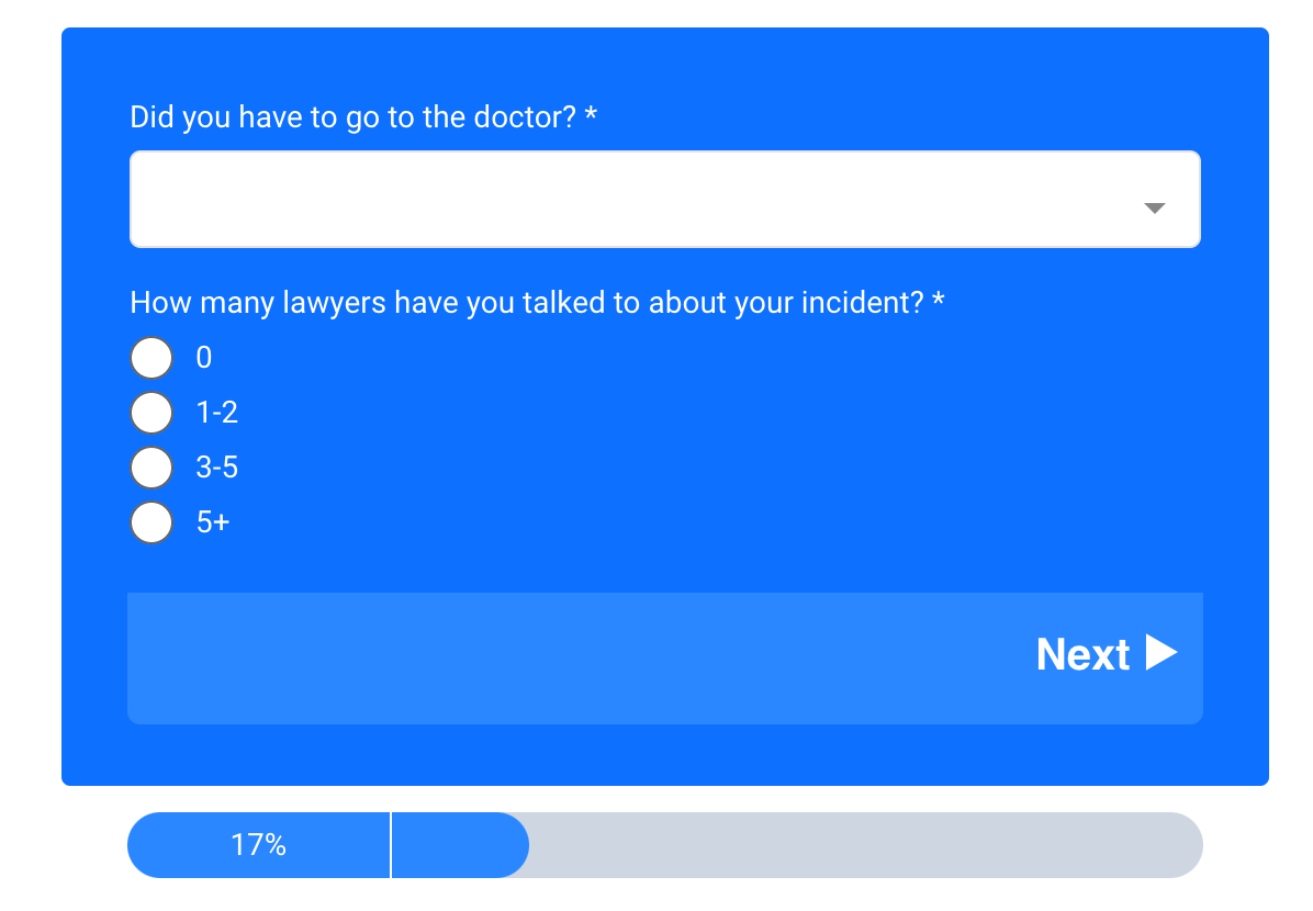
Then the form asks how many injuries were sustained, and so on.
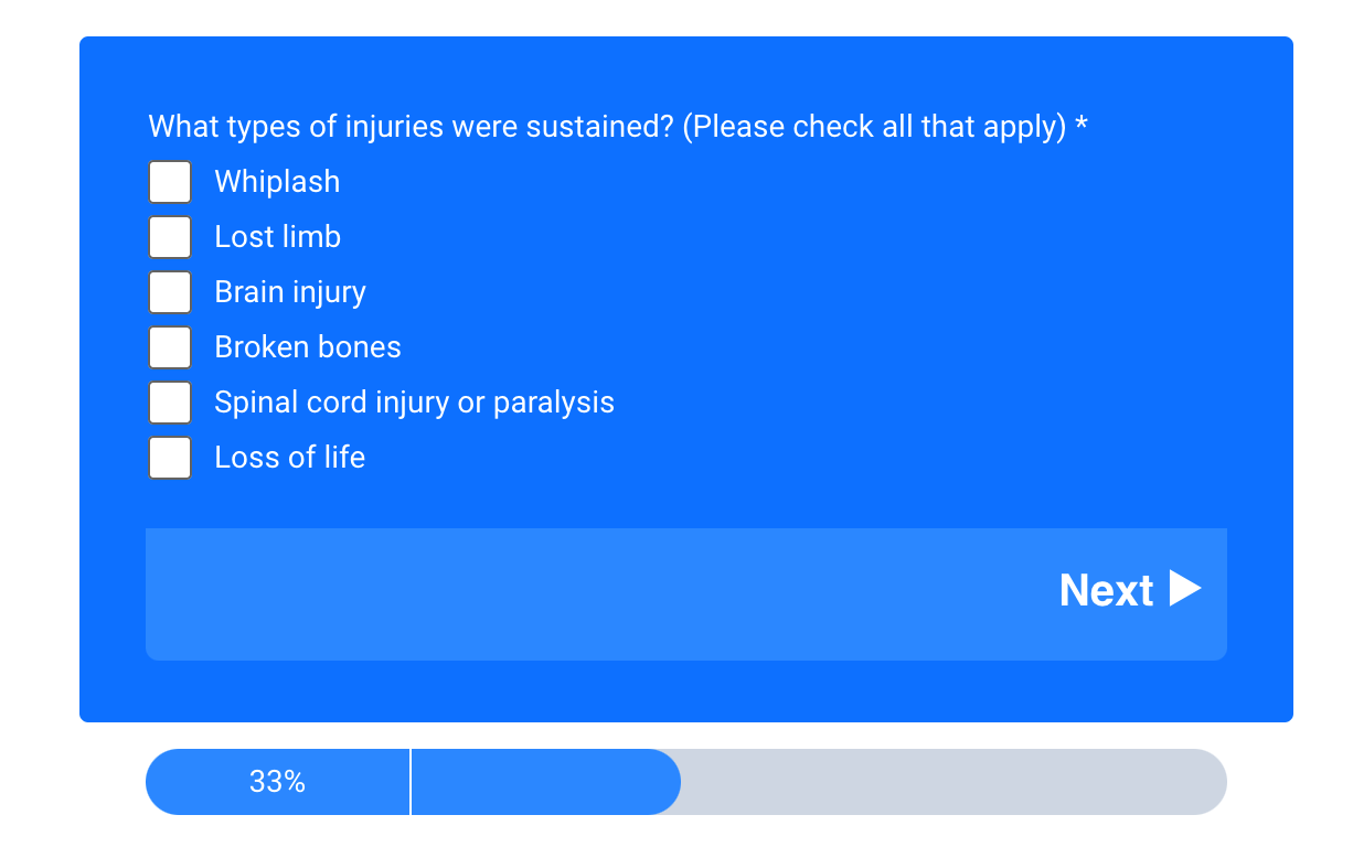
One of the best tools for creating multi-step forms is GetLeadForms, which offers several customizable templates like this one.
With it, you can plug in the specific questions you need to ask to fluidly guide leads through the process to collect important information without barraging them with a ton of questions all at once.
5) Remove distractions by keeping your law firm landing pages simple
This is self-explanatory but definitely needs mentioning.
It’s easy for visitors to get overwhelmed with too many images, headlines, CTAs, and so on, to the point that it hurts the UX and makes them want to leave the page.
And it’s especially important not to throw too much at leads when they’re going through something difficult like a personal injury, bankruptcy, or divorce.
At the end of the day, your goal is to show leads what you’re offering, what your UVP is, and how to take the next step.
An integral part of this is keeping your page simple, ideally using minimalist design principles, which performance marketing company Klient Boost identifies as:
- “White space
- Simple, direct copy
- Clear, direct headlines
- Clear, direct CTAs
- Fewer colors
- Contrasting CTA colors
- Encapsulation
- High readability”
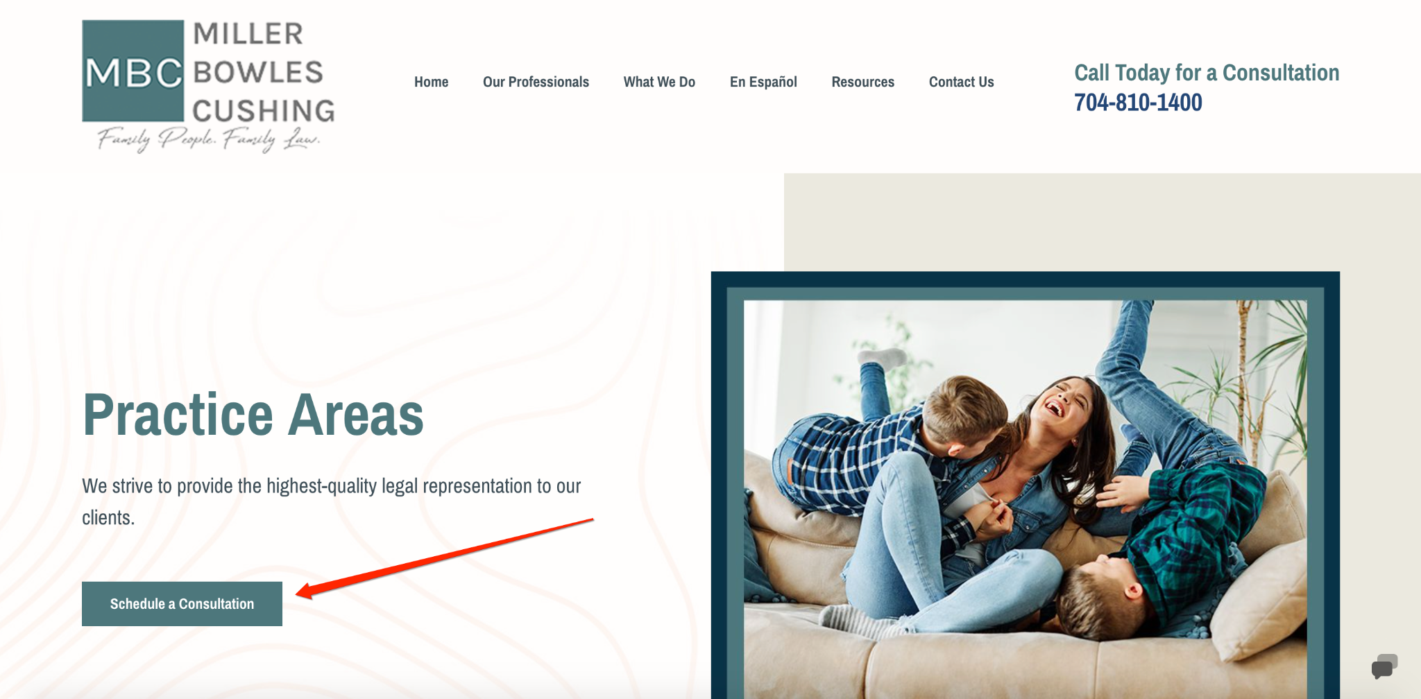
Example: A great divorce lawyer landing page example that expertly uses simplicity is this one from Miller Bowles Cushing.
They use clear headlines, simple, direct copy, high-contrasting text, CTA combos, high readability, and more to make it easy for leads to browse through their landing pages.

They also make it impossible to miss critical CTAs like this “Schedule a Consultation” CTA on their practice areas page to ensure leads aren’t distracted and know where to click.
6) Place social proof near your key conversion points (like your forms)
Social proof, where prospects are influenced by the thoughts and opinions of others, is important in nearly all industries.
But it’s absolutely essential in the legal industry where there’s so much at stake.
According to a 2018 FindLaw study,
89% of legal leads want more information about a lawyer’s reputation, and 42% consider recommendations a top priority.
By carefully weaving social proof into your lawyer landing page design and forms, you can provide leads with the right information at the right time to validate the law firm and motivate them to take action.
Example: Personal injury attorney George Sink places multiple forms of social proof right underneath his lead form, including being voted best law firm by multiple sources, receiving a 10.0 Avvo rating, and receiving the Avvo Clients’ Choice Award.

Social proof is so powerful that we even built an optional social proof feature right into our LeadForms over here at GetLeadForms.
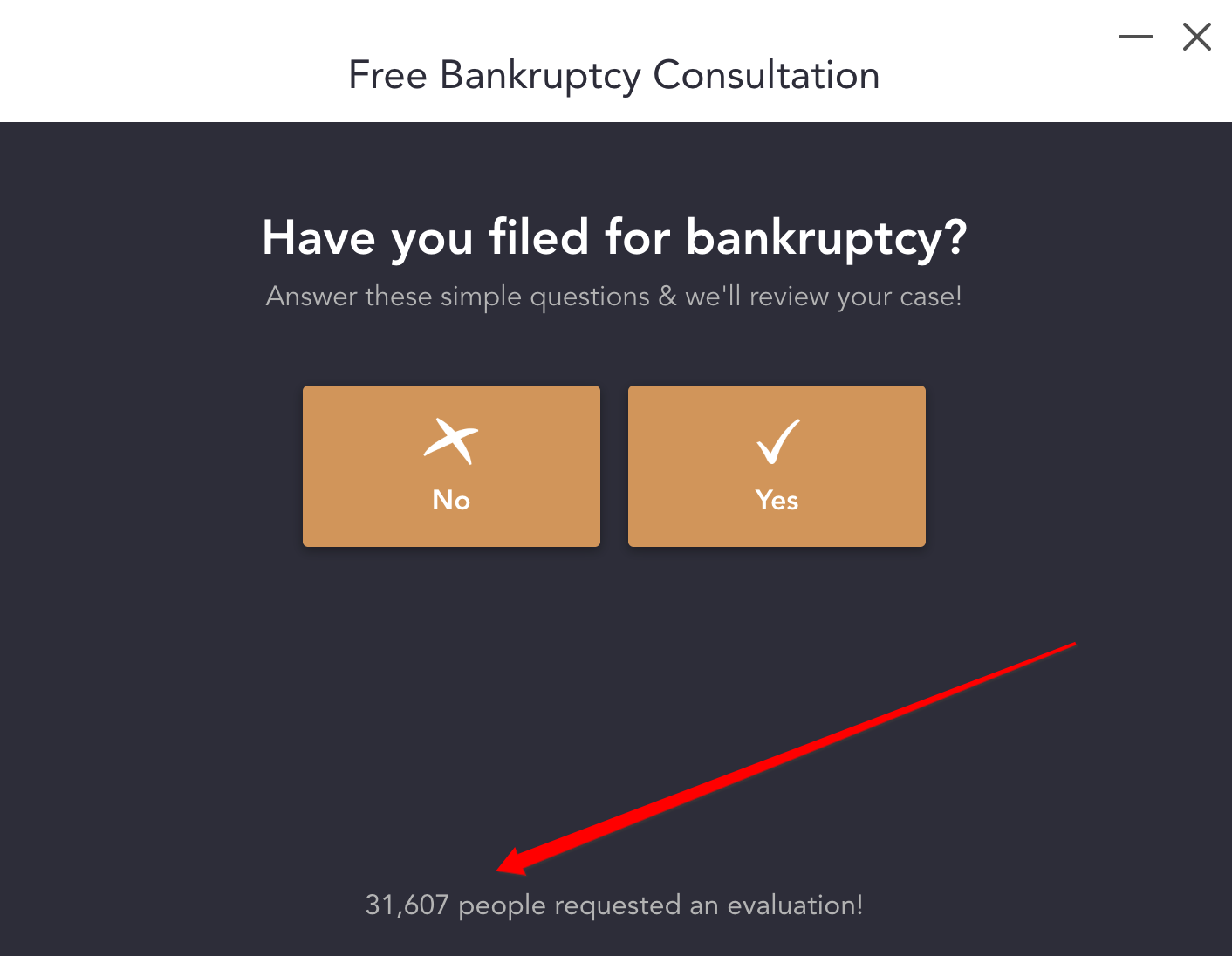
Each time someone submits the form, the count automatically increases, which boosts the impact of the social proof over time.
Here’s one of the best legal landing page templates with social proof for a bankruptcy form popup.
7) Make your landing pages more friendly by showing a human on your form
Many of today’s consumers are wary of scams and spammy sales practices, making them more skeptical and hesitant to submit their info through forms than ever before.
That’s why it’s so important to build trust in your landing page and establish instant rapport.
But how do you do that?
A simple yet effective strategy is to show images of people on your team, along with design elements that look and feel human.
Example: Miami injury lawyers Vinas and DeLuca place a photo of themselves directly to the right of their contact form, allowing leads to see exactly who they’re contacting.
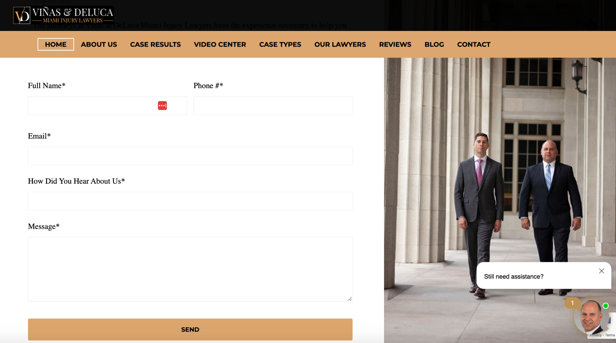
Also, in the chat box, they feature an image of one of their two main lawyers, Francisco Vinas.

This helps prospects connect the dots and makes for a far more personal experience to quell any concerns they may have about reaching out.
At GetLeadForms, when we tested this, we saw a 33% conversion lift, simply by adding an image of a person to our forms.
In fact, this was so powerful from a conversion perspective, that we baked this right into our lead form templates, like in this example from the pest control industry. Note — This obviously isn’t from a law firm, but you can customize the templates to make it legal-centric.

This addition may seem simple, yet it can have a massive impact. Here’s an example of this form, repurposed for the legal industry.
So grab your camera and take your best selfie, then drop it into your lead capture form!
8) Ensure your legal landing pages are TCPA compliant
If you’re generating leads, especially in the legal space where you’re sending leads to an intake team, it’s vital that they have expressed consent to contact them, especially if you’re using any type of automated dialing system or SMS marketing.
Believe it or not, this is an area where many lawyers are missing the mark and not always TCPA-compliant.
There are two sides to the equation here.
One is asking leads for their consent.
The other is documenting their consent to protect against litigation.
A simple way to ensure you’re above board is to automatically generate TCPA-compliant certificates that show proof of consent with each lead submission.
This is especially important for agencies that sell leads to lawyers because they can say they offer TCPA-compliant leads to make their services more valuable.
And this is something that can be done with ActiveProspect TrustedForm.
Here’s how it works, with a graphic pulled directly from their website.
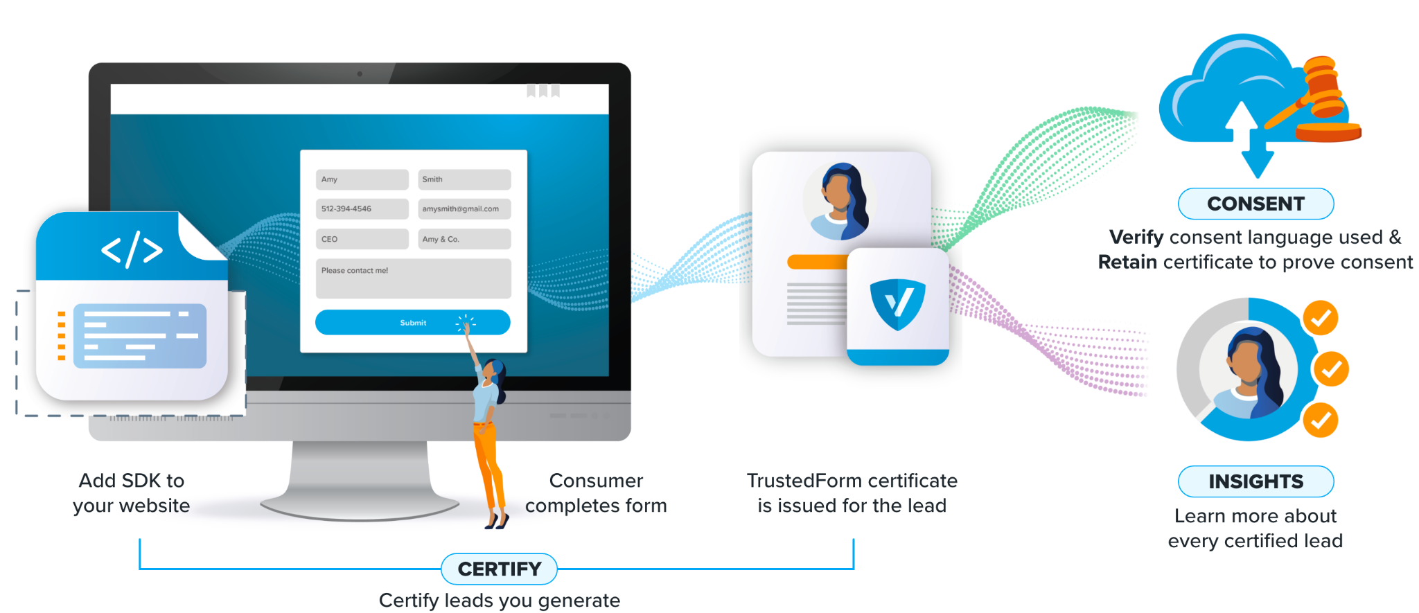
First, you sign up for TrustedForm and add their software developer kit (SDK) to your website.
Next, whenever a lead completes a form, a TrustedForm Certificate is generated for the lead, which can be captured in a hidden field.
From there, a lead’s consent is verified and the certificate is retained, allowing you to prove consent at any time.

At GetLeadForms, we believe that TCPA compliance is so important that we’re one of the few lead capture tools that seamlessly integrate with ActiveProspect TrustedForm.
In turn, this allows you to completely automate the process of capturing, documenting, and storing lead consent to keep you clear of litigation.
You can learn more about the integration here.
9) Engage prospects as they are leaving with Exit Intent Popups
On average, only about a third of leads who begin filling out a form actually complete it.
About 68% never finish, which presents a huge problem for lawyer landing pages.
This is where exit intent popups, which appear when a lead decides to bounce, can help.
Here you can feature a customized offer at the exact moment when a lead is about to leave your site to motivate them to engage further and complete the form or complete another action such as calling you.
When used correctly, this technology can help significantly increase the number of leads that follow through with form completion and prevent you from needlessly squandering quality leads.
Example: Dell & Schaefer Law Firm uses this exit intent popup to encourage leads to contact them to discuss their disability insurance claim.
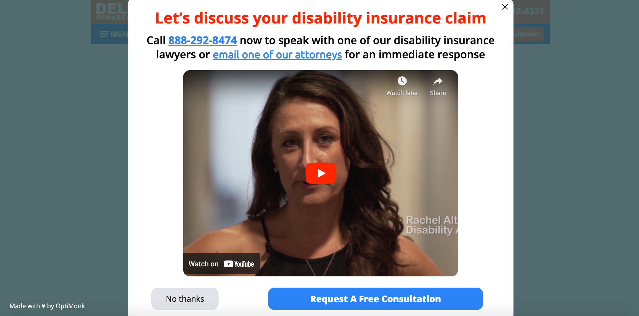
Leads have three options — call the law firm directly, email one of their attorneys, or request a free consultation — making it super convenient.
Or, if they’re not interested, a lead can easily get out of the popup by clicking the “X” button or simply clicking anywhere outside the popup to prevent any friction.

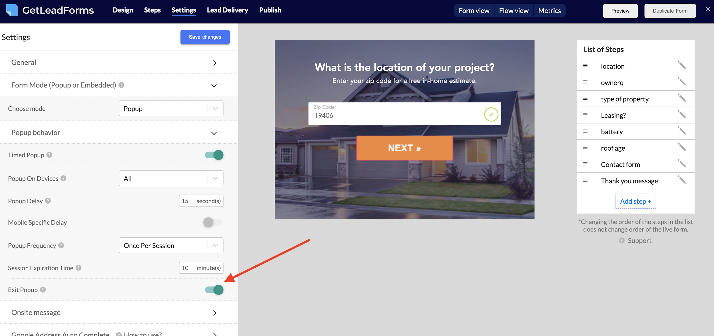
Note that GetLeadForms gives you the ability to turn on exit popups for any landing page for a lawyer.
So if you’re using a LeadForm on your landing page, you can easily turn it into an exit popup with the flip of a switch.
With that said, exit popups aren’t the only game in town. Here’s a post that we wrote about six different types of popups that you can use to boost conversions.
10) Verify your lead’s phone numbers right in your landing page forms
Would you believe that about 25% of all leads processed are invalid?
It’s true. And 30% of those invalid leads are because of a fake or incorrectly input phone number.
If you’re planning to call your leads or have an intake team call them, you’ll want to be sure your leads are providing you with the correct phone number.
Otherwise, you can end up wasting a ton of time without much to show for it.
The solution?
Verify leads using a one-time passcode (OTP) verification.
Example: Say a lead arrives on a child support landing page and is prompted to fill out a form to get a free case evaluation.
You ask for their name, email, and phone number.

After providing this information, a four-digit PIN code is sent to the phone number they provided.
All the prospects have to do is enter the PIN code on the screen to verify it, and they’re good to go.
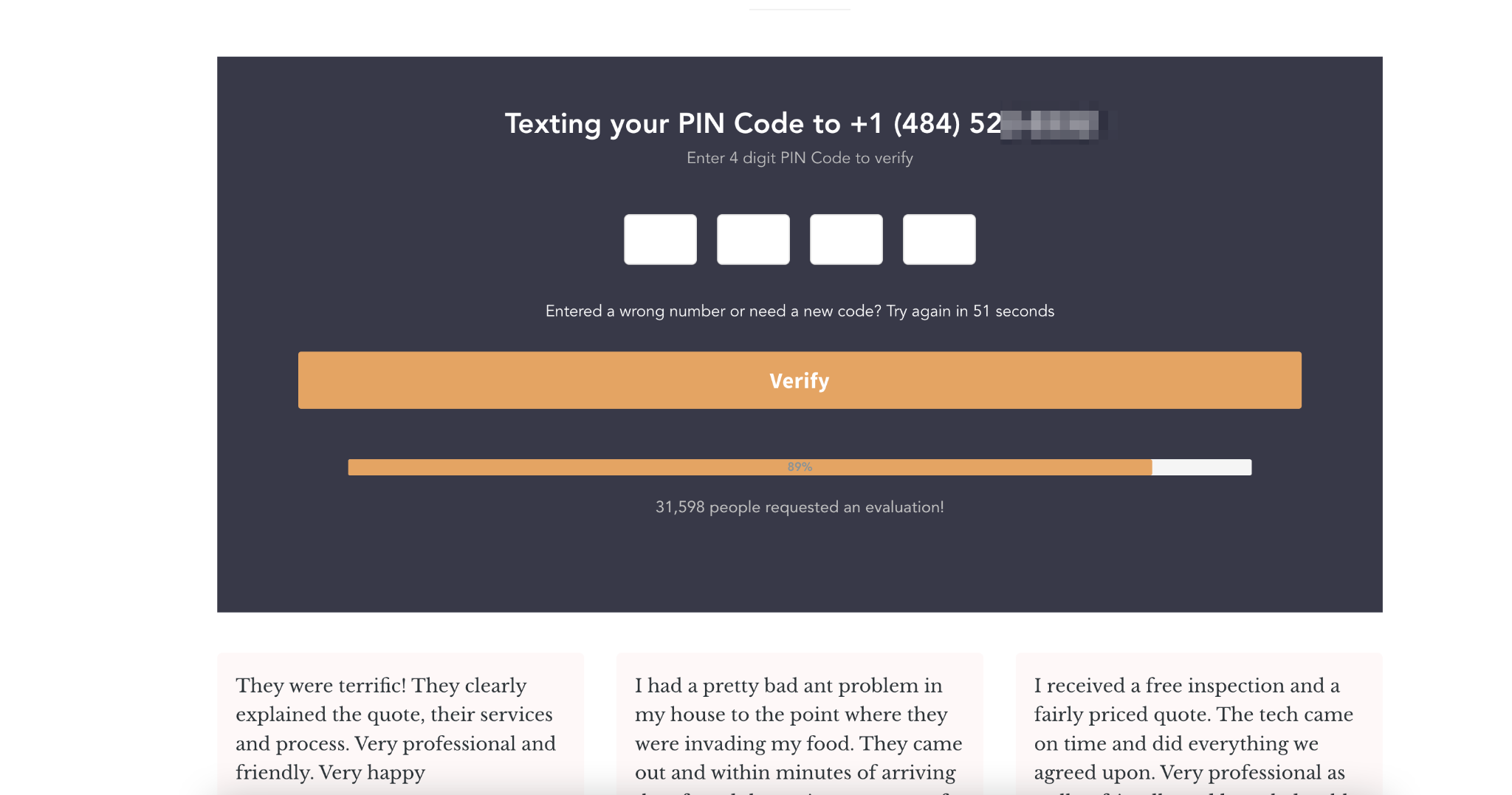
Just like that, you’ve quickly qualified the lead and verified that their phone number is real.
So whenever you call them or have your intake team call them, you can be certain that it’s the correct number.
Do conversion rates drop a little when you use lead verification?
Yes of course.
But the benefit is that lead quality goes through the roof!
And if you’re on the agency side doing lead gen for lawyers, or if you’re selling legal leads then saying that you can offer 100% verified phone numbers with your legal leads is a major value proposition that can allow you to charge a premium on your leads and marketing services.
And the GetLeadForms OTP verification makes this easy, allowing you to get set up, rather than having to build it yourself.
11) Setup lead routing between your landing page and your intake team
There are some situations where you may want to conditionally route a lead based on a response to a specific person in the law firm or to a specific client.
In this case, you’ll want to be strategic about who a lead gets sent to in order to save time and increase the chances of converting.
Example: Say you’re generating personal injury leads for cancer after using Johnson & Johnson Baby Powder, and one of the qualifying questions is “state of residency” like this example from Pintas & Mullins Law Firm.
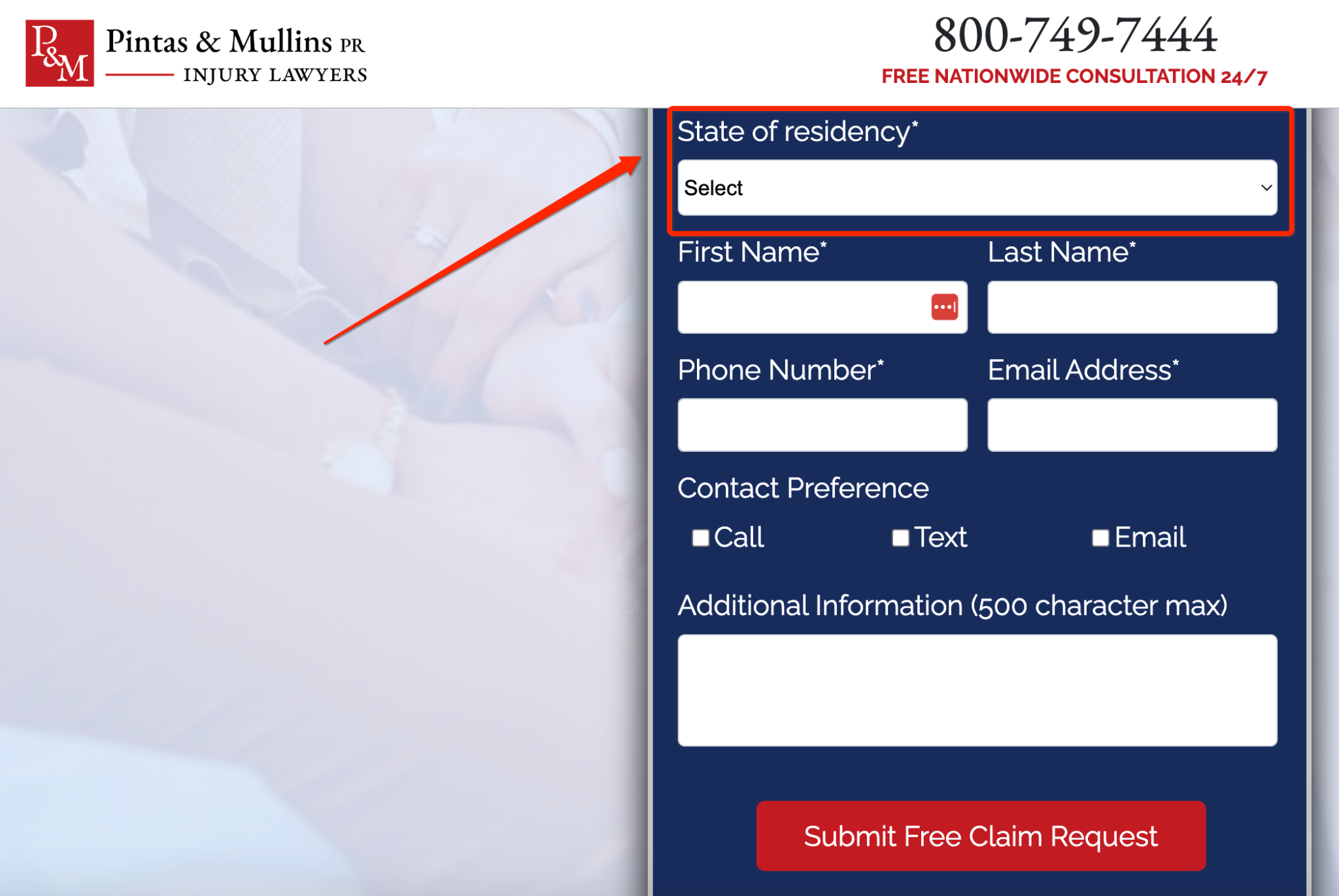
If someone chooses New York, and you want to route them to a different person or team than if they choose Alabama.
With smart lead routing, you can set it up so the right person or team automatically receives the appropriate lead with zero added effort.
That’s something you can do with conditional email notifications for email delivery through GetLeadForms, which will direct submissions based on response.
The end result is leads going exactly where they need to, resulting in a much greater chance of your prospect ultimately converting.
Final Thoughts on Optimizing Lawyer Landing Pages
As we discussed throughout this post, creating winning lawyer landing pages isn’t just about generating leads.
It’s about getting qualified leads.
And that’s something most legal marketers struggle with to some extent.
By properly optimizing landing pages through techniques like using proven lead generation form templates, making compelling offers, implementing social proof, and more, you should not only be able to generate a high volume of leads but ensure that they’re consistently high-quality.
Ready to capture more leads?
Build and optimize high-converting lead funnels, quizzes, and forms with AI-powered lead capture software.
Start Free Trial