7 Best Lead Magnet Landing Pages [With Examples]
Creating a lead magnet landing page is easy.
Creating a lead magnet landing page is easy.
But nailing a high-converting lead magnet landing page?
That’s where the real challenge kicks in.
You search for examples, only to be flooded with countless options.
Out of them, you’re not sure which ones really work and which might send your efforts down the drain.
But don’t worry. I made a list of the seven best lead magnet landing pages and real-life examples.
Note: When it comes to capturing leads with your landing page, you’ll want a lead form that maximizes conversions. That’s where GetLeadForms shines. Dive into our collection of tailor-made lead form templates built to engage and convert. Explore them here.
What makes an excellent lead magnet landing page?
Simplicity is often the key to a high-converting lead magnet page.
While it’s important to make it visually appealing, you don’t want to bog down your visitors with too many distractions.
Most top performers usually stick to the following non-negotiable elements:
- Hook. This is the starting point of your landing page, which grabs your prospects’ attention. Most effective hooks are compelling, quick, and to the point.
- Offer. Your audience should know exactly what they’ll get. Is it an eBook? A webinar? A free consultation? Be direct and transparent about what you’re offering to avoid any ambiguity.
- Bullets. Bullet points break down the essence of your offer into easily digestible chunks. They also make your landing page skimmable for your audience.
- Featured Image. Including a relevant, high-quality image can boost engagement and visually represent what you’re offering. This image can build trust by giving prospects a sneak peek of what to expect.
- Lead Form with CTA. The lead form is the gateway to capturing valuable information from your visitors. A concise, intuitive form with a clear CTA button prompts action without overwhelming the prospect. This is our forte in GetLeadForms.
Remember that less is always more. Including every tiny detail about your offer may be tempting, but keeping the user experience in mind is crucial.
P.S. If you want to know more about optimizing your landing page lead forms and the common pitfalls to avoid, check out this article I wrote.
7 best lead magnet landing page examples
Some on this list might sound familiar, and there’s a good reason for that. These lead magnets stood the test of time and proven themselves effective. But the others are fresh and redefining the art of capturing leads.
Let’s now dive into these inspiring lead magnet landing page examples!
1) Free case evaluation
Free case evaluations act as great lead magnets for the legal industry, especially if you’re looking to capture qualified personal injury leads.
What makes them a top-notch lead magnet is they’re a way for you to offer something free yet valuable to attract the lead into your funnel rather than just saying something basic like ‘Contact Us to Discuss Your Case.’ Here’s a great lead magnet landing page example for this one:

Lawsuit Info Center offers legal assistance for car accident victims.
Its landing page hits the sweet spot. Lawsuit uses an eye-catching headline, great call-to-action buttons, and solid reasons to jump in and get an estimate.
Plus, a friendly chat-like widget (built with GetLeadForms) at the bottom right directs you to the lead capture form with just a click.
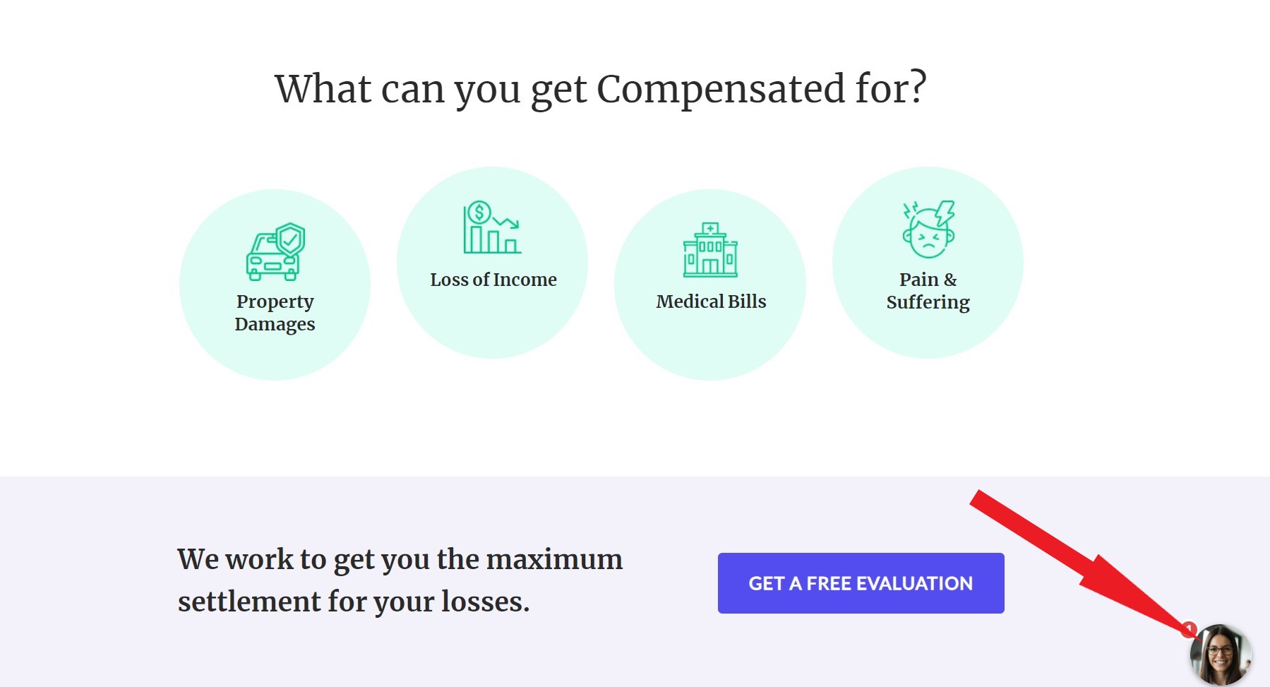
Speaking of which, this legal business uses our responsive multi-step form to qualify their prospects. They use it to ask the right questions and provide choices for faster completion.
Like what they claim, it really takes only a minute or less to fill it out. Talk about frictionless!

Note: Like the design of the evaluation form above? You can get it here.
2) Ebook landing page
Ebooks have held their ground as a valuable lead magnet tool.
With so many new content formats, some might say that ebooks are becoming obsolete. But let’s not be too hasty in pushing them aside.
In fact, around 27.7% of marketers still use it as part of their lead-generation campaigns. That’s because when done well they deliver excellent in-depth knowledge, perspective, and insights on a particular topic.
In addition, creating a high-converting ebook is entirely feasible as long as you nail your lead magnet landing page.
Hip2Keto showcases one that’s worth admiring.

At a glance, you instantly grasp what’s being offered. The headline is crisp, and the copy is intriguing.
Keto diets often get a bad reputation for being strict. But this content challenges that notion. Plus, the site provides high-quality, relevant (and yummy!) images that make you want to dive right into their recipes and tips.
What’s even better is the sign-up process. It’s a pop-up lead form with only two fields to fill out. Such simplicity reduces barriers for potential subscribers.
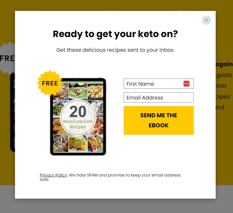
One thing that Hip2Keto could do to drive even more leads from this page is to A/B test this form with a multi-step pop-up form that starts with just one question.
Now, won’t you feel encouraged if you see a landing page like this? That’s what your target audience should feel, too.
3) Real estate home valuation widgets
Let’s talk about another exciting lead magnet that drives leads for real estate agents and mortgage brokers.
A home valuation widget is a helpful tool for prospective home sellers or buyers who want an estimate of a property’s current market value.
This is an excellent resource if you’re working with mortgage lenders, real estate agents, and similar professionals looking to provide added value to their audience.
One great example is Bonaventure Realty’s home valuation widget.

It’s a landing page and a form combined in one. While it might seem limited in detail, a single glance is all it takes to understand its offer.
The headline, “What’s the real current value of your home?” is direct to the point, informing visitors of the form’s purpose. It’s then paired with the sub-headline that assures it’s free.
This home valuation widget also uses an address autocomplete feature. As you start typing in your address, you’ll get possible matches, ensuring accuracy and ease.
But that’s not all. Its multi-step form is minimal and responsive, showing simple, one-at-a-time inquiries with predefined answers for effortless selection.
Do you want to create something similar to this lead magnet? You can follow the step-by-step guide from our latest post. I also have a template version identical to the home valuation widget above that you can try here.
4) Demo lead magnet
A demo lead magnet provides a guided tour of a product or service, allowing your prospects to understand its features and benefits without a direct hands-on experience.
While it’s more of a presentation than a trial, it still offers invaluable insights. Demos often attract those deeper in the sales funnel, making them more likely to convert.
I found Semrush’s demo lead magnet page as the perfect example. Besides the enticing headline, it clearly outlines the demo’s benefits.
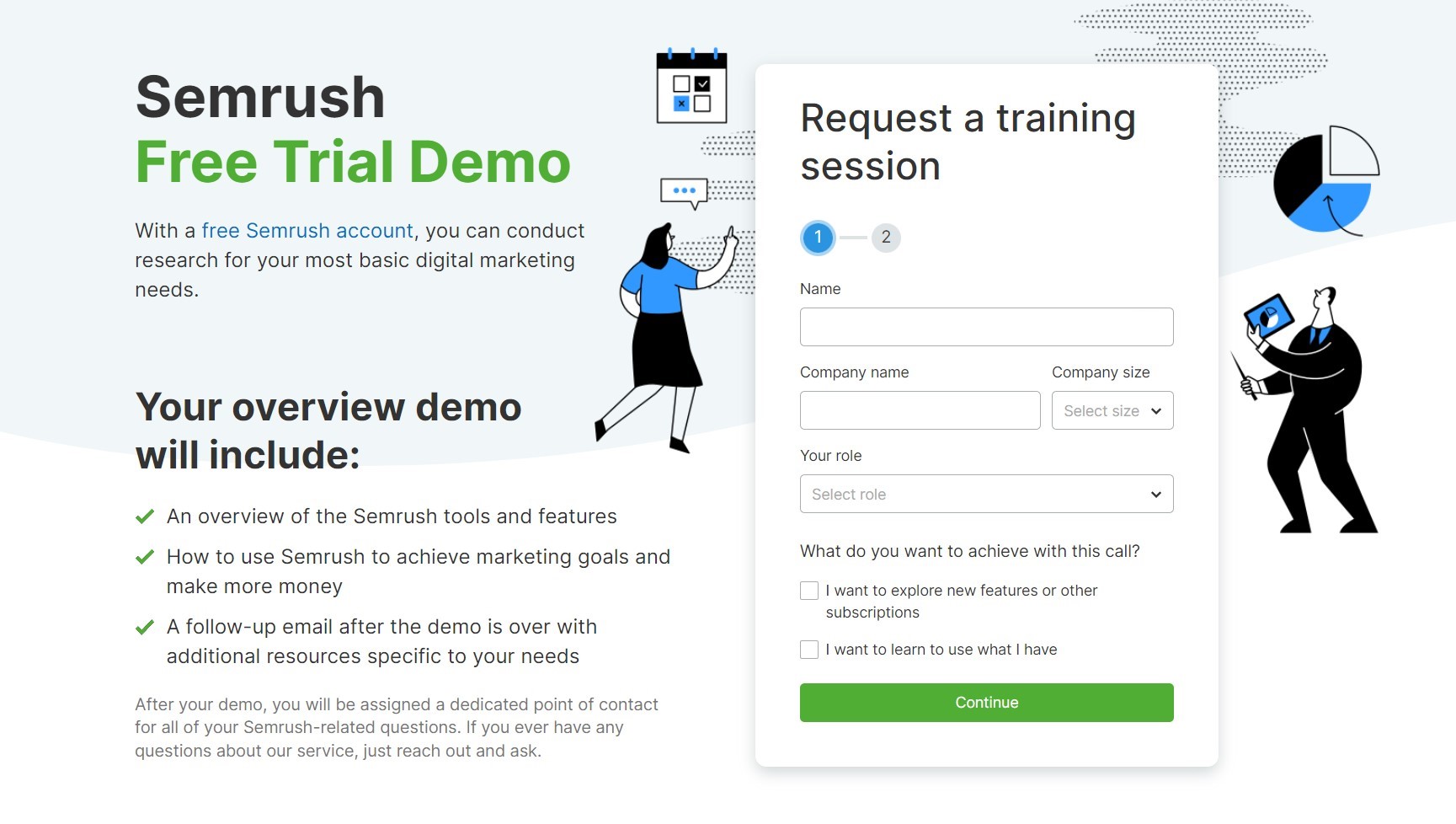
The sign-up form is also simple and strategic. It collects details about the user’s role, company, and expectations so the Semrush team can fit the demo experience into their needs.
If you’re considering demo lead magnets for your SaaS, you need a compelling, intuitive form like Semrush’s. I have the ideal lead magnet template for you.
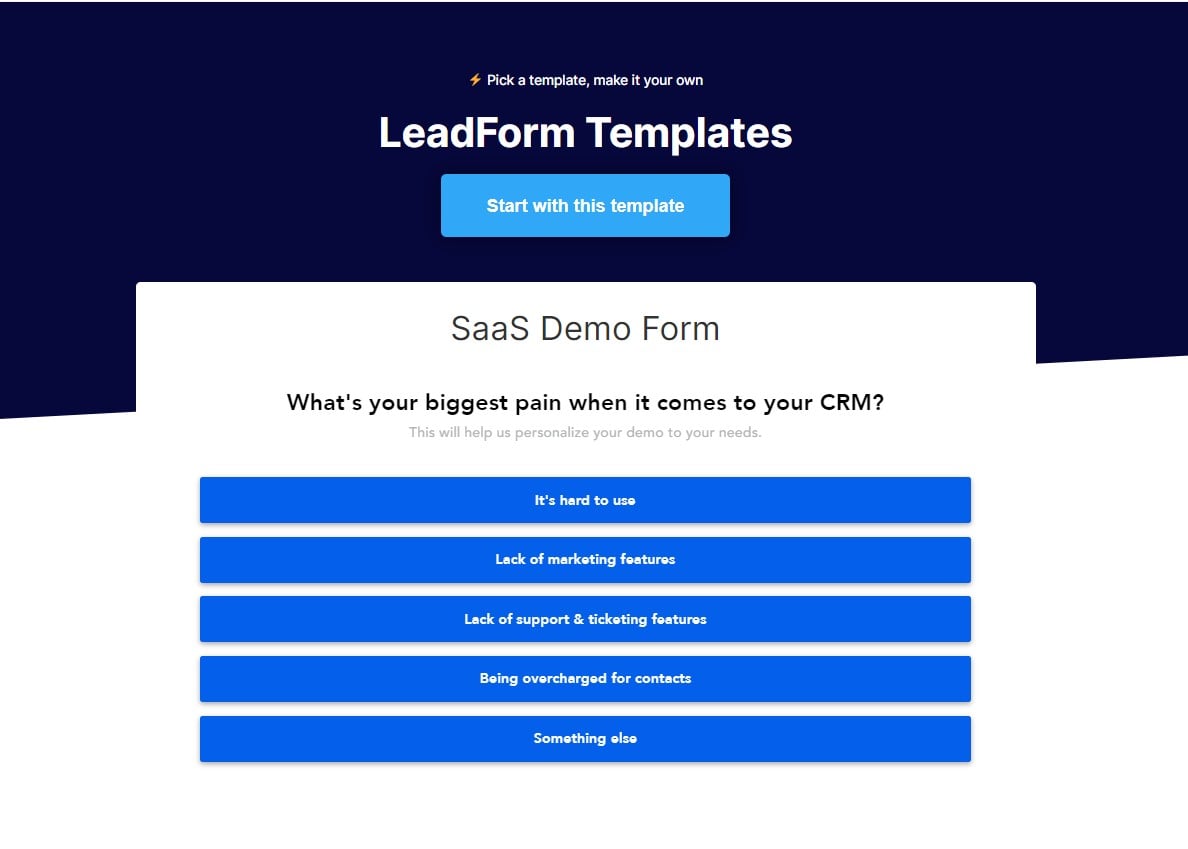
Do you want to make your SaaS contact and demo form more effective and high-converting? Pair our template with these five optimization tips in this post.
5) Free consultation or a free quote
Both are great lead magnets for businesses offering services. They provide transparency and a client-first approach.
However, free consultations delve into specific challenges and provide tailored advice. On the other hand, quotes give a clear picture of the costs involved.
You can choose the one that aligns best with your business goals and customer needs.
Take a look at PestControl’s page. Its landing page shows a clear message of what you can expect.

It assures prospects of a swift, cost-free quote in three simple steps. This kind of approach eliminates barriers and makes it more likely for visitors to engage.
But other than the landing page itself, one crucial part of this lead magnet is the form it uses. To promptly provide the correct quote, the form needs to gather enough information without overwhelming the visitor.
This page nails it by using this lead form.

If you’re thinking about harnessing the power of free quotes or consultations, ensure your form is spot-on.
You can get the proven pest control lead form template here.
6) Free report
Free reports are also one of those gems in the lead magnet space.
What makes them so great is that they dish out deep insights and analysis, making them a go-to for professionals hungry for the latest info or trends.
This free report lead magnet page of Forrester’s is spot on.

It’s well-designed and exudes confidence.
Right off the bat, it’s clear on what it offers – forecasts about tech budgets and how to smartly sync investments with business goals.
The landing page also shares an image of the free report and bullet points about what you can do with the data you get from it and what’s inside.
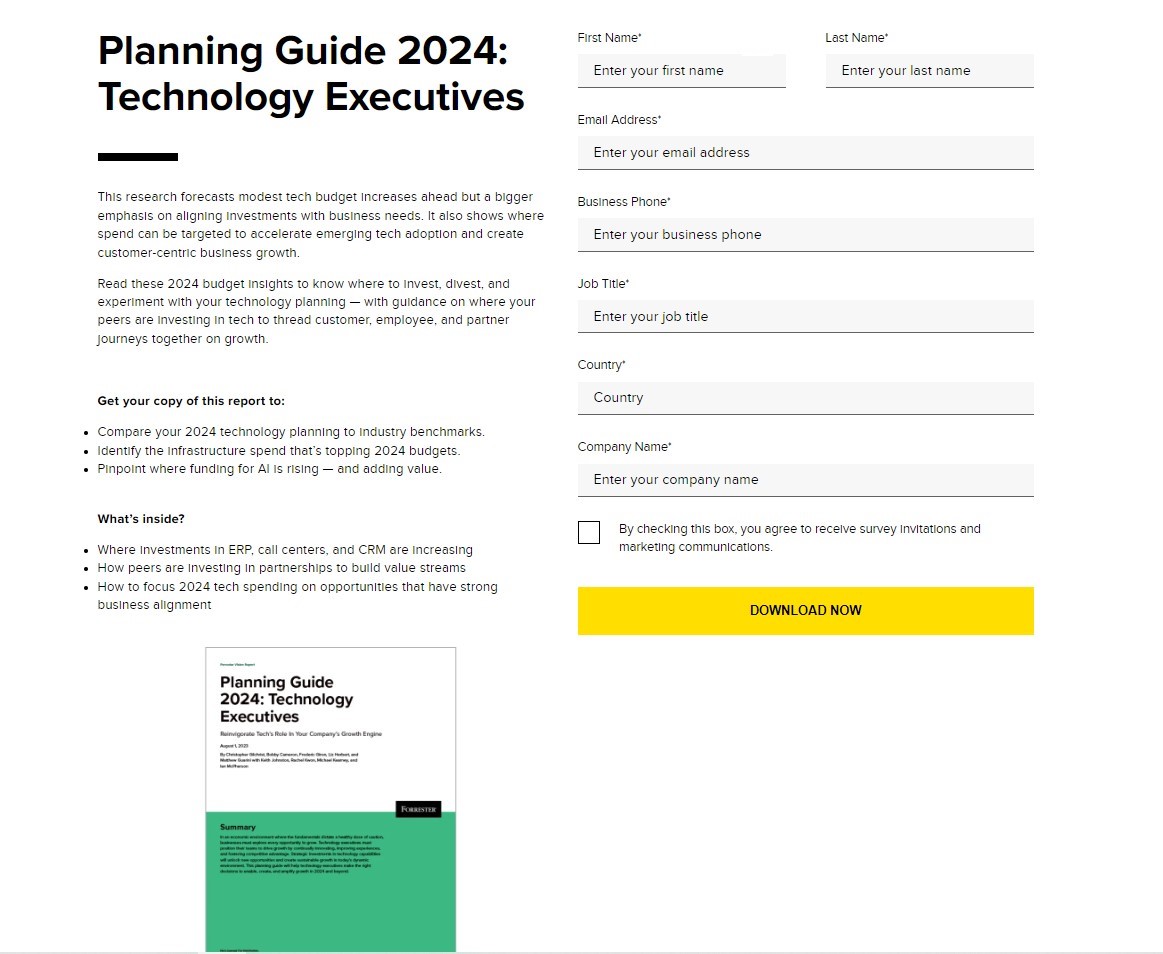
Just by looking at it, you can already sense how comprehensive and valuable the lead magnet is.
Finally, the lead form goes beyond just asking for an email address which tells me that Forrester is using this page to capture and qualify their leads.
However, one area for improvement is that the form itself is a bit long, and this could be a great area to test using a highly optimized multi-step form.
7) On-demand webinar landing page
Last but not least is the powerhouse of lead magnets.
We all know that live webinars are already gold mines for marketers. They offer comprehensive content and a personal touch with live interaction.
But it poses one big problem. Many prospects might be unable to attend them in real time due to scheduling conflicts or time zone differences. This is where on-demand webinars come into play.
Instead of missing out on a large portion of your audience, offering webinars that your viewers can view at their convenience ensures you gain a wider reach.
Here’s an example of a fantastic on-demand webinar landing page from Demio.
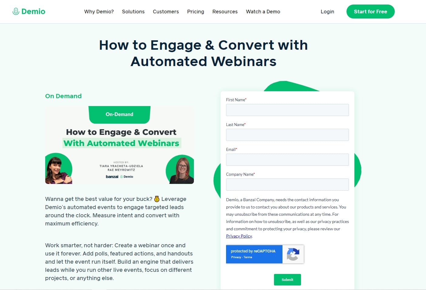
Demio’s design is clean and engaging. It shows a clear headline highlighting what you’ll get and learn from watching the webinar.
Their short description emphasizes the value of automated webinars and paints a picture of an interactive experience.
The images of the hosts also add a personal touch. It gives the prospects a sense of connection, knowing who they’ll learn from. Additionally, the sign-up form is user-friendly.
Overall, Demio’s landing page efficiently communicates value while keeping the user experience smooth and intuitive.
Using multi-step lead forms on your lead magnet landing pages
As I wrap this up, there’s one element that can’t be overlooked on your lead magnet pages: multi-step lead forms.
These forms can genuinely enhance user experience and boost your conversion rates. Because, let’s be honest, nobody enjoys filling out long, tedious forms.
GetLeadForms has some top-notch templates that can help you in this area. Check out our templates here if you’re looking to take your lead magnet landing pages to the next level
Check out these additional insights:
- Multi-step Forms with Unbounce: Ever considered using Unbounce for your forms? I created an easy-to-follow tutorial just for you. Read it here.
- Case Study: Find out how I doubled my leads using a lead magnet as a content upgrade! Check it out here.
- Additional Resource: Are you working with B2B businesses and want to know the most effective lead magnets to create? Click here to read.
Ready to capture more leads?
Build and optimize high-converting lead funnels, quizzes, and forms with AI-powered lead capture software.
Start Free Trial