Insurance Lead Generation: How to Get More (And Better) Insurance Leads
When it comes to generating insurance leads, there are two main approaches you can take with your insurance lead generation efforts.
When it comes to generating insurance leads, there are two main approaches you can take with your insurance lead generation efforts.
You can try to drive more traffic to your website, which takes time and money.
Or, you can get more of the traffic you’re already generating to convert, while also focusing on lead quality.
It’s the second approach that I recommend, assuming you’re already bringing in some traffic.
Why?
Because it’s a strategy you can immediately implement to convert more traffic into highly qualified insurance leads right away.
And that’s what I’ll be discussing in-depth in this post.
While there’s plenty of content like “Top X Tips” for generating insurance leads, there’s not much about getting more out of existing website traffic.
With that said, here’s how to convert more leads to drive insurance sales, including simple changes that can be made to a website and helpful tools you can use along the way.
Your Insurance Website is One of the Best Sources for Generating More Insurance Leads
It’s true that you can try all different types of channels to pull in more insurance leads.
Email marketing, social media, pay-per-click, and SEO are just a few examples.
And as I just mentioned, there’s no lack of content with tips on how to do this.
But at the end of the day, an insurance website is one of the best places for more leads.
Here’s what I mean.
Say your site currently has a 3% conversion rate. If you could increase your conversion rate to 6%, then you will double your lead volume without having to spend any more to get leads.
In turn, this will bring down your overall cost to acquire new leads, and you will get the most out of existing traffic.
When you look at it like this, it’s clear that your website (or landing page) is one of the best sources for more inbound leads.
That’s why I suggest focusing on your website first, especially if you’re already getting some traffic.
This brings me to my next point.
Lead Quality > Lead Quantity When it Comes to Insurance Lead Generation
Getting great results isn’t just about getting a large number of leads.
It’s about getting qualified leads with a strong intent to buy.
Otherwise, what’s the point?
Even if you’re putting a ton of effort and money into a campaign to get insurance leads, you’re not really getting anywhere if hardly anyone actually converts.

Source: Giphy
That’s why you should always be focusing on lead quality rather than quantity.
This is true for all industries, but it’s especially true in the insurance industry, where you need data about your leads before you or someone on your sales team reaches out
So what I’m suggesting here is a two-pronged attack.
- Leverage current insurance website traffic rather than constantly chasing down new leads from different channels
- Develop a fine-tuned process to maximize lead quality
That way you’ll not only generate more leads but better insurance leads.
For the rest of this post, I’ll discuss five simple changes that you can make to your insurance website to convert more traffic into highly qualified insurance leads.
Let’s jump in.
Note: One of the best ways to improve your website conversion and lead quality is by using a tool like GetLeadForms. You can grab a free trial here.
1) Optimize Lead Generation Forms to Maximize Leads
Bad forms will easily kill conversion rates.
Even if the rest of a site is firing on all cylinders, looks great, and offers a seamless UX, conversions will plummet without proper form optimization.
For that reason, this is the first area I suggest addressing on your insurance lead generation website.
One strategy I recommend is to use multi-step forms.
Three reasons why:
-
Placing too many questions in a single lead generation form can overwhelm visitors and send them running without completing it.
-
Prospects nowadays are careful about the information they share and are reluctant to share too much when it’s presented in a single long form.
-
And if you’re selling insurance leads, then there’s a good chance that the business that you’re selling leads to is going to require you to collect more than just a name and email address. A multi-step form is the best way to accomplish this.
Besides that, multi-step forms are ideal for insurance lead gen because they allow you to gather essential lead information so you can qualify leads.
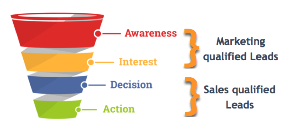
In turn, you can send sales qualified leads (SQLs) with a strong intent to buy to the appropriate salesperson and nurture marketing qualified leads (MQLs) that aren’t quite yet ready.
Not to mention, multi-step forms take up less real estate on a website and tend to have better aesthetic appeal.
And when it comes to conversions, multi-step forms are off the charts, with a HubSpot study finding they converted 86% higher than single-step forms.
Here’s an example of how insurance brand Ladder uses a multi-step form for life insurance lead generation.
First, a visitor who wants a life insurance quote clicks on “Get my price” from the homepage.

The visitor is then taken to this page where they start filling out a multi-step form beginning with their name.
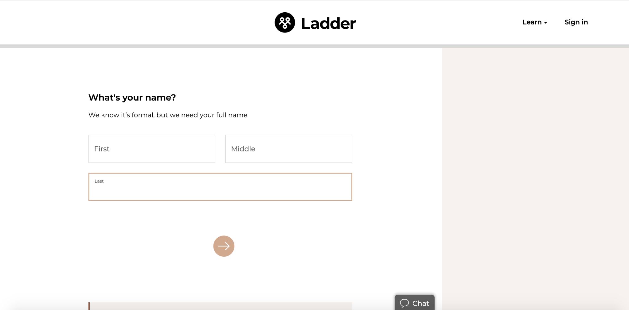
From there they enter their email… Note: if they were using a tool like GetLeadForms then they would be able to turn on a feature called ‘drop-off’ mode to capture the email even of the prospect abandons the form.
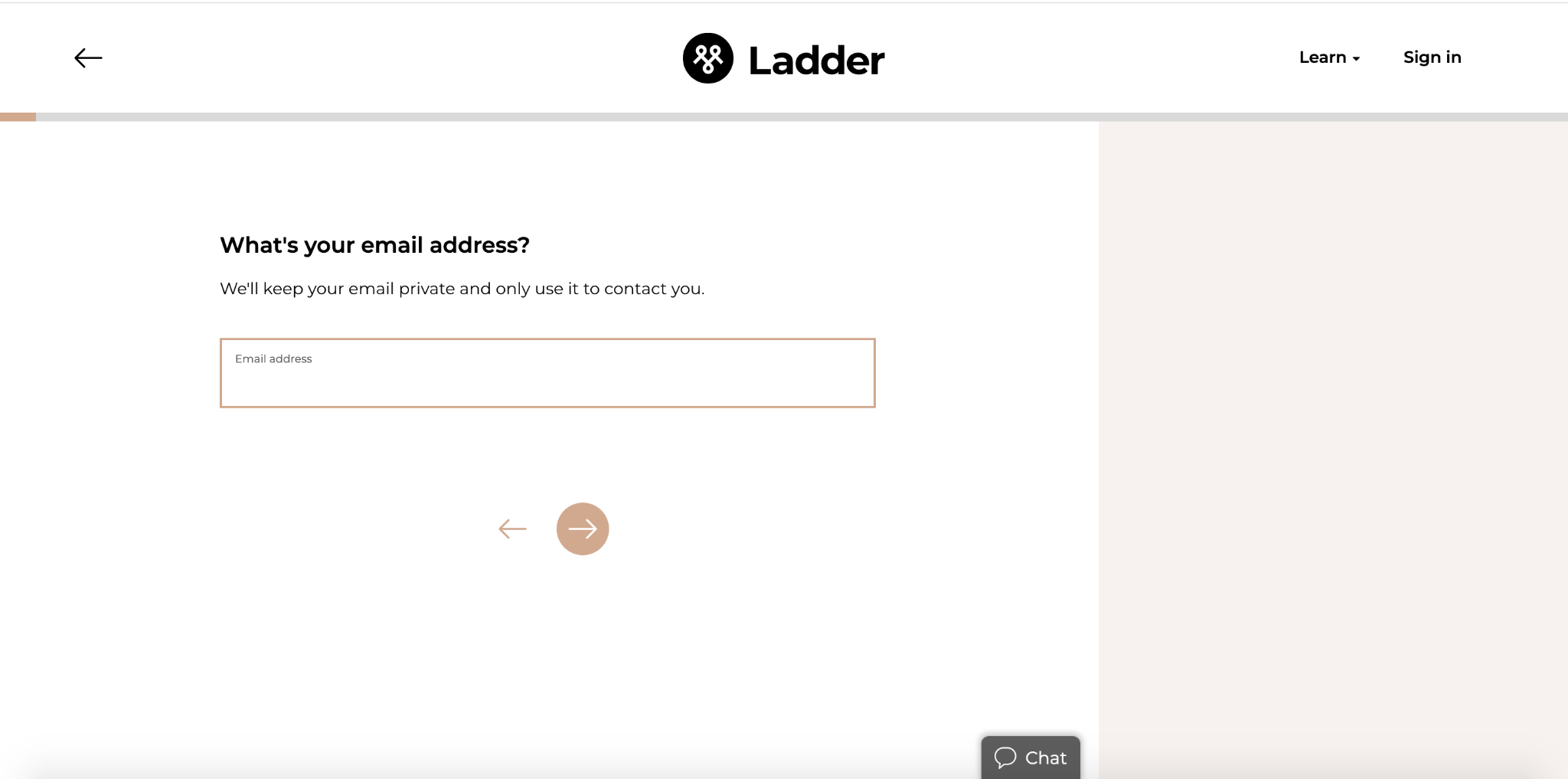
…gender…
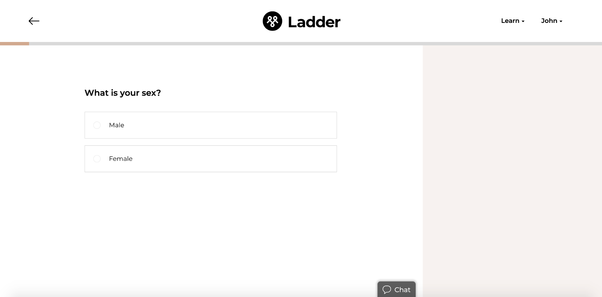
…height and weight, and so on.
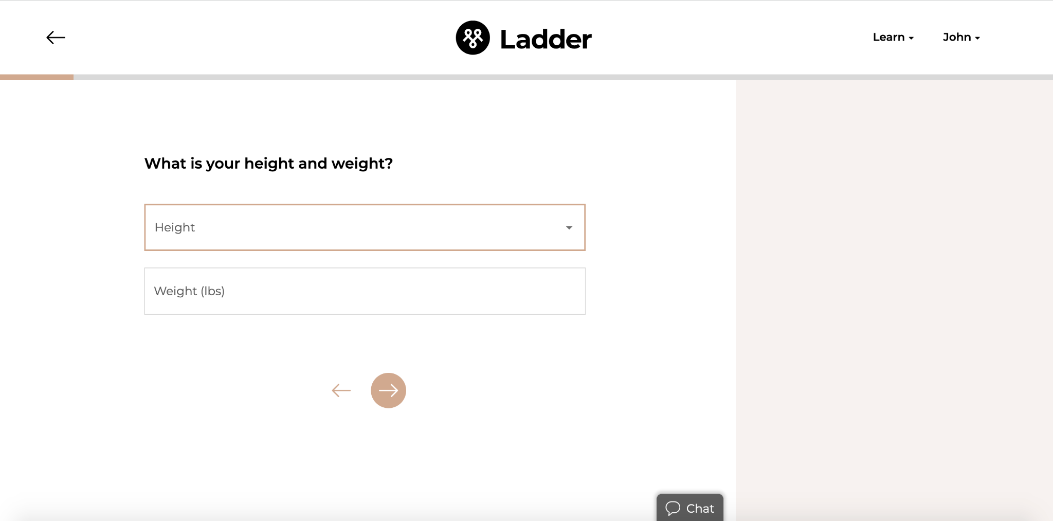
That way Ladder can conveniently collect key information to ensure the lead gets sent to the right team member without barraging the lead with a massive volume of questions in a single form.
It’s a win-win because Ladder gets ultra-qualified leads with important information at their fingertips, and the visitor gets a simple, streamlined user interface that isn’t overwhelming.
Creating multi-step forms like this was pretty challenging back in the day. But now thanks to tools like GetLeadForms, you can create these interactive forms without having to get a developer involved.
This insurance form template, for example, is specifically designed for insurance agent lead generation and can be fully customized to walk visitors through the lead qualification process.
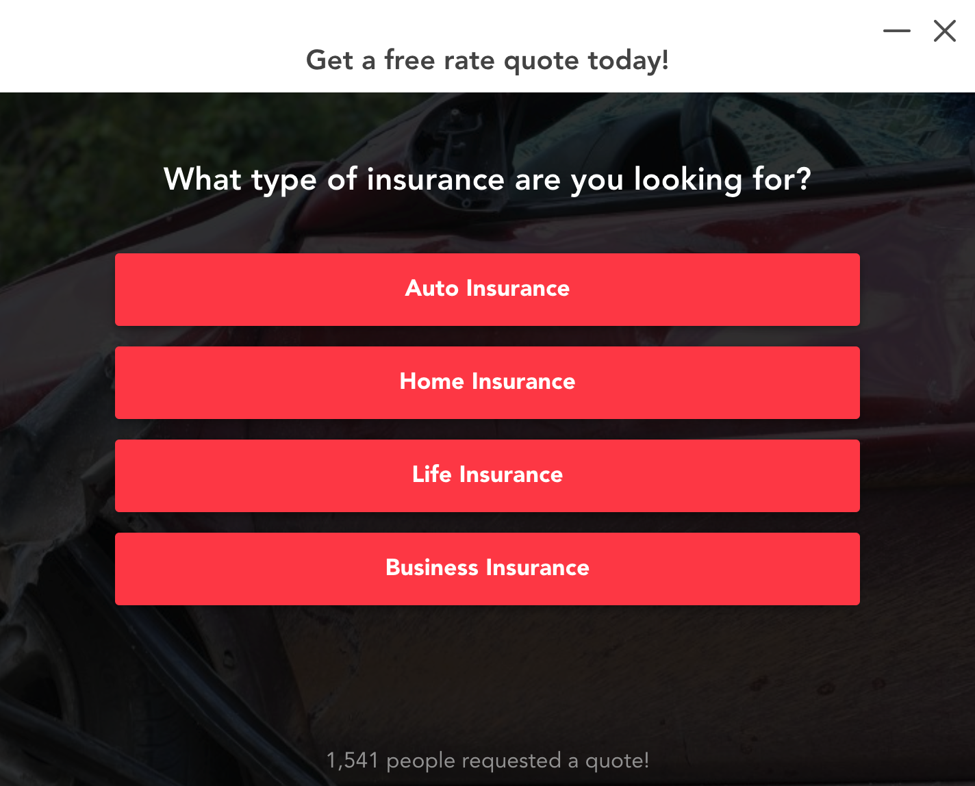
It works across all major websites, including Unbounce, WordPress, LeadPages, and more.
Also, note that GetLeadForms allows you to create conversational forms where you can ask multiple questions in a conversational style.
2) Make the Call to Action Visible and Easy to Find
While this point is somewhat of a no-brainer, I wanted to mention it because of how big of an impact it can have on conversions.
I’m not going to get into all the gory details, as that could be a whole other post in itself.
I just want to talk about the importance of three main things:
- Making the CTA clearly visible
- Ensuring it’s easy to find
- Using well-crafted copy to drive clicks to the CTA
Let’s look at Ladder again, as they do a great job with this aspect of insurance lead generation as well.
For starters, they place their CTA in a conspicuous location above the fold on their homepage.
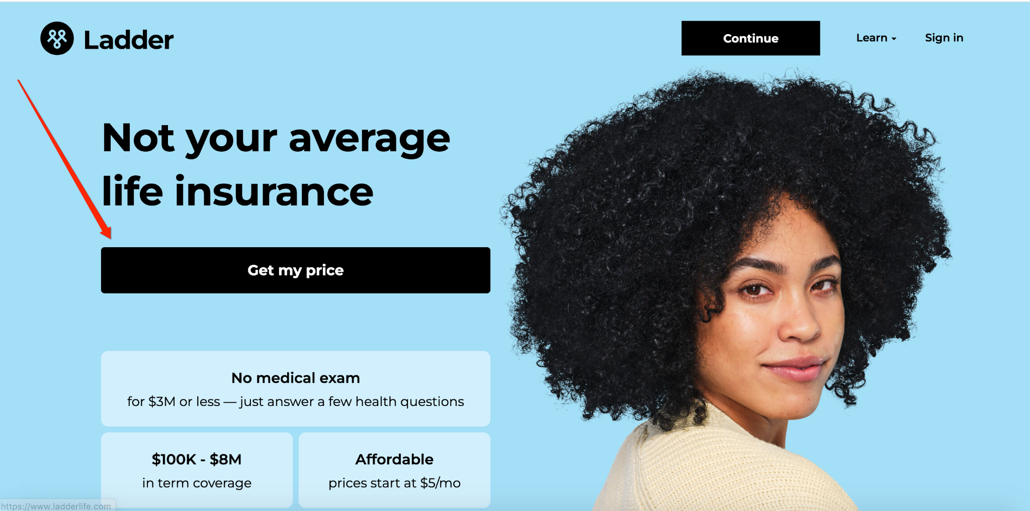
But they also place a link to the same page using slightly different CTAs in other prominent locations, including here…
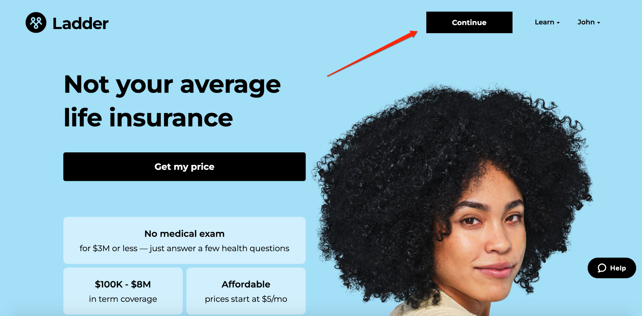
…here…
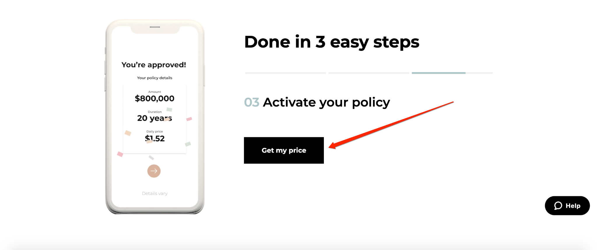
…and here, making them clearly visible and easy to find as visitors browse Ladder’s website.
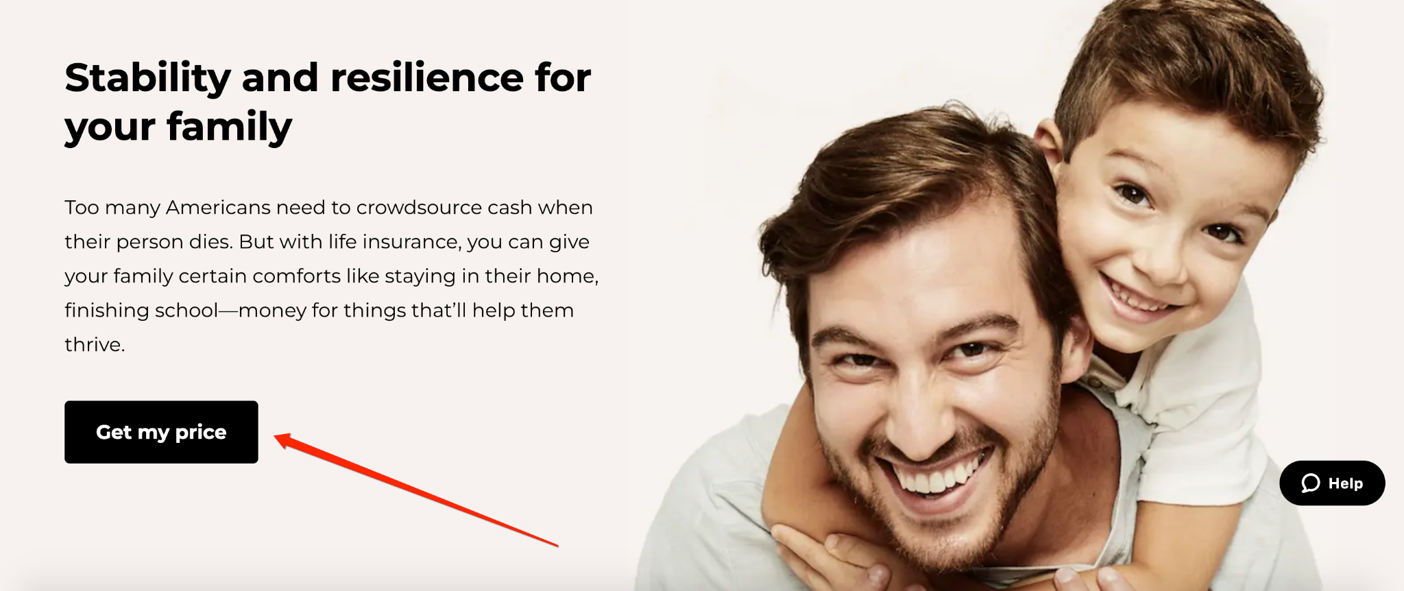
As for copy, they use simple yet powerful writing, starting with an eye-catching headline and transparent benefits with concrete numbers.
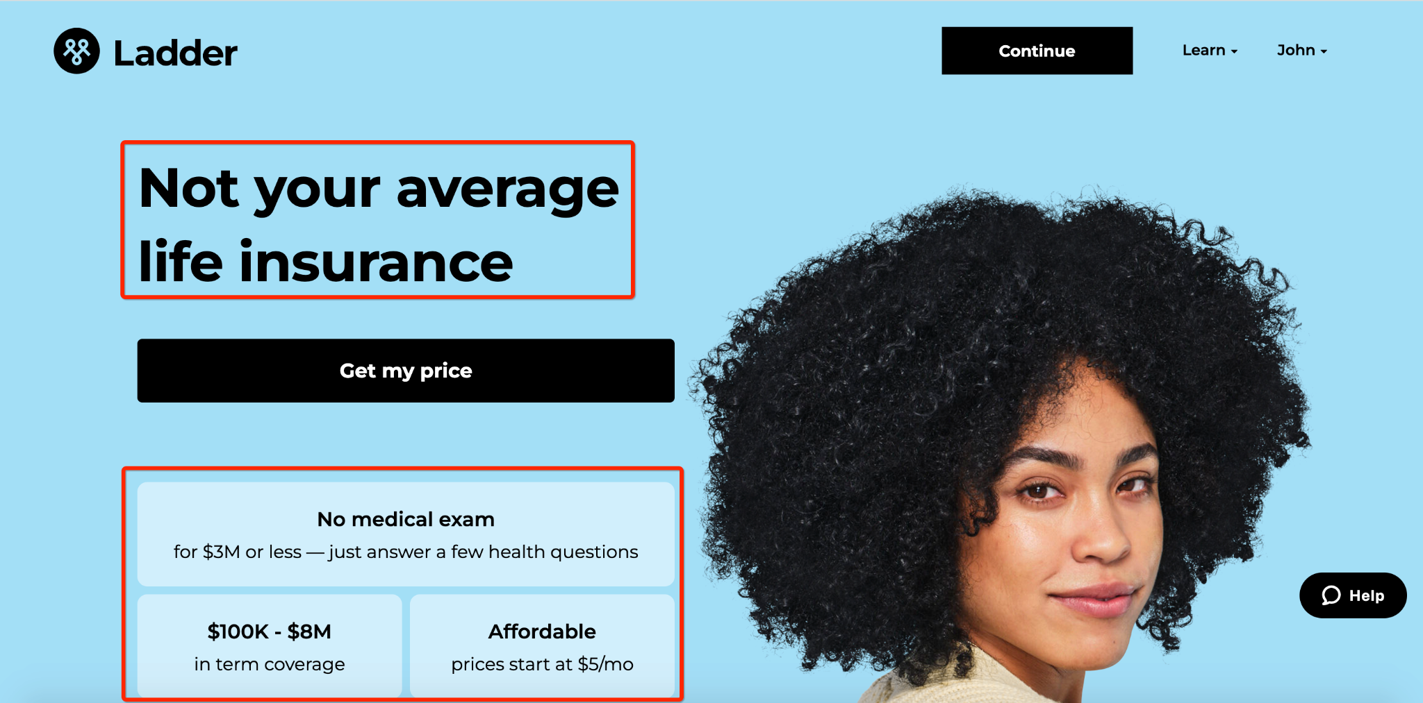
They feature real-life testimonials for social proof and numbers on how much coverage they’re providing and how many people are applying.
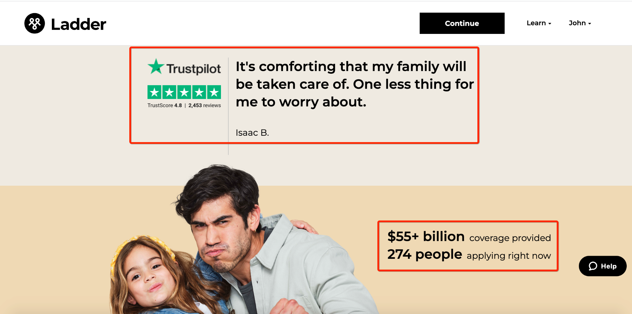
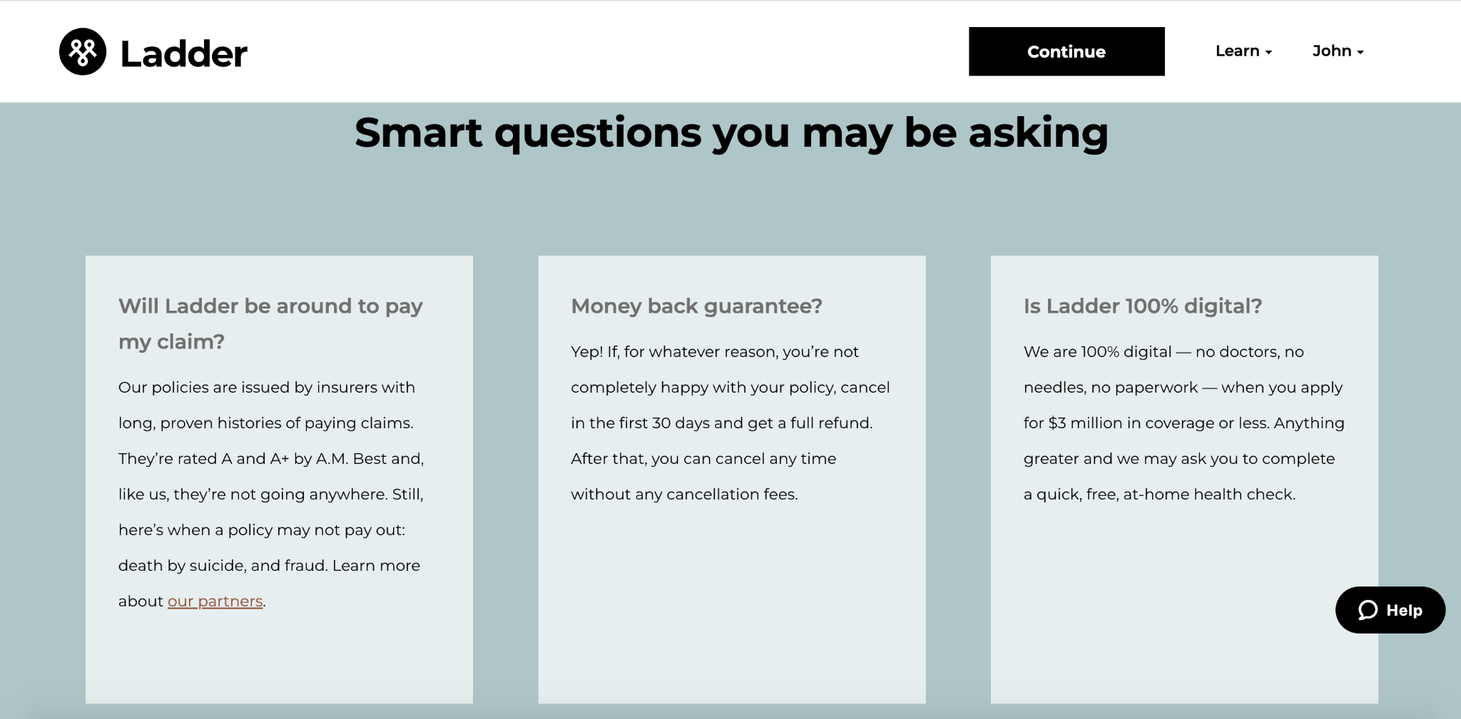
They feature answers to pressing questions visitors may have.
And they zero in on key concerns visitors have when considering purchasing online life insurance.
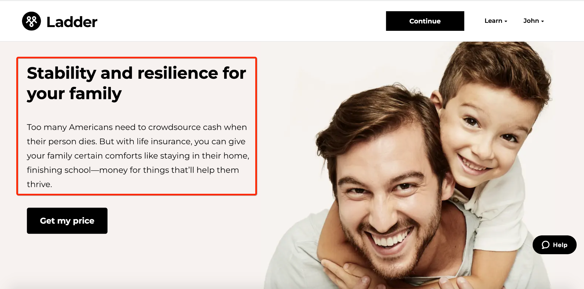
Put that all together, and Ladder’s CTAs help convert the maximum percentage of visitors into qualified leads.
3) Create a Quiz or Survey
Another easy way to streamline lead generation for insurance agents while also ensuring leads get routed to the right place is by offering a quiz or survey.
Not only does this help you capture more insurance agent leads, but it also offers several other benefits, including the following.
- It simplifies the process of answering multiple questions, making it easier for leads to get from start to finish
- It focuses on micro-commitments rather than asking for a ton of information upfront like you would with a single form
- You can gather insightful data to assist with lead follow-up and ensure leads are supplied with hyper-relevant, personalized information
- You can add MQLs who aren’t ready to buy right away to your email list for nurturing
- It improves the overall user experience
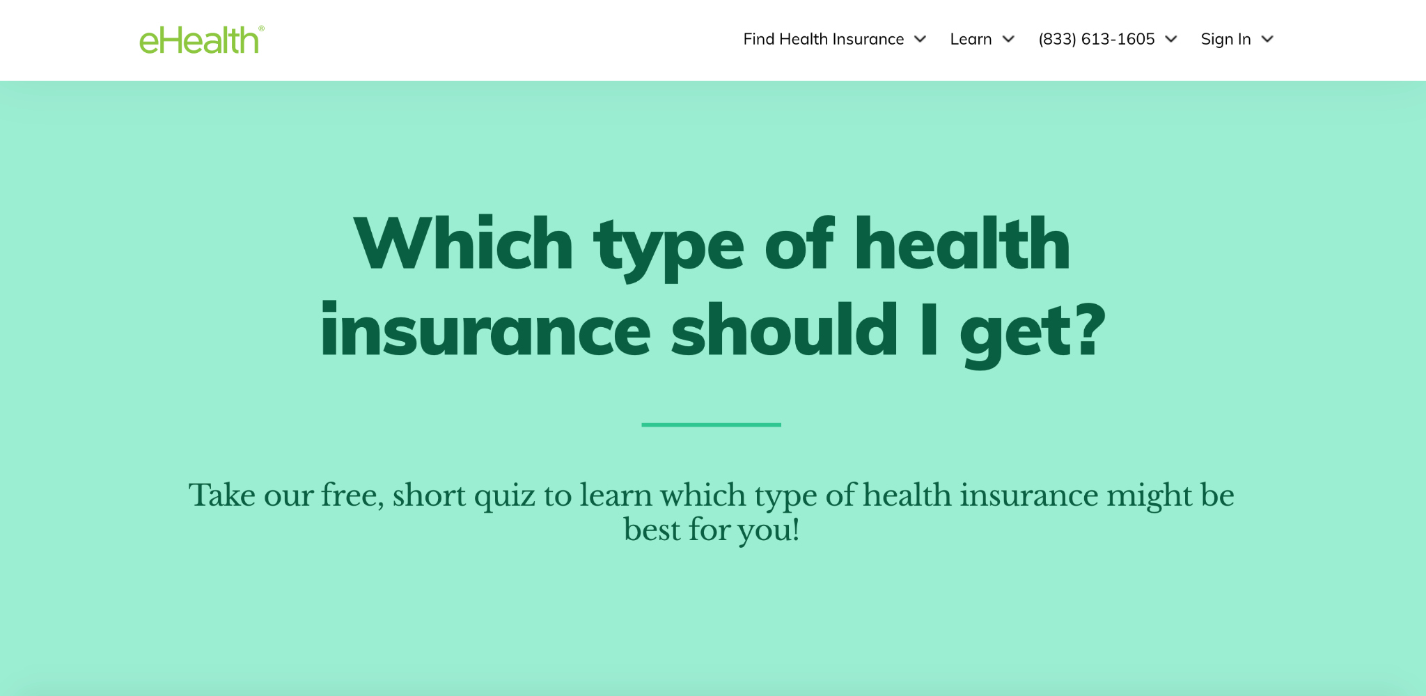
A great example of a company that uses quizzes/surveys to their advantage is eHealth, “the largest private health insurance market in the US.”
Here’s the first thing visitors see when arriving on eHealth’s site.
After scrolling down, they begin the quiz with this simple question.
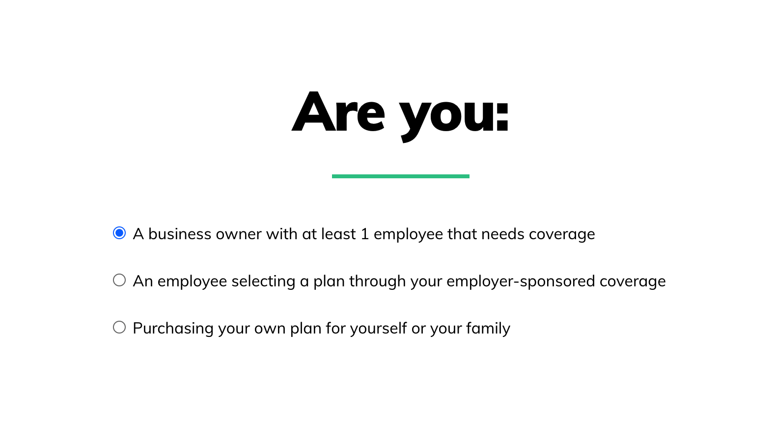
Based on the prospect’s response, they work their way through the rest of the quiz. I’ll say I’m purchasing my own plan for myself and my family for this example.
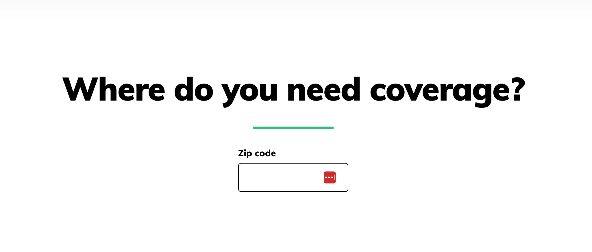
Then, I’m prompted to enter my ZIP code…
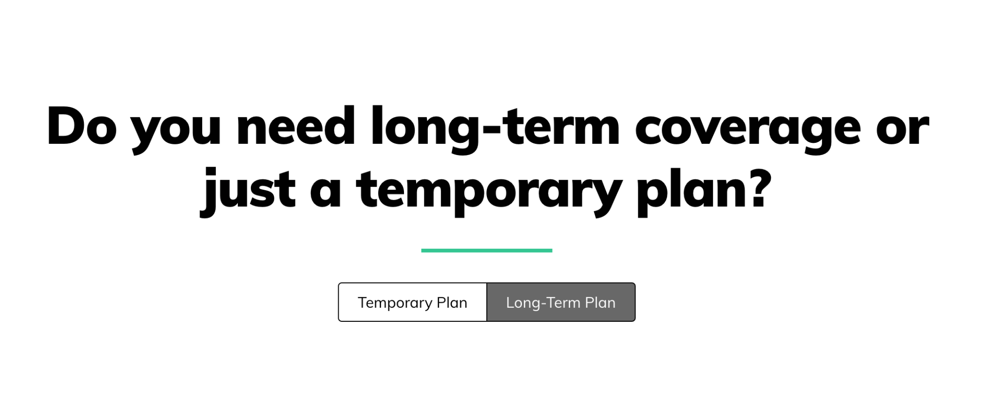
…how long I need coverage for…
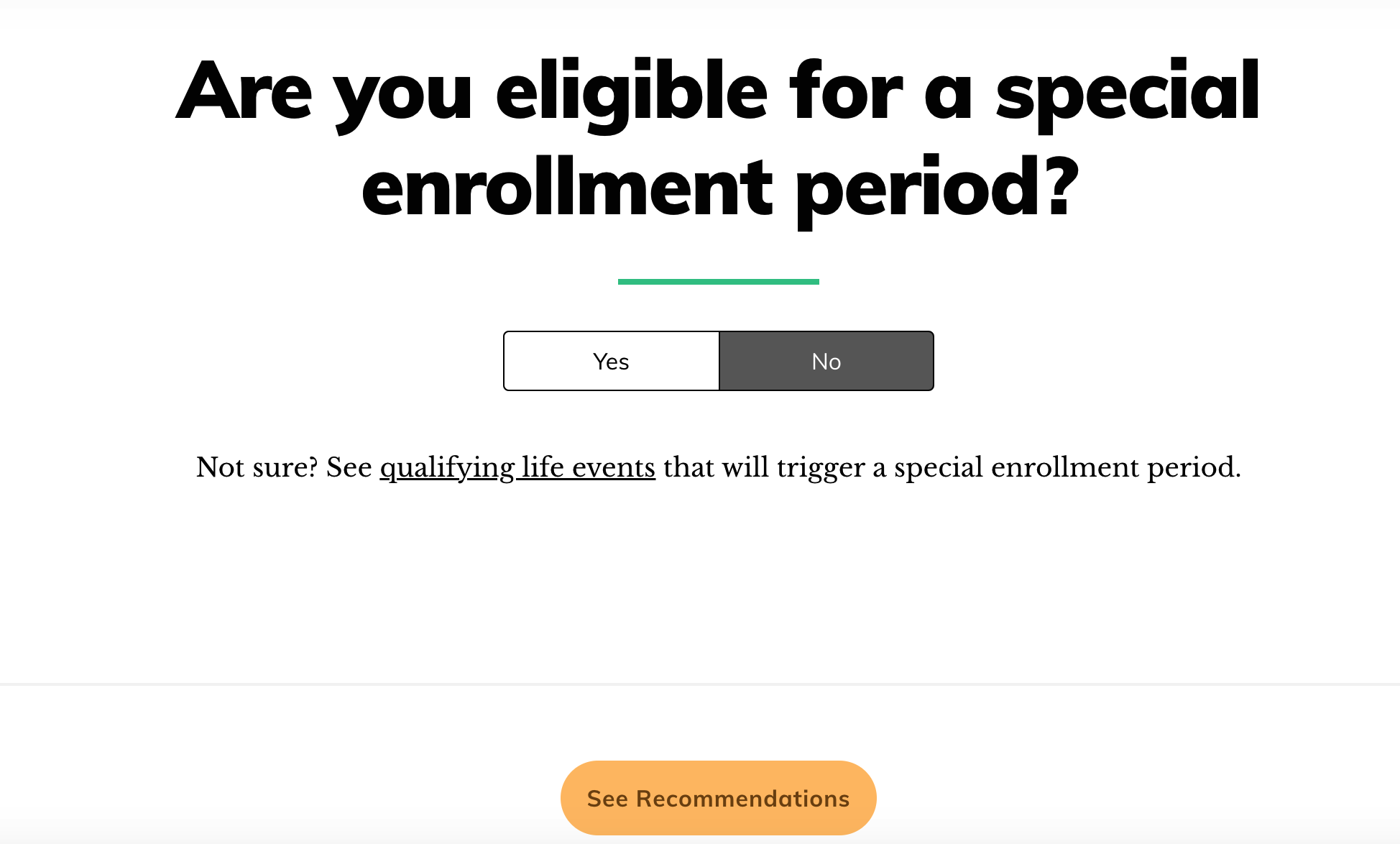
…and if I’m eligible for a special enrollment period.
Then, I click on “See Recommendations.”
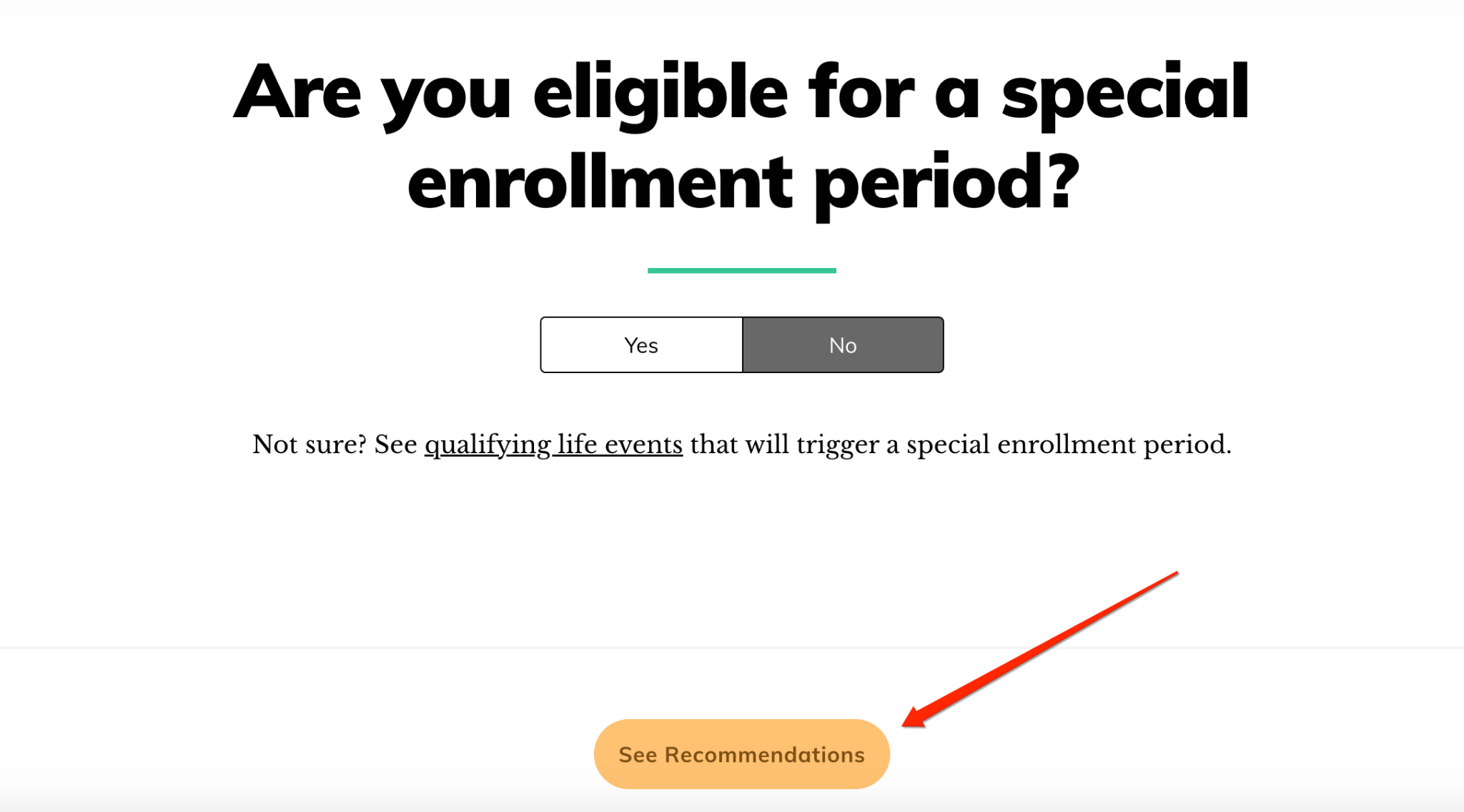
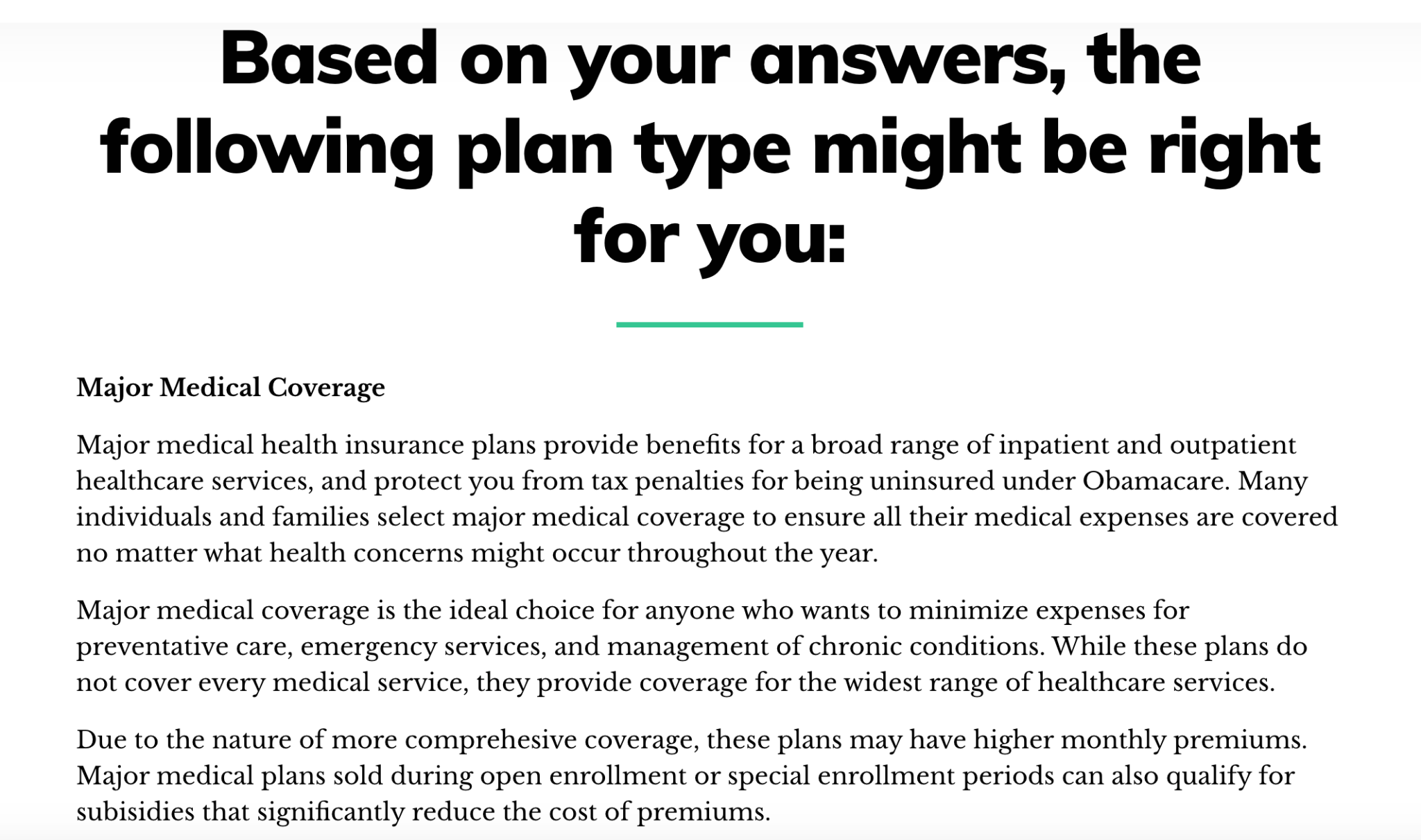
From there, I can see what type of plan might be right for me.
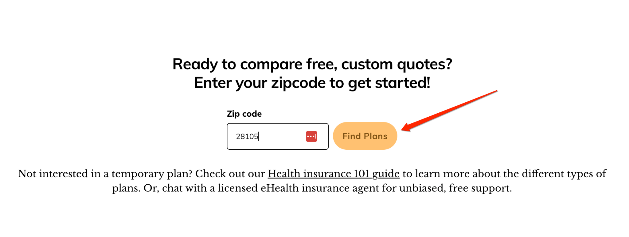
And finally, I can get free, custom quotes by clicking the “Find Plans” CTA at the bottom.
So, how do you create these high-converting quizzes and surveys?
This is where a tool like GetLeadForms can help. Here’s a template to help you get started.
A quick tip to streamline the process of filling out quizzes and surveys is to use autocomplete for basic information like name, address, and email.
This saves a lead time and can make the experience feel much more fluid.
Further reading on building lead quizzes and surveys: How to supercharge your landing pages with multi step forms & lead quizzes.
4) Make it Easier for Your Website Visitors to Find Your Forms
Put yourself in the shoes of your average insurance website visitor for a second.
After arriving on the site, they may check out a variety of pages, including your homepage, about page, blog, pricing page, contact page, and so on.
But you never know exactly when they’ll be ready to fill out a lead form.
One of the best ways to maximize form engagement and thus increase lead volume is by adding a lead capture widget that’s available on all website pages.
So after your visitors are done browsing and ready to convert, all they have to do is open the widget and fill out the form.
With GetLeadForms, for example, you can add a lead capture widget that looks similar to a chatbot with a subtle message in the bottom corner of the site.
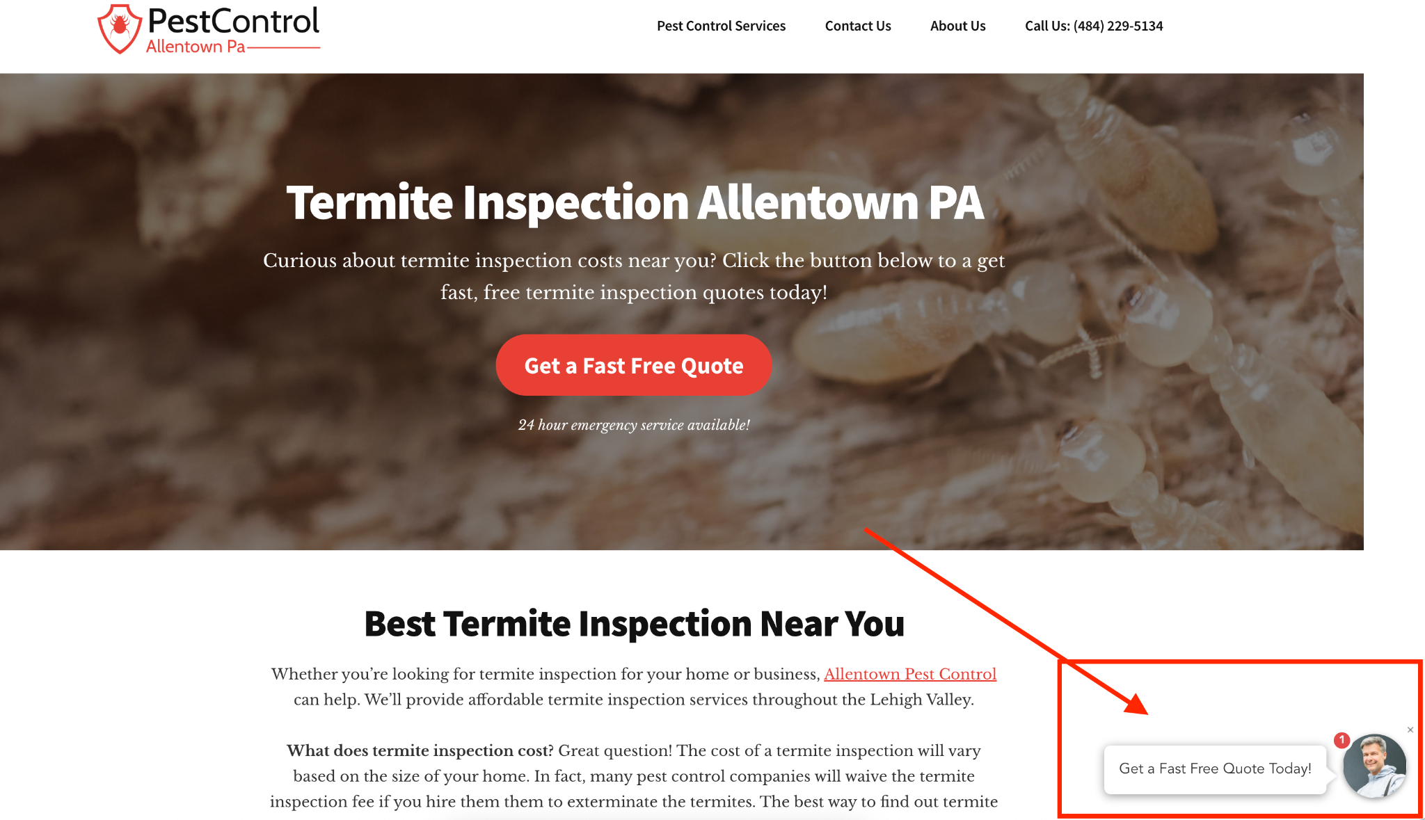
The widget shows up across the entire site and is always following people throughout their journey.
So whenever they’re ready, they simply click on it and can fill out the form at their convenience.
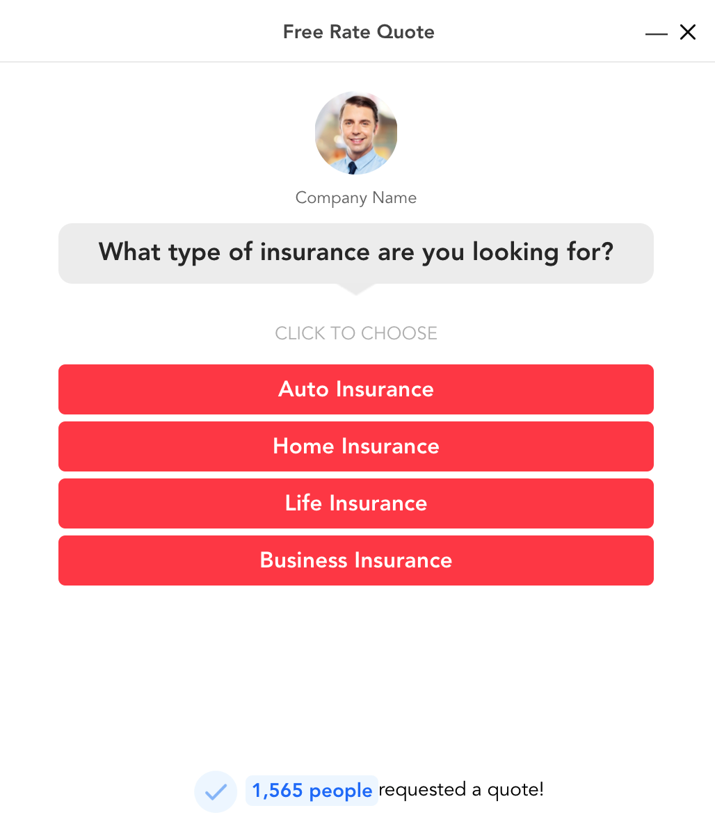
This makes it as easy as possible to engage with a form and is one of the best ways to get more qualified insurance agency leads.
5) Use Exit-Intent Popups to Engage Visitors as They Are Leaving Your Site
Let me start by saying not everyone’s a fan of popups.
I get it. They can be annoying.

Source: Giphy
And while some insurance lead generators see them as a nuisance, they can actually be quite effective when used correctly.
I recently wrote an entire post about responsibly using exit-intent popups for service businesses, which is worth checking out.
Although the insurance industry doesn’t operate the same way service businesses do, the same fundamental principles apply to insurance lead generation.
The main goal of exit-intent popups is to get visitors that are about to leave to engage with your site — to check out your offers, read your blog posts, look at pricing, and so on.
It’s just a matter of serving up the right exit-intent popups at the right time so you’re able to nurture the segment of visitors that are about to lead and warm them up to the idea of buying.
Do that correctly, and a decent percentage of people will engage with your exit popups, which means you’ll generate more quality insurance leads and get the most out of website traffic.
As long as the offer is compelling and not annoying, this can be an insanely effective way to convert more traffic into highly qualified insurance leads.
Let’s look at an example from Chubb Commercial Insurance, a company that uses an exit-intent popup flawlessly for commercial insurance lead generation.
Here’s the first thing visitors see when landing on their site.

Chubb’s main goal is to get visitors to ask for a quote, so they have multiple CTAs throughout their site, including these two.

They also have this “sticky” CTA that follows visitors while they’re exploring Chubb’s site.
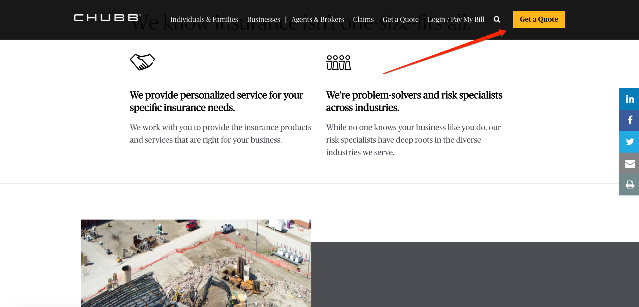
Of course, only a small percentage of visitors will click or tap on this CTA, which is why Chubb uses this exit-intent popup to grab the attention of the majority of visitors that don’t.
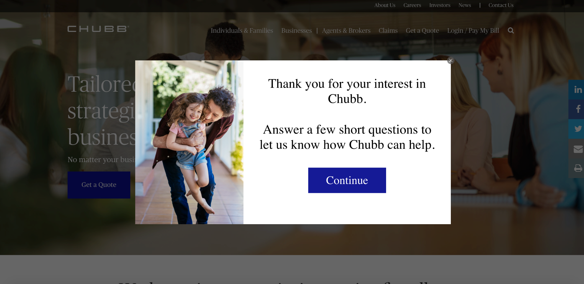
It’s not disruptive, and if someone isn’t interested, they can simply click away and the popup disappears.
And while it won’t get everyone to engage and ask for a quote, you can bet that it raises Chubb’s conversion rate significantly without creating unnecessary friction.
If you want to create your own exit-intent popups for an insurance website, GetLeadForms makes it super easy.
With it, you can add an exit popup to any landing page with a quick flip of a toggle switch.
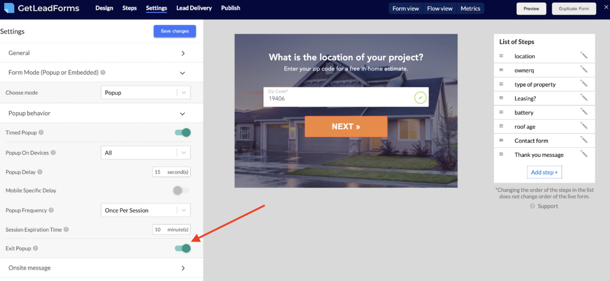
That way there’s no messy coding, and you can turn it on or off whenever you like.
Wrapping Up Our Discussion on Insurance Lead Generation
While spending more money to drive more traffic to your insurance website is an option, it’s often more effective to better leverage the traffic you’re already getting.
This is something you can do right now, and by focusing on quality over quantity, you should be able to generate more highly qualified insurance leads immediately.
To recap, the five core strategies to focus on are:
- Optimizing lead generation forms
- Making your CTA visible and easy to find
- Using a quiz or survey
- Make it easier to find your lead capture forms
- Leveraging exit-intent popups to engage prospects as they are leaving your site
Interested in exploring some of our insurance lead form templates to maximize leads? Browse our templates here.
Ready to capture more leads?
Build and optimize high-converting lead funnels, quizzes, and forms with AI-powered lead capture software.
Start Free Trial