Form Conversion Rate Benchmark Report: Understanding and Improving Your Form Conversion Rates
So, you’ve likely landed here wondering, “What’s a good form conversion rate?”
So, you’ve likely landed here wondering, “What’s a good form conversion rate?”
And it’s a common question that I get asked all of the time because, let’s face it, your form can really make or break your landing page or website’s success.
That’s why in this post, I’ll dish out some form conversion rate benchmarks based on what I’m seeing over here at GetLeadForms.
I’ll discuss why it’s a complete waste of time to focus on industry average benchmarks and I’ll even show you how to establish your own.
Plus, I’ll throw in some tips to help you boost your form conversion rates to get even more leads.
Why Your Form Conversion Rate Matters
If you’re already sold on why your form conversion rates matter then feel free to skip ahead to the benchmarks.
But if you need a little nudge to see why focusing on your form is worth it, let’s dig in.
Here’s the deal:
Your form is like the make-or-break superhero of your landing page or website’s conversion rate.

And here’s why:
Form conversion rates are a big deal since they directly affect how many leads or sales you get from your website and landing pages.
In fact, I even like to say that your form is like the bridge between your website and your sales team.
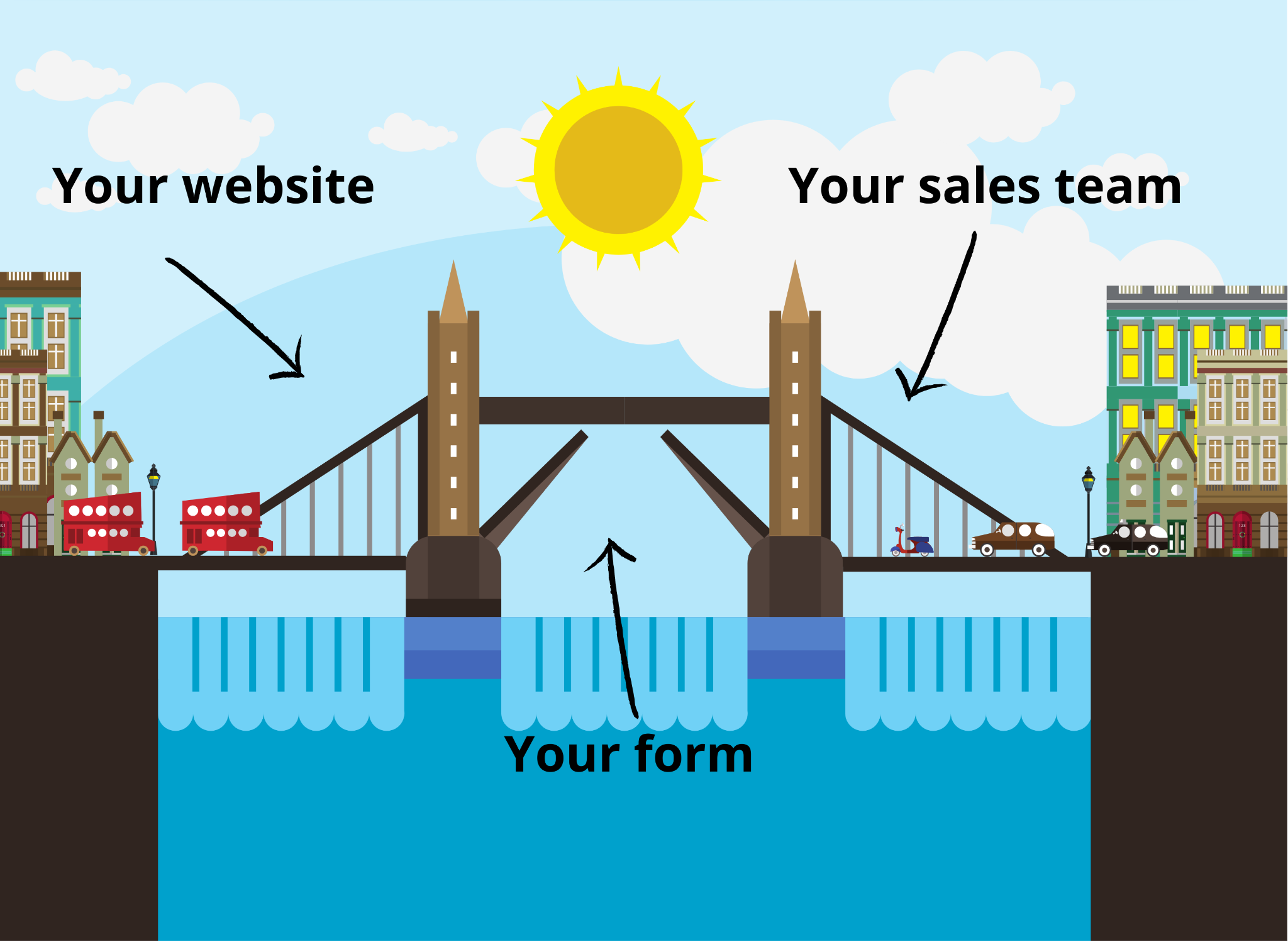
Boosting your form conversion rate means more leads or sales without spending more on marketing, and it helps shrink your CPAs.
But, just one hiccup with your form could tank your conversion rates and mess with everything, from your overall website and landing page conversion rates to your cost per acquisition. We’ll touch on some factors that might crush your form conversion rate later in this post.
Additional reading: Instantly increase conversions with these 11 Proven Lead Generation Form Templates (By Industry)
Average Form Conversion Rate: It Might Be Lower Than You Think
So, what’s a good conversion rate of a form, you ask?
Well, if you chat with any marketer about it, they’ll likely toss out a number between 2-3%. That’s been the go-to figure for years.
And, honestly, I’ve found that to be pretty accurate overall.
But, surprise! Average form conversion rates might be lower than you’d think.
A study by Ruler Analytics shows the average form conversion rate across all industries is 1.7%. But, it varies a lot among industries, with some nailing way higher conversion rates than others.
Nowadays, with website visitors being extra cautious about sharing their oh-so-valuable contact info, I’d suggest assuming that the average form conversion rate probably leans more toward the 1% range. But again, it depends on the industry, traffic source, and even the type of form.
Form Conversion Rate Benchmarks by Industry
Alright, let’s dive into specific industries to give you a better idea of conversion rates by industry.
To paint a picture of what a good form conversion rate looks like, I’ll share some benchmark figures from Ruler Analytics Average for rae by industry, along with some data from GetLeadForms so you can see what we’re experiencing here.
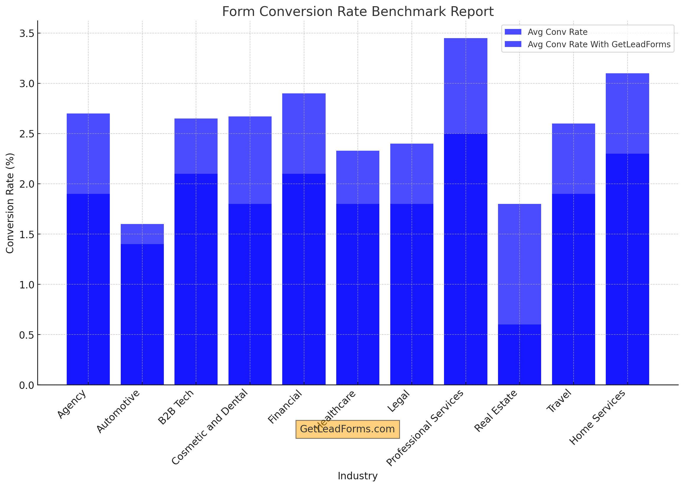
Here’s a breakdown of the table above:
Industry
Avg Conv Rate
Avg Conv Rate With GetLeadForms
Agency
1.9%
2.7%
Automotive
1.4%
1.6%
B2B Tech
2.1%
2.65%
Cosmetic and Dental
1.8%
2.67%
Financial
2.1%
2.9%
Healthcare
1.8%
2.33%
Legal
1.8%
2.4%
Professional Services
2.5%
3.45%
Real Estate
0.6%
1.8%
Travel
1.9%
2.6%
Home Services
2.3%
3.1%
With GetLeadForms we see that the average conversation rate increases by an average of 36%. Keep in mind that all this data is benchmark info, which means a bunch of factors influences it. And that leads me to my next point
Why Industry Benchmarks Don’t Matter
And how to establish your own benchmarks
I’ve been in the online marketing game for over two decades, and at this point in my career, I could care less about industry benchmarks.
It’s not that I’ve got some magic touch, but I’ve learned that other people’s benchmarks aren’t all that important, and they’ve never really helped me push the envelope.
Here’s why I think focusing on average industry benchmarks isn’t worth your time:
- Benchmarks don’t capture your unique situation: Benchmarks are often based on aggregated data from various businesses and industries, which means they might not accurately reflect your specific situation. Factors like your audience, product, and marketing strategy can all impact your conversion rates.
- Benchmarks limit your potential: If you’re only trying to hit a benchmark, you might be selling yourself short. Your business could achieve conversion rates that are way higher than industry averages if you push beyond these standardized goals.
- Benchmarks are a moving target: Conversion rates fluctuate over time due to changes in technology, user behavior, and market trends. Relying on old benchmarks can lead to some seriously bad calls.
Now, don’t get me wrong – I’m not saying to forget about benchmarks completely. What I’m saying is, focus on your OWN benchmarks.
How to establish your own form conversion rate benchmark:
First off, you have to figure out your form’s conversion rate. Your landing page or CRM tool probably gives you that info, so I won’t go into detail here.
I’ll use GetLeadForms as an example since our lead form builder lets you see your form conversion rates right out of the gate.
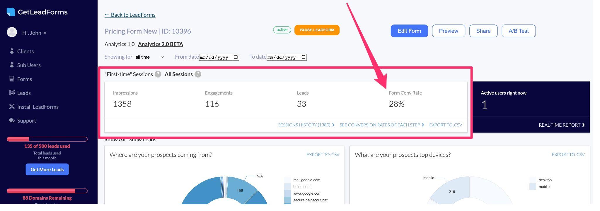
Wanna follow along? Grab a free trial of GetLeadForms here.
Start by gathering data on your current lead form conversion rates. You’ll need enough data (think 60-90 days) to set a solid baseline.
In GetLeadForms, it’s as easy as adjusting the From Date and To Date. This will give you an updated baseline conversion rate.

You can even export this data to a CSV if you want to save it.
Next up, it’s time to optimize your form to boost those conversion rates.
Form Optimization Tips: 6 Ways to Improve Your Form Conversion Rates
In this part of the post, I’ll show you some key areas to focus on that’ll help boost your form’s conversion rate.
Even if you haven’t set up your benchmarks yet, don’t sweat it! Go ahead and make these changes anyway.
Honestly, waiting around for perfect data won’t get you far. The best marketers know how to make moves even without all the info they’d like. So, if you don’t have your benchmarks sorted yet, no worries. Just keep pushing forward!
1) Use multi-step forms to increase conversions
Multi-step forms are all the rage these days, and it’s easy to see why.
They’ve got some cool perks that make them better than old-school, single-step forms.
First off, they’re way more user-friendly ’cause they break the form into smaller, easier-to-handle steps.
Check out how slick this form looks with the fields separated into their own step:
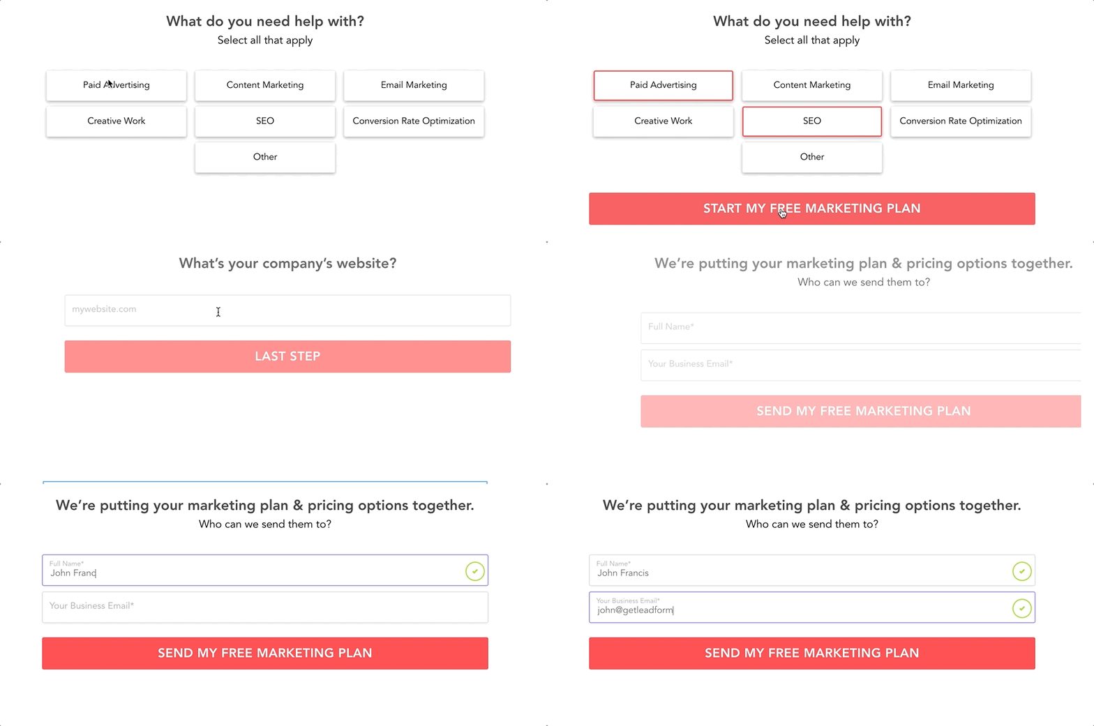
It makes the form way less scary and more eye-catching for users, which is super important. Wanna grab this template? It’s right here.
But that’s not all!
Multi-step forms also bring higher conversion rates to the table, thanks to their friendlier, more laid-back vibe. People are way more down to complete a form that’s easy on the eyes and doesn’t drown them in fields all at once.
So, if you wanna kick your form conversion rates up a notch, multi-step forms are where it’s at. They don’t just make filling out forms more fun for your users, they can also seriously boost your conversion rates. Talk about a win-win!
2. Find the sweet spot with the right number of fields
When it comes to form fields, it’s all about balance.
Too many fields can spook potential leads, while too few can be counterproductive. The secret is finding the perfect number of fields for your form. Like in these examples.
Sure, reducing the number of form fields can make it easier for visitors to complete them, boosting your conversion rate. But you don’t want to strip it down so much that you’re missing crucial info from your leads.
What you want to do is focus on asking for the basics, like contact details, and then throw in a couple of qualifying questions like in this example — notice how it starts out with a simple question to engage the website visitor:
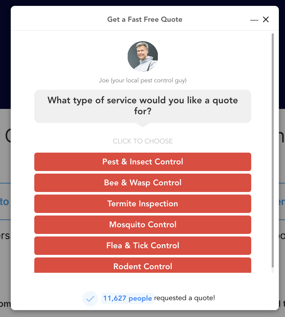
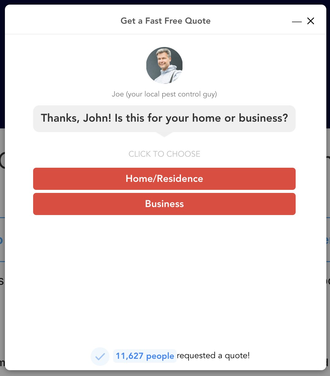
Then it asks a qualifying question or two just before asking for contact details.
Qualifying Question 1
Qualifying Question 2
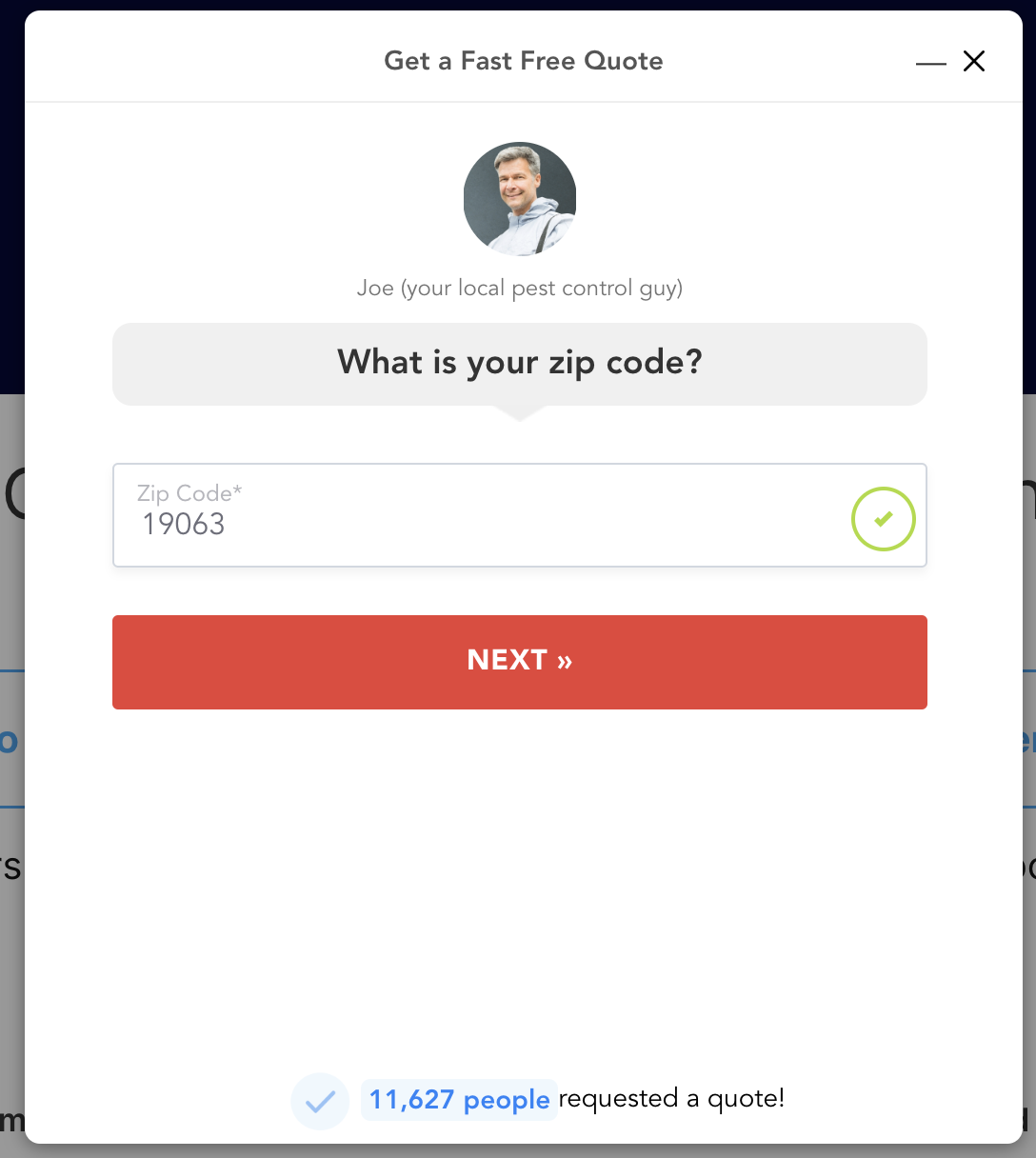
It asks just the right amount of questions without overwhelming your prospects.
You can see it in action here.
3 Show off some social proof
Social proof is like the secret sauce that adds some extra firepower to your form. At GetLeadForms we see that adding social proof can boost form conversions by 26%
So, flaunt those testimonials, reviews, or shoutouts from happy customers to give your form a credibility boost and convince more visitors to fill it out.
Here’s an awesome example of using real-time social proof in your forms:
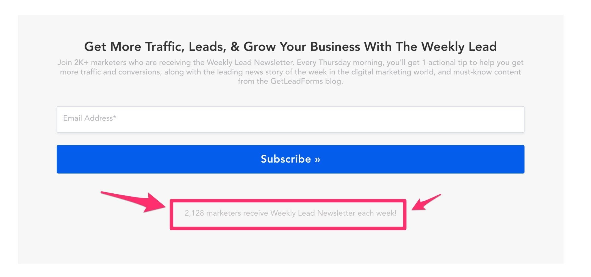
Each time a prospect fills out the form, the counter ticks up. Meaning it’s authentic and shows visitors they’re joining a growing crowd of happy customers. Want to see a form with built-in social proof? Just click right here.
By showcasing real-life examples of satisfied customers, you’ll make your form feel more trustworthy and relatable. And who doesn’t love some good ol’ validation, right?
4. Sweeten the deal with incentives
Who doesn’t love a little extra something?
Offering incentives, like discounts, free trials, or exclusive content, can really amp up the motivation for visitors to fill out your form, and that means higher conversion rates for you!
Imagine a visitor hesitating over your form, and then they spot a tempting offer, like this:
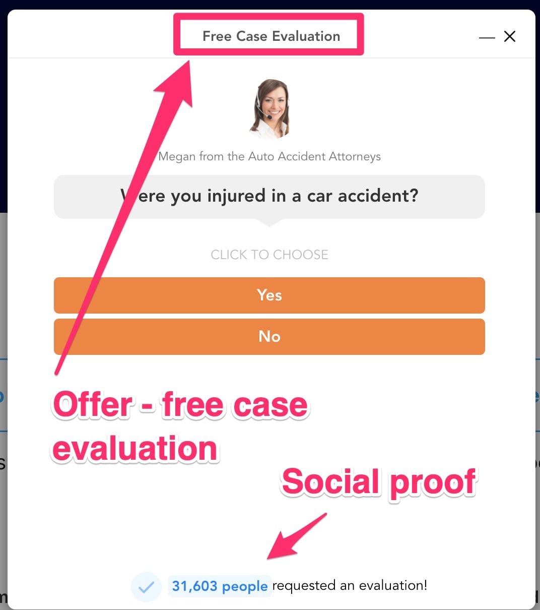
Maybe it’s a 10% discount on their first time doing business with you, a free consultation, or a members-only e-book. Suddenly, they’re way more excited about completing your form.
So, go ahead and spice things up with some cool incentives. You’ll not only make your form more appealing but also give your conversion rates a nice little boost.
5. Make your forms easy to find
This might seem like a total no-brainer…
… but you’d be surprised how many people bury their forms on some random “Contact Us” page and then wonder why they have such low contact form conversion rates.
Instead of making your visitors go on a treasure hunt, the key is to make your forms super easy to find
This is exactly why I created the onsite message feature for GetLeadForms.
The onsite message feature is a subtle way to keep your forms within reach at all times. It helps you display cool, personalized messages right on your site to make the user experience more fun, grab leads, and pump up those conversions.
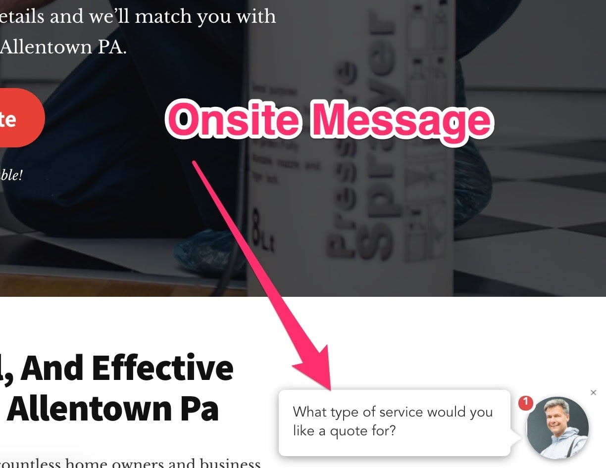
When you give it a click, the onsite message smoothly reveals your form. Want to see it in action? Check out the demo right here!
6. Show the human behind your form
Your prospects are more likely to engage when they feel connected to a human, not just a faceless entity.
Here’s how you can do it:
- Use a friendly tone: Write your form copy like you’re talking to a friend. Make it conversational, relatable, and easy to understand. Drop the jargon, and keep it simple.
- Be transparent: Let people know why you need their information and how you plan to use it. It builds trust and shows that you respect their privacy.
- Use a photo: Including a picture of yourself can help establish trust and make your form more personable. Let your audience see the face behind the form!
Speaking of using a photo in your form, here’s a great example. You can even grab this template here.

By revealing the human side of your form, you can create a more enjoyable experience for your audience and boost your conversion rates in the process!
Final Thoughts on Improve Your Lead Form Conversion Rate
There you have it — in this post, I shared some benchmarks around form conversion rates, insights into how to establish your own benchmark, and some practical tips to improve your form conversion rates.
With that said, don’t wait for perfect data or get caught up in industry benchmarks. Start optimizing your forms today and watch those leads and sales roll in.
Some next steps:
You can signup for a free trial, (there’s no credit card required): Try GetLeadForms free here →
Or, explore some of our proven starter templates →
Looking for some additional content? Check out these posts:
- Improve your conversion rates with this post: 9 Landing Page Form Teardowns (Mistakes to Avoid)
- Get some No-Fluff Advice: How to Build a Lead Generation Website That Converts
- Check out these 14 High Converting Lead Generation Form Examples [By Industry]
Ready to capture more leads?
Build and optimize high-converting lead funnels, quizzes, and forms with AI-powered lead capture software.
Start Free Trial