7 Exit Intent Popup Examples For Service Businesses (With Templates)
I’ll be the first to admit that there are a ton of articles featuring exit intent popup examples.
I’ll be the first to admit that there are a ton of articles featuring exit intent popup examples.
While many offer helpful info, they’re pretty broad and only include generic examples that might not directly apply to you.
Also, most posts only talk about using exit intent popups to simply generate email leads, but not necessarily qualified leads with a strong intent to buy.
In this post, I’ll be focusing on exit intent pop up examples specifically for service businesses.
I’ll also include real-life examples and templates you can use to create your own high-converting exit popups to generate qualified leads.
If you’re looking to use exit intent popups across your website to get high quality leads but aren’t sure how to get started, what tool to use, and how to design an exit pop up, then this article is for you!
First, just so we’re on the same page, let’s discuss how exit intent popups work.
Note: If you’d like to skip the content and jump right into creating an exit intent popup, then you can find some free starter templates here.
How Exit Intent Popups Work
Exit intent popups appear when a website visitor shows intent to leave a page.
It should be noted that exit popups work differently on desktop and mobile.
In fact, some exit intent popup tools only offer desktop exit popups.
So when you’re selecting a tool, you’ll want to make sure it offers both desktop and mobile exit popups so you can truly maximize conversions. At GetLeadForms, we make it possible to turn any form into both a desktop and mobile exit popup with the click of a button. You can signup for a free trial here.
This is especially important if most of your traffic is mobile.
Now let’s look at how exit popups work on desktop and mobile devices.
How Exit Popups Work on Desktop
An exit popup is typically triggered when a visitor attempts to move their cursor toward the exit button on their browser or off the page.
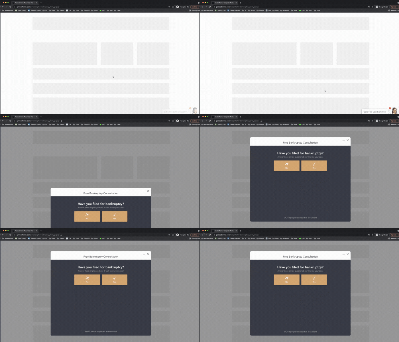
When this happens, a popup will appear with an offer such as a free quote, coupon, or resource.
How Exit Intent Popups Work on Mobile
Because mobile pages can’t track cursor movements like desktop, the process works a little differently.
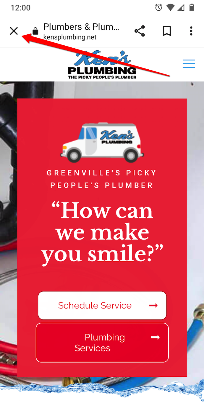
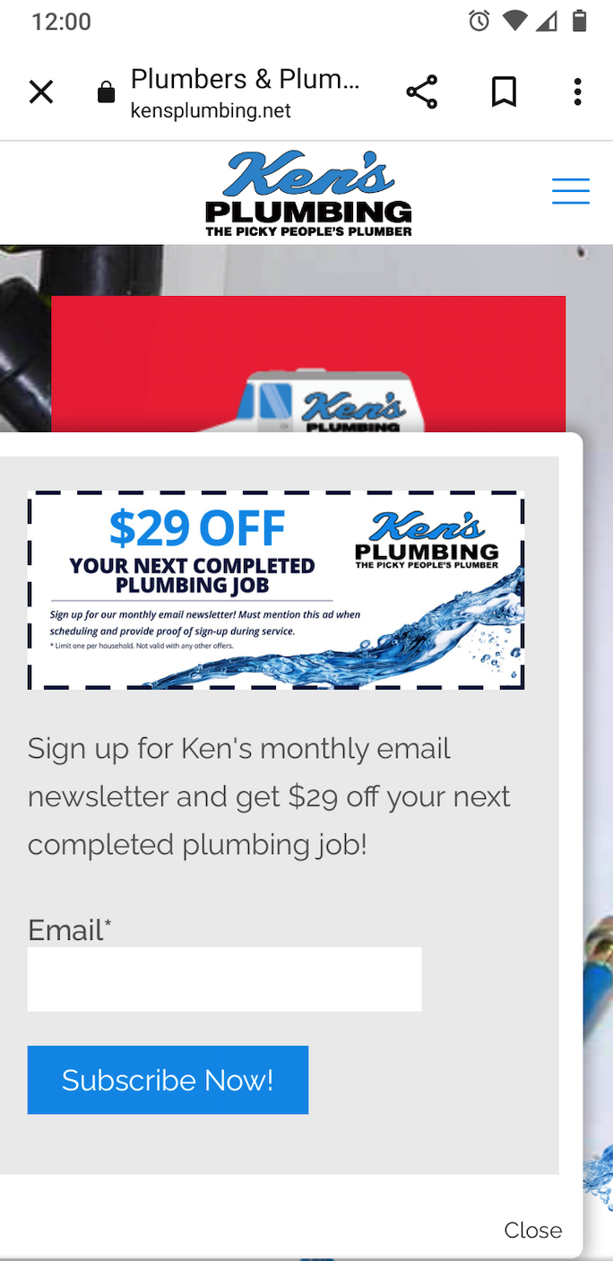
Here the exit popup can be triggered when the user presses the back button like in this example from Ken’s Plumbing in Greenville, SC.
When this happens, the user gets an offer for a $29 coupon if they sign up for the monthly newsletter.
Note that there are other triggers for mobile, such as scrolling down a certain percentage of a page, sitting idle for a period of time, or moving to a different tab.
But simply tapping the back button is the most common trigger.
Why Exit Popups Get a Bad Rap
Many marketers cringe when they hear the word “pop up.”
Popups are often associated with annoying, disruptive advertising techniques that attempt to clobber visitors over the head with in-your-face messaging.

Source: Giphy
All someone is trying to do is click or tap off a website, and all of a sudden they’re hit with salesy offers in a desperate attempt to get them to stay on the site longer and engage.
That’s often the perception, anyway.
But we feel exit popups get a bad rap and are actually an incredibly effective tool when used correctly.
By following best practices, a website exit popup is a non-disruptive way to get relevant, valuable offers in front of visitors that they may not know about but could benefit from.
It’s a win-win because you get a quality lead from someone who has expressed interest in a service, and the visitor gets a great offer.
Think of it this way. The vast majority of website visitors won’t convert right off the bat.
Most will explore a site, get their bearings, check out a service, maybe check out some blog posts, look at pricing, and so on.
But very few will end up becoming customers the first time around. Rather, most will leave on the first visit.
An exit intent popup is one of the best ways to engage these visitors and warm them up to the idea of buying or getting them into your sales funnel so you can nurture them until they’re ready to buy.
It just comes down to giving them the right offer at the right time.
If you nail that, a good chunk of people will submit your exit popups, you’ll get more quality leads, and you’ll raise your ROI across your marketing campaigns.
In our opinion, it’s not the exit popups themselves that are annoying. It’s the way that marketers and businesses are using exit popups that make them annoying.
On that note, let’s get to the heart of this post.
7 Exit Popup Examples That Convert for Service Businesses by Industry
- Pest Control – Pest Control Allentown, PA
- Plumber – Queen City Plumbing
- Personal Injury Lawyer – Wattel & York
- Roofer – Exceptional Exteriors
- Landscaper – Plant Professionals
- Mortgage Broker – Scott Griffin Financial
- Marketing Agency – Wpromote
1) Pest Control – Pest Control Allentown, PA
Pest Control Allentown, PA is a pest control company that offers several different services, including pest and insect control, bee and wasp control, termite inspections, and more.
When visitors land on their homepage, there’s a CTA to “Get a Fast Free Quote.”
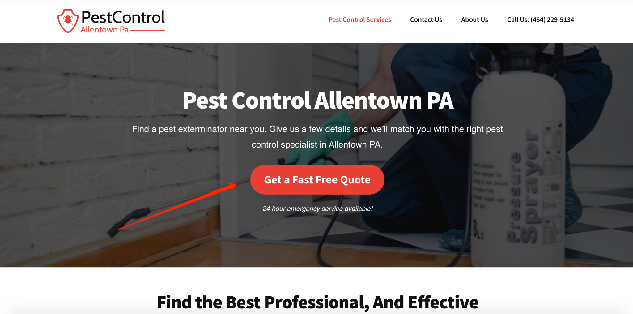
Ideally, visitors will click on that CTA or contact the company.
But if that doesn’t happen and they try to leave the page, this conversational multi-step exit intent popup appears, encouraging the prospect to request a free quote.
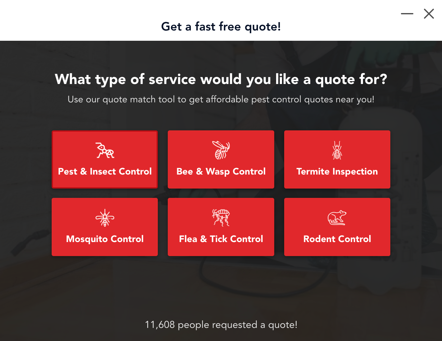
From there, the visitor can use the quote match tool to help guide them to the specific type of pest control service they’re looking for so they can get their free quote.
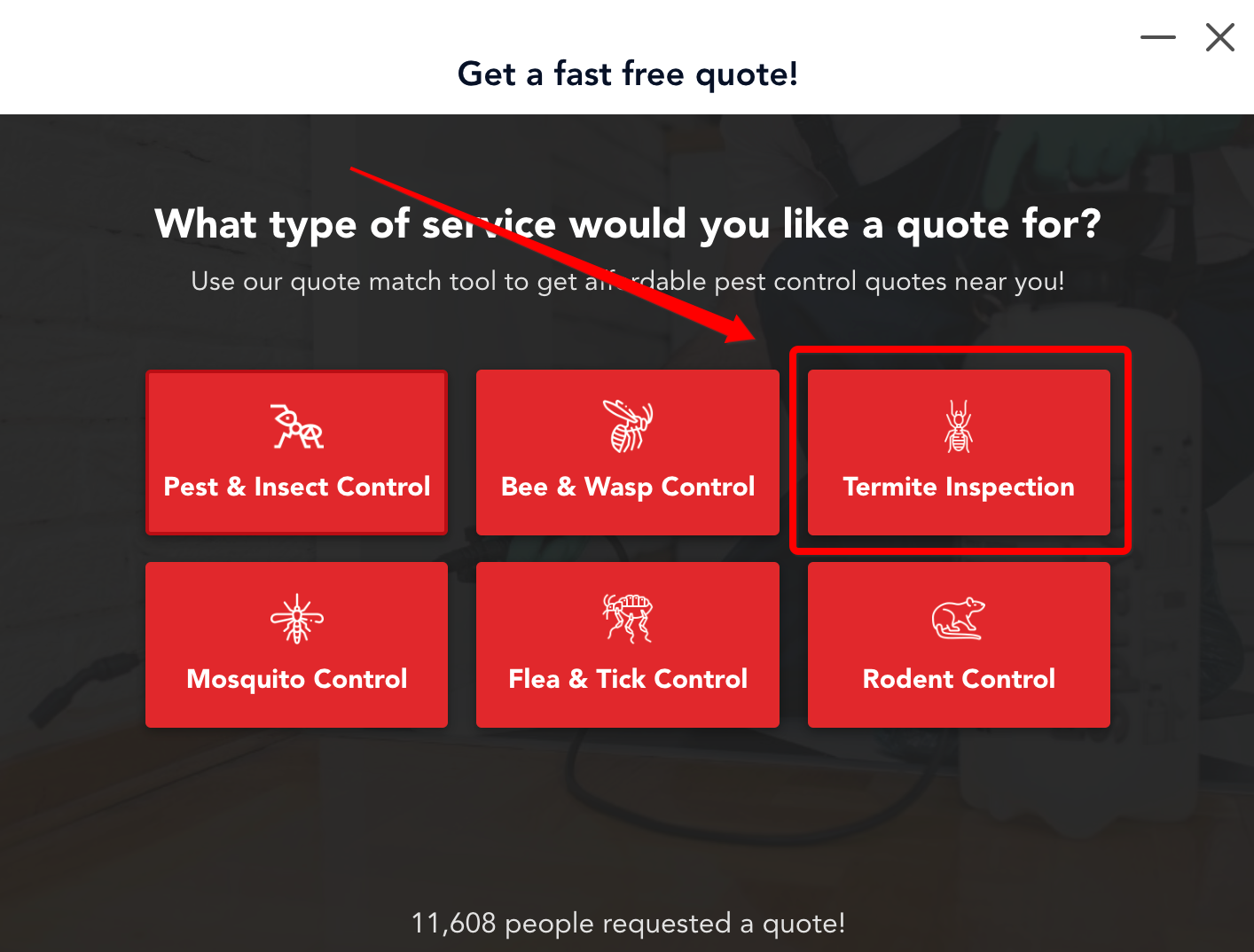
For example, they wanted a termite inspection, they would click here.
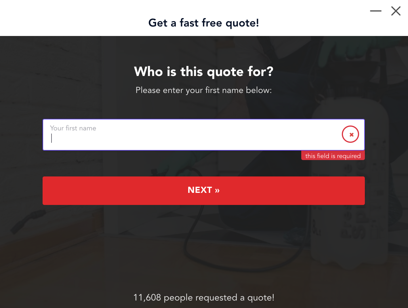
Then they will give out some additional information like their name…
…whether they need service for a home or business…
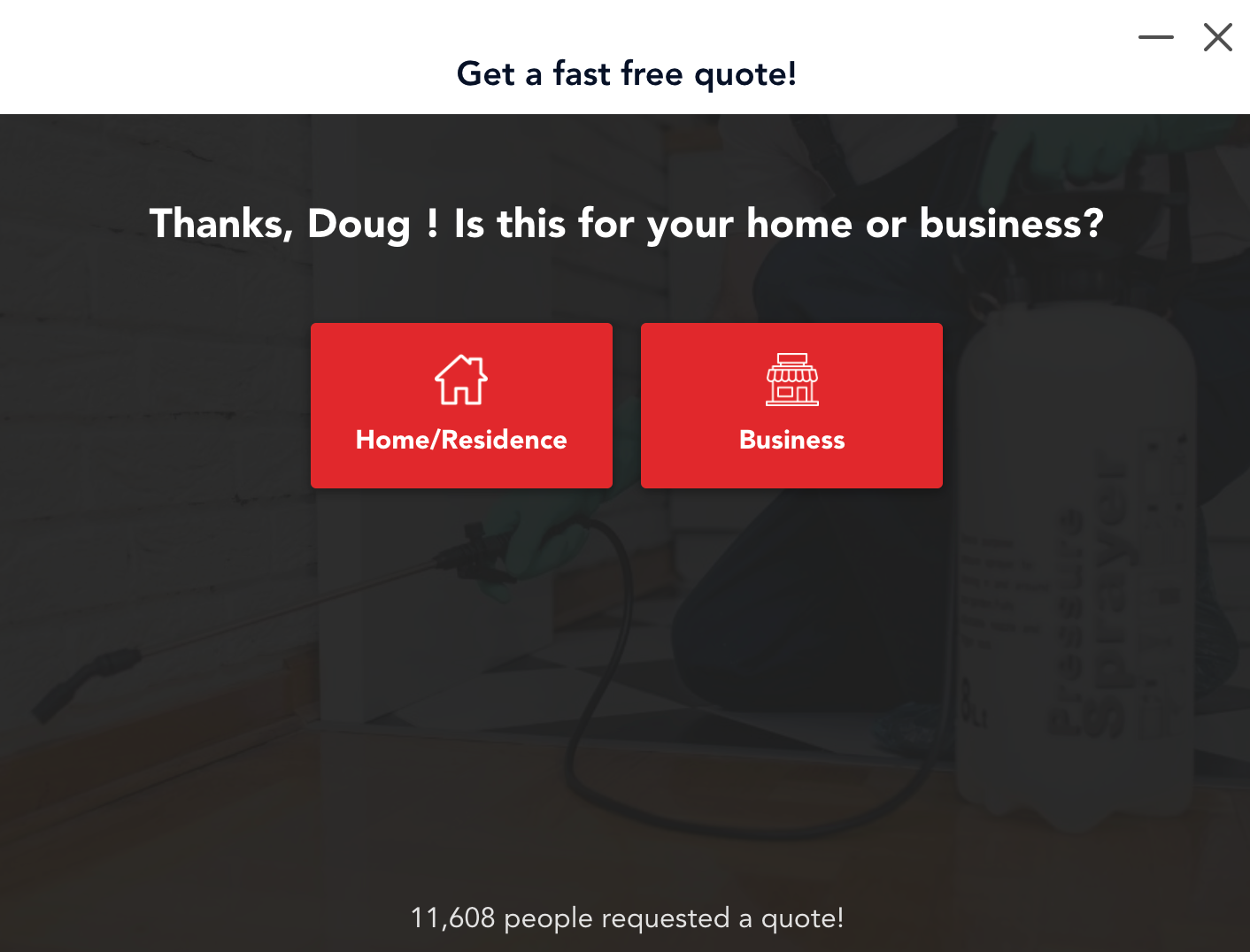
…and so on. The screenshot above is a great example of an exit popup with personalization.
Rather than missing out on a potentially great lead, the company can capture a sizable portion of qualified leads where they know what specific type of service they’re looking for.
In turn, they can route each lead accordingly to maximize their conversion rate.
Also, notice how Pest Control Allentown, PA used a simple yet beautiful design and logical exit popup scripts to smoothly move leads along while grabbing key information.
If you like this particular pest control template, you can find the exact same one here.
And to learn more about conversational forms and how to create them, check out this post.
2) Plumber – Queen City Plumbing
Queen City Plumbing offers plumbing, heating, and air services in Charlotte, NC and the surrounding areas.
The primary action they want their website visitors to take is to call them directly about their plumbing or HVAC problems.
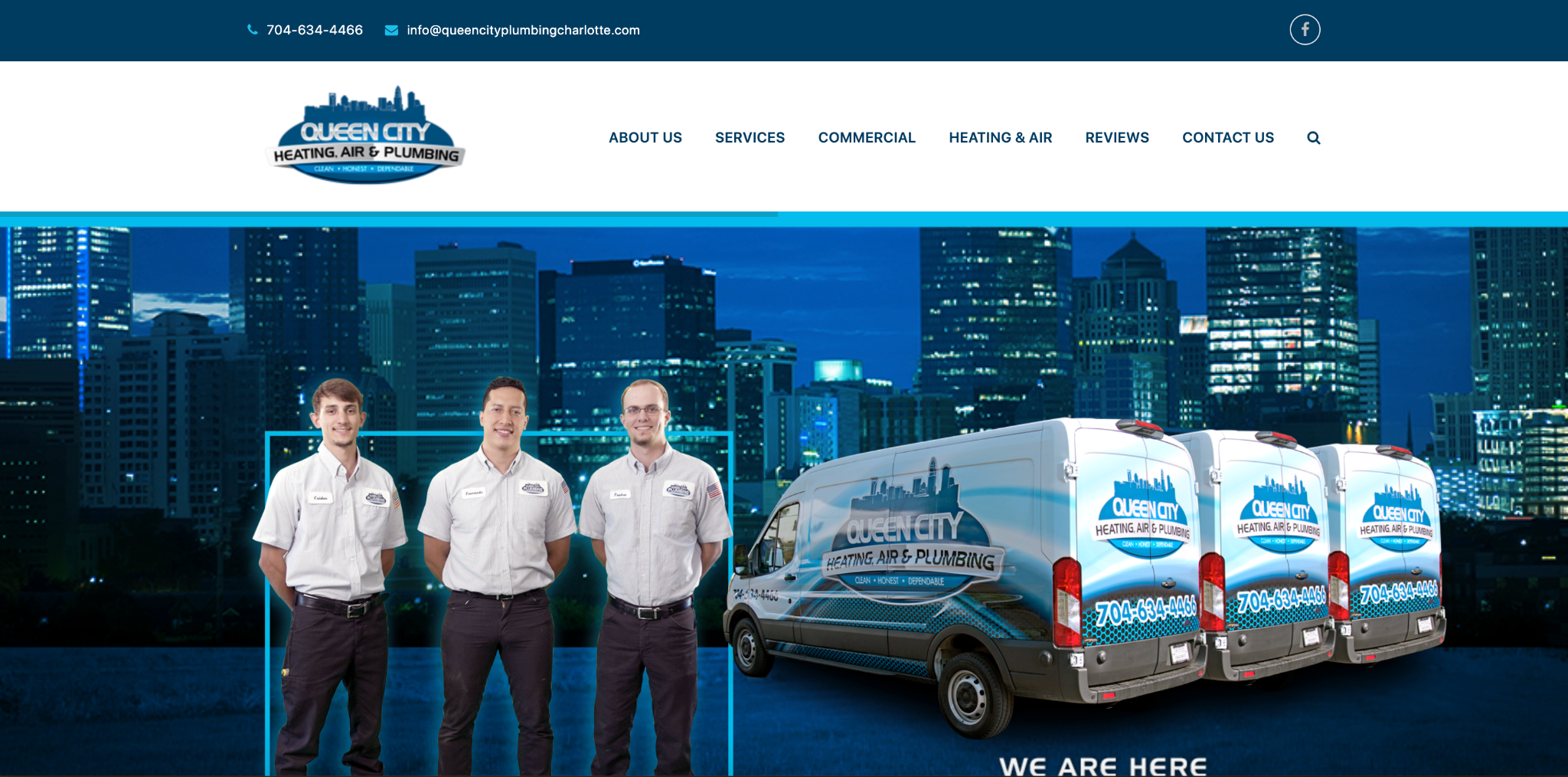
Here’s the first thing visitors see above the fold on their homepage.
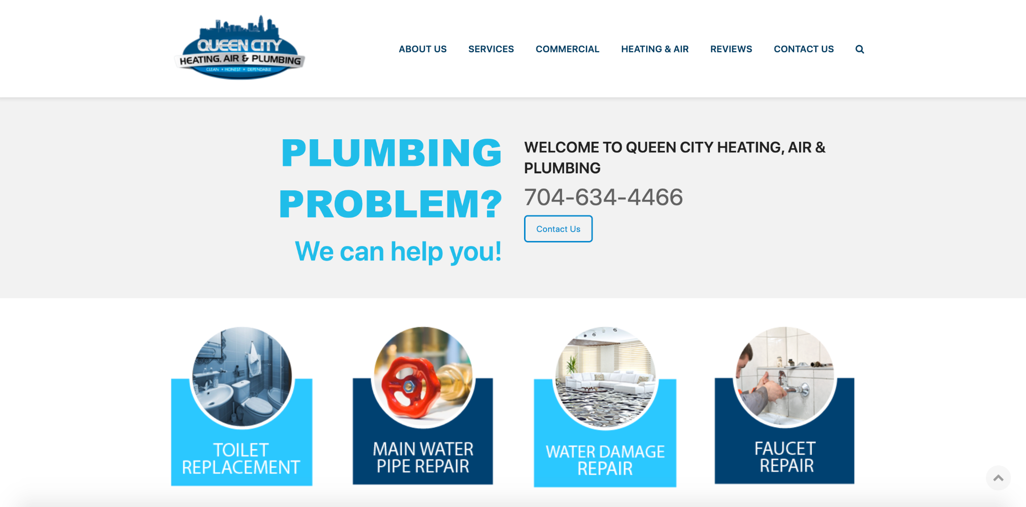
Just below that, there’s a crystal clear CTA with Queen City Plumbing’s phone number, along with a contact page.
Of course, not all visitors are going to convert right away, and after exploring the website will want to leave.
When that happens, this pop up exit intent appears with an offer for a $99 plumbing and HVAC inspection asking visitors to call for more details.
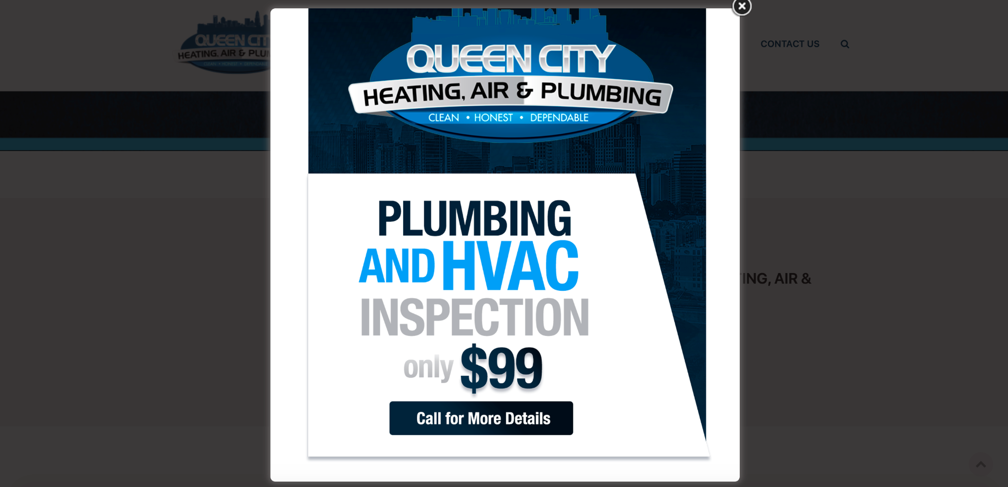
The goal is to motivate high-intent visitors to go ahead and call right away so fewer leads slip through their fingers.
It’s a solid offer, given the average cost of a plumbing inspection according to HomeAdvisor was $200 as of 2022, with those on the high-end costing as much as $4,500.
And with the CTA being to call for more details, it’s a very straightforward way of striking while the iron is hot with highly interested leads.
Not to mention it looks great with a super simple CTA and attractive aesthetics.
But if you wanted to take it a step further and narrow down a lead’s exact need, you could use this plumbing lead form, which allows you to identify the specific issue they’re dealing with, such as clogged drains, a running toilet, or dripping faucets.
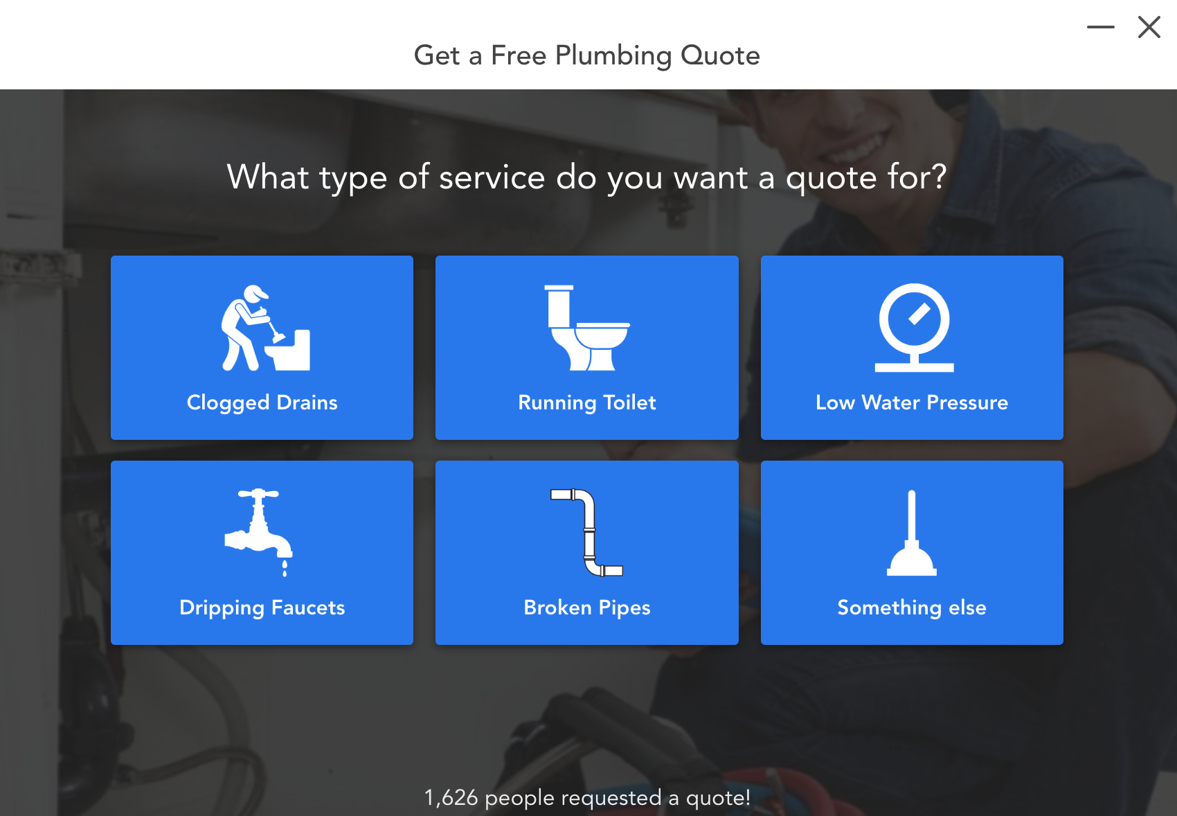
You can also use it to capture their name, location, phone number, and email to put them in your sales funnel for later nurturing if they don’t convert right away or complete the entire form.
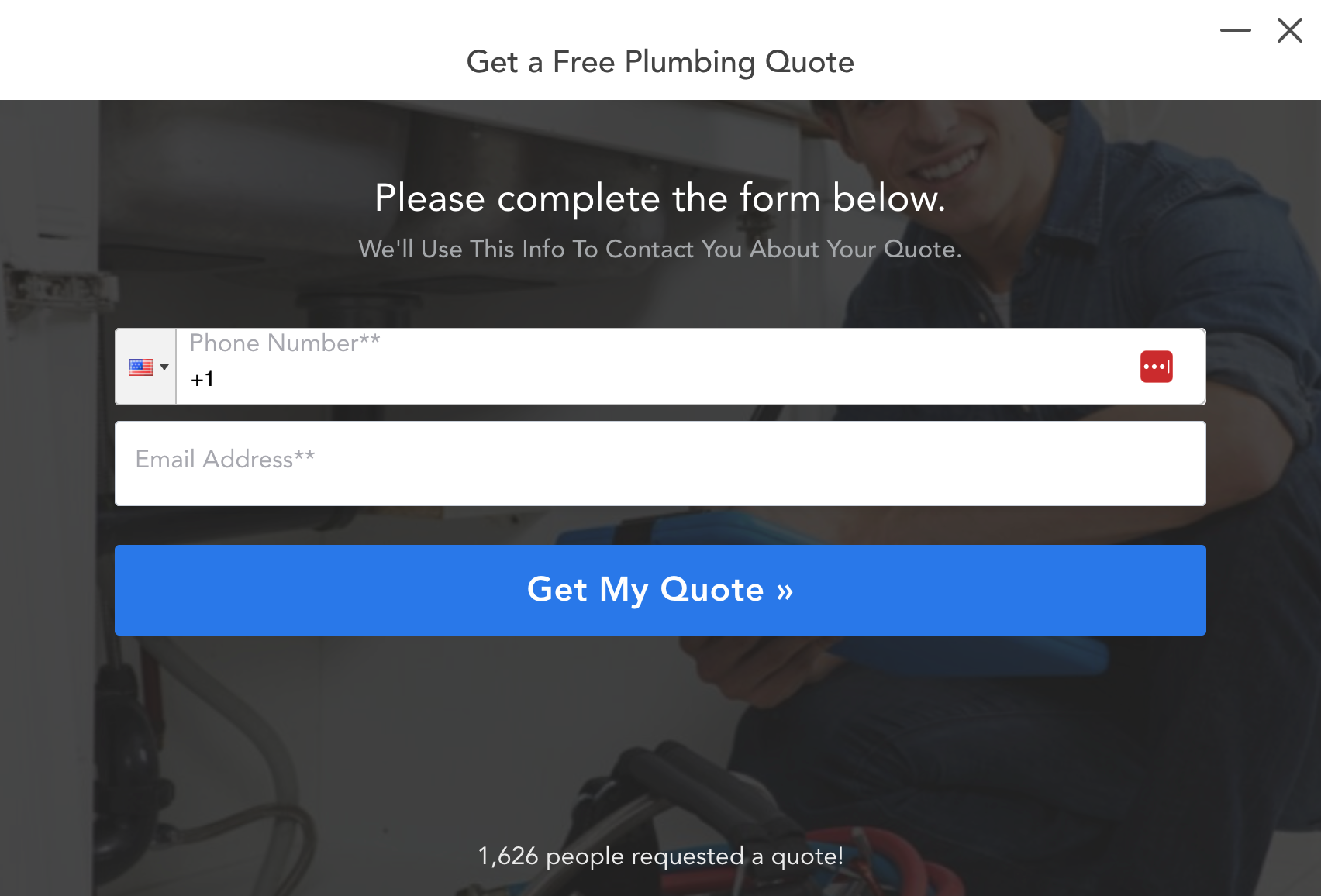
3) Personal Injury Lawyer – Wattel & York
Our next example comes from Wattel & York, an Arizona-based personal injury lawyer.
When a visitor lands on their homepage, Wattel & York has two main goals — either have the visitor fill out a form for a free consultation or open the chatbot where the firm can learn about what the visitor needs help with and direct them to the right resource.
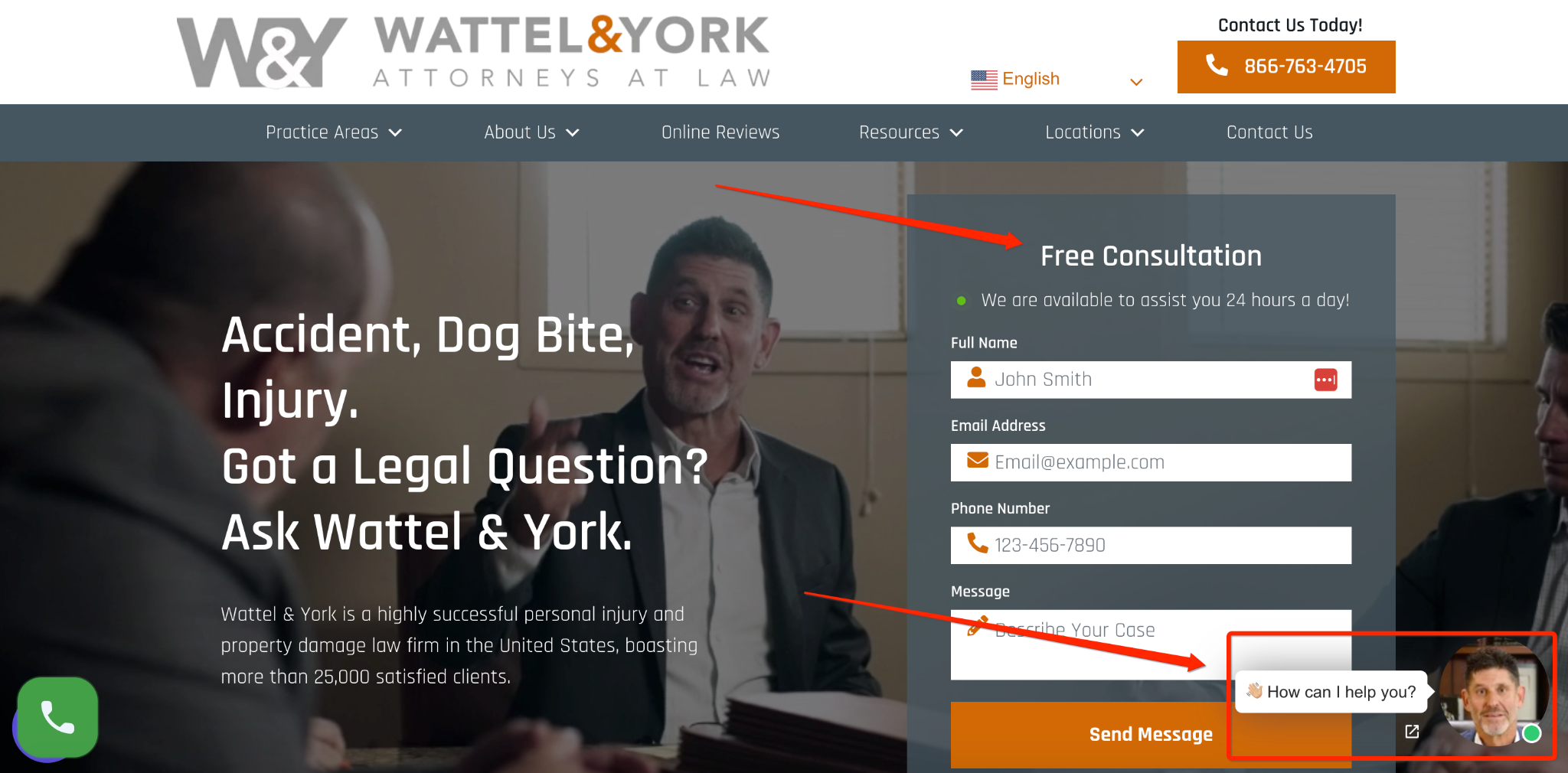
But let’s say the visitor doesn’t engage with either of these and wants to leave.
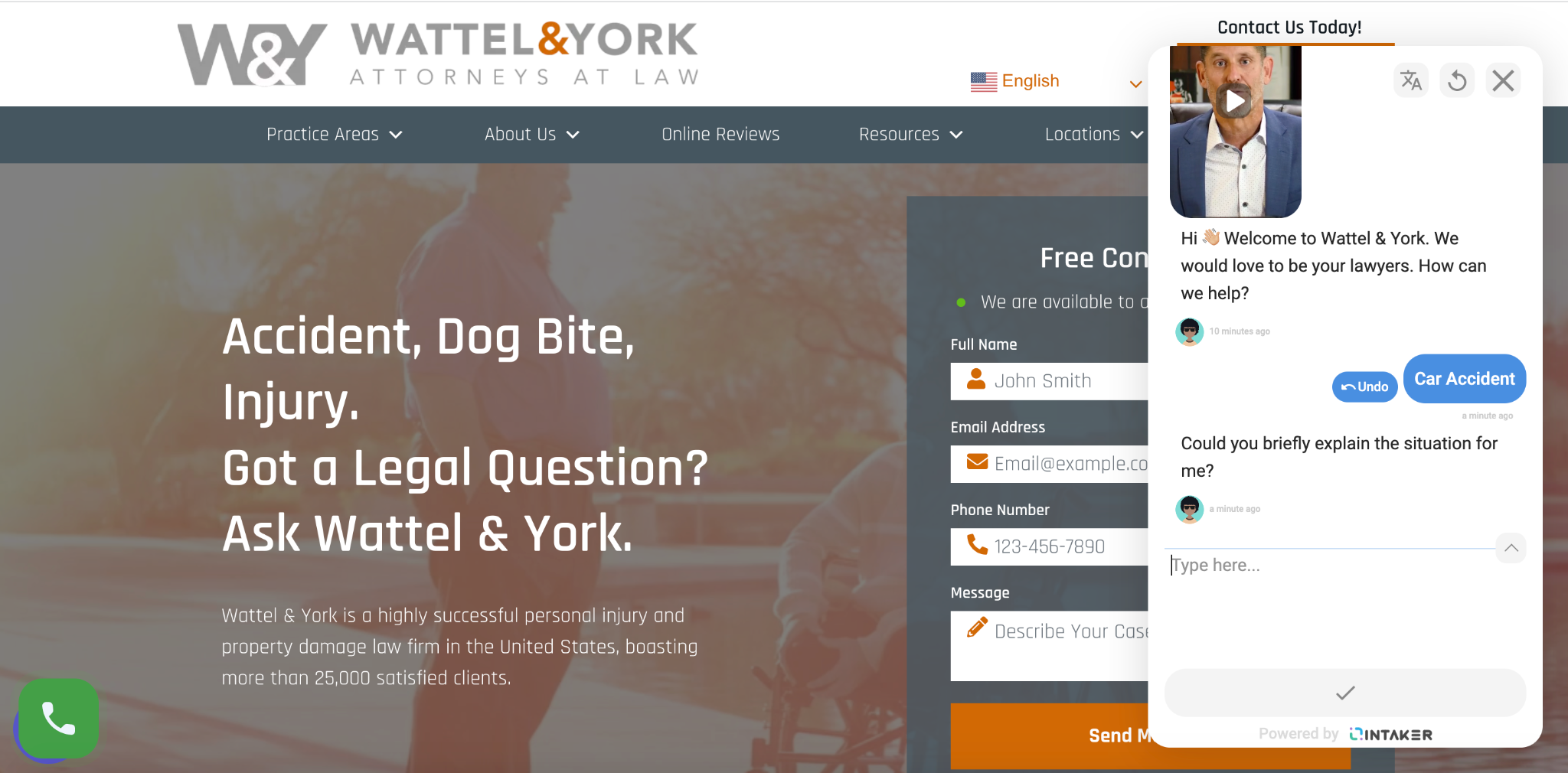
When this happens, this multi-step exit intent popup appears asking if the visitor has a matter their lawyers can help with through a simple yes or no answer.
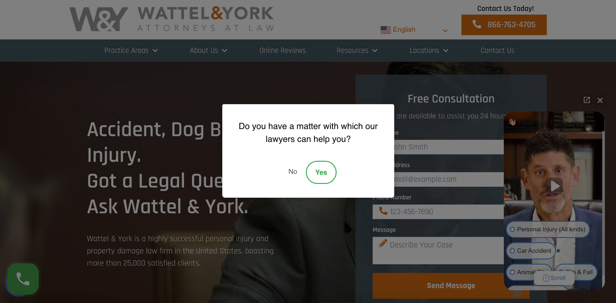
If the prospect clicks “yes,” the chatbot appears, which features one of the founding members of the firm David E. Wattel.
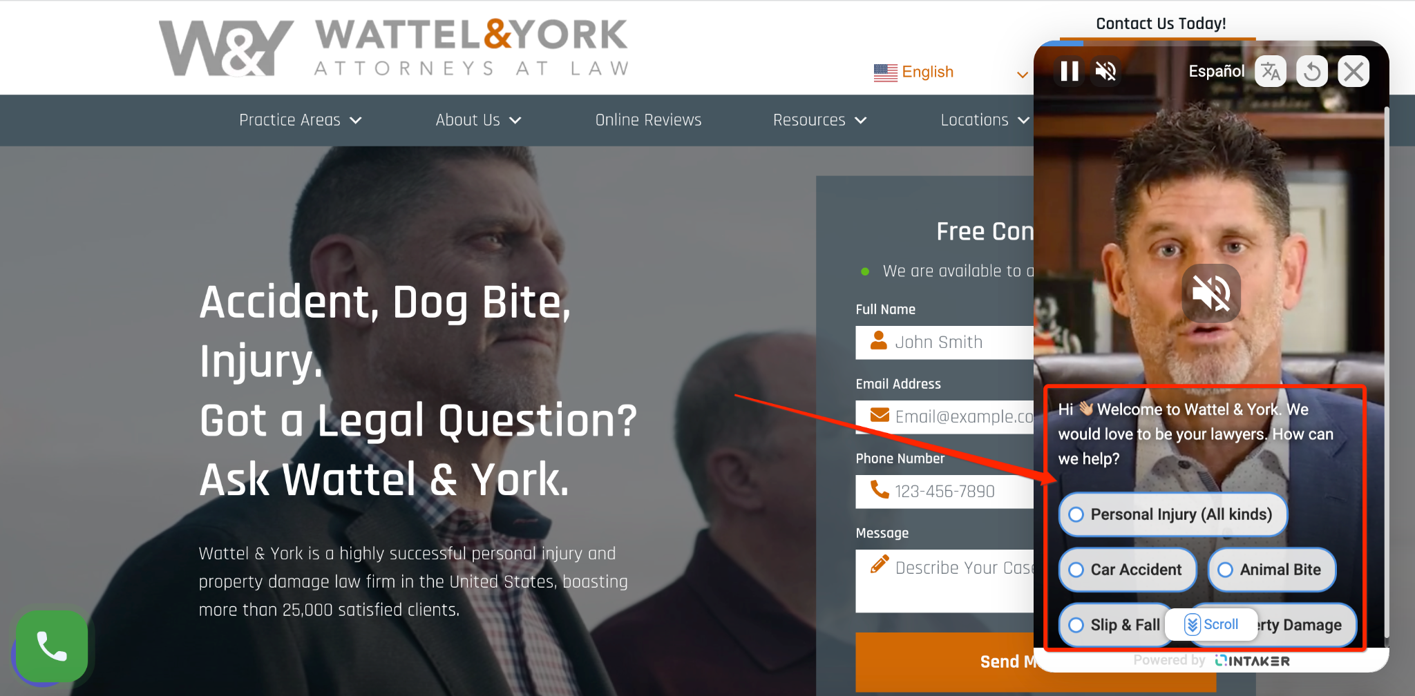
This popup is innovative because it incorporates a personalized video that allows visitors to instantly connect with a founder and multiple steps where they can select the exact area of law they need assistance with.
If someone chooses a car accident, for instance, the chatbot asks if they could briefly explain the situation, allowing the firm to gather more information and direct the lead to the right place.
In terms of templates, GetLeadForms offers specific templates for personal injury lawyers, including personal injury with icons.
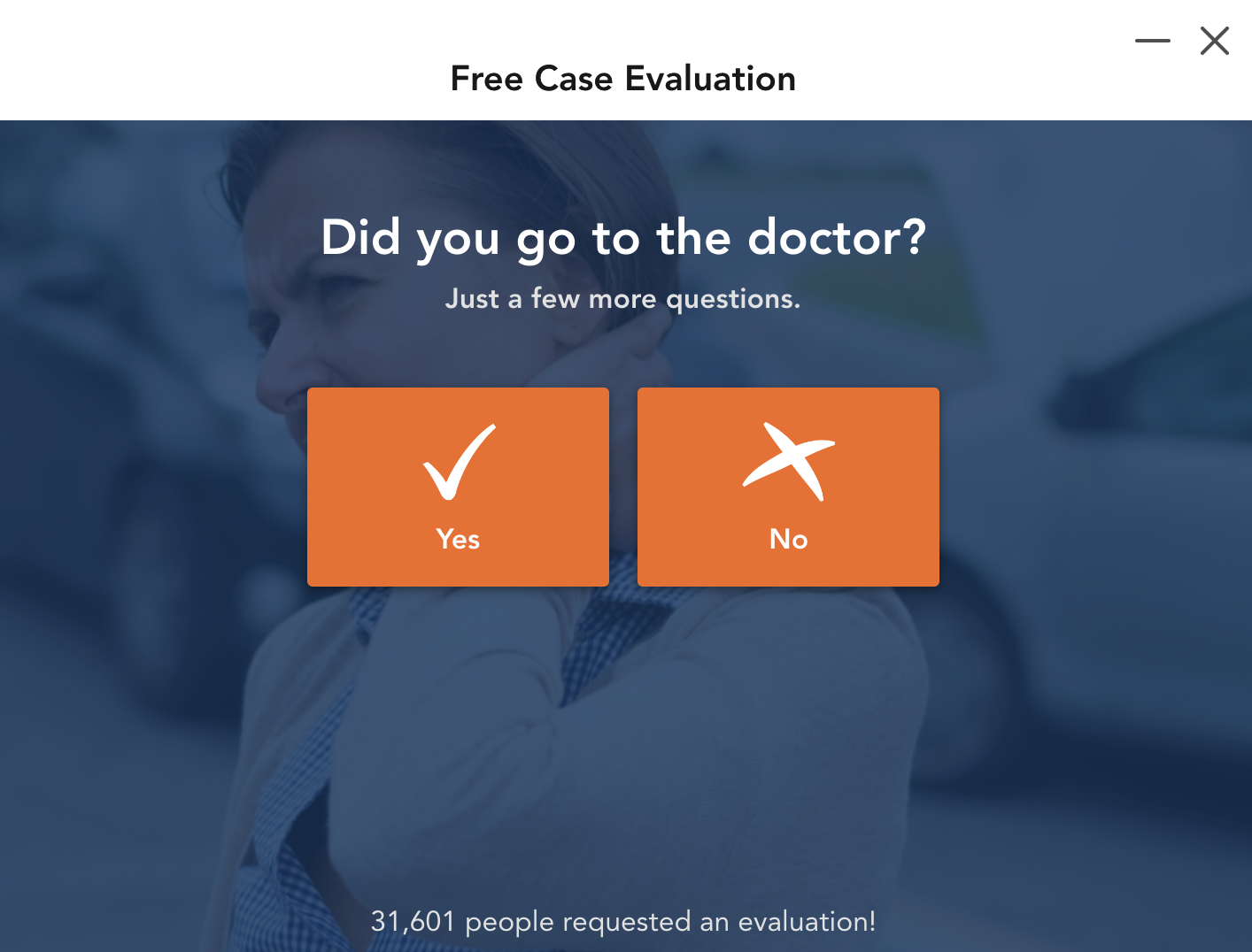
Similar to the example above, this lets you use exit popup scripts to move visitors through a series of questions to collect critical information so you can send them to the right sales team member.
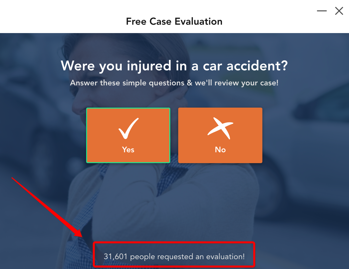
You could, for instance, ask if a visitor was injured in a car accident.

Then ask them if they went to the doctor.
Then ask if they currently have a lawyer.
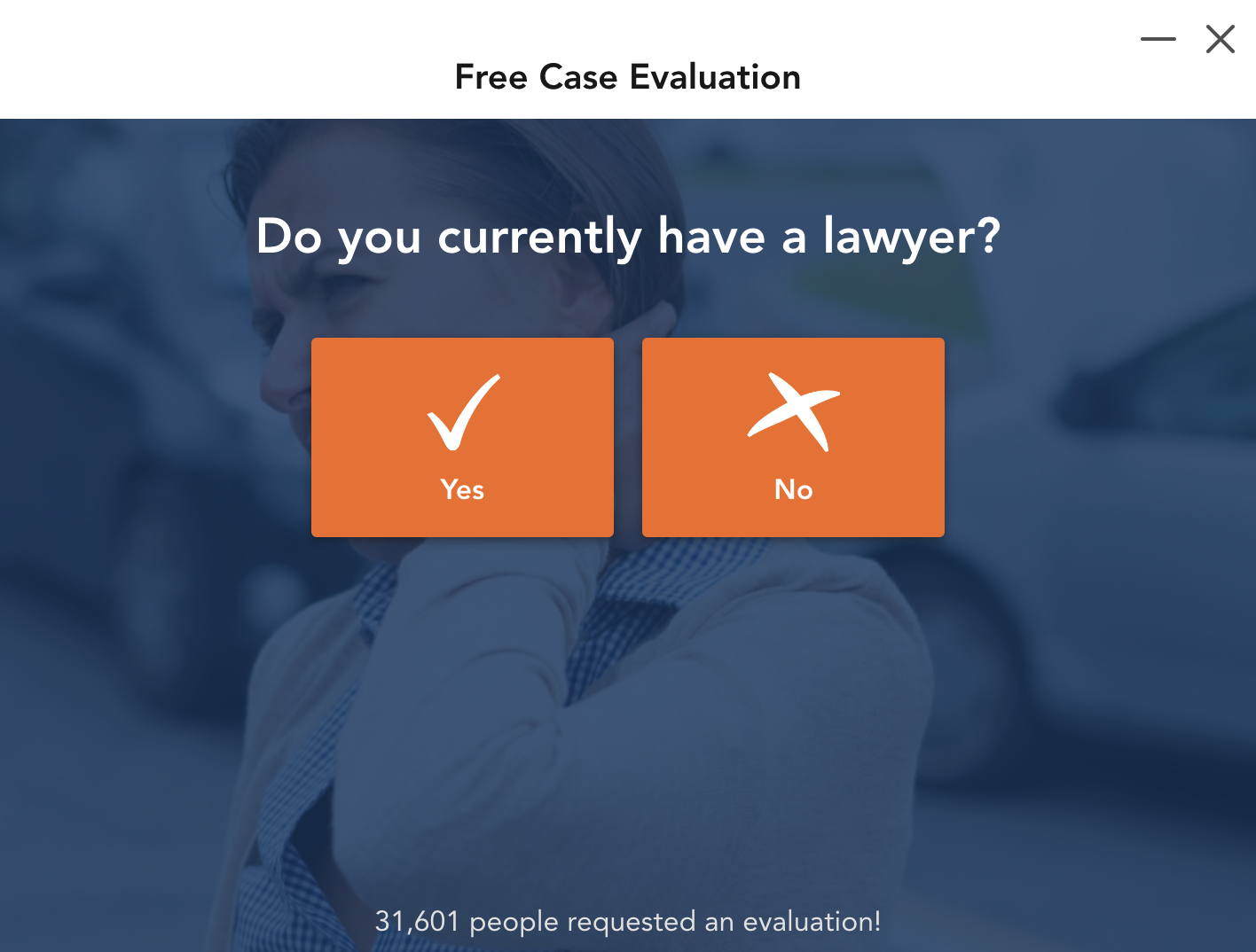
You can place it on any lawyer landing page and fully customize it to make it your own and take advantage of features like built-in social proof where you can do things like state how many people have requested an evaluation to maximize leads.
And it works across most major website and landing page builders, including Unbounce, which you can find a tutorial for here.
4) Roofer – Exceptional Exteriors
Next, there’s Exceptional Exteriors, a roofing company from Rochester, NY.
This is an extremely simple exit intent popup example, but it definitely gets the job done.
The main goal of Exceptional Exteriors is to direct visitors to the specific service they’re looking for and get them to contact the company.
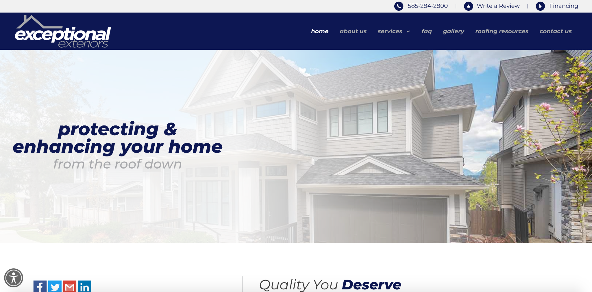
If this doesn’t happen, however, they use an exit-intent popup when leaving the site to generate qualified leads and pinpoint the service they need.
They do this by offering a free quote for a project where they ask for the prospect’s name, phone number, email, and service.
They also ask the prospect to leave a comment or message to figure out the specifics.
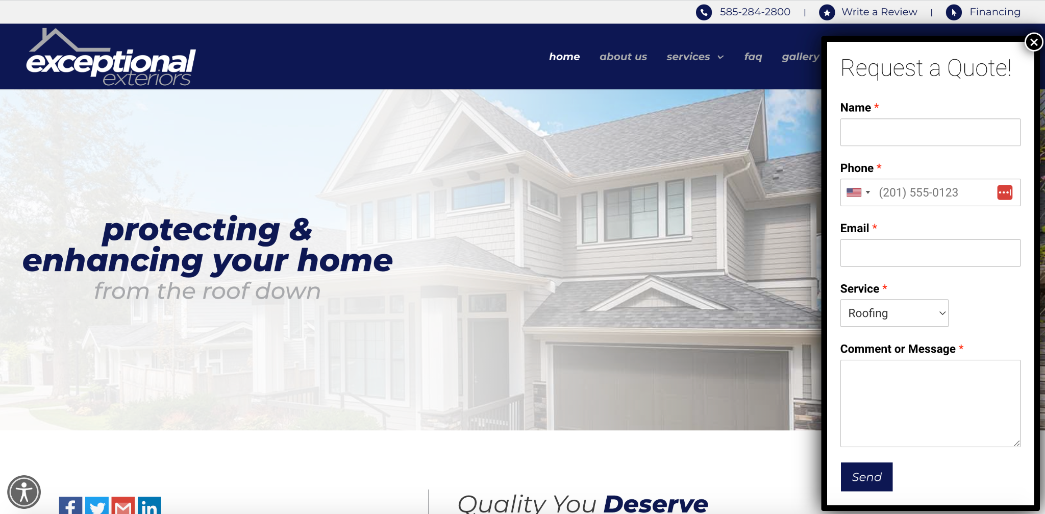
With a basic yet attractive offer and straightforward user interface, Exceptional Exteriors can generate qualified leads that would otherwise leave their site.
And they do it in a non-obtrusive way.
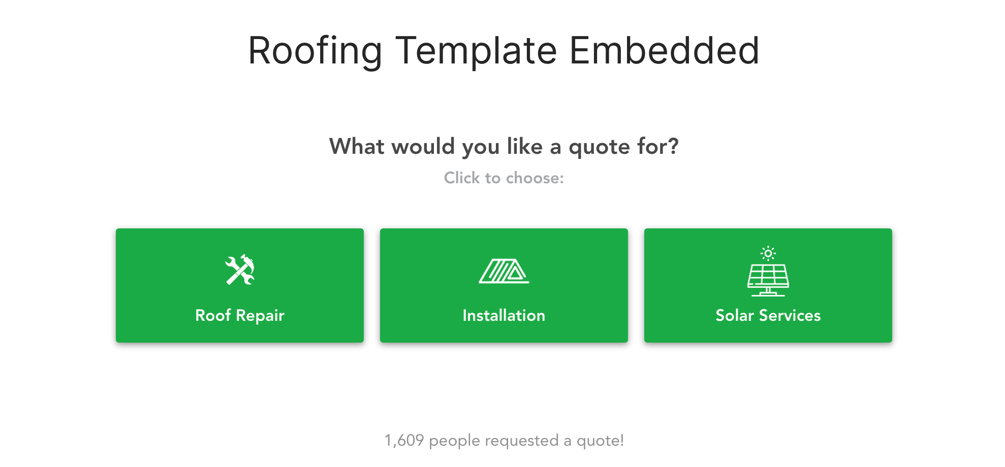
You can find a similar embedded roofing template here that you can personalize with an offer for a quote or whatever else you’d like to entice visitors with.
5) Landscaper – Plant Professionals
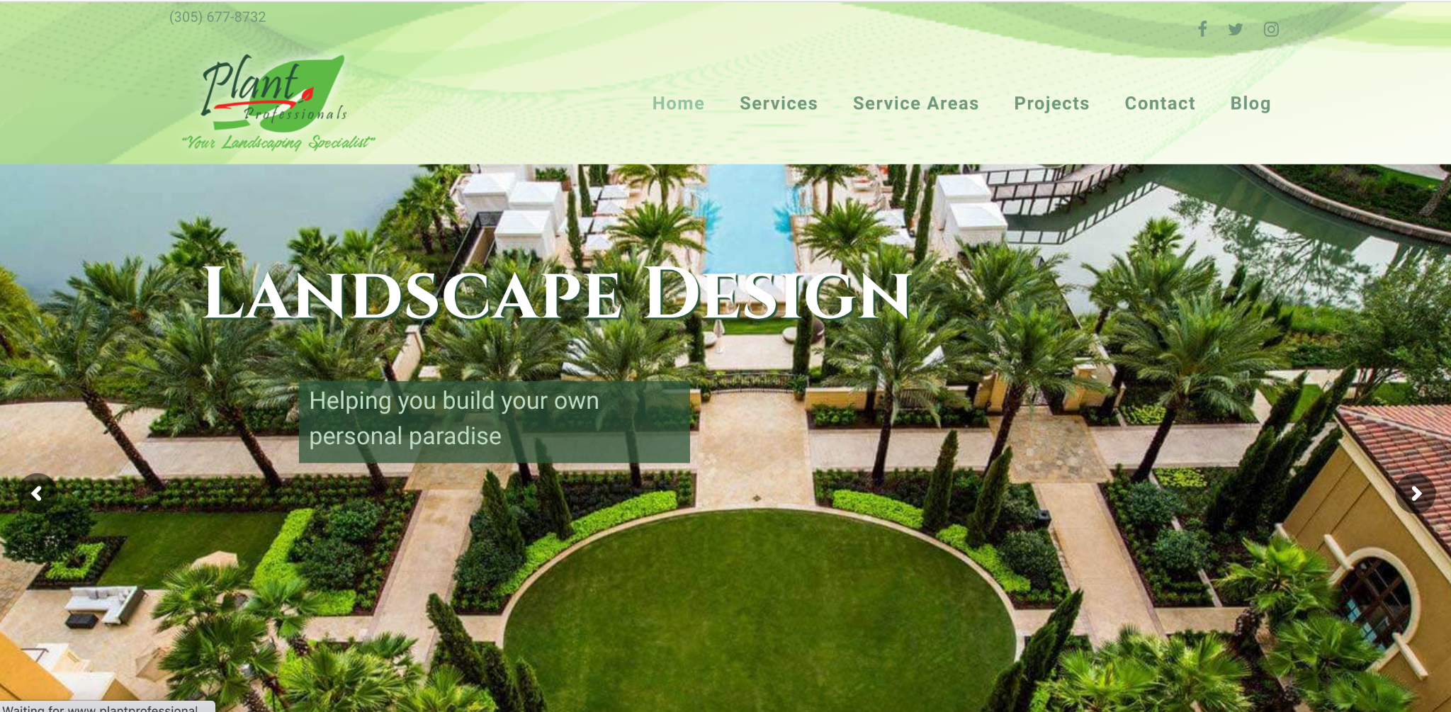
Plant Professionals is a Miami-based landscaping company that helps customers “build their own paradise.”
Here’s the first thing visitors see above the fold on their homepage.
Scroll down a bit, and it’s clear what the objective of Plant Professionals is — to get visitors to request an estimate.
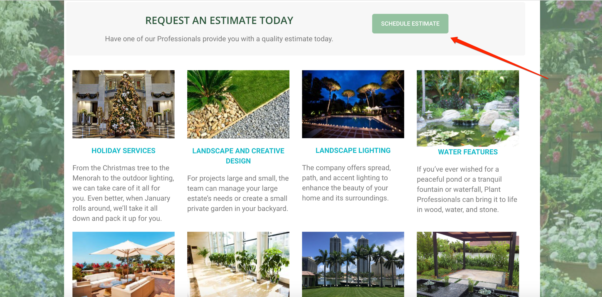
While a small portion of visitors will follow through with this, we know that the vast majority will not.
For that segment of visitors, Plant Professionals has an exit intent popup in place with an offer to get a quality estimate right away.
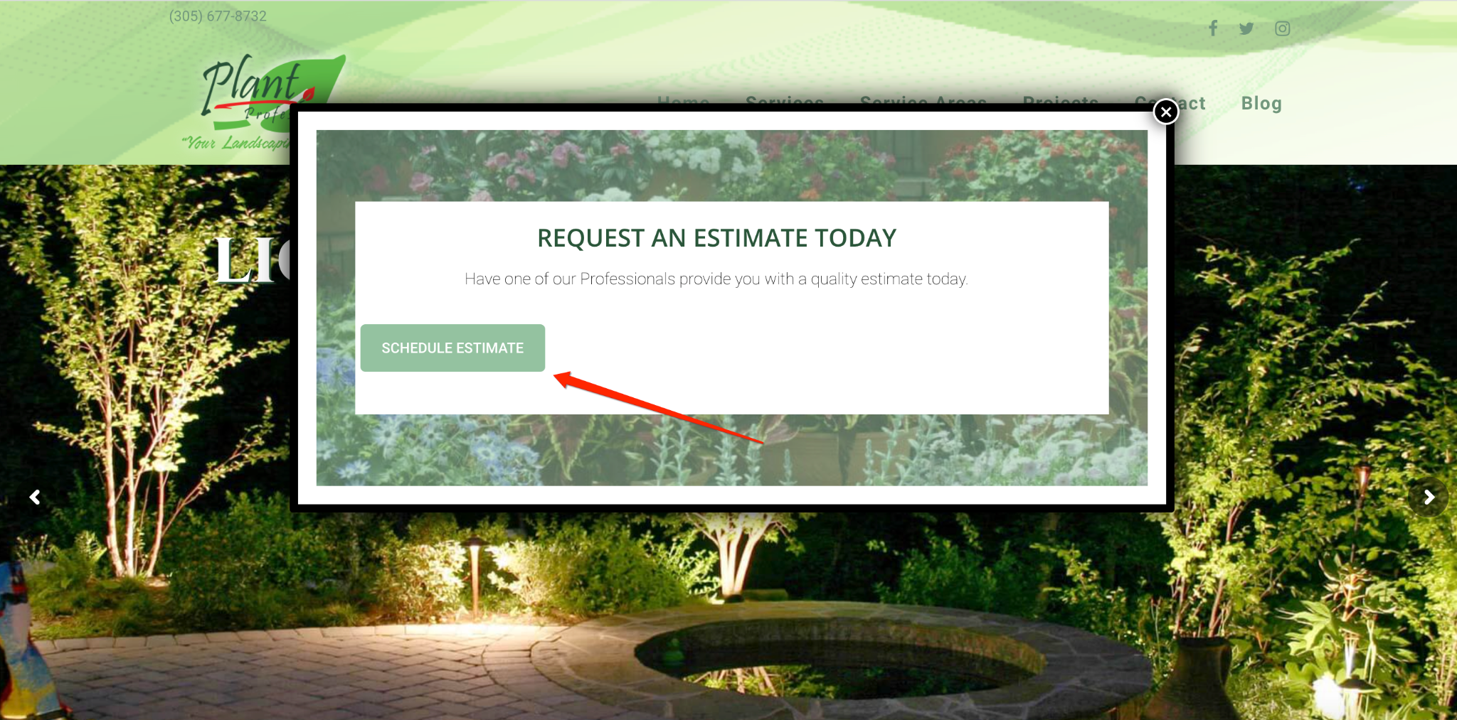
When someone clicks on the “Schedule Estimate” CTA, they’re taken to this form where they provide their name, contact information, and a message.
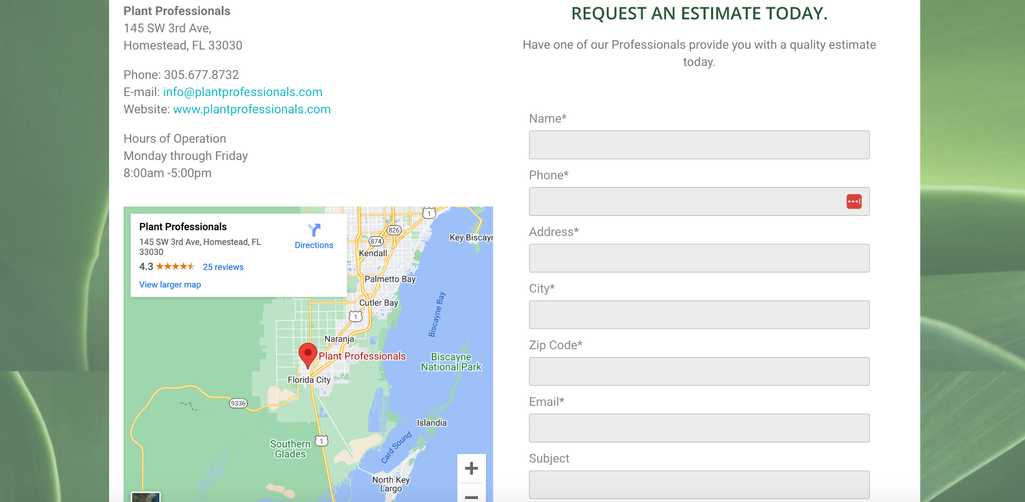
And for those that don’t convert, they can still be nurtured through a drip email or text campaign.
While this particular popup could improve its aesthetics and could benefit from a multi-step form rather than a single form with several fields to fill out, it’s still effective for accomplishing the company’s goal of increasing the number of visitors who request an estimate.
Note that if you choose to use a longer form like this, it’s smart to use an auto-fill feature for the address because it saves time and makes for a much smoother UI.
GetLeadForms has something similar with the landscaping – chat style template where you can encourage visitors to request a free quote, walking them through the process using multiple steps.
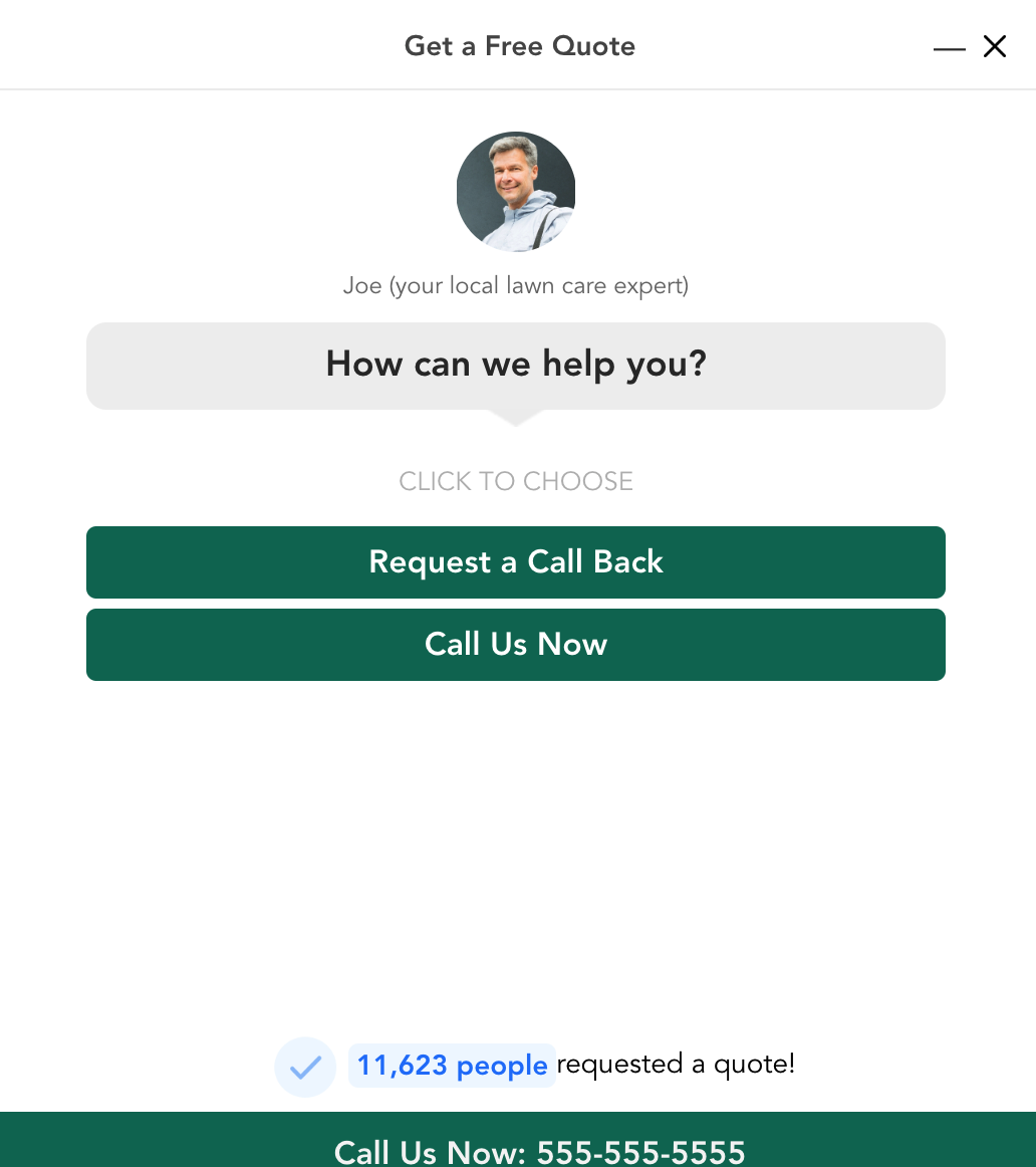
If, for instance, someone wanted to request a call back, they would click here.
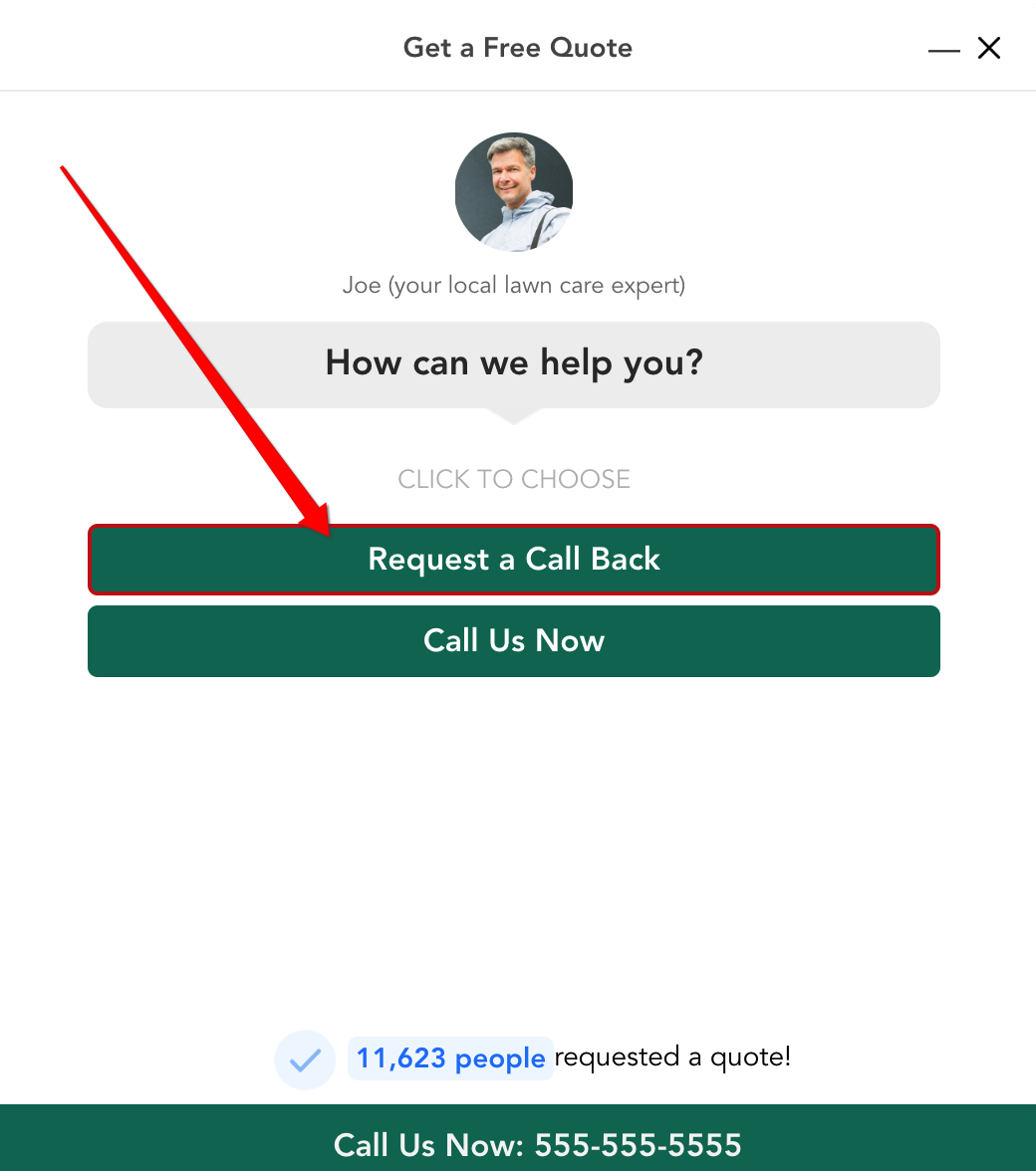
Then they would choose the specific type of service they were interested in, and so on to equip your team with key information to get them to the right salesperson and maximize your conversions.
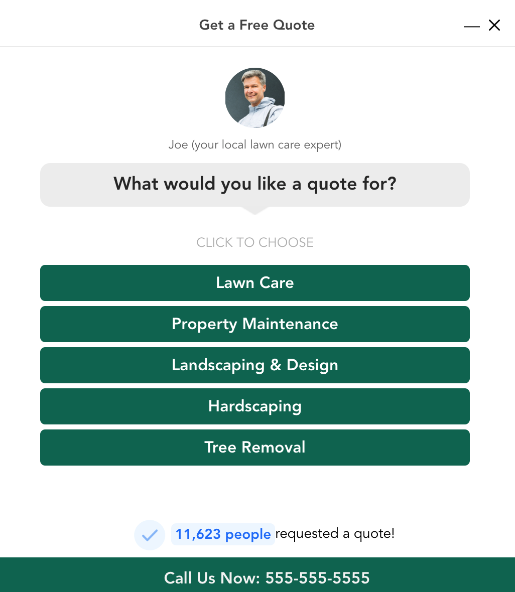
The added benefit of using a template here is that it has more of a conversational feel and a more pleasing user experience, which ultimately leads to more conversions. Grab this template here.
Mortgage Broker – Scott Griffin Financial
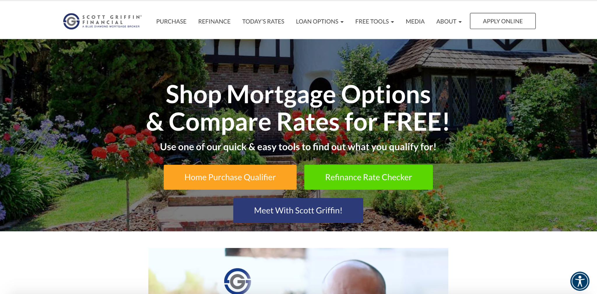
Scott Griffin Financial is an LA-based mortgage broker with a great-looking website that gets straight to the point and makes it easy for visitors to find the information they need.
Above the fold, this site has three main resources to check out — the home purchase qualifier, refinance rate checker, and “Meet with Scott Griffin” CTA to schedule a consultation.
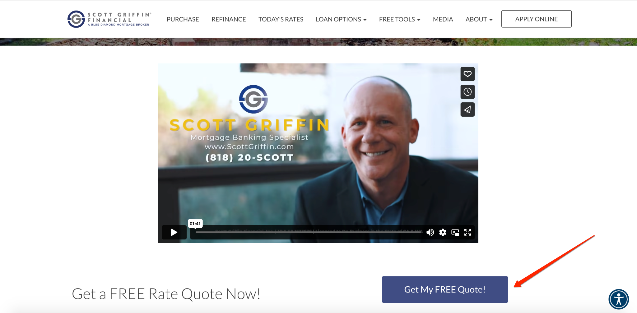
Below that, there’s a brief video of the company and a crystal-clear CTA, encouraging visitors to get their free quote.
But for those that don’t request a quote and try to click away, they see this exit intent popup where they enter their ZIP code.
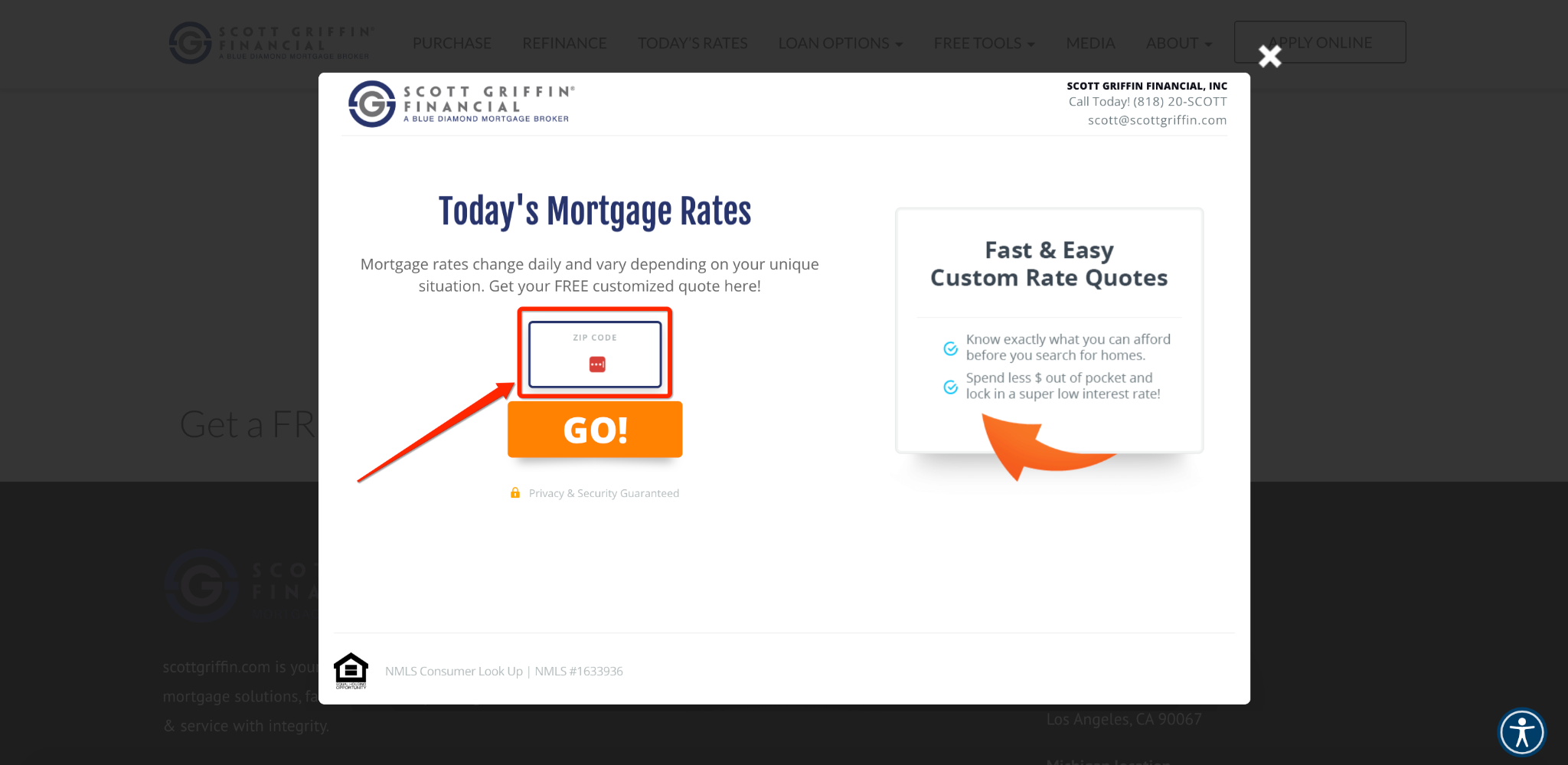
Based on that, they choose what type of loan they need — one for a home purchase or a home refinance.
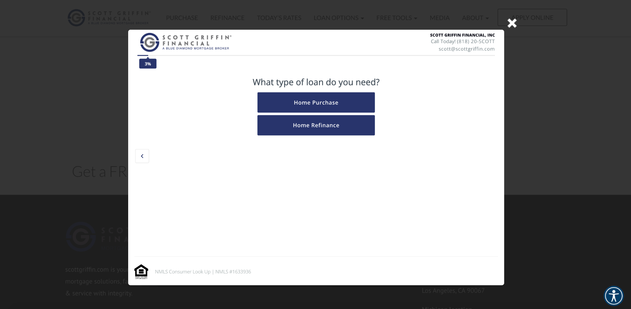
Then, they answer a few other questions like the type of property they want to purchase.
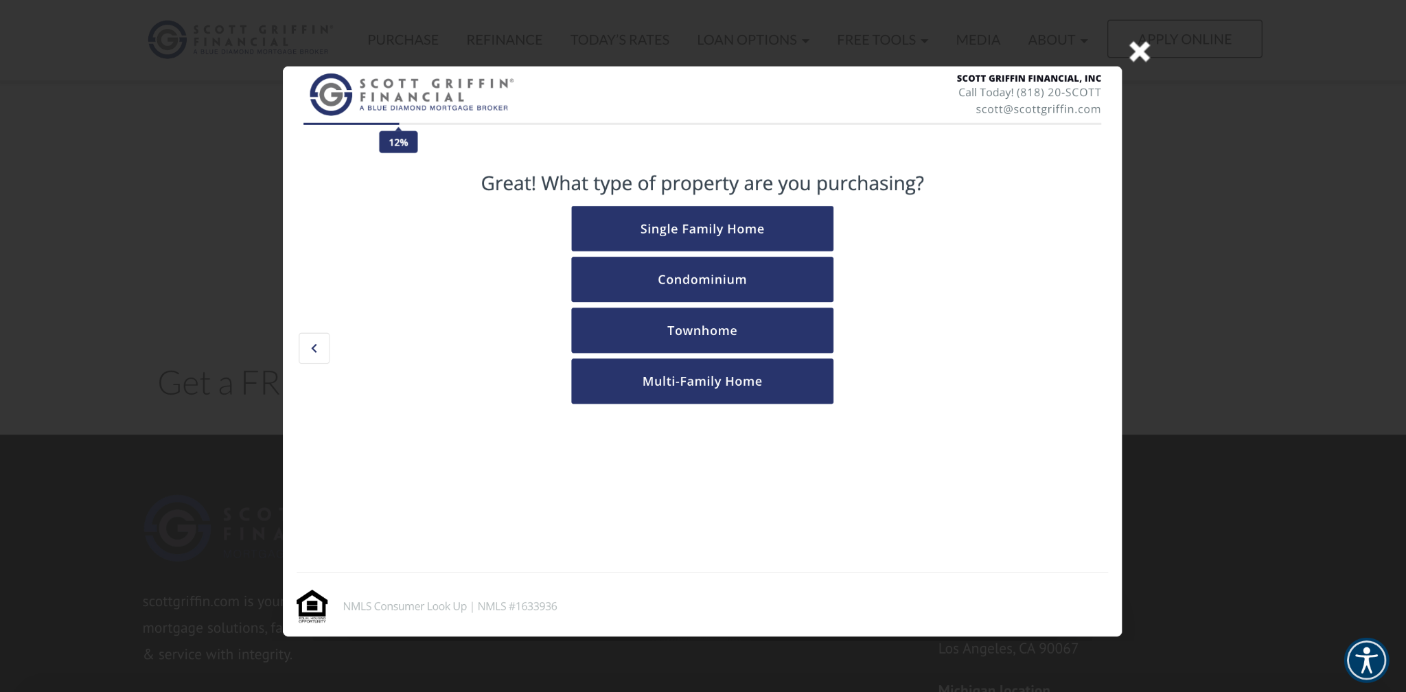
Once the info is in, the appropriate sales rep will reach out to qualified leads.
And for those that aren’t quite qualified, they can be nurtured until they’re ready.
In the process, Scott Griffin Financial can generate ultra-high-quality leads while also providing an attractive offer and streamlined user experience.
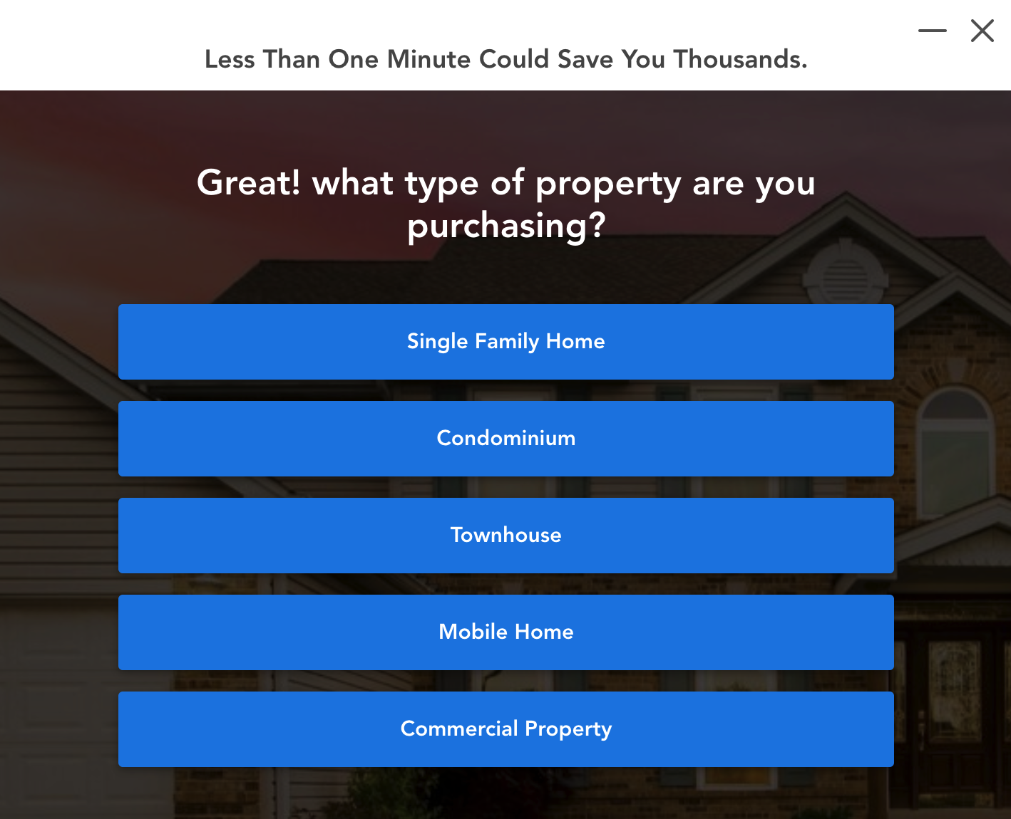
You can create a similar exit intent popup with this mortgage broker template
With it, you can build a fully customized multi-step form to ask visitors essential questions and seamlessly move them through the qualification process.
For example, you can start by asking what type of loan they’re looking for.
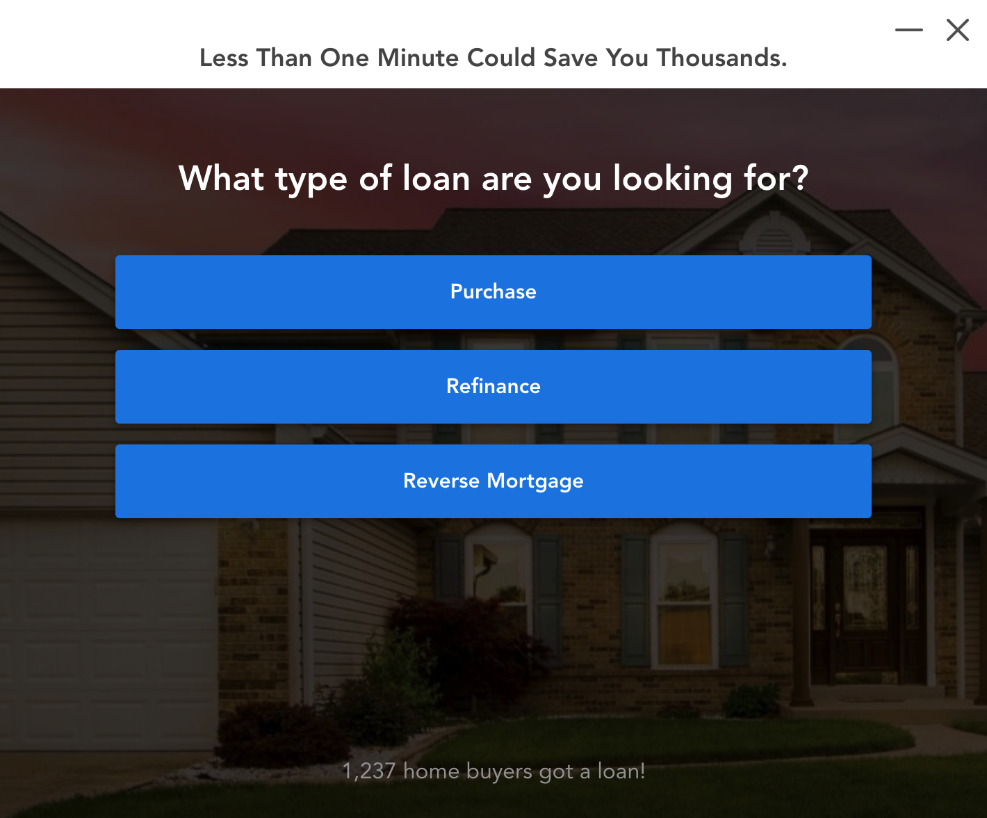
Then you could ask what type of property they will be purchasing.
And just like that, you can start generating highly qualified mortgage leads.
7) Marketing Agency – Wpromote
Our final exit intent popup example is from Wpromote, a Southern California marketing agency that focuses on search, social media, and influencer marketing.
Here’s what their website looks like.
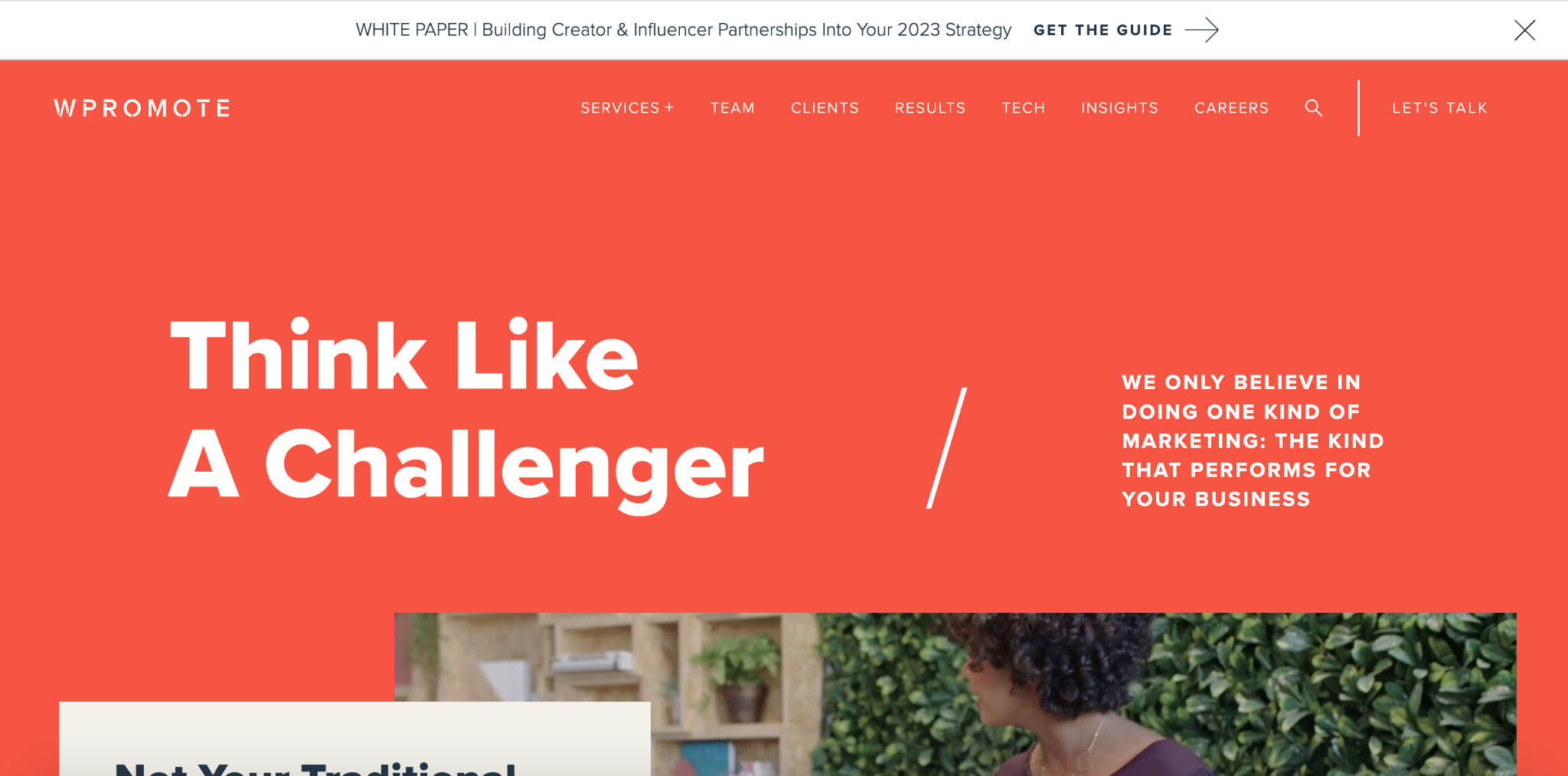
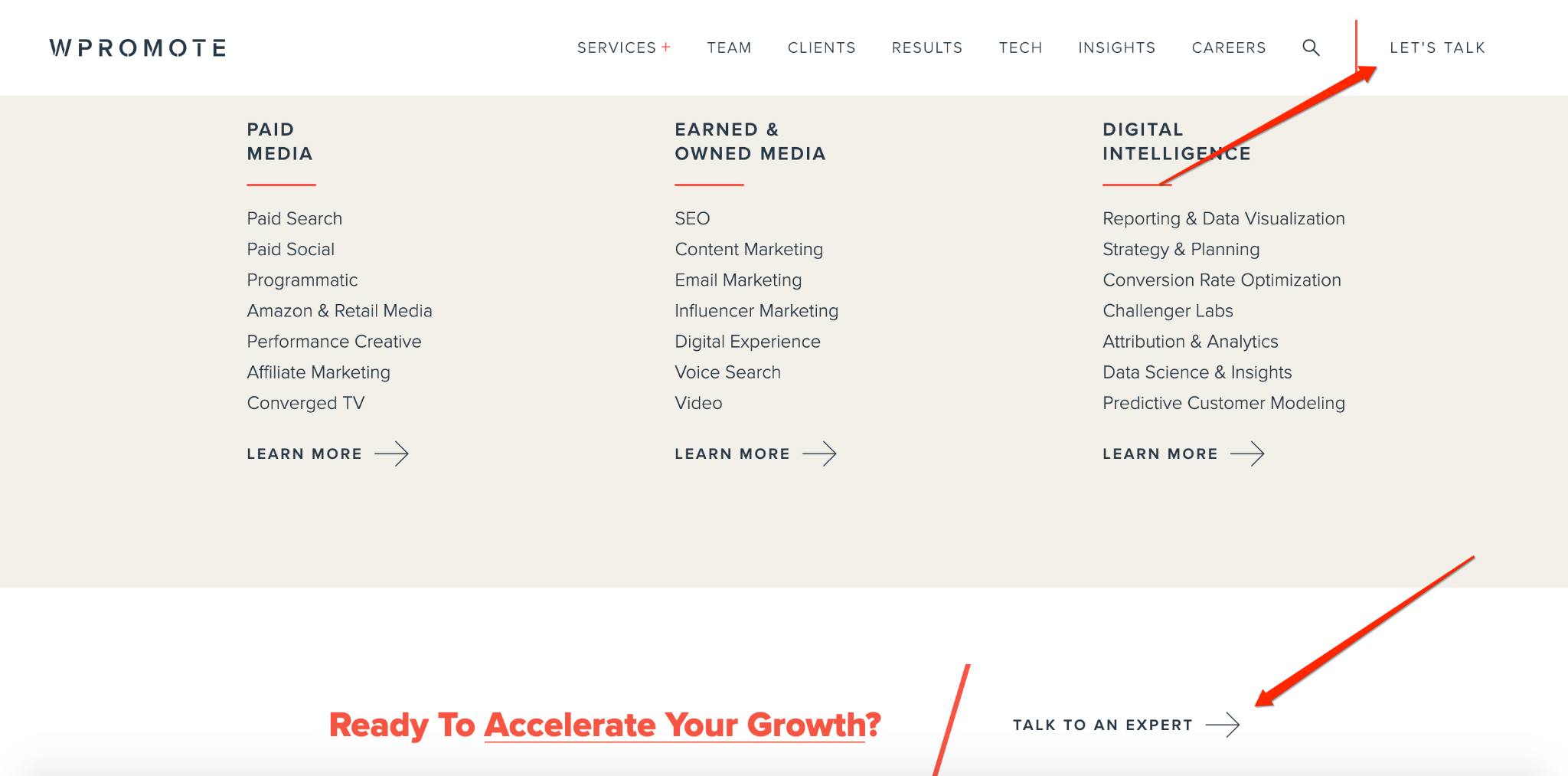
Their main goal is to encourage visitors to learn about their marketing services and contact them to speak with an expert about a campaign.
Wpromote has multiple CTAs throughout their website that focus on this.
But for the large segment of visitors that aren’t ready and instead want to exit, they use an exit intent popup.
It’s unique because besides allowing visitors to download one of their free guides, Wpromote asks visitors how they can help, with one option being to talk to a strategist.
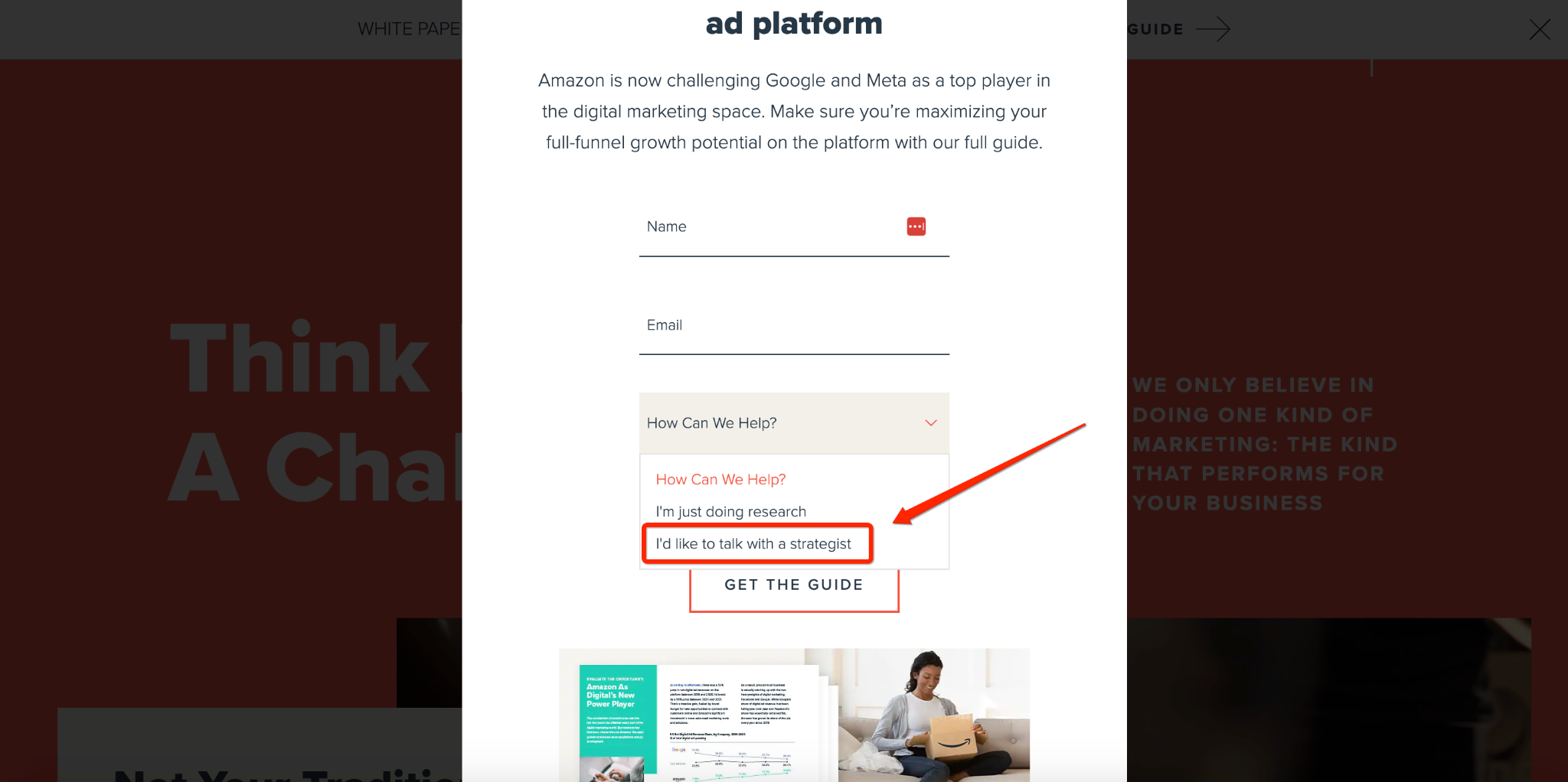
If they choose this option, by default, that makes the visitor a much more qualified lead than someone who simply wants to check out a guide, in which case, Wpromote can promptly have a team member reach out to them.
This “best of both worlds” approach is a nice compromise between just grabbing an email address and giving visitors with a strong intent to buy a simple means of getting in touch with the company.
A good template for creating a multi-step form for marketing agencies is this one from GetLeadForms.
With it, you can let leads choose what they’re looking to accomplish…

…what specific marketing service they’re interested in, and create an enticing offer to ensure a smooth, intuitive UI.
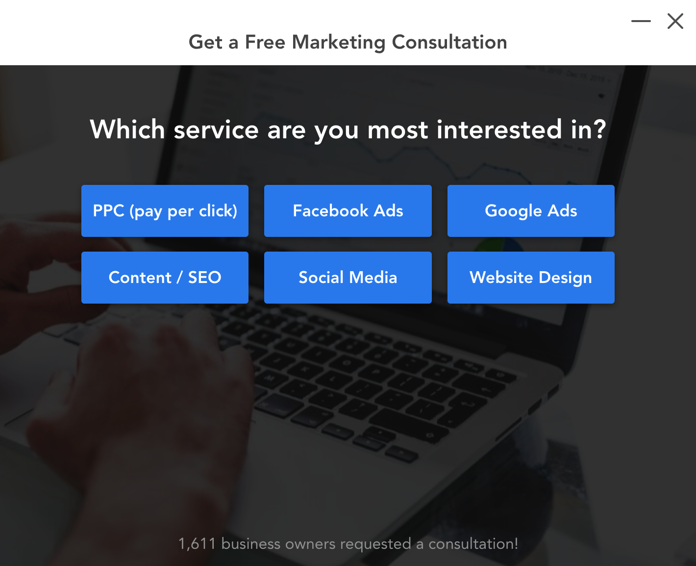
This wraps up our list, but there are many other examples throughout our blog. For example, check out this exit popup example that’s used by an insurance business to generate insurance leads.
How to Add an Exit Intent Popup to Any Page
With GetLeadForms, you can add a pop-up when leaving a site for any form on any landing page on any device with the flip of a button.
You simply click the toggle switch here to turn it on or off.
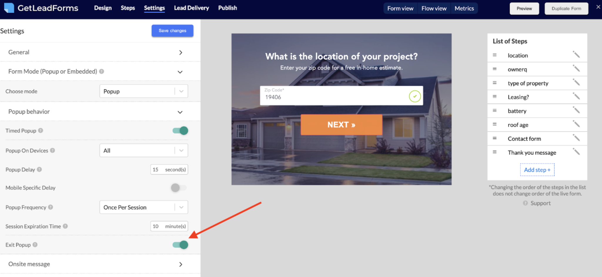
Like HubSpot exit intent popups, there’s no complicated coding, and you can create a fully personalized experience for countless industries.
Grab your free trial here.
Closing Thoughts About These Exit Intent Popup Examples
Although some service businesses are hesitant to use exit intent popups because of the bad rap they get, the truth is these popups get results when used correctly.
By following the right formula, as illustrated by these examples, and using the right template, you can create amazing exit intent popups to drive highly qualified leads and increase conversions.
When it comes to pop-ups, the exit intent a popup is just one type of popup form. There are many other popups that you can use to drive more (and better) leads. For some additional reading, check out our ultimate guide on the six different types of popups.
Ready to get started with an exit intent popup? Browse our library of starter templates here.
Ready to capture more leads?
Build and optimize high-converting lead funnels, quizzes, and forms with AI-powered lead capture software.
Start Free Trial