6 Different Types of Popups to Increase Website Conversions (Ultimate Guide)
Popup forms are an excellent way to grab a visitor’s attention and generate more leads, and they’re still relevant today.
Popup forms are an excellent way to grab a visitor’s attention and generate more leads, and they’re still relevant today.
But with so many different types of popups, it can be difficult to figure out which type of pop-up you should be using and how you should be using these forms on your site.
When it comes to popup forms, user experience matters way more than it ever did in the past.
In this post, I’m going to show you the six different types of popup forms that you can use and how to use them effectively…
Without pissing off your website visitors.
Consider this the ultimate guide for popup forms.
Contents:
- What are popup forms? Good and bad examples of each
- Are popup forms still effective today?
- Example 1: The multi step popup form
- Example 2: Timed Popups and how to calculate the best pop-up timing
- Example 3: Exit Popups
- Example 4: Click Popups
- Example 5: Persistent Popups
- Example 6: Scroll Popups
What are popup forms? Good and bad examples of each.
A popup form is a small window that opens up on your website. It’s usually triggered by something like a click, exit, scroll or the amount of time that someone spends on your page.
Before we continue, let’s get something really clear first…
There are good pop-up forms and bad popup forms.
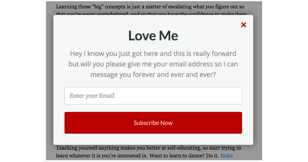
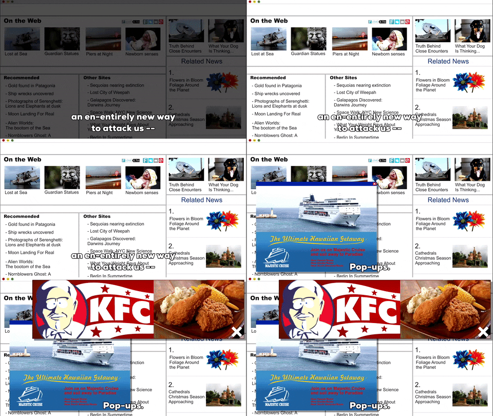
Here’s a bad example of a pop-up form.
The example above is bad for so many reasons. It’s ugly, looks scammy, and has an overall poor user-experience.
Here’s another example of a bad popup that looks more like an alert box — DON’T use these.
It’s popups like the ones above that give popup forms a bad reputation.
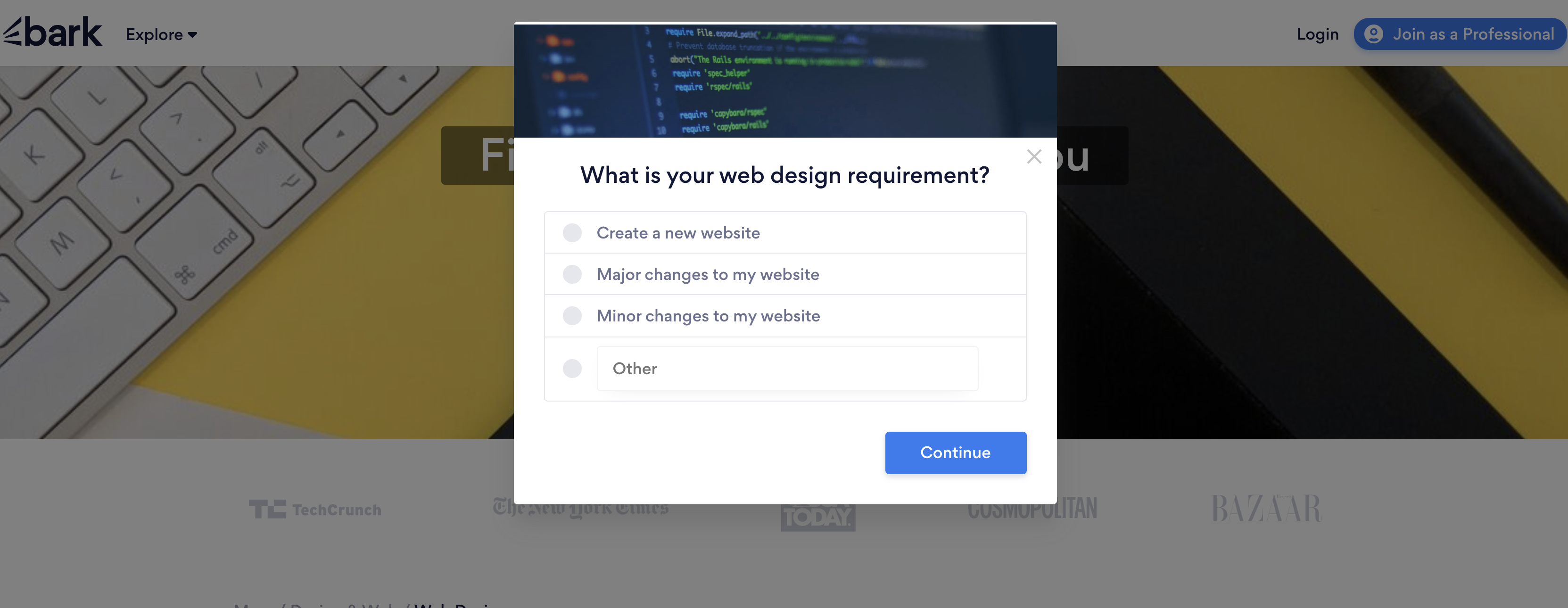
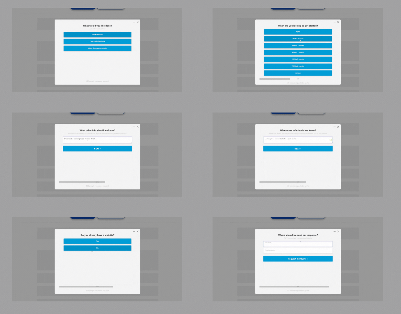
Instead, here’s a good example of a pop-up form coming from Bark.com
What makes this popup better than the first two examples?
It’s more relevant to what the website visitor is looking for. Rather than asking the visitor to simply provide their email address, they are trying to help the visitor find what they are looking for — in this case a website designer.
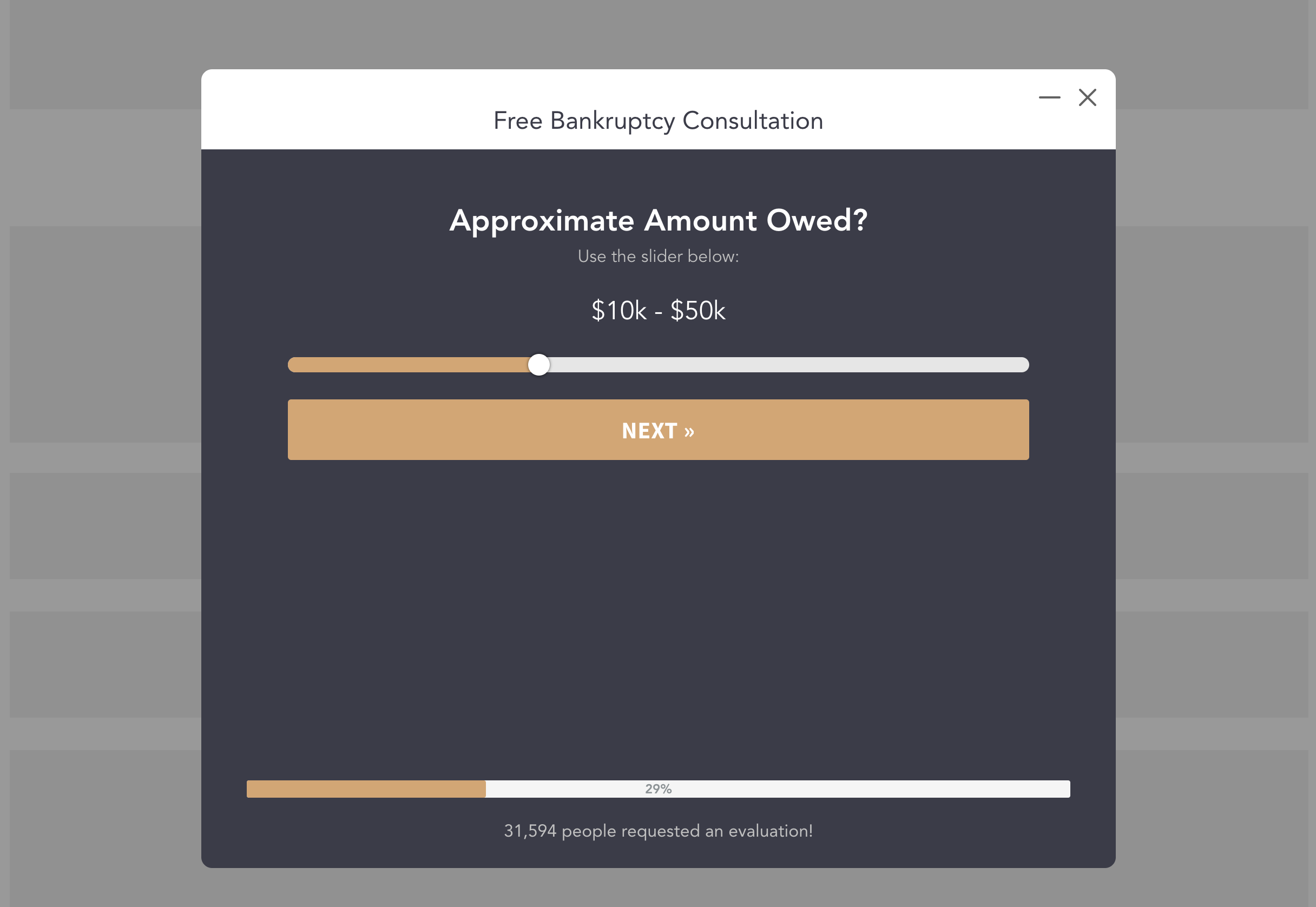
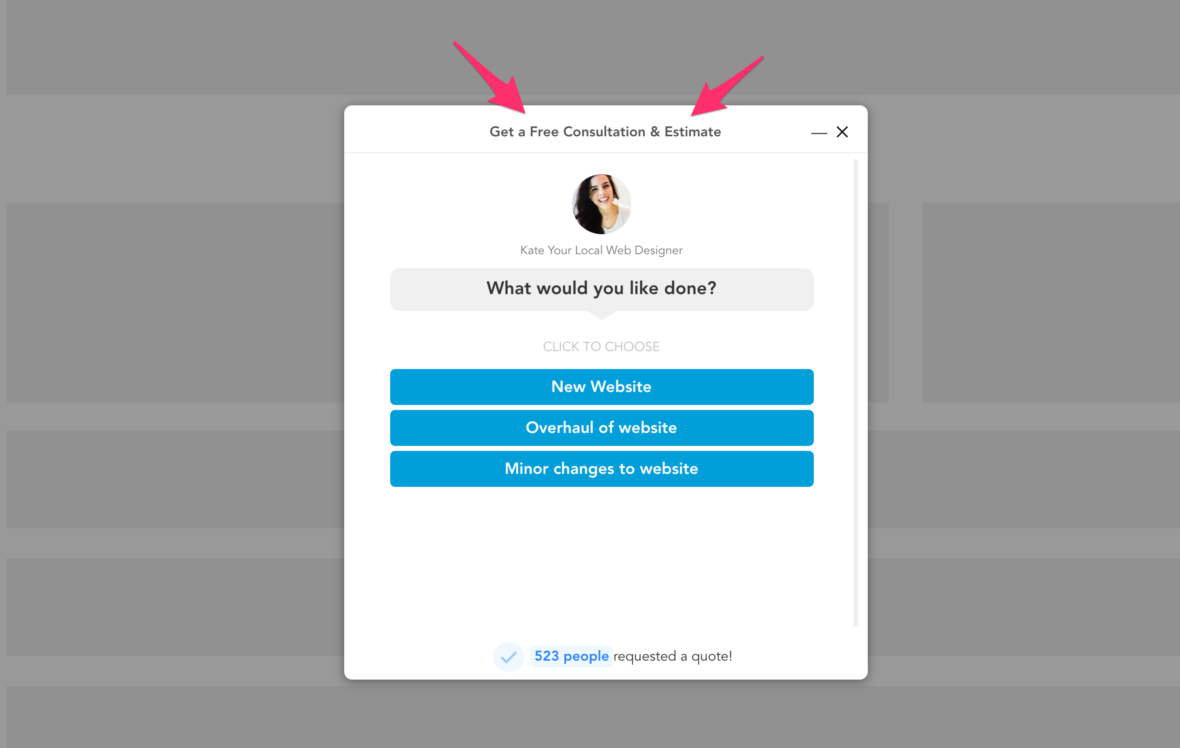
Here’s another example of a good popup form that was created with GetLeadForms.
This form leads in with a stronger offer, which is a free consultation.
And it also uses more modern UI elements like a slider to it as easy as possible for the prospect to complete the form.
Interested in using this style of pop-up form for you own site? You can grab a free template here.
So, why use pop-up forms in the first place?
Popup forms are often used for lead generation in a marketing campaign. They’re usually either set up as an overlay (which appears above everything else on the screen) or a lightbox (a smaller modal-style box).
One of the biggest benefits of using popups is their ability to capture email addresses and other types of information from visitors. I usually recommend going beyond email address, but more on that later.
Now you might be thinking:
Are popup forms still effective today? Are people still using popups?
Let’s dive a bit deeper into this topic.
Are popup forms still effective today?
Most marketing experts today would agree that popups are still effective. But to really answer this question we need to go back in time.
Source: giphy
Don’t worry, we don’t actually need to zap you back into time.
I’ll give you a quick synopsis right here!
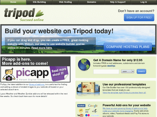
The first popup form was created as a ‘popup ad’ and originated on Tripod.com in the late 1990s, created by a man named Ethan Zuckerman.
Remember Tripod? The internet sure has come a long way.
Zuckerman figured out how to use javascript to launch advertisements in separate windows as a response to complaints from advertisers about their ads appearing on pages with inappropriate content.
At the time pop-up forms were extremely effective at building an email list because the technology was so new.
However, as popups gained popularity, we saw pop-up forms being used for both good and bad. As with happens with most things.
On one side you had legitimate businesses and marketers who were using pop-up forms to generate more leads and a bigger email list with a focus on list growth.
But on the other side, malicious actors began doing all sorts of things to manipulate popups, which I truly believe ultimately gave popups a bad reputation in the long run.
For example, a common malicious tactic in the late 1990’s into the 2000’s was the use of the ‘fake close button.’
Simply put, upon dismissing the pop-up through the “close” or “cancel” button on the window hosting the pop-up, the button would do the opposite and display a new popup — this would often happen on what seemed like a never ending loop.
Source: giphy
I still have many vivid memories as 12 year old John, being stuck in endless cycles of vicious popups. I’d close one, then ten more would open. The only way to get out of the pop-up was to rip the computer plug out of the wall!
Thankfully today, we tend to see less and less malicious pop ups being used. Although every so often I come across a spammy looking alert box popup, but these are pretty easy to spot.
In fact, a few years back Google really started cracking down on sites that have poor popup experiences.
So are popup forms still used today?
YES!
I don’t even need to pull out a fancy statistic to tell you how many websites out there are using popup form to generate more leads. Simply browse some of your favorite websites and you’ll see what I mean.
At GetLeadForms, we see about 75% of our customers use pop-up forms either in addition to or in place of embedded forms.
Popup forms really aren’t bad.
There’s a huge misconception that they’re going to ruin your conversions and drive people away from your site.
But here’s the thing — as long as you’re mindful about how you use popups on your site, the opposite is true.
In fact, one study that analyzed 2 billion popups showed that the top 10% highest-performing pop-ups had an average conversion rate of 9.28%.
Just think about the math for a second:
If you’re getting a 1,000 visits to your website per month and you’re converting an extra 9% of those visitors into leads on the high end, then you’re getting about 90 extra leads per month. In this case it makes a ton of sense to use popup forms.
The biggest thing to keep in mind is that it’s now all about user experience. You shouldn’t just blindly throw a popup on your website and call it a day.
That’s a recipe for disaster.
Let’s dive a bit deeper into the different types of popups and how you should think about the strategy for each.
What are some popup examples? [6 different types of pop-up forms]
Do you ever find yourself wondering how many types of pop-ups are out there? Well, let’s just say that there are many different types of popups. Here are six of my favorite.
1) Multi step popup form
A multi step pop-up is my favorite type of popup and it’s exactly how it sounds. It’s a form that opens up as a pop-up and leads the user through multiple steps to get you more qualified leads.
You can see an example of multi step popup form here.
Instead of just asking for one field like the email address, you can ask the prospect multiple questions right in the same form.
These types of forms give the appearance of being higher quality than your standard popup forms.
If you want to take things to a completely new level, then you can even make your form look more friendly by adding your image to the form (note: expect a serious boost in conversions by doing personalizing your popup lead forms).
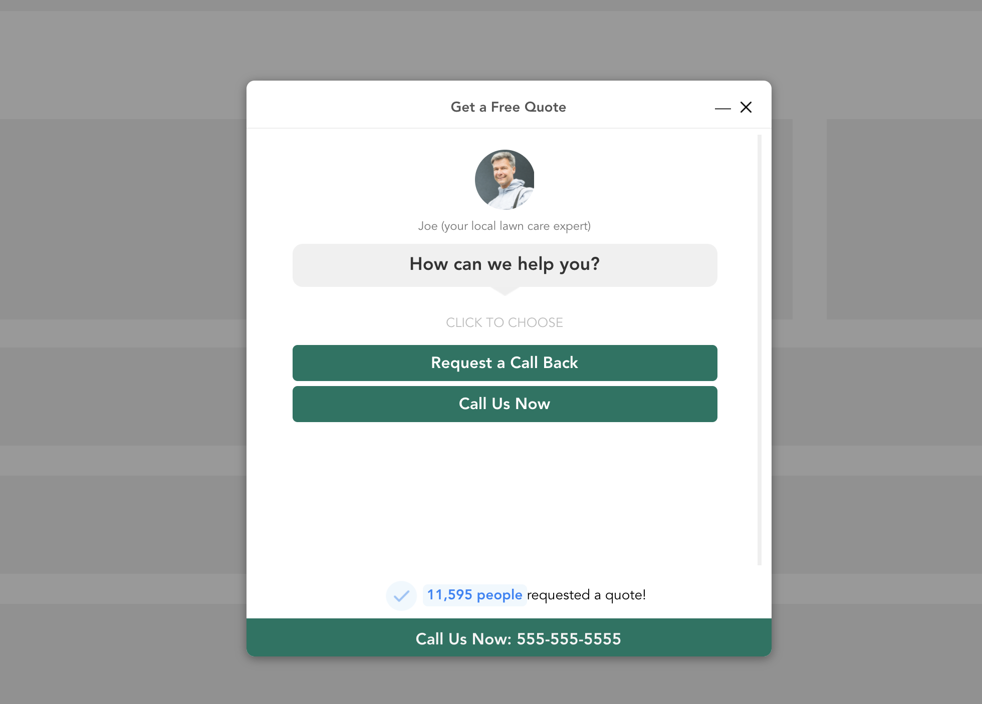
Here’s an example of that chat style form that’s above.
If you love the idea of using multi step forms to engage leads, here are some popular multi step form examples for your inspiration.
The huge benefit to using a multi step popup form is that you can generate more qualified leads. This is great for any service businesses, SaaS companies, and any other type of business that needs to generate more than just a name and email address.
2) Timed Popups
This is probably the most standard type of popup form, also sometimes referred to as entry popups.
Timed popups, or entry popups are popupsthat automatically appears after a visitor has been on your website for a certain amount of time.
The benefit to the timed-popup is that you can automatically engage your visitor as they are browsing your site.
Just be very careful with how aggressive you are with your timed popups.
If you set your timed popup to appear too soon or too often, then you’ll end up creating a pretty bad experience for your visitor.
How to calculate the best pop-up timing
At GetLeadForms, I’ve seen users set their timed popups anywhere from appearing within ten seconds to well over a few minutes.
Generally speaking, after doing a ton of testing here I’ve found that the best timing for your popup to appear is after about 30 seconds to 60 seconds. Sometimes even waiting as long as 90 seconds isn’t a bad idea.
With that said, there is a more scientific approach here.
If you have Google Analytics installed then you can base your timed popup based on your average browser duration time. I typically make mine appear at 50-75% of the average time on page.
For example, here’s a post that I pulled from my Google Analytics account. This blog post has an average time on page of about 3 minutes with a 76% bounce rate.
So I would probably make my timed-popup appear closer to the end of the average session duration time, around the 1.5 minute or 2.5 minute mark for this specific page.
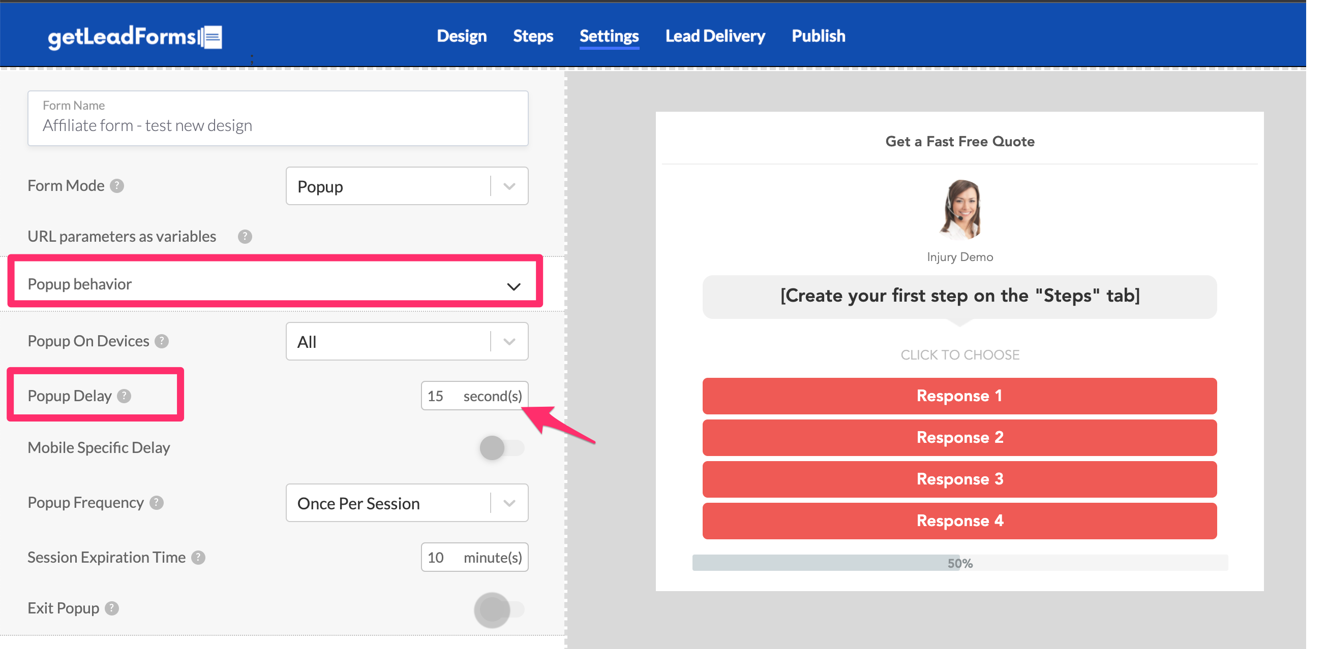
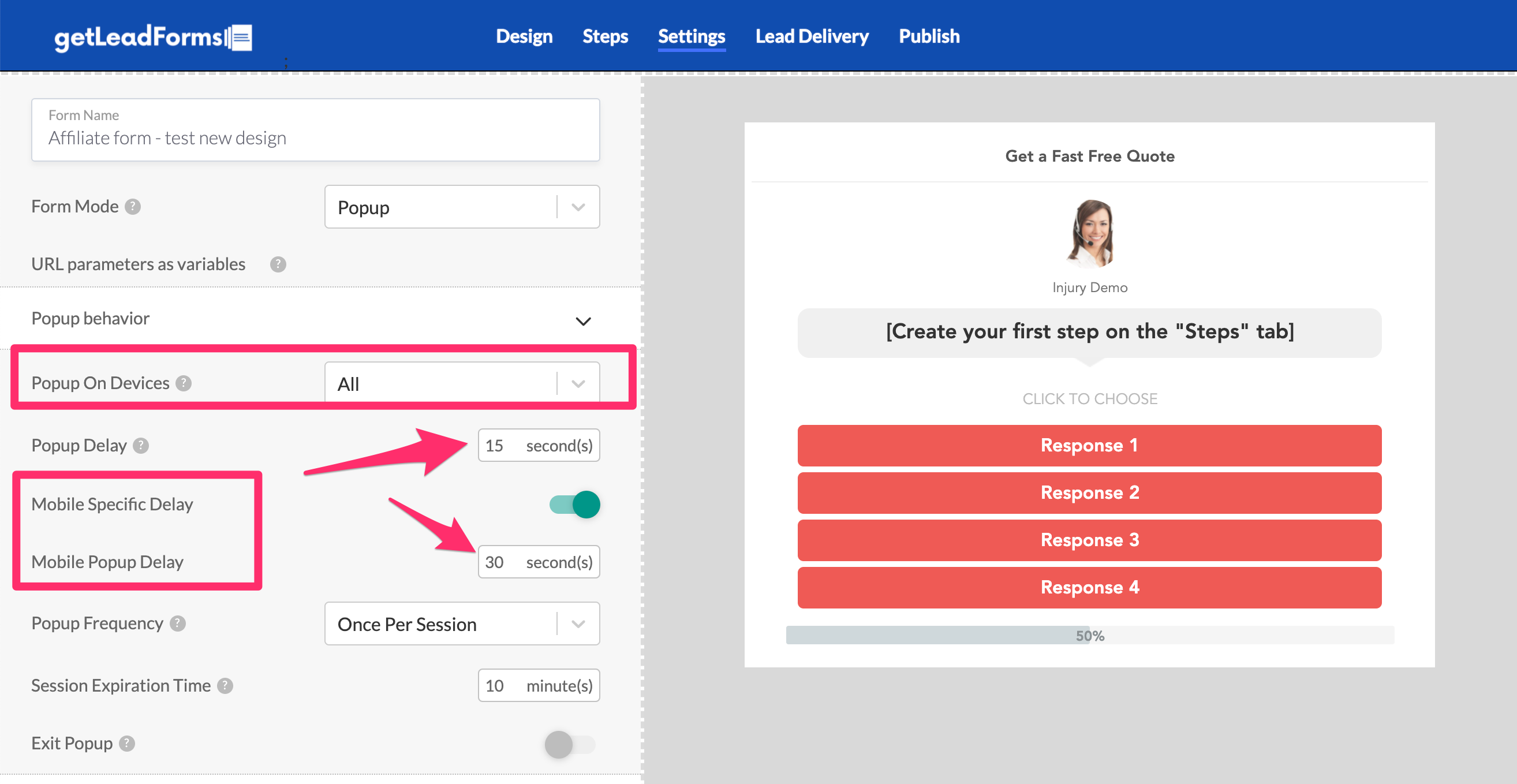
If you’re using GetLeadForms you can easily update your timed-popup delay inside of the form builder. Simply go to settings and update delay.
If you’re planning to use a timed popup, then I also recommend segmenting your timed popup by device. For example, I’ve seen that it’s pretty common for people on mobile devices to have a lower average session duration than desktop users.
Inside of GetLeadForms, you can segment by device simply by flipping the mobile device switch and adjusting the timed popup.
You can even turn timed-popup off on mobile devices completely.
At the end of the day, if you’re planning to use a timed popup then I highly recommend testing your timing frequency as much as possible.
In fact, it never hurts to run a little A/B test where you test the frequency of your timed popup.
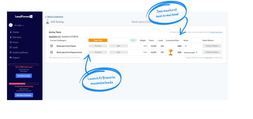
You can run A/B tests right inside of GetLeadForms.
3) Exit Popups
The exit popup, also known as exit-intent popups is by far one of the most effective popup type that you can use today.
An exit popup (or exit intent popup) is shown to visitors who are about to leave your site.
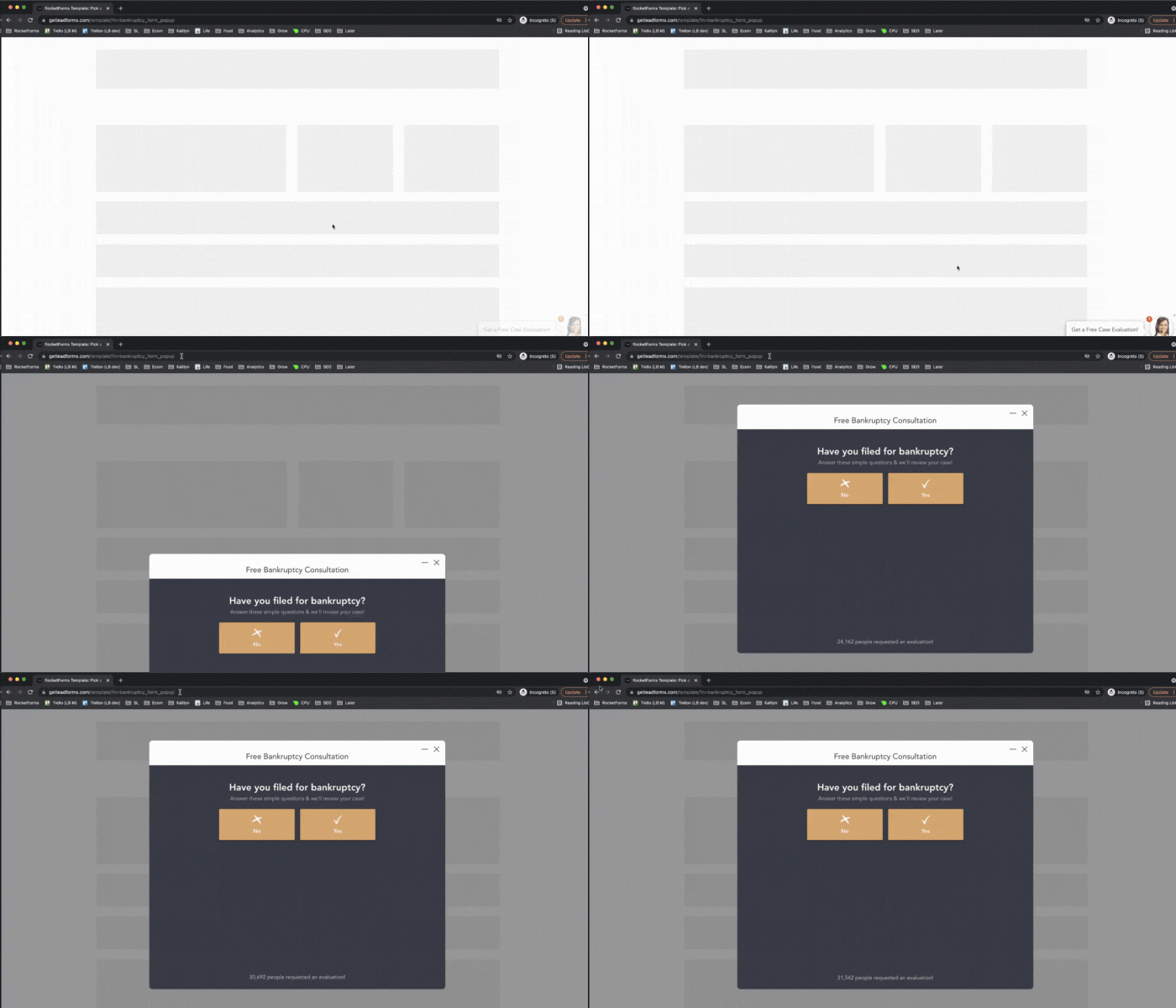
You can see an example of an exit popup form here.
One of the huge benefits of exit popups is that they’re only shown to people who are about to leave your site. This means that you won’t bombard visitors with pop ups while trying to read an article or browse through your website, but instead it’s shown at the perfect time when someone is ready or had a chance to consume your content.
Do exit popups work?
They sure do! At GetLeadForms, we see that exit popups tend to be the most effective form of popups with about a 2%-4% conversion rate.
If you’re going to use an exit popup, then I highly recommend putting some thought into the strategy. For example, make sure that you’re leading in with a good offer.
For example, if you’re running a web design agency then you could offer your visitor a free consultation as they are leaving, like in the example below.
Here’s an example of the exit popup in the image above. As you can see, this popup is a bit different than most. It’s more personalized to look like a chat box.
For more examples of exit popups check out this post: 7 exit intent popups for service businesses (with templates).
4) Click popup
In addition to the exit popup, the click-popup has become one of the most widely used popup forms today.
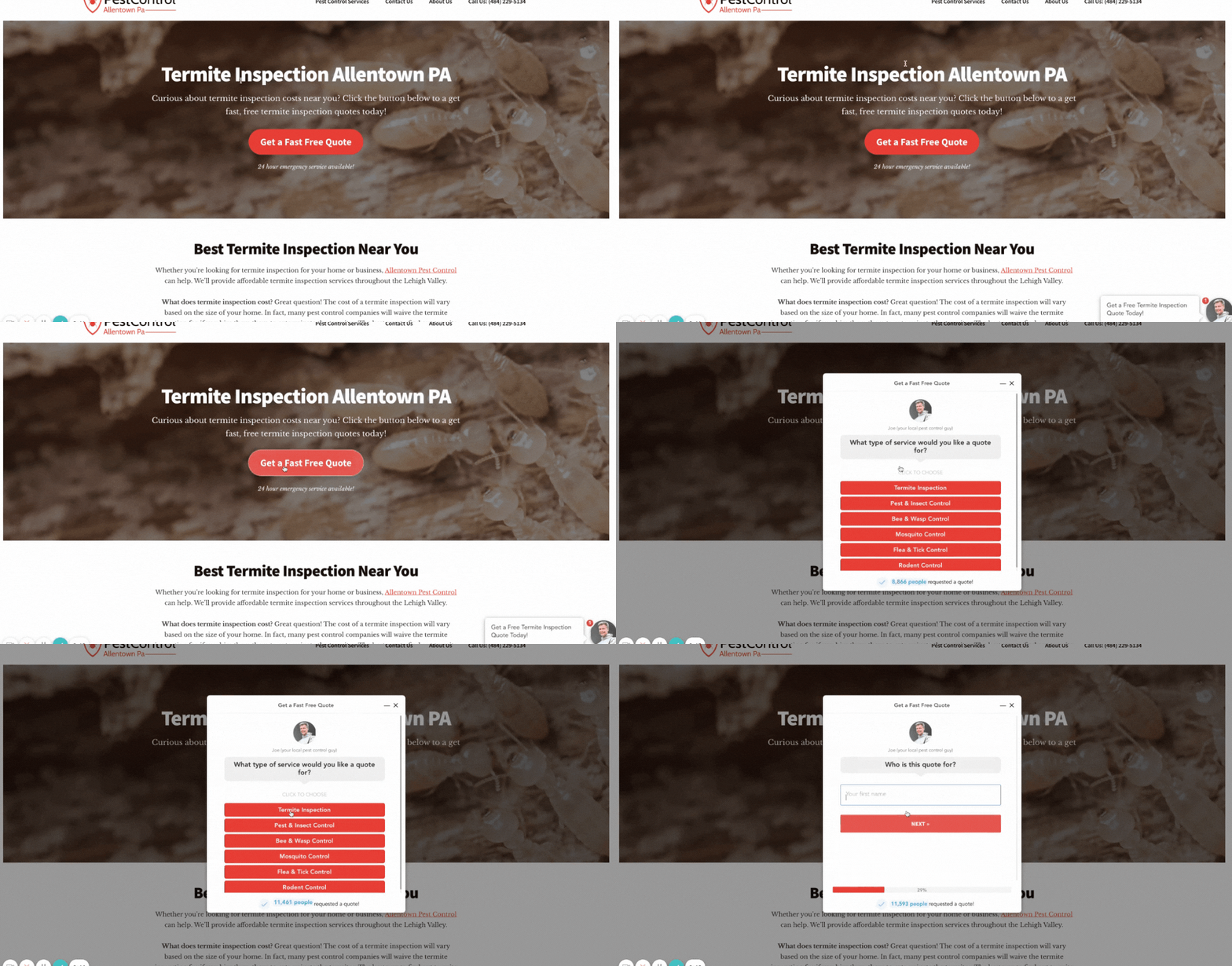
A click popup appears anytime that someone clicks on a button on your website. For example, in the image below the visitor clicks on the ‘Get a Quote’ button and the form pops open.
This click-pop was set up with GetLeadForms. You can grab a free trial here.
Here are some of the benefits of using click-popups on your website:
- The visitor is actually expressing that they are interested in engaging with the form by clicking on the button that opens the form.
- Click-pops aren’t as intrusive as a timed popup since it requires someone to actually click on a button to open the form
- With a click-popup you can keep your prospect on the same page instead of redirecting them to a different page in your funnel — whenever you can shorten the amount of clicks it takes to get to your forms, the more likely it is that your overall website conversion rate will increase.
The nice thing about a click popup is that you can add it almost anywhere on your site. I usually recommend hooking up your LeadForm to open up on key CTA buttons throughout your site and a CTA in the header area.
5) Persistent Popup
A persistent popup tends to persist throughout the visitor’s browsing session, usually off to the side in the bottom right or left corner of the screen.
This is a newish type of popup that has become more popular over the last couple of years — most widely seen with chatbots.
Here’s an example of a persistent popup that’s a feature of GetLeadForms:
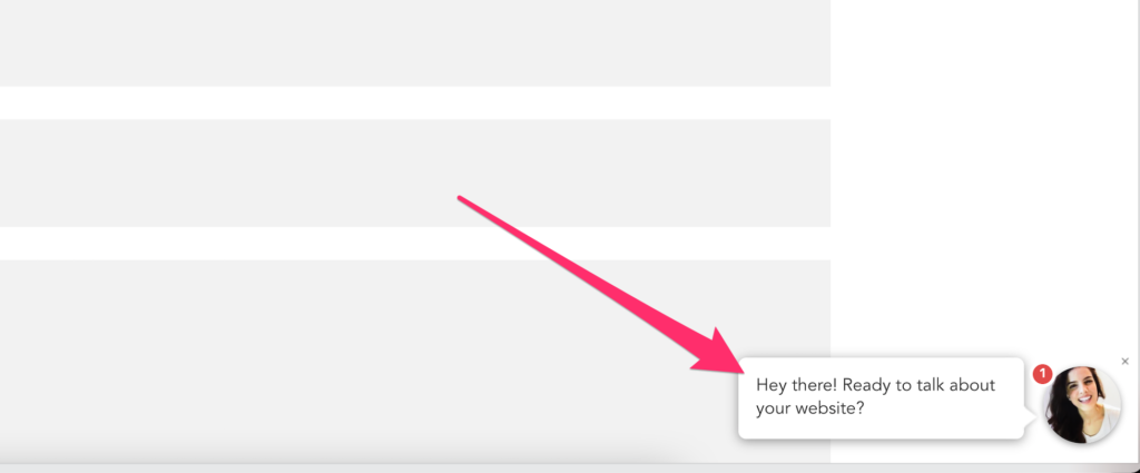
At GetLeadForms, we got pretty creative with how we think of the persistent popup.
Rather than designing the popup like a boring form that just sits there waiting for someone to engage, we turned it more into more of a friendly greeting that sits there waiting for the user to engage.
When the visitor clicks on the popup, the form opens right up.
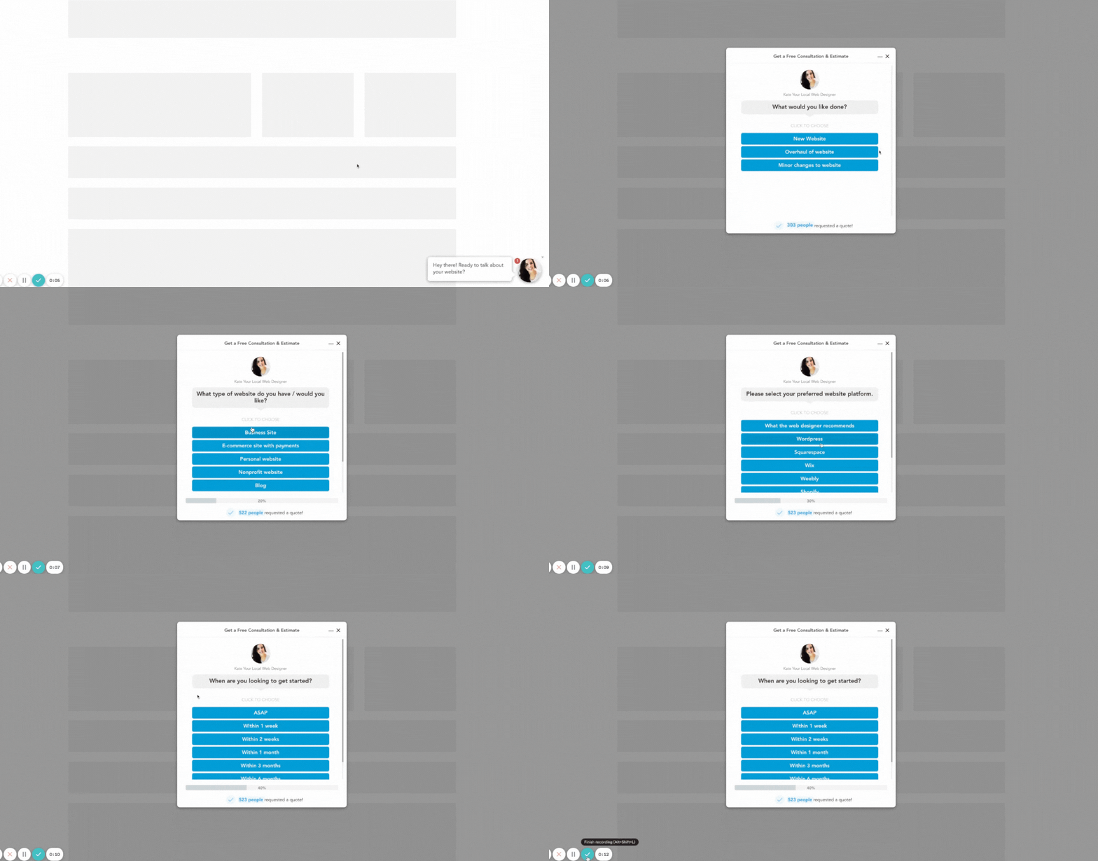
This is a pretty unique feature to GetLeadForms. You can see an example in action here.
6) Scroll Popups
A scroll popup usuallyappears after someone scrolls down to a certain point on your website
Scroll popups are great because they help you capture leads from people who have already spent some time on your page, which means there’s a higher chance of them converting into subscribers or customers.
The downside to scroll popups is that this type of popup can feel a bit intrusive. I don’t know about you, but I’m not a fan of having a scroll popup appear on my screen when I’m in the middle of reading a blog post. For this reason, we tend to avoid using scroll popups at GetLeadForms.
Things to Avoid When Using Popup Forms
Now that we discussed some of the most common types of popup forms, lets quickly touch on some big things to avoid when using popups.
-
Don’t use a popup that blocks everything, this includes video backgrounds and full screen images!
-
Allow for scrolling in the background — don’t lock the visitor on the page.
-
Try not to use a popup form that takes up the whole browser window.
-
Avoid using too much text!
-
Stick to one type of popup. Don’t start hitting people with timed popups followed by exit popups.
-
Make sure to test out different types of popup images before choosing one, if possible try testing different colors as well because some studies show that certain colors perform better than others for increasing conversions.
-
Don’t be too aggressive if using exit and timed popups. We tend to limit pop ups to just once per browsing session.
Final Thoughts About Different Types of Popups
Popup forms are still an extremely effective way to boost website conversions.
And there are many other types of popups including gamified popup forms, opt-in bars, and popups offering discount codes, but the examples that I provided throughout this post are some of the most common.
Two parting thoughts that I want to leave with you for when it comes to using popups on your website:
- Always keep user experience in mind. The experience of your prospects should always come first.
- Test everything — don’t just assume that one of the types of popups explained in this article isn’t going to work for you because you don’t like it. Let the numbers guide your decision-making.
If you’re looking for an easy way to create user friendly pop ups that work then you can grab a free trial of GetLeadForms here.
Or explore some of our latest popup form templates here.
Ready to capture more leads?
Build and optimize high-converting lead funnels, quizzes, and forms with AI-powered lead capture software.
Start Free Trial