Content upgrades are like a cheat code for turning casual blog readers into email leads.
In this case study, I’m going to show you the behind-the-scenes of how I managed to double our leads over at the GetLeadForms blog just by adding a simple content upgrade to one of our posts.
Plus, you’ll get the play-by-play on how to quickly make your own content upgrade leveraging AI. Consider this your ultimate guide to using content upgrades for lead gen.
What are content upgrades?
Content upgrades are a clever way to offer your audience something valuable in exchange for their email address.
Think of it as a hyper-relevant lead magnet — an additional piece of content that complements your blog post or article. The idea is to entice your readers with bonus content that addresses their specific needs and interests.
To give you a clear example of how a content upgrade works, take a look at the image below of an actual content upgrade that I created 👇
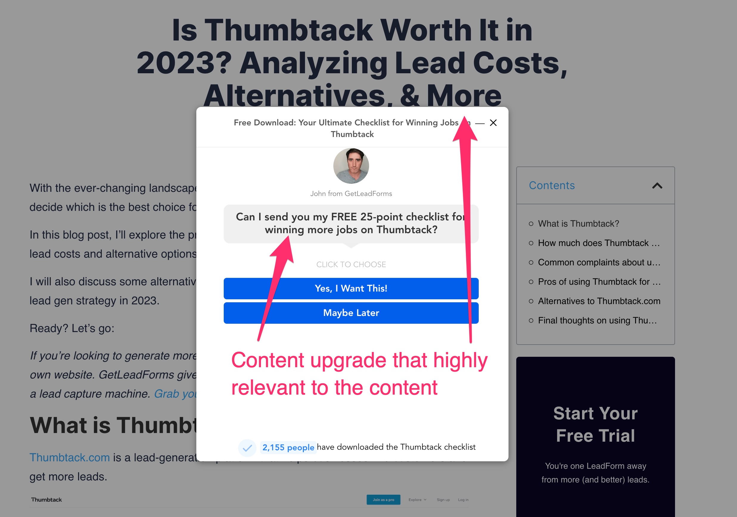
In this case, as readers learn about the pros and cons of using Thumbtack for their business, they are presented with the opportunity to receive even more valuable information by submitting their email address.
Hubspot is also another great example of a business using upgrades to grow their email list.
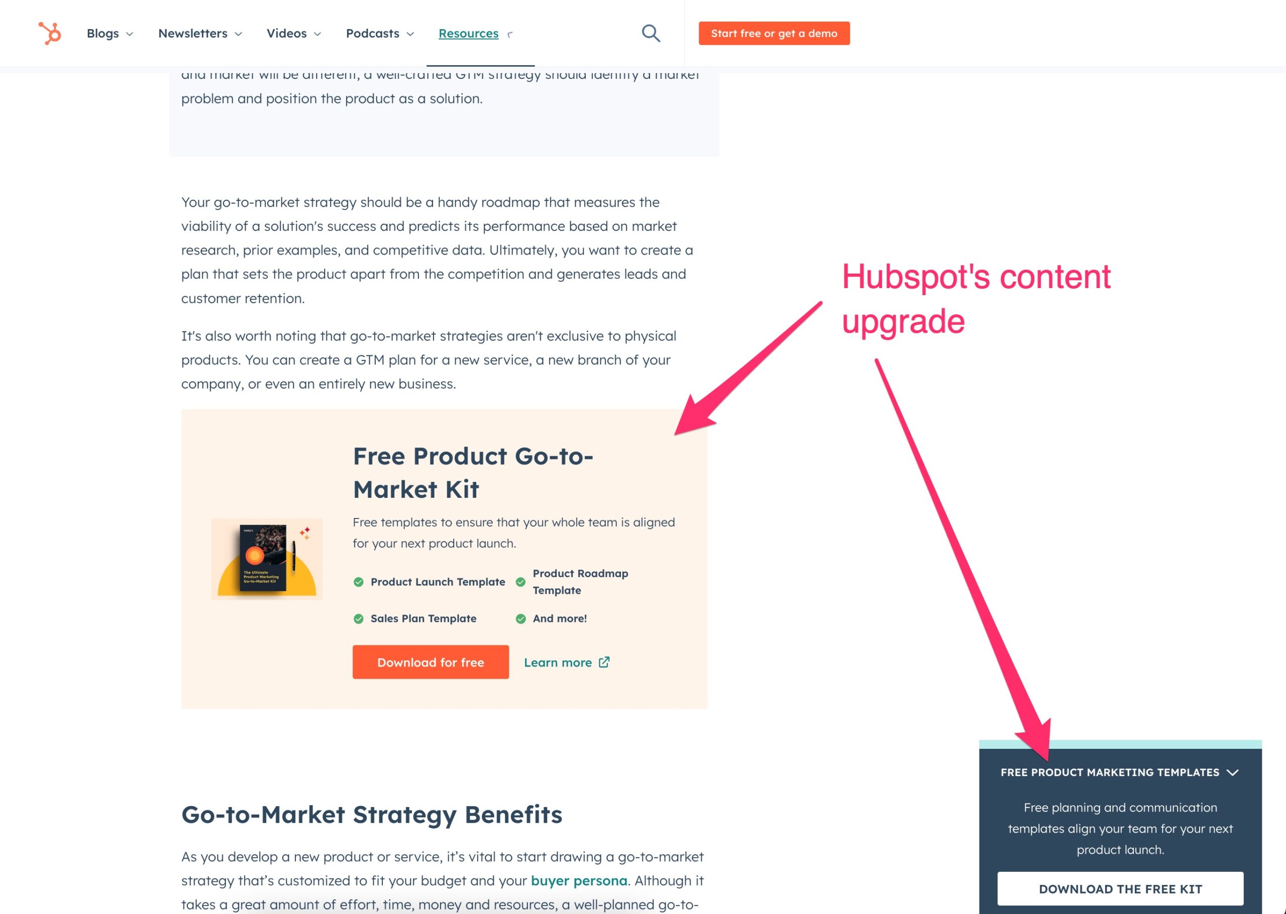
Hubspot understands the power of providing additional resources and content upgrades to their readers.
Remember, content upgrades are all about understanding your target audience and addressing their pain points. By providing valuable bonus content, you’ll not only increase your conversion rates but also grow your email list with engaged subscribers.
Why are content upgrades so effective?
To truly understand the power of a content upgrade, let’s picture a basic marketing funnel.
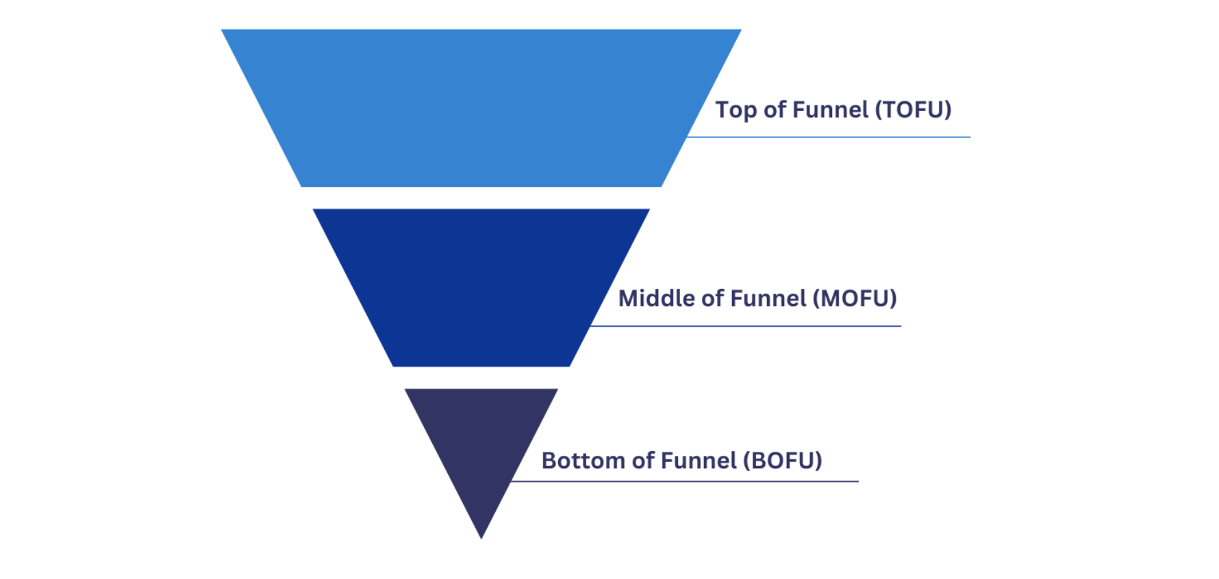
At the top, you have awareness.
At the bottom, you have conversions—where businesses capture demand.
I’ve found that it’s the middle of the funnel that often gets neglected.
The middle of the funnel is where you turn that awareness into desire, which then nurtures visitors into conversions.
And this is exactly where content upgrades come in.
Imagine having pages or blog posts on your website that receive a lot of traffic, but have minimal conversions. That’s the perfect opportunity to add a content upgrade.
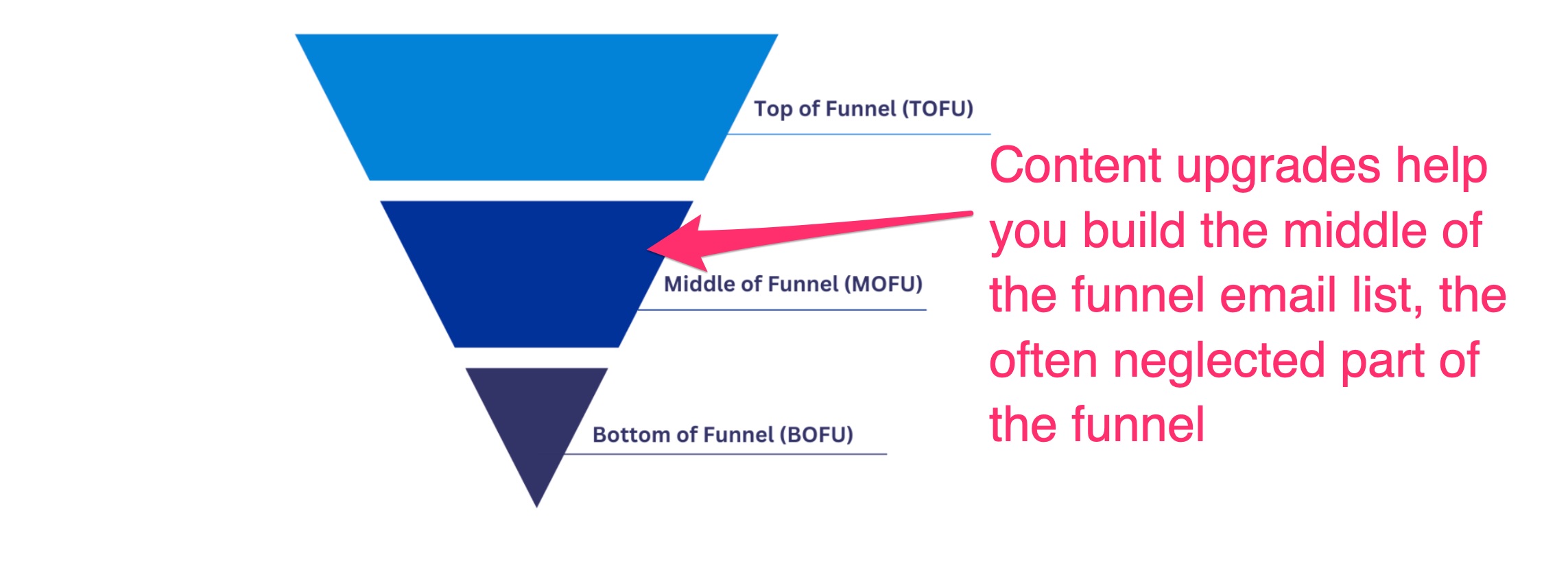
I like to think of it this way:
While content upgrades may not directly lead to a high volume of transactions, they have the unique ability to build a sizable email list of people who are already interested in what you have to offer.
Why are content upgrades better than standard opt-in offers?
What makes a content upgrade better than a standard opt-in form like “subscribe to my newsletter for weekly updates” or even just one really good lead magnet that’s plastered across all of your pages?
Well, it all comes down to relevance.
The beauty of a content upgrade lies in the fact that it’s closely aligned with the blog post or page that your visitor is already engaged with. This makes it a no-brainer for them to submit a form for additional information.
For instance:
If you’re running a fitness site and you have a blog post titled: “How to Get 6-Pack Abs,” what do you think would perform better?
A content upgrade that offers the perfect 5-minute ab workout?
Or a healthy meal cookbook?
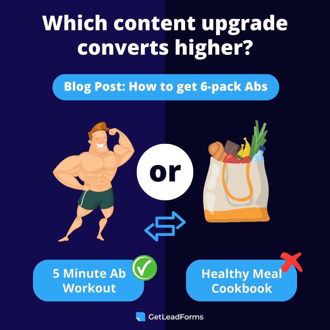
I’d put money on the 5-minute ab workout being the winner here.
Why? Because it’s directly related to the content that your visitor is already interested in. When you offer a content upgrade that is highly relevant and valuable to your readers, your conversion rate skyrockets.
Case study: How I doubled leads by adding a content upgrade to a blog post
No let’s take a look at some real-life results.
At GetLeadForms, we experienced firsthand the incredible impact that content upgrades can have on turning website visitors into leads.
In fact, by adding a content upgrade to one of our blog posts, I was able to double our conversion rates and significantly grow our email list.
Background:
Initially, we had some top-of-funnel blog posts that were getting a ton of traffic, but very few conversions. I wanted to tap into that potential and convert more of that traffic into valuable email leads. So, I decided to experiment with a content upgrade strategy.
To start, I strategically placed a personalized-looking chat-style newsletter form on our blog post, offering our readers the opportunity to receive our best lead generation tips directly in their inbox each week.
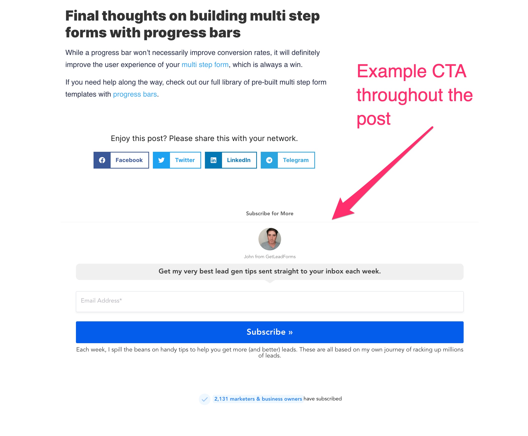
Note: While the screenshot is from the bottom of a current post, the form as present throughout the post. This rules out the issue of only visitors who reach the bottom of the page seeing it.
Despite running some A/B tests on the lead form to optimize the conversion rate, we were only seeing a dismal 0.55% conversion rate. It was clear that a generic newsletter opt-in offer was not enticing enough for our audience.

That’s when I knew I had to make a more impactful change.
I decided to implement a content upgrade on our highest-traffic top-of-funnel page, for a post discussing if Thumbtack is worth it.
Next, I created a content upgrade lead magnet called, “Your 25-point Checklist for Winning More Jobs On Thumbtack.
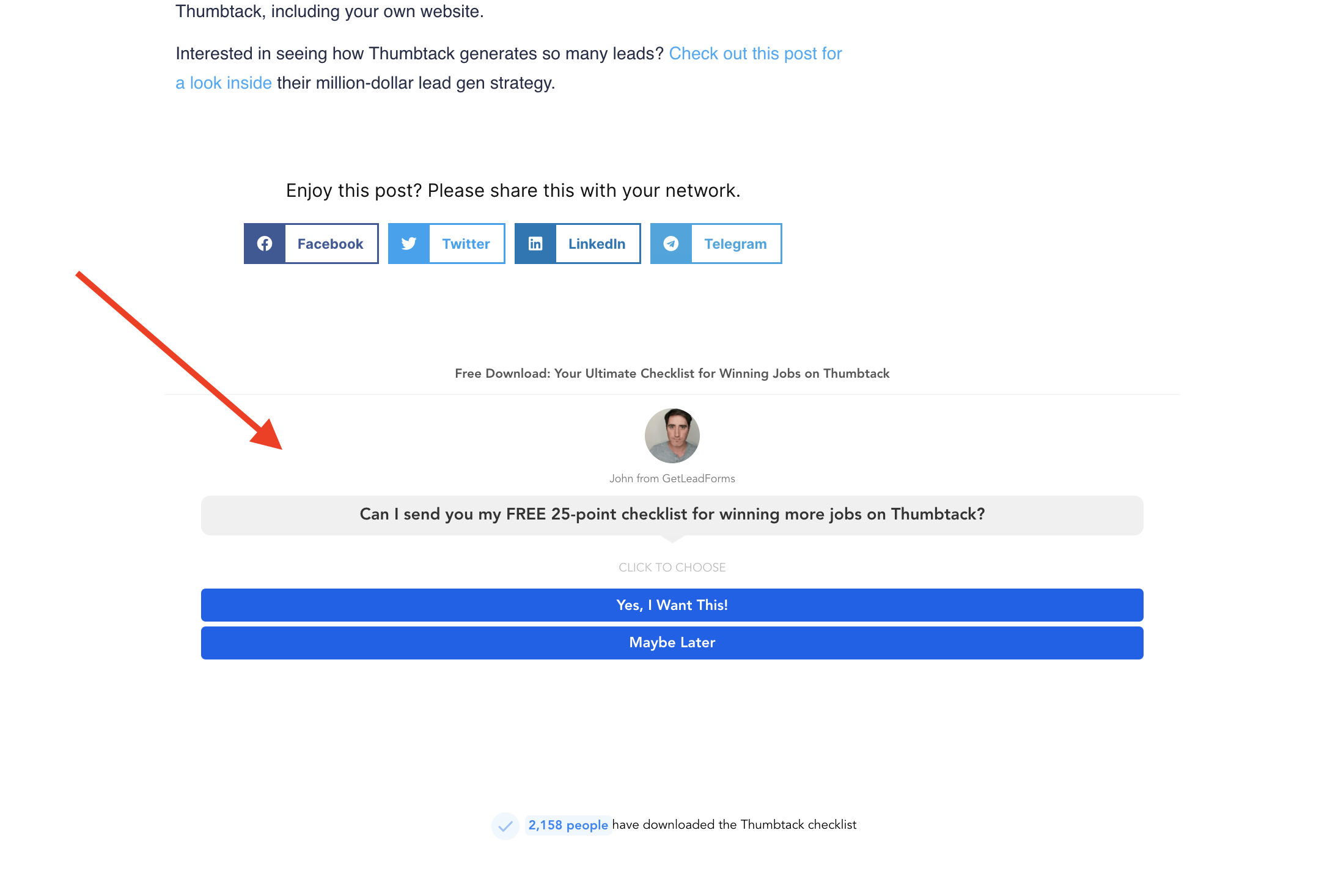
This valuable resource took me just about two hours to create using the help of AI (I’ll get to that in a moment).
By strategically placing this content upgrade on the page using GetLeadForms, I was thrilled to see our conversion rates double practically overnight to 1.1%

The new email leads started rolling in, and our email list began to grow at a much faster rate. I was pretty amazed at the power of a content upgrade to instantly boost the effectiveness of a high-traffic but low-conversion landing page.
The little known hack for identifying high intent leads within your content upgrade
While content upgrades are great for building your email list in the middle of the funnel, they’re not so great for getting you high intent leads that are ready to do business with you.
In fact, passing these leads off to your sales team can end up being a big mistake, mainly because the leads usually are not in buying mode — which ultimately wastes everyone’s time.
But here’s the solution:
Add a qualifying question that appears only after your prospect submits your form.
For example, in the case of my content upgrade that I shared the case study above, I wanted to understand if the leads might be interested in using our lead capture software. So I ask them a qualifying question at the end fo the form like this:
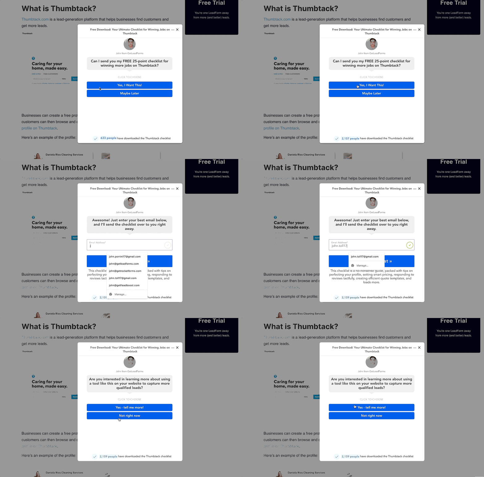
To ensure that I don’t add any friction, I’m adding my qualification question to the end of the content upgrade, after the prospect submits the form. This is the power of using content upgrades with multi step forms.
Now you might be wondering:
What if they abandon the form? Do I still capture the lead?
The answer — Yes! Leveraging our drop-off mode feature, I’m still able to capture the lead in the email list, even if they bail out on the qualifying question.
Free template: content update with qualification question 👉
Now let’s walk through how to set all of this up.
How to create an effective content upgrade
In the sections below, I’ll walk you through step by step, how to create a content upgrade.
Since we eat our own dog food, we’ll be using GetLeadForms for this. But you can use any form tool. If you decide to use GetLeadForms, here’s a content upgrade template for you to get started with.
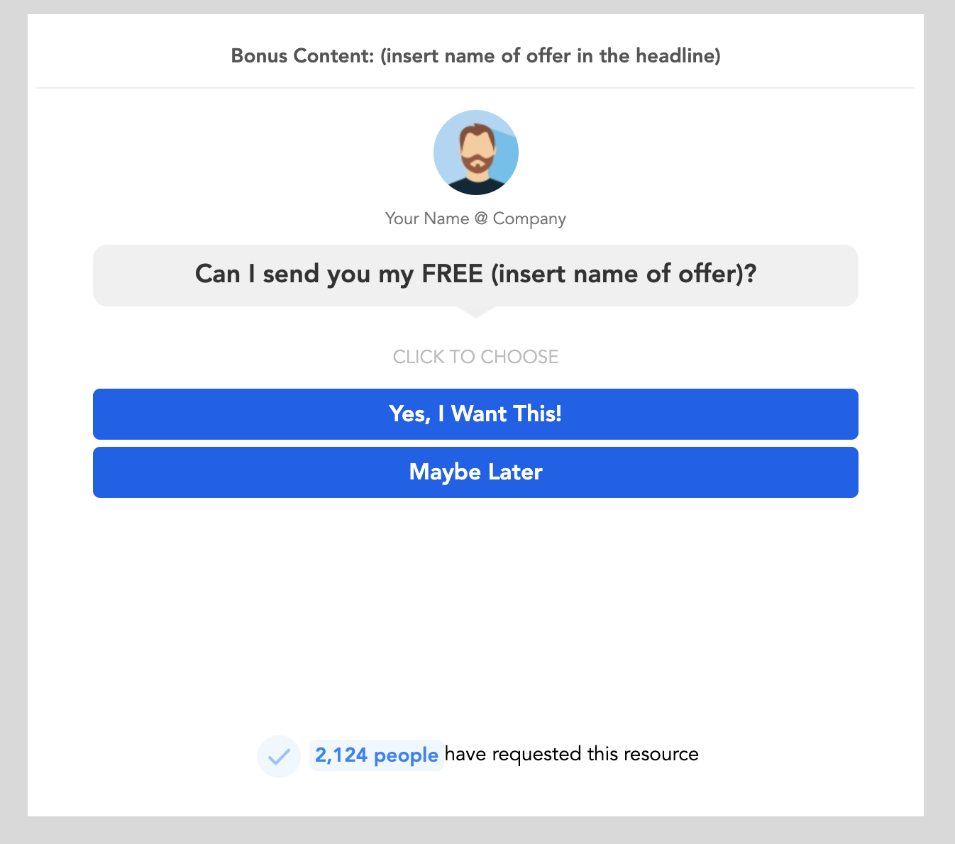
Grab this free content upgrade template here 👉
Step 1: Analyze existing content, grouping by funnel
Analyzing your existing content and bucketing it by funnel is a key first step before creating your content upgrade.
This is because going in blind and randomly creating these lead magnets without a strategic approach can lead to a maintenance nightmare and may even negatively impact your conversion rates of bottom-funnel content.
To stay focused and organized, I recommend exporting your top-performing content into a spreadsheet and grouping by funnel:
- Top of Funnel (TOFU)
- Middle of Funnel (MOFU)
- Bottom of Funnel (BOFU).
By categorizing your content in this way, you can effectively prioritize which posts to target for content upgrades.
From there, start with TOFU and MOFU content since BOFU content is already geared towards conversion. These top and middle-funnel posts are where you can truly capitalize on capturing your audience’s attention, engaging them further, and nurturing them towards conversion.
Once you have your content bucketed, you can then move on to brainstorming content upgrade ideas that align with each specific funnel stage. This will ensure that the upgrades you create are well-suited to the readers’ needs at their respective stages in the buyer’s journey.
Group your content by themes
After you’ve exported your content and organized your posts by funnel stage, the next step is to group your content by themes.
Instead of creating upgrades for each piece of content, you can create upgrades that are tailored to specific themes.
This not only saves you time and effort, but also allows you to offer more value to your readers across a wider range of posts.
Choose the format of your content upgrade
This is the critical step that most marketers miss.
You want your readers to actually consume and get value from whatever you’re giving away.
After-all, what’s the point of creating a content upgrade if no one benefits from it?
For example, instead of creating a 20+ page white paper or PDF ebook, consider something more concise and actionable. For example:
- Checklists
- Free tools
- Calculators
- Spread sheet templates
- Templates
- Videos
- Courses
- Email series
- Discounts and offers.
The possibilities are endless!
The important thing is to choose a format that aligns with your audience’s preferences and is easily digestible.
Once you have decided on the format, it’s time to roll up your sleeves and start creating your content.
Creating your content upgrade using AI and Canva
When it comes to creating your content upgrade, you have a few options.
- You can create the content yourself
- Outsource it to someone on a platform like Upwork or Fiverr,
- Or even leverage AI technology.
The option you choose will depend on your budget and skillset.
In my case, I had a bit of time on my hands and wanted to keep things low budget, so I decided to create my content upgrade using a combination of AI and Canva.
I went to ChatGPT and asked it to provide a 25-point Checklist for Winning More Jobs On Thumbtack as a starting point.
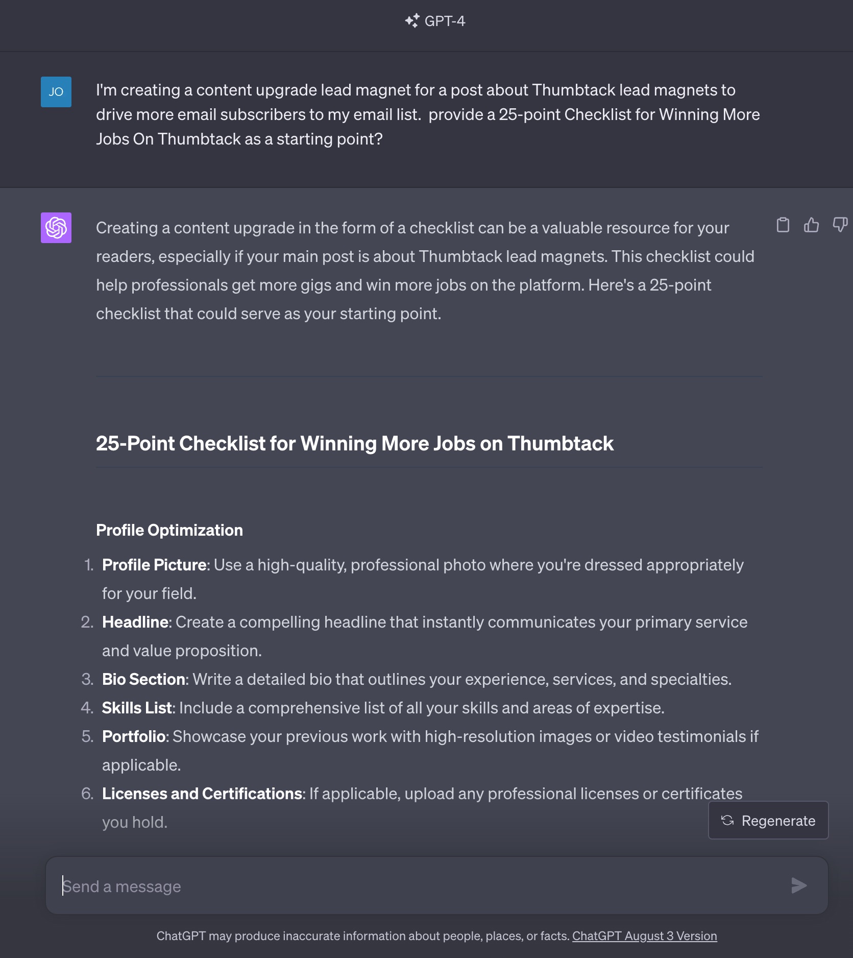
As you can see, the AI generated a draft of the checklist for me, and I made some updates and improvements to personalize it. In less than one hour, I had the entire checklist ready to go.
Once you have a draft of your content, the next step is to design it and make it visually appealing. That’s where Canva comes into the picture.
Canva is a user-friendly design tool that offers a wide range of templates, graphics, and fonts to help you create professional-looking content.
When using the Canva template, it’s just a matter of personalizing the colors, fonts, and adding your own logo or branding elements. You can also rearrange the sections, add or remove checkboxes, and make any other modifications to make the checklist your own.
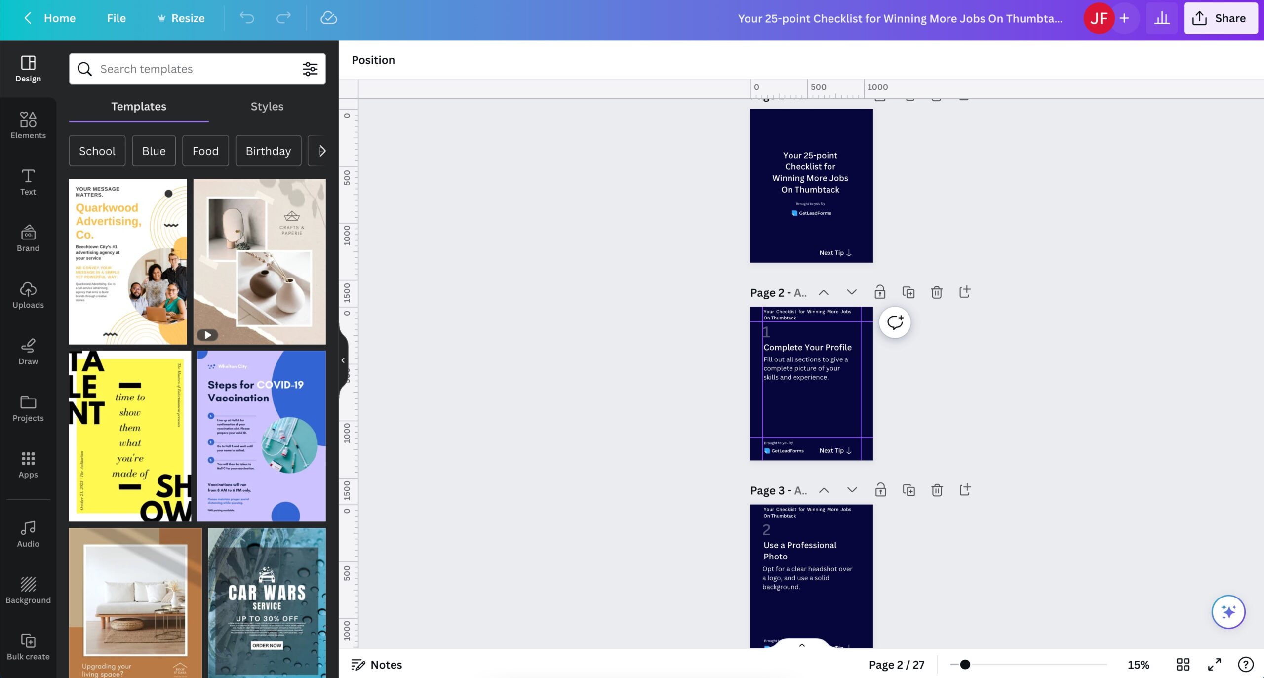
To help speed things up for you, I converted my content upgrade into a free template that you can use. Simply add the template to your Canva account and update it with your own content and branding. Get the template here (no opt-in needed).
Building a high converting opt-in form for your content upgrade
The next step in creating an effective content upgrade is to build a high-converting opt-in form that will entice your audience to subscribe.
First, let’s avoid those generic opt-in forms that don’t stand out.
Instead, you need a form that is visually appealing and compelling enough to persuade your prospects to share their email addresses with you.
Take a look at this example of a content upgrade form.
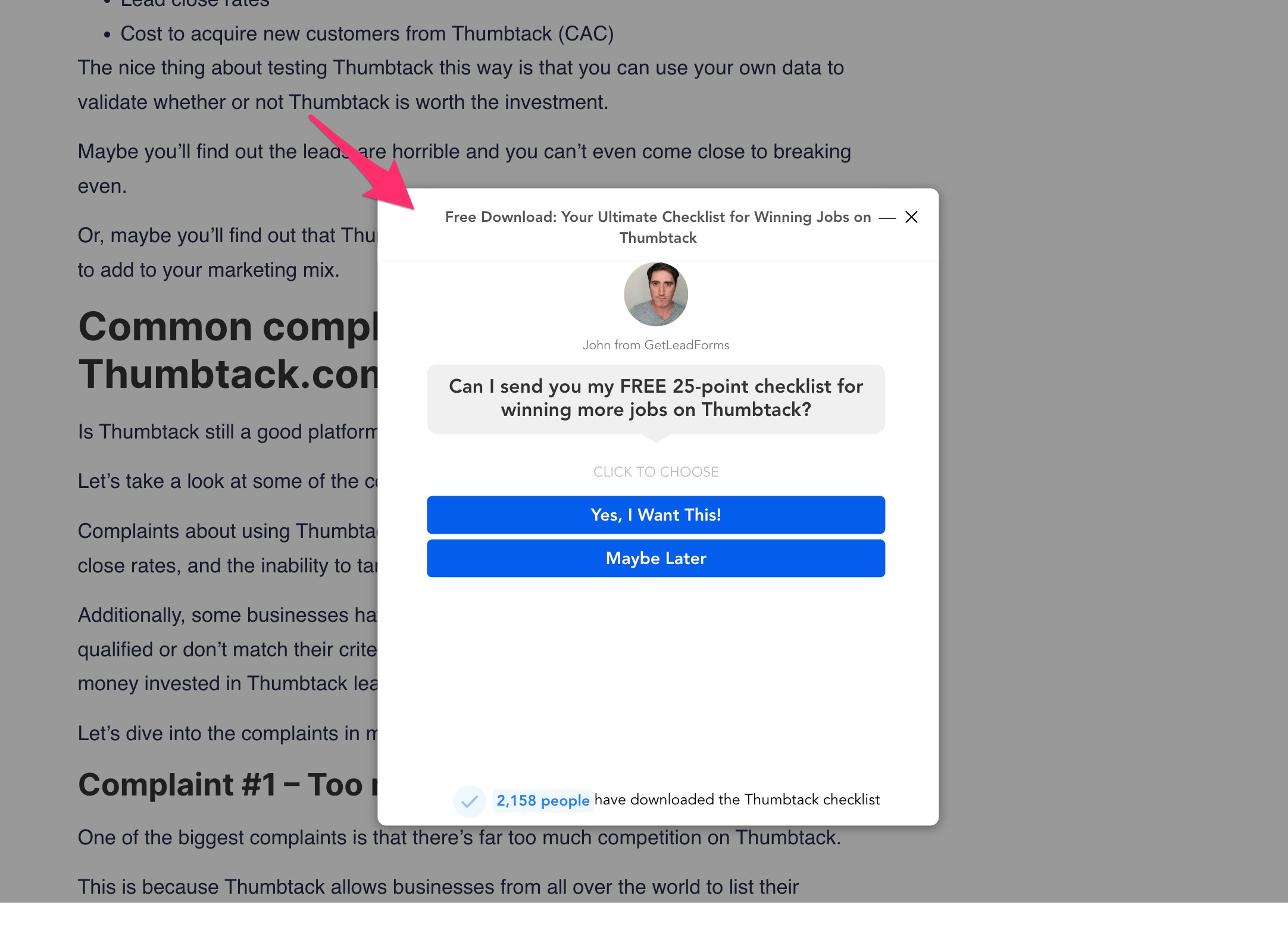
Notice how it incorporates an image of a person to build trust and authenticity. It also leverages social proof, showcasing real time social proof to create a sense of credibility.
To save time and effort, I’ve got a template ready for you right here.
Simply grab it and customize it to fit your brand and style. By personalizing the colors, fonts, and adding your own branding elements, you can make the opt-in form uniquely yours.
If you want to further qualify your prospects, then you grab this content upgrade template with what I like to call a qualifier — a step for a qualifying question at the end.
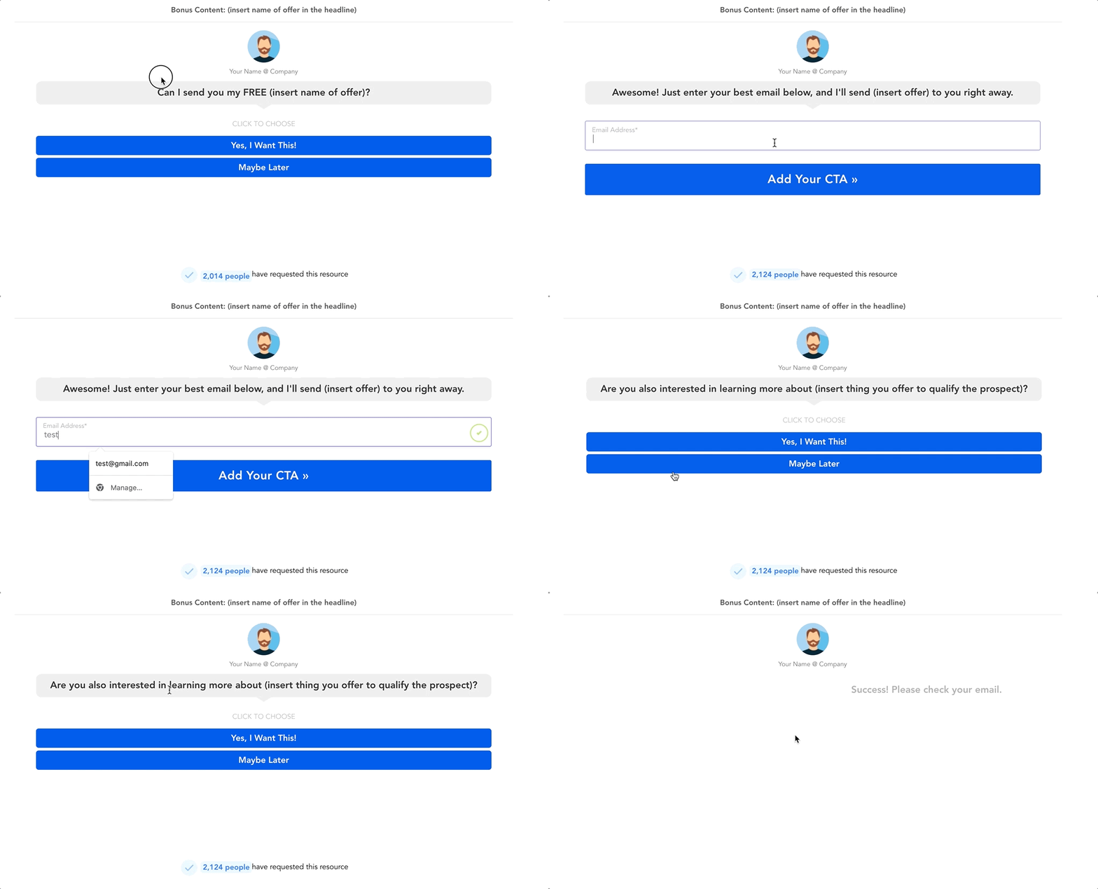
What makes this content upgrade form so effective is that after capturing the prospect’s information, you can ask a qualifying question at the end that’s directly related to the product or service that you offer.
If they answer yes, then you can route the lead directly to your sales team.
Grab the content upgrade with qualifying question template here 👉
Identifying where to add your content upgrade on your site
After you’ve put in the time and effort to create your visually appealing and irresistibly persuasive opt-in form, it’s time to go ahead and add it to your website.
But where exactly should you place your content upgrade? 🤔
Let me give you some recommendations.
First and foremost, your content upgrade should find its home in a blog post. This is where most of your audience will be engaging with your content, so it’s the perfect opportunity to capture their attention and offer them something of value in exchange for their email address.
To maximize visibility and conversions, I suggest placing your content upgrade in three strategic locations within your blog post.
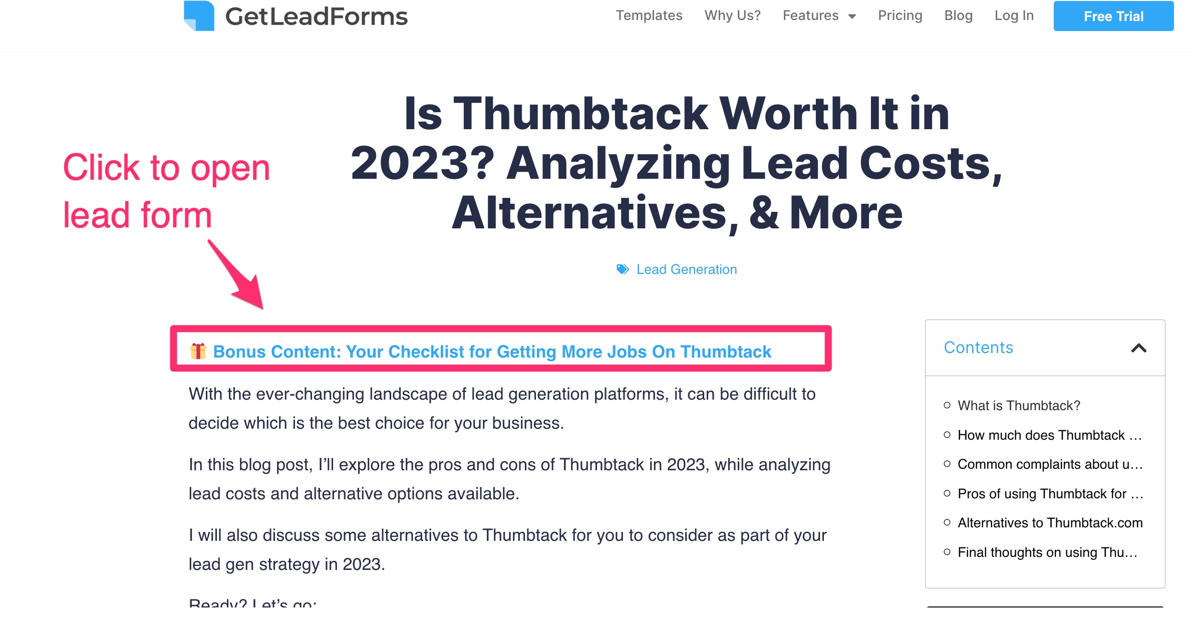
Above the fold CTA: Consider placing it in the top section, above the fold. This ensures that your audience sees it immediately upon landing on your page. You can use a compelling call-to-action to entice them to opt-in and access your valuable content upgrade.
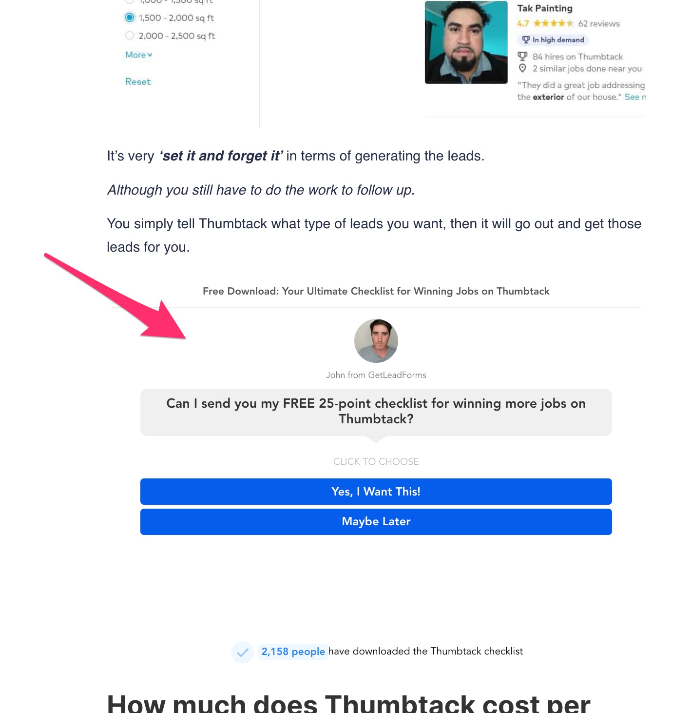
Inline CTA: Next, I recommend inserting your content upgrade embedded into the page, about 33% of the way down the page (top 1/3). This is the point where your readers are already engrossed in your content and are craving more value. By strategically placing your content upgrade here, you catch their attention at the right moment and make them feel like they’re getting even more value out of your post.
Bottom of Page: Don’t forget to include your content upgrade at the bottom of the page. This is for those dedicated readers who make it all the way through your post. Offering them a next step, such as accessing a more exclusive content upgrade, is a great way to keep them engaged and encourage further interaction with your brand.

If you’re using a tool like GetLeadForms, I have two additional recommendations to boost conversions.
Exit intent popups: I suggest setting the popup to appear as an exit popup. This means that as visitors are about to leave your site, they’ll be offered your content upgrade in a last-ditch effort to capture their interest. This can be a powerful way to convert those hesitant prospects into email subscribers.
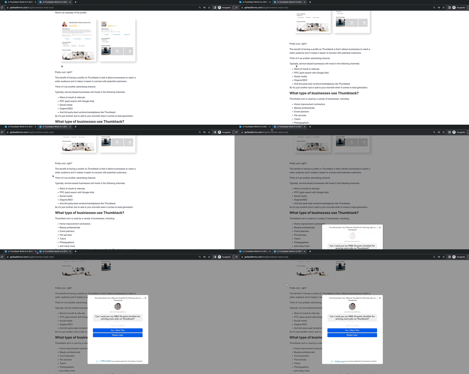
Creating an exit popup content upgrade in GetLeadForms is super easy. Just flip a switch and voila! You’re all set to offer your content upgrade to those who are about to leave your site.
Onsite message popup: Secondly, leverage GetLeadForms’ onsite message feature. This is a small, unobtrusive message that persists in the bottom right-hand corner of your page. When your readers are ready, they can click on it to open up the form and subscribe to your content upgrade. It’s a subtle yet effective way to capture their attention and encourage them to take action. See a live example here:
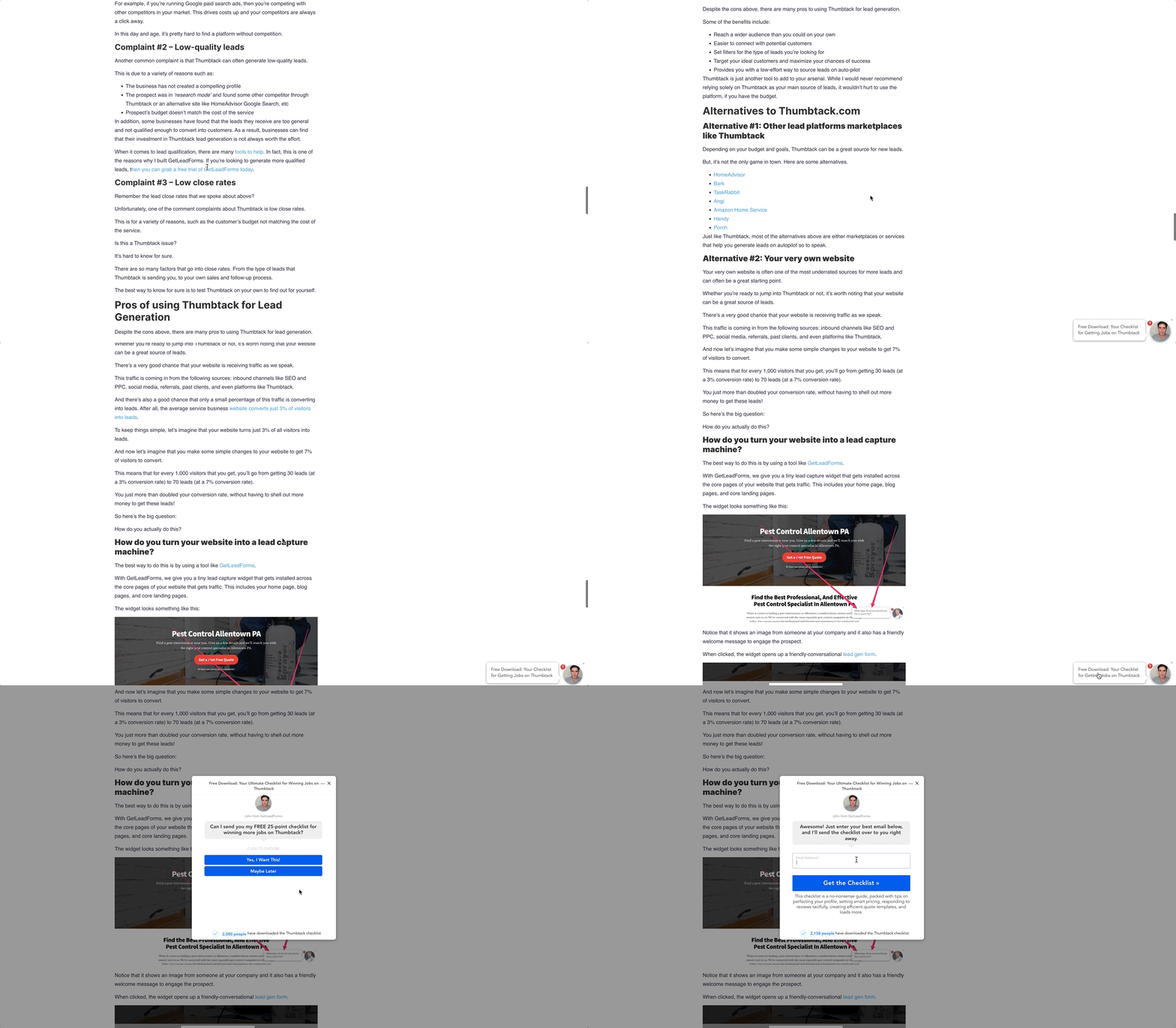
By strategically placing your content upgrade throughout your blog post and utilizing additional features like exit popups and onsite messages, you’ll be well on your way to boosting conversions and building your valuable email list.
Delivering your content upgrade through email
Let’s not forget this key final step!
After your prospect opts-in to your content upgrade, it’s important to deliver it to them through email.
Here’s my approach:
First and foremost, in most cases, I immediately redirect them to the actual content they signed up for. Some may debate this approach, but I believe it’s better to have them access the content right there without making them jump through hoops. After all, we want them to consume the content and experience its value.
But delivering the content directly on your website is just one part of the equation. It’s crucial to integrate your lead form with a CRM or email service provider.
In my case, I use ActiveCampaign.
First, I send the lead to a specific email list for the lead magnet, then the lead is automatically added into a simple automation inside of ActiveCampaign.
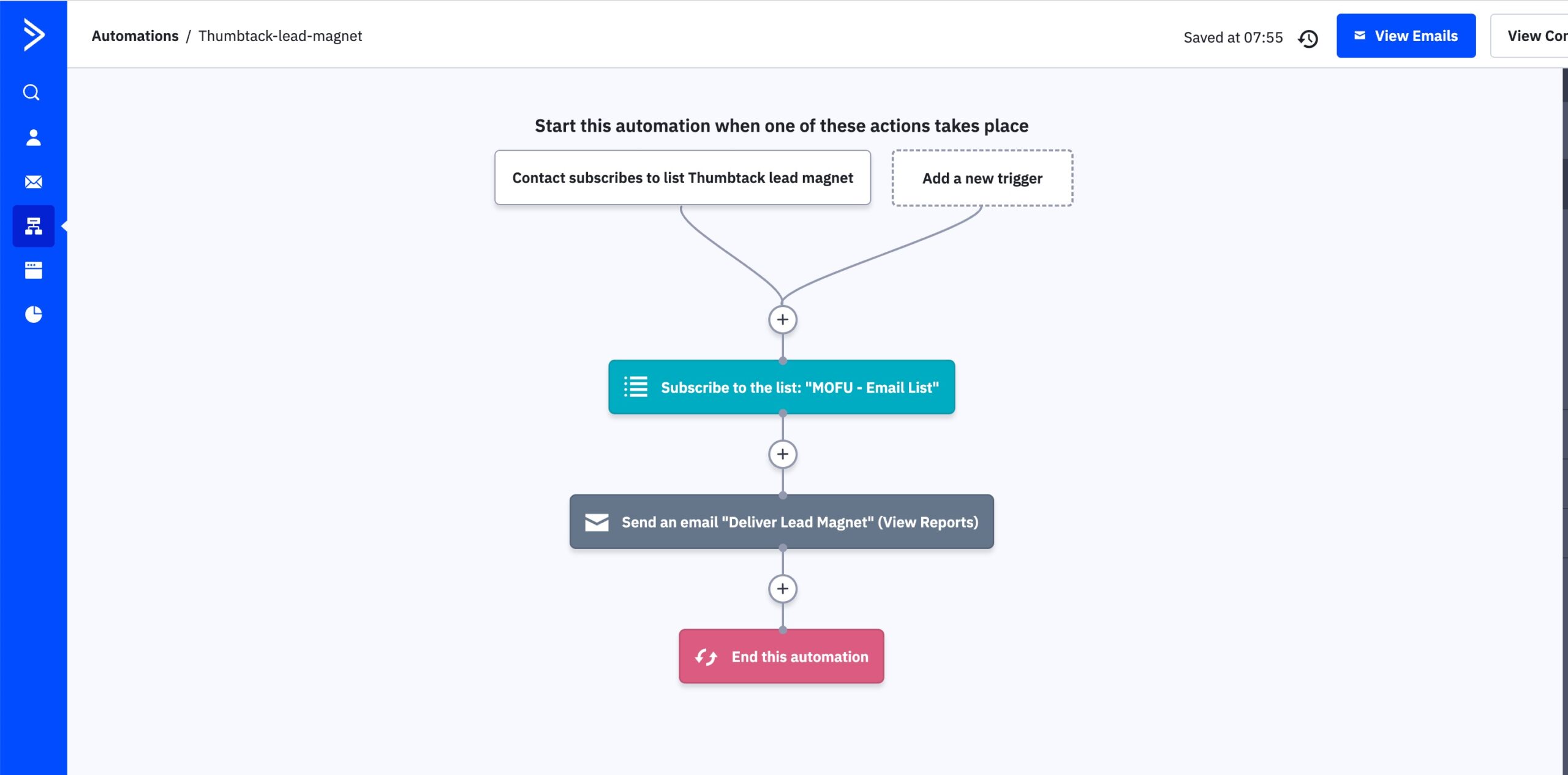
This automation adds the lead to a global middle of funnel email list for long-term nurturing, then delivers the lead magnet to their email.
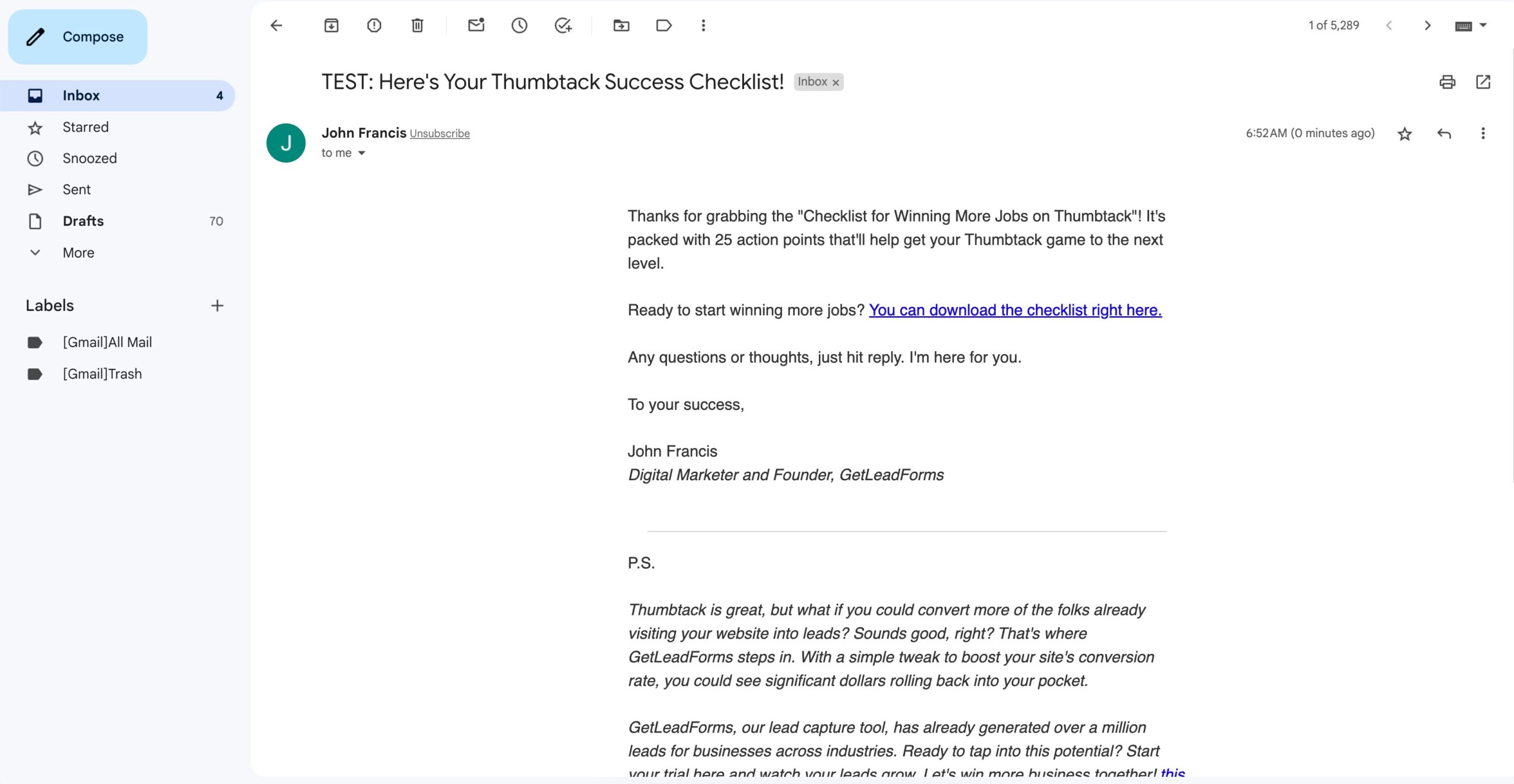
At some point I could plan to get more sophisticated and build out a short nurturing sequence to educate the lead about GetLeadForms.
Remember, getting the prospect’s email is not just about capturing a lead; it’s an opportunity to provide real value and build a relationship. By delivering the content upgrade through email, you can continue delivering valuable content and nurturing the prospect towards conversion.
Final thoughts on creating high converting content upgrades
To wrap up — using content upgrades as a part of your overall content marketing strategy can have a significant impact on your lead generation efforts. By offering valuable bonus content that is directly related to the topic of your blog post or piece of content, you can entice your readers to provide their email addresses and become subscribers, then eventually customers.
Here are some resources to help you on your journey of crating content upgrades:
1) Two Step Content Upgrade Template — Get the free template 👉
2) Single Step Content Upgrade Template — Get the free template 👉
3) Content Upgrade Templates With Qualifier and Drop-off Mode — Get the free template 👉

