Product Update: New LeadForm Builder
!new leadform builder
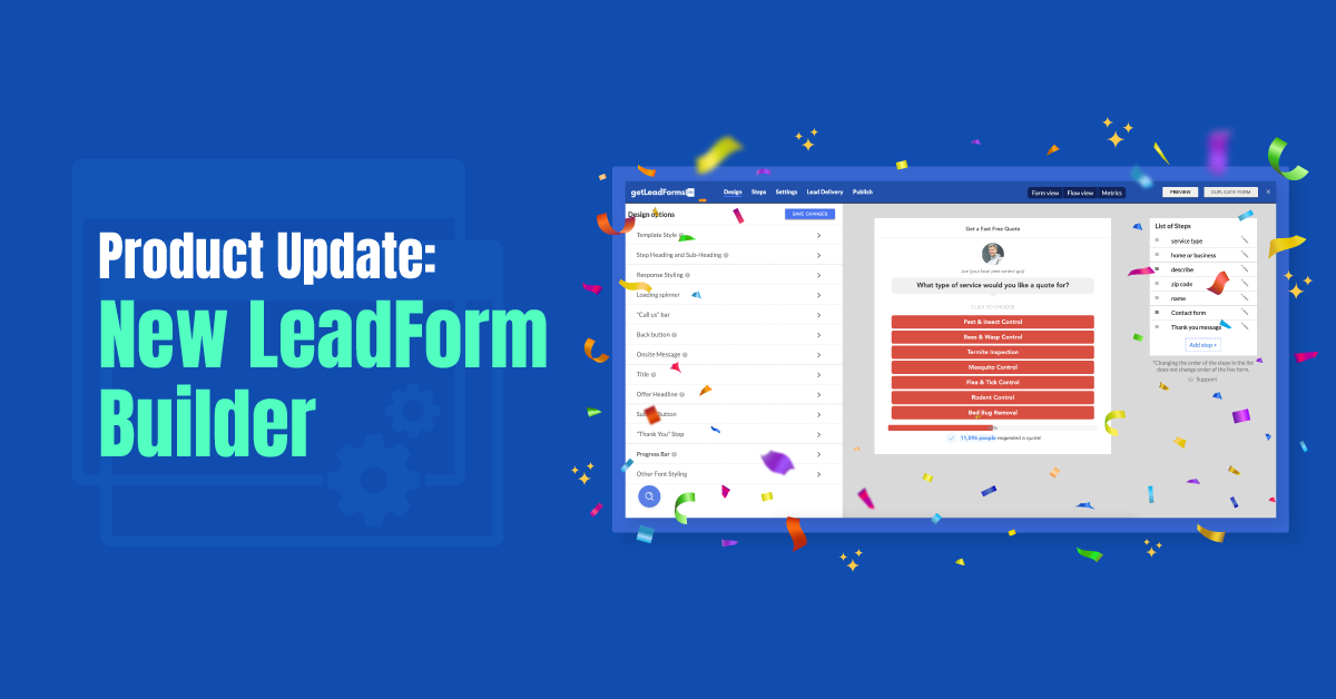
Just in time for the holidays and new year, I’m super excited to announce that we’ve just released a major update to our LeadForm Builder.
Now it’s easier than ever to build an Interactive LeadForm, or Conversational Forms as we like to call them over here at GetLeadForms.
In this post, I’m going to show you exactly what changed and why.
Ready? Let’s go!
Introducing a new, cleaner UI that’s easier to use
Let’s start with a before and after.
Simply drag the slider to the right to see the LeadForm Builder before and to the left to see the form Builder after our update.
[s201_bai id=”6″]
The latest version has a cleaner UI, is easier to navigate and places more of an emphasis on the LeadForm that you’re building.
So why make a change?
There’s no denying the previous version was a little challenging to work with at times.
And the reason for this is because over the last couple of years, we’ve been rapidly building new features and just dropping them into the builder to make them accessible to customers as fast as possible, without a ton of thought being placed into the UX side of things. I guess that’s part of being a scrappy, self-funded SaaS business.
We eventually got to the point where it became pretty clear that we needed to take a step back, slow down and focus on user-experience before we continue with the next big push of features and settings.
I like to think of it this way.
We built a Ferrari — GetLeadForms is the most advanced multi step form builder out there, with tons of features that you won’t find anywhere else.
But despite being loaded with features, we really needed to focus on the design of the Ferrari so you’ll actually know how to drive the darn thing!
So, what else changed? Well, here are some of the more notable updates that we made.
Your LeadForm is now more front and center in the builder
Prior to this update, the real-time preview of the LeadForm was kind of pushed over to the left side of the page, with the navigation taking up most of the room.
So, to bring more focus to the form, we dropped the left hand navigation bar and expanded the width of the Form Builder. This allowed us to place more emphasis on the real-time preview of the LeadForm.

Eventually, you’ll be able to click right into the form to make changes. That’s coming in a future version.
A simplified navigation
The previous version of the form builder had dual navigations, which was a bit redundant and a little confusing — especially to new users.
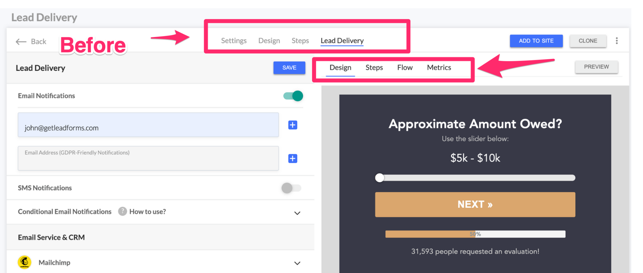
The challenge that we faced when it came to improving the navigation was that there are quite a few different views of the form. So, thinking through simplified navigation was actually quite a challenge.
However, after a couple of design iterations, we were able to find a way to consolidate everything into just one navigation area.

Highlights:
- We moved all of the navigational links up to the same line, rather than having two separate navs
- Re-ordered the steps a little to focus more on how people build their forms, we’ve noticed that users tend to start with ‘Design’ first.
- Nested the sub-nav for ‘Form View’, ‘Flow View’, and ‘Metrics’ right in the primary nav so you can easily toggle between the different views
- And we came up with more logical, descriptive names for each element in the navigation
Improved grouping and categorization of settings so you can easily find what you need
One of the compliments that we always get is about how feature rich GetLeadForms is.
And one of the most common questions that support gets is something like: “Where do I find…?”
When we stepped back and did a UX audit, we realized that settings and features were not only hard to find, but the overall look and feel of the settings panel was a little overwhelming and disorganized.
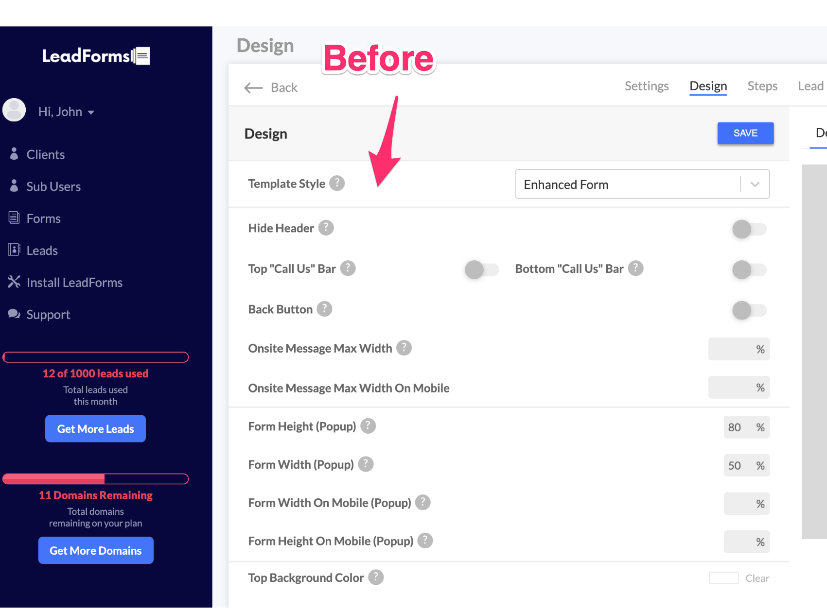
Not a great first impression.
To improve the UX, we started grouping settings and features into more logical groups (or categories), resulting in a more organized, less cluttered experience. Here’s the exact same image above, but with each element organized and grouped into parent categories.
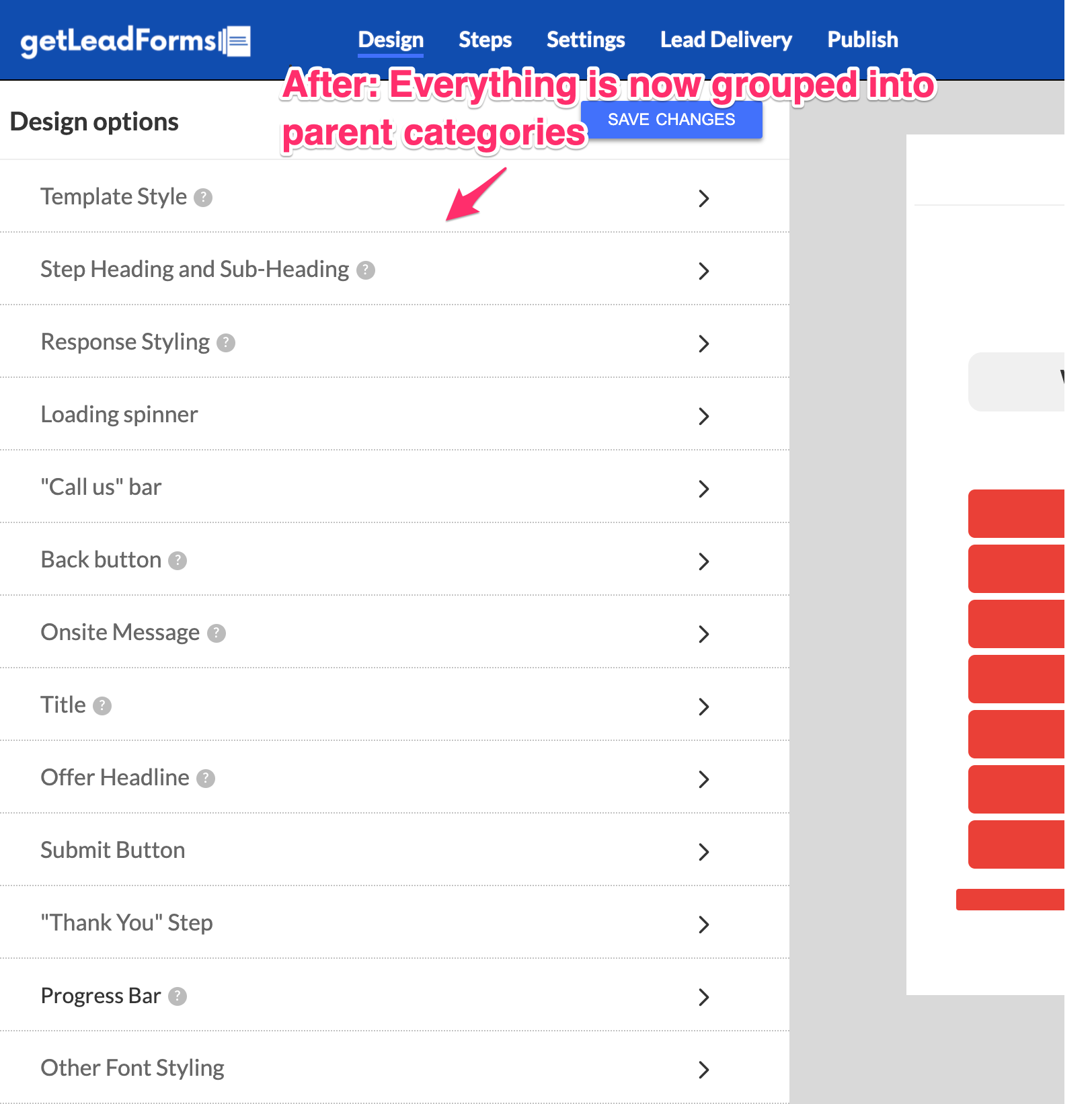
All of the same settings and features that you’ve always used are still there.
All you need to do is find the category that you’d like to change (i.e, button color) and expand the group.
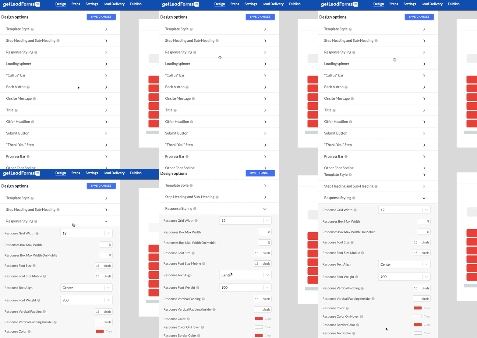
You’ll find all of the settings nested into its parent group.
There’s still more work to be done here. In the future, we’ll most likely consolidate some of the groups, remove unused features, and focus on streamlining this a bit more.
Flow view is bigger and easier to work with
This one is small, but notable. In the previous version of the builder, the Flow View was a tiny box that was hard to work with at times, especially if your form contained a ton of steps.
The flow view is now bigger.
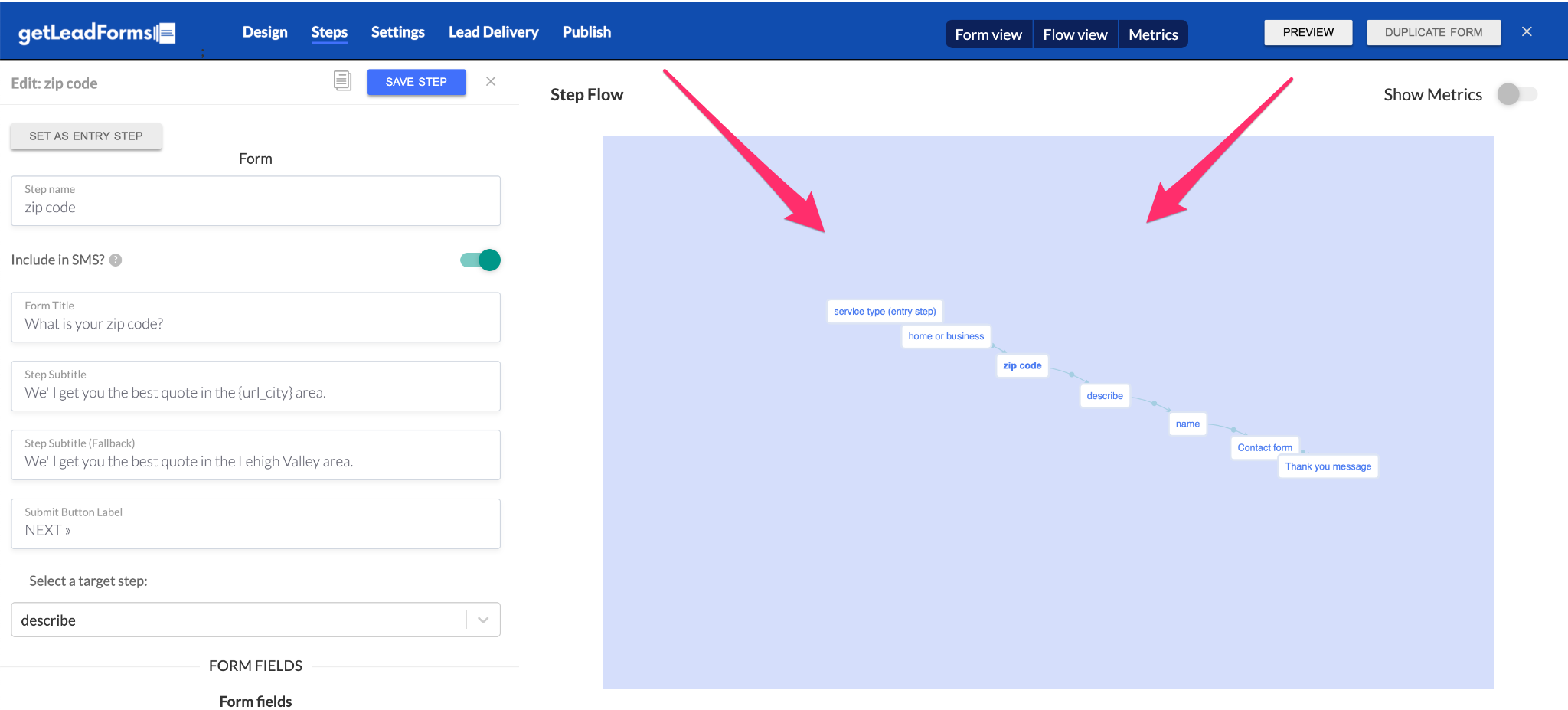
This makes it easier to see how all of the steps in your form connect, especially if you’re using conditional logic.
New steps panel makes it easy to access and edit steps in your LeadForm
This is one of my favorite updates and it’s completely new.
One of the biggest UX challenges that we’ve come across is that in most cases, it’s not simple forms that our users are building. In fact, they’re often building complex forms that have multiple steps.
For that reason, we realized that we have to give the user an easy way to see how all of the steps connect together and access each step to make an edit.
In the previous version of the form builder, you had to click into two different places to access the step of your form. And sometimes, if you switched views the list of steps would go away and you’d have to click back into it.
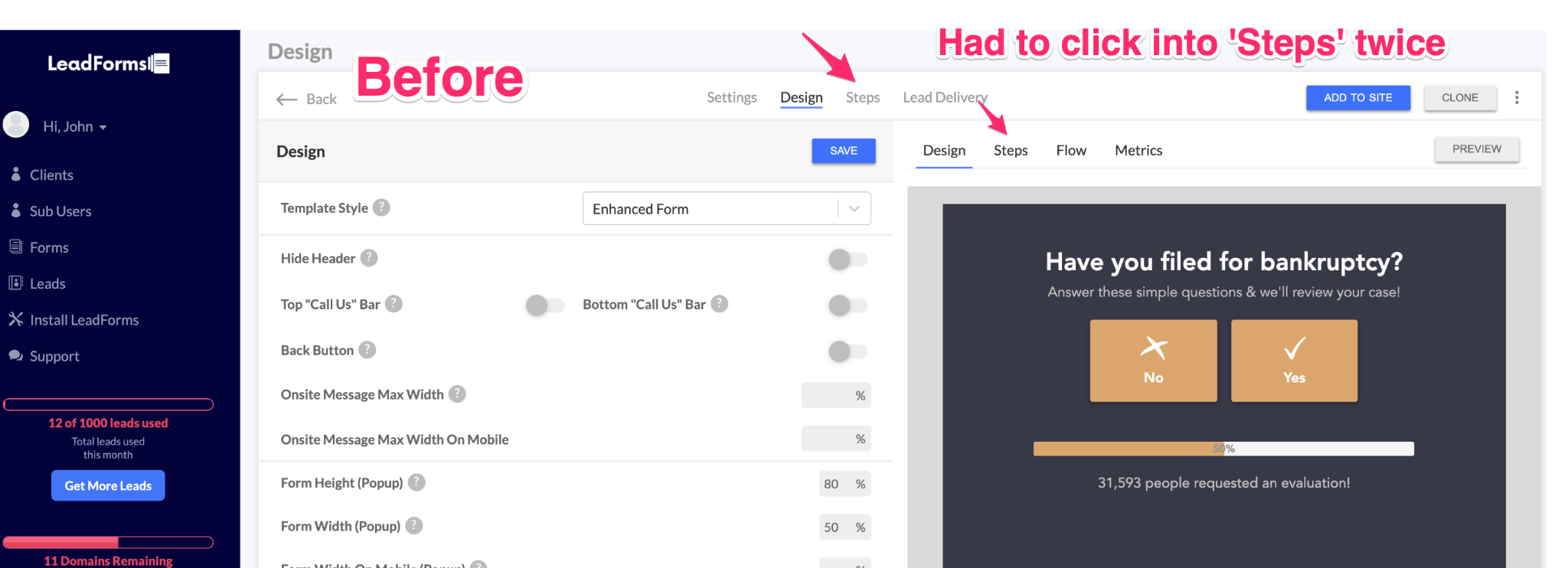
We realized that the experience was not only confusing, but also required too many clicks, so we got the brilliant idea to simply add a list of steps to the right side of the Lead Form Builder.
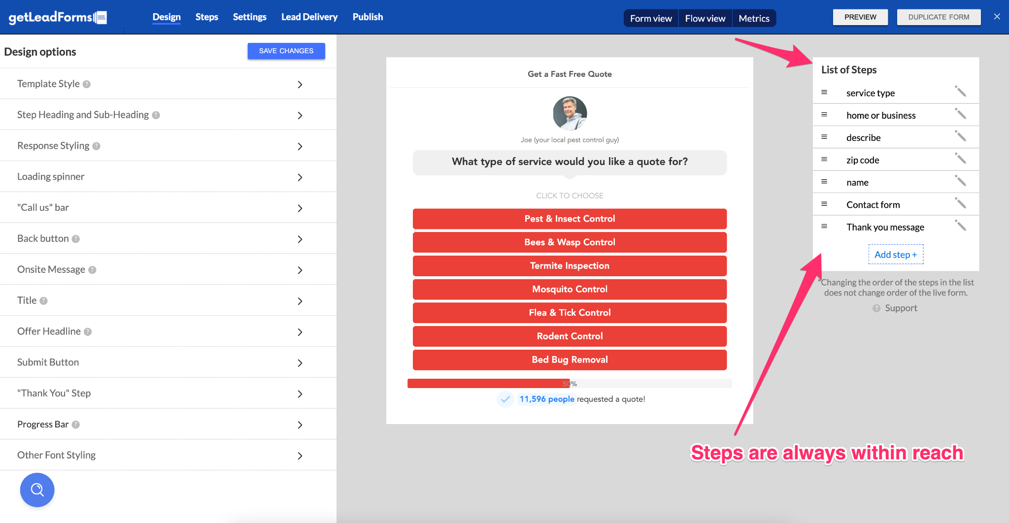
This list persists no matter which part of the Form Builder you’re looking at.
What’s next?
That wraps up the main updates. And I didn’t even touch on some of the smaller changes, including code refactoring for better performance.
As you can see, we’ve been pretty busy with the latest update of the LeadForm Builder.
In the coming weeks, we’ll start dropping some new training videos into the builder, while working on some other features on our roadmap.
GetLeadForms Customers: Login to see the latest changes for yourself (note: you may have to clear your cache
Not using GetLeadForms yet? You can start your free trial here.
Ready to capture more leads?
Build and optimize high-converting lead funnels, quizzes, and forms with AI-powered lead capture software.
Start Free Trial