Get More Qualified Solar Leads: 9 Conversion Boosting Tweaks for Your Forms
Your solar forms hold incredible potential when it comes to capturing high-quality leads from your website.
Your solar forms hold incredible potential when it comes to capturing high-quality leads from your website.
Think about it this way: the average solar lead form converts around 1-2% of website visitors into leads.
Imagine if you could increase that conversion rate, from let’s say 2% to 3%.
You just doubled leads without having to get more traffic.
But it’s not just about getting more conversions.
The second big opportunity lies in getting more qualified leads.
When it comes to solar lead generation, quality is the name of the game, especially if you’re selling leads.
With that said, let’s dive into nine conversion boosting tweaks that you can make to your solar forms to start capturing more (and better) leads today.
Note: If you’re short on time and would like to grab a highly optimized solar form template, then you can get this free template here.
Use multi-step forms to generate more qualified solar leads
A multi step form is one of the best ways to generate more qualified solar leads.
For instance, notice how this solar form starts with the zip code to qualify the prospect based on location.

Then it begins to ask qualification questions to get a better sense of the prospect’s situation.
Get this exact template here →
This multi-step form is designed to engage and convert your prospects while also qualifying them at the same time.
Breaking the form into multiple steps like this makes it less overwhelming for the prospect, so you can capture more information without sacrificing conversions.
Make an offer within your solar lead gen forms
Your first transaction doesn’t start when your prospect pays you for your products or services.
It starts when your prospects submit their personal information through your contact form.
Ever hear the saying — “Personal data is like the new oil of the internet and the new currency of the digital world?”
Your prospects understand that their personal data like their name, email, phone and contact details are extremely valuable to them. In some cases, this data is more valuable than money.
That’s why if your form does a good job incentivizing prospects to part with their valuable data, then you’ll most likely see conversion rates increase.
Here’s a great example of a solar form that makes a strong offer.
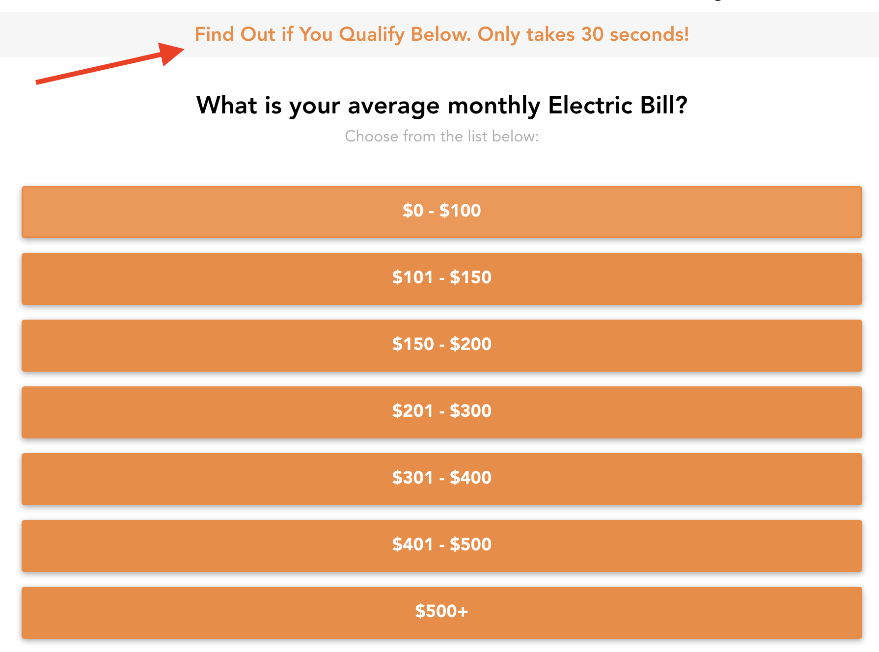
The first thing to note is that you’re not giving away the house with the offer. In fact, all you’re doing is reframing your contact form into an offer for the prospect to compare solar quotes with you.
The second thing to take note of is that the offer is made right on the form, so prospects know exactly what they are going to get by submitting your form.
Other offers in the solar industry include:
- Discounted or free initial consultations
- Zero-down financing
- Extended warranties
- Early bird discounts
Ask qualifying questions to understand your prospect’s purchase intent
One of the most effective strategies in any lead gen form is to ask qualifying questions.
By asking the right questions, you can quickly identify the right leads and route them to your sales team.
On the other hand, if you come across unqualified leads, you can save time and resources by not passing them on.
For example, let’s say you have a form on your website where potential customers can request more information about solar energy.
Within that form, you can include a question like, “Are you interested in leasing or purchasing your solar system?” – If the prospect answers, “Purchase,” you can immediately route them to your sales team to discuss leasing options. This not only saves time but also ensures that you’re catering to their specific needs.
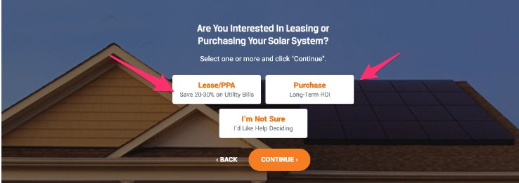
By incorporating tailored questions like this into your lead generation forms, you can increase your conversion rates and reduce the time wasted with tire kickers not interested in what you have to offer.
Further reading: Here are some great examples of lead generation forms with qualifying questions.
Add social proof to boost your form conversion rates
To truly turn your solar site into a high converting lead generation website, you need to get your prospect to know you, like you and trust you.
This is where social proof can help.
In fact, according to one study, more than 90% of respondents trust the opinions of fellow customers more than the words or actions of the company or brand itself.
It just so happens that one highly effective way to boost your form’s conversion rate is to add social proof right into your form.
Just take a look at this example and notice how this form strategically places social proof elements at the bottom of the form, so the prospect knows that other visitors completed the form as well.
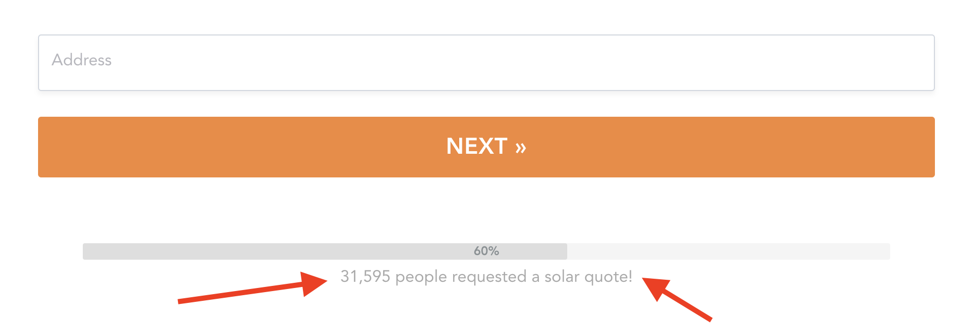
I recommend showcasing testimonials, customer reviews, or statistics about the number of form submissions right on forms — especially those high friction fields like social address and contact fields.
When potential leads see that others have had a positive experience with your solar company, they’re more likely to fill out the form and convert into customers.
Add your image to your form to build trust
Prospects are hesitant to part with their personal information more than ever before for one huge and often overlooked reason.
Your prospects don’t know what you’re going to do with their precious contact details.
Especially if they are landing on your website for the first time.
For example, before someone submits their form they might have these questions running through their head:
- “Is my phone or email going to get spammed after I submit this form?”
- “Will this person sell my details off to other companies who will start spamming me?”
- “Will someone get access to my bank account and drain it?”
Yes that last one seems extreme, but these are serious questions that go through the minds of your prospects and are causing you leads.
One powerful way to establish trust is by adding an image of a real person to your form, just like this:
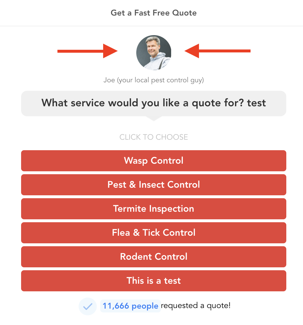
In fact, I tested this and found that adding an image of an actual person to a form can increase conversion rates by 35%.
Why is this so effective?
One simple reason:
It’s showing that there’s a human behind the form which helps make the prospect feel safe that their data is in the right hands.
Now here’s the catch.
Try to avoid using generic stock photos for this because it could be seen as misleading which could be counterproductive. I highly recommend using a real image of a real person smiling right back at your prospect.
Send traffic to a dedicated landing page with a form
Distractions are everywhere.
Especially on solar websites.
And distractions are one of the biggest conversion killers.
This is why I recommend sending your traffic to a dedicated landing page like in this example from Solar Energy World:
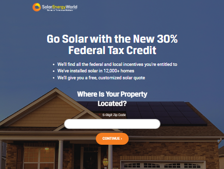
This landing page is designed to keep the prospect focused on the following:
- Understanding that they are in the right place
- Seeing the offer
- Then submitting the form
Sprinkle in a little trust and then that’s all there is to it.
By minimizing distractions and streamlining the user experience, they make it easy for potential customers to take action.
Verify your solar leads
Aside from converting traffic into leads, one of the biggest challenges that most solar businesses face comes with what happens after the lead is submitted — usually dealing with fake or invalid leads.
In fact, one study highlights that about 1 in every 4 leads processed is invalid. And roughly 30% of invalid leads are due to a phone number.
There are three reasons why this happens:
- Someone actually entered their contact details into your form wrong — this is quite common on smaller screen sizes like mobile devices.
- Someone wants to submit a test lead or doesn’t want to provide you with their real contact information.
- A milious individual or even a bot is submitting spam through your form — if this happening to you then check out this post on how to reduce spam submissions in your lead forms.
The costs of contacting these bad leads can quickly add up. Not only is it a waste of time for your sales team, but it also hinders your ability to focus on qualified leads who are genuinely interested in your solar services.
That’s where lead verification comes in.
By verifying a phone number in real-time using OTP phone verification, you can ensure that the leads you receive are legitimate and accurate.
One solution that helps with lead verification is GetLeadForms’ OTP phone verification feature, which helps you easily verify that your prospect’s gave you a legitimate phone number.
It helps ensure that you spend only time and effort on high-quality prospects.
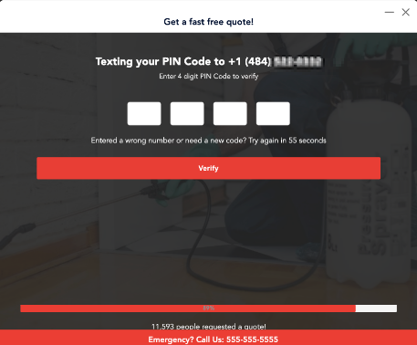
With real-time lead verification, you can immediately weed out fake or invalid leads, saving valuable time and resources.
Engage visitors as they are leaving using exit intent popups
Do you know that a whopping 75% of visitors leave a website without taking any action?
That’s pretty painful to hear, especially if you’re paying to get traffic to your site.
But the good news — there is one key way to improve conversions and engage visitors as they are leaving.
Enter exit intent popups.
Exit popups are a powerful tool that can grab visitors’ attention and get you one more chance at converting the prospect.
And when it comes to exit popups, I recommend using a multi-step form with an irresistible offer.
Remember, the prospect is on their way out the door as they are being hit with an exit popup, which also might even be perceived as a little annoying.
So you have to do everything in your power to make your exit popup to convert. This is exactly why you need a really good offer.
If you’re looking to improve your conversion rates and engage visitors as they are leaving we have a comprehensive guide on pop ups that will walk you through different types and how to make the most of them. Check it out here.
Engage visitors as they are browsing your service pages and blog posts
Engaging visitors as they are browsing your website is crucial for capturing their attention and converting visitors.
Let’s face it: not every visitor will convert into a lead on their first visit. In fact, the average solar form blog converts less than 1% of traffic into leads.
That’s where the power of onsite messaging comes in.
Here’s how it works:
As the visitor is browsing your solar website, maybe reading your blog or learning more about your solar business, a subtle message sits in the bottom right or left corner of your page like this:
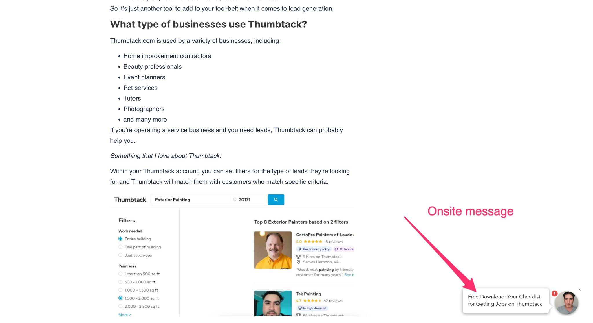
This widget includes an image of you and a friendly message to engage the visitor.
When clicked, it opens up your lead form:

Notice that this form uses many of the elements that I discussed throughout this post: social proof, multiple steps, personal images, and more.
This is such a powerful conversion tool —when I added this onsite message to a blog post, doubled my inbound leads from one blog post.
Final thoughts on generating more qualified solar leads
Generating high-quality solar leads at scale isn’t easy.
But the 9 conversion boosting tactics shared in this article will definitely go a long way in helping you engage, qualify, and convert more of your traffic into leads.
It all starts with an optimized, multi step solar lead form.
Ready to capture more leads?
Build and optimize high-converting lead funnels, quizzes, and forms with AI-powered lead capture software.
Start Free Trial